For their seventh album, “Sleep Well Beast,” American indie band The National collaborated with Pentagram design studio to create a full-on corporate identity and a visual language that conveys the band’s musical influences and encourages an easier interaction with the fans.
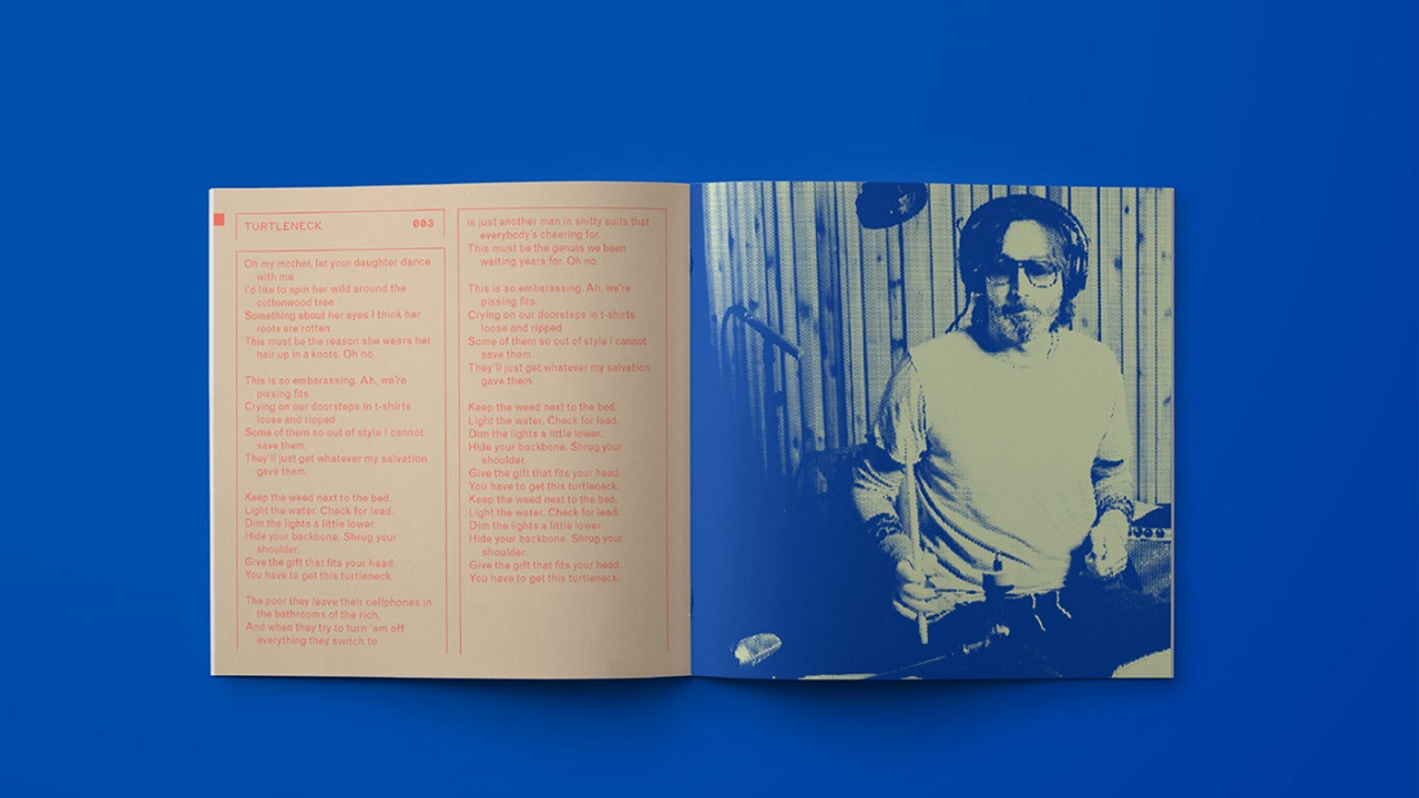
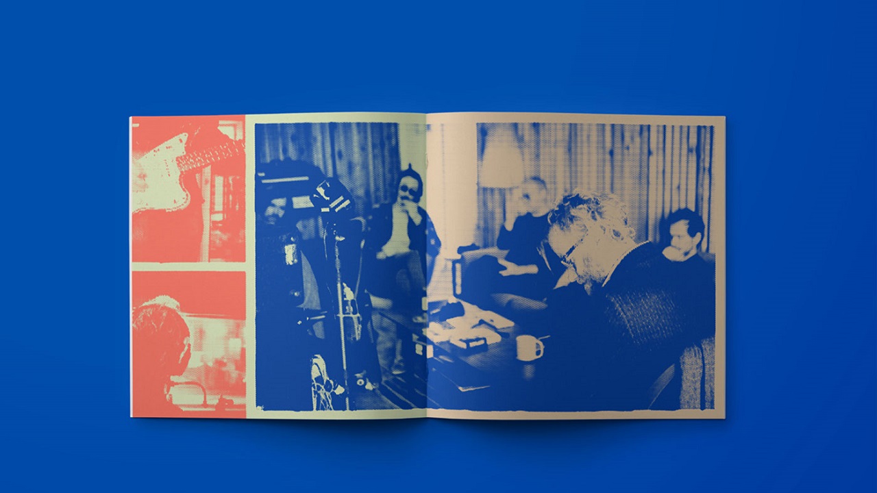
The New York-based studio disguised The National’s latest album’s typical elements, which are generally cheerless because of occurrence of such themes like collapsing relationships, emotional confusion, or self-sedation, into powerful visuals that can be admired in both print and digital.
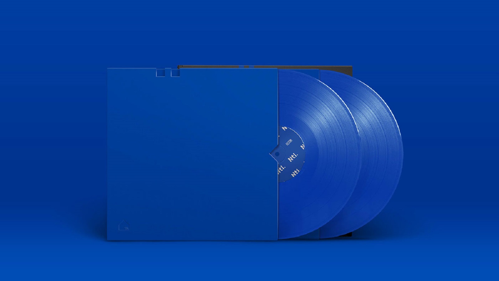
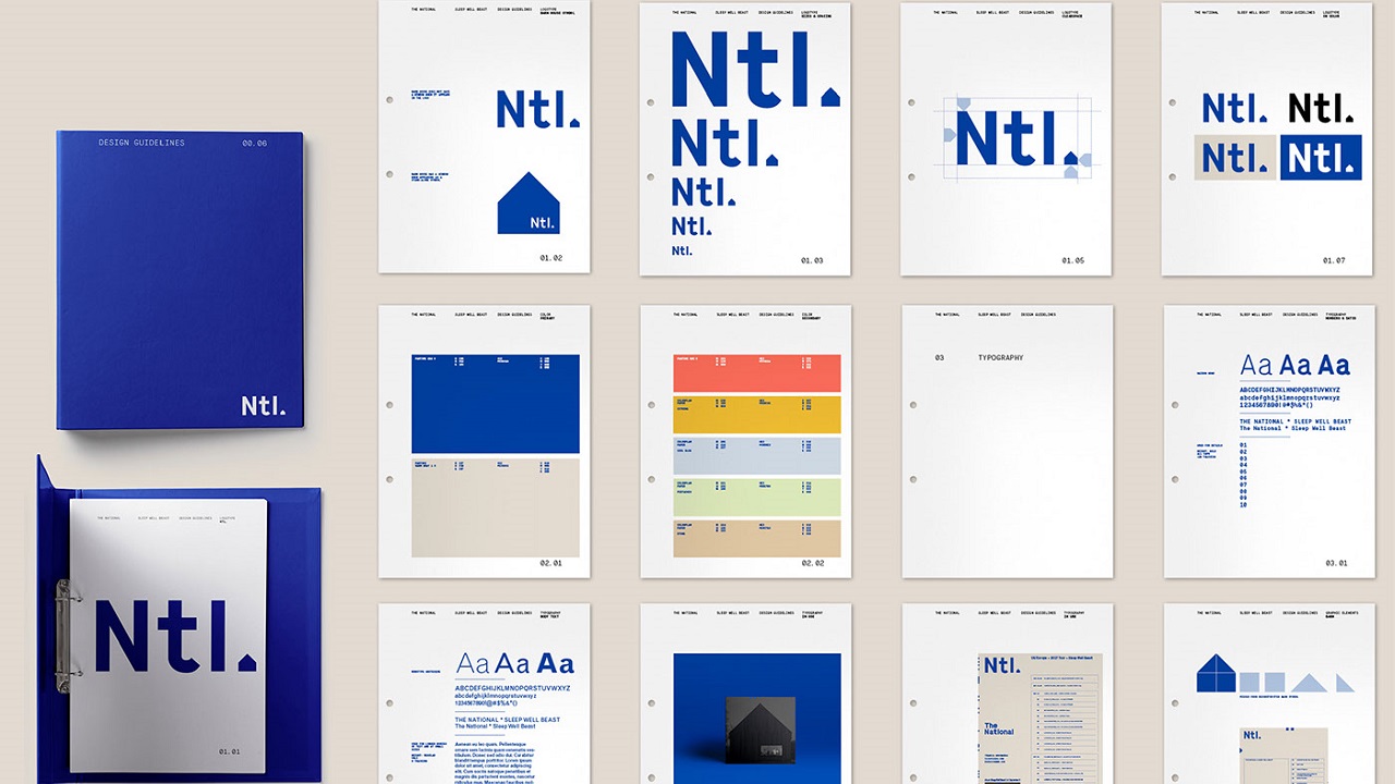
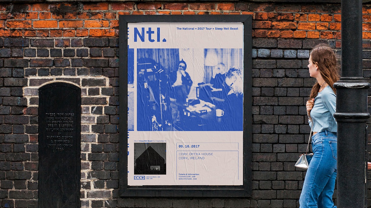
The studio’s creativity can be discovered on the album cover, on promotional materials, and on graphic guidelines, which were all made to enhance the whole experience. All elements were centered around blue and white colors. The palette of shades was not chosen by random at all, as it correspondingly reflects melancholy, a recurring theme in The National’s music.
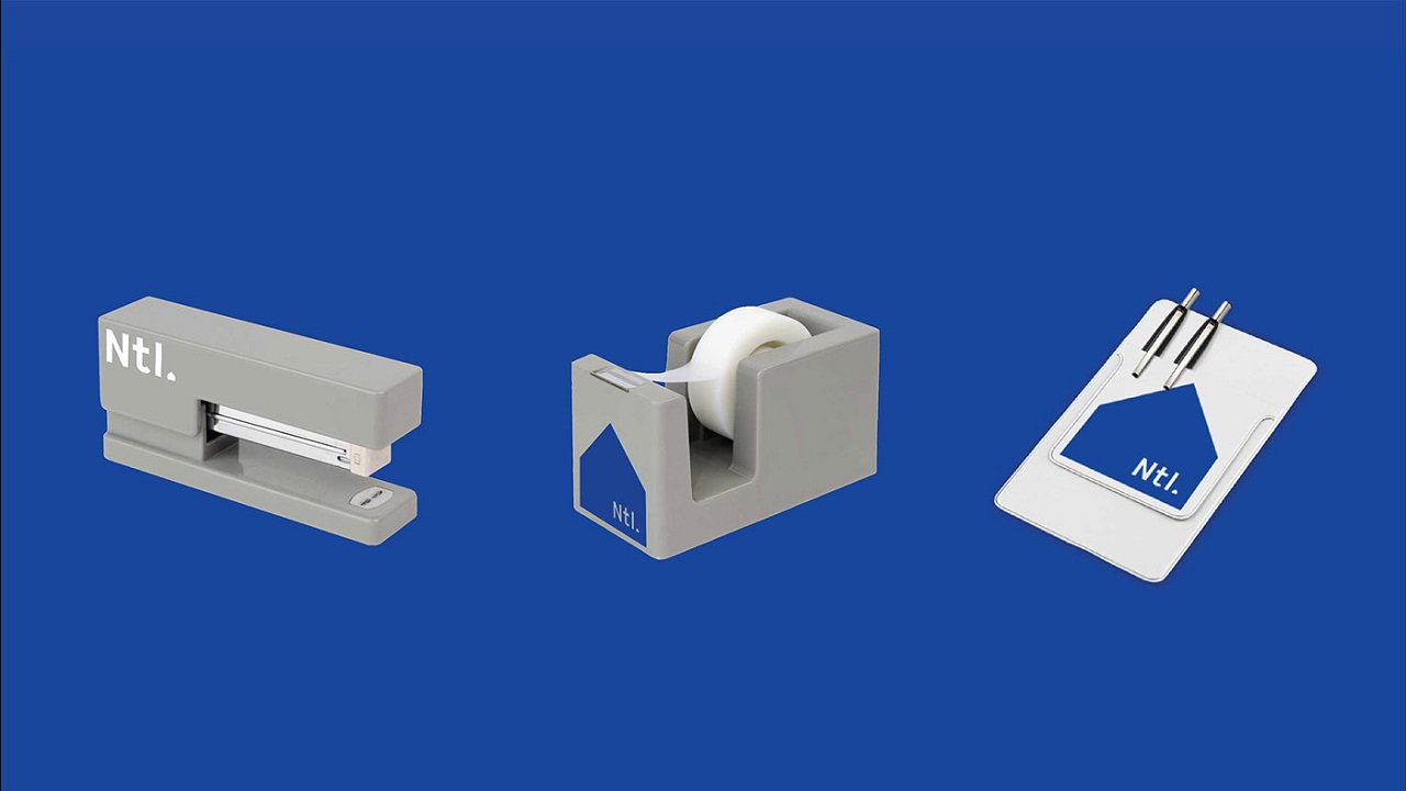
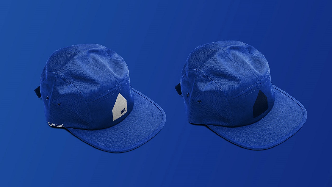
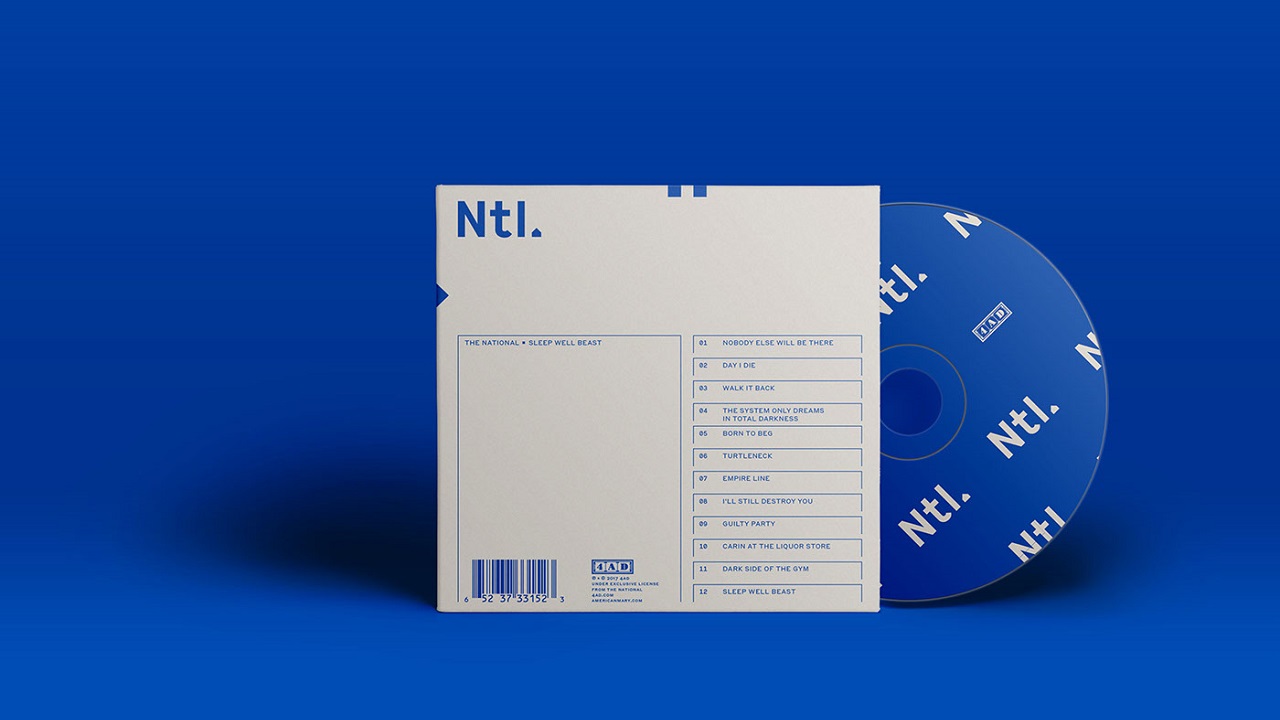
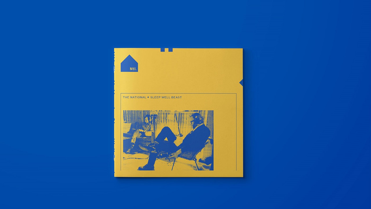
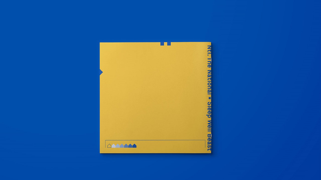
Pentagram chose to shorten the band’s name to a more corporate-related model. “Ntl.” is depicted with industrial characters using the Maison typeface. As you would think, the new logo appears on T-shirts, caps, and posters, but it can also be seen on ridiculous promotional corporate supplies, like staplers and tape dispensers.
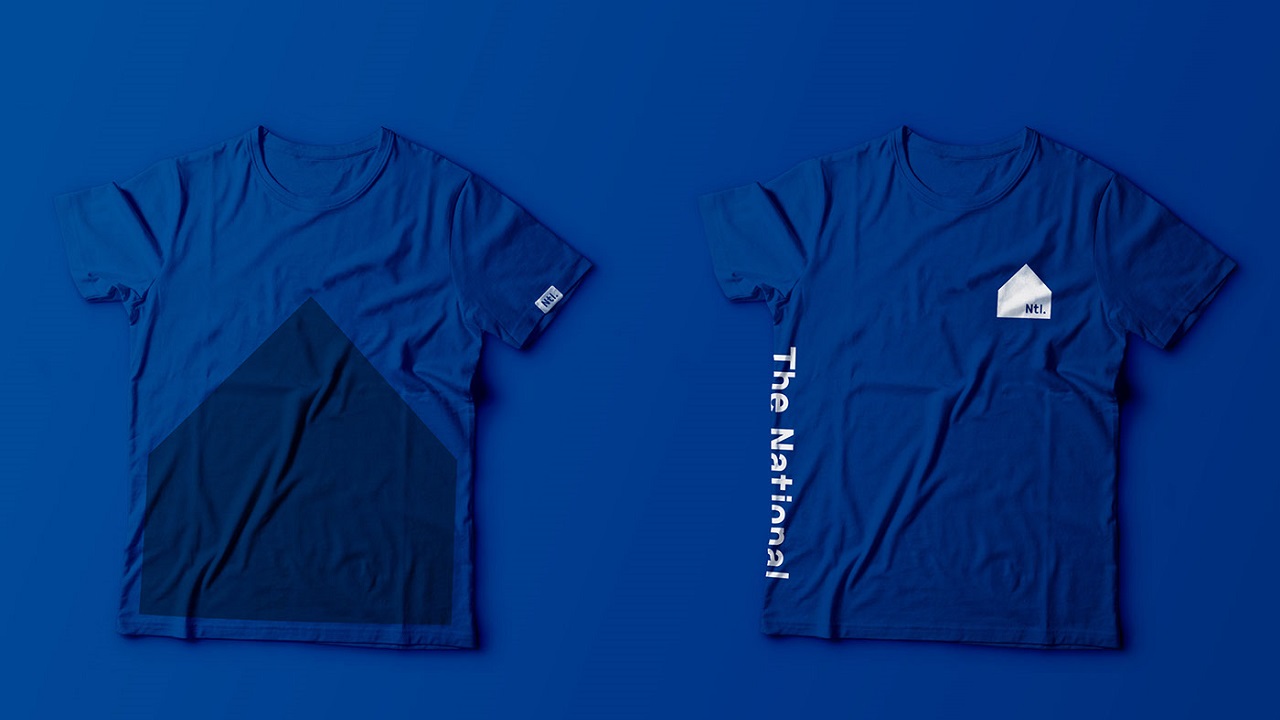
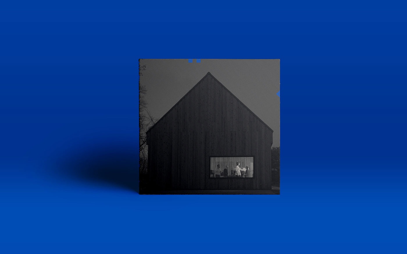
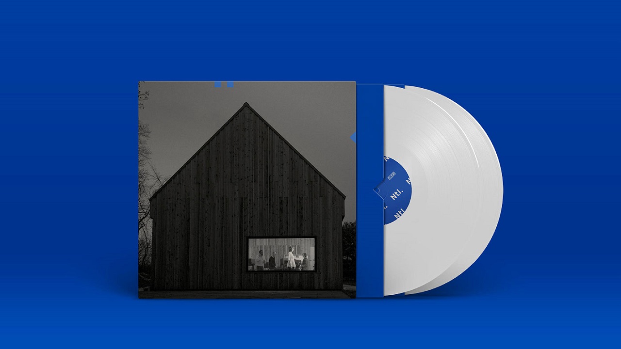
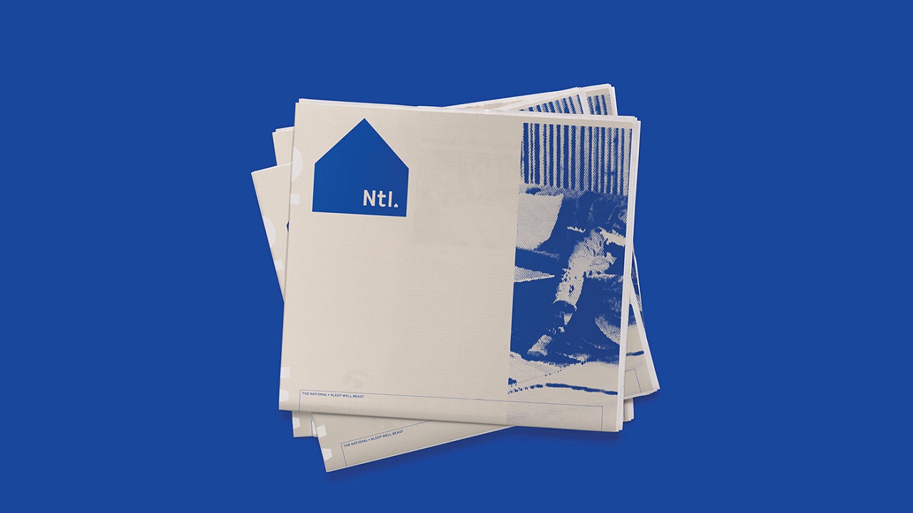
Sleep Well Beast was recorded in a barn in Hudson, New York. The unusual visage of the studio gave birth to a house-like symbol that was gladly embraced by the band members.
The building’s image features in a black-and-white photo, shot by Graham MacIndoe who spent weeks on photographing the group while they were recording. To soften the visual language, he placed these images on both the record’s cover and on the CD.
The band is emotionally connected to this particular place because the house is built on the property of one of the members. “It’s part of the mythology of identity: it’s the headquarters of the corporation or organization that produces music-propaganda,” said Luke Hayman, one of Pentagram’s partners.
Bearing such great significance to the band, the barn’s image was transformed into an icon. Broken into two squares and a triangle, this is the shape the band chose as the perfect emblem to reflect their image. It now stands firm as Ntl.’s promotional logo.
Besides posters and graphics, the campaign included a series of videos made by artist Casey Reas. He honored the music of The National with films that played on billboards placed in high-traffic areas of New York, London, and Copenhagen. The Collected Works studio also created a new website for the rock band.
Two of the National’s members, Aaron and Bryce Dessner, got together with the Collected Works before. As a result, they released Day of the Dead music collection, in which the musicians brought living tributes dedicated to the iconic jam band Grateful Dead, while the designers’ swirling abstract visual structures summoned the “Deads” back to life.
Two other band members used to be graphic designers, and one of them, bassist Scott Devendorf, even worked at Pentagram. That’s why the band seemed a little reluctant to call on a specialized agency to help them with the campaign. “They’ve embraced this by commissioning an identity from ‘the largest independent design firm in the world’, Pentagram, who happen also to be friends,” adds Hayman.
As you can tell, they have made an excellent job and the studio’s visual gift will definitely enchant the eyes of many fans. But that’s enough of design, it’s time for an audio treat. Just listen to the second song from the band’s LP “Day I Die.”
Credits:
Client: The National
Agency: Pentagram