“A Chef’s Life” stars, Vivian Howard and her husband Ben Knight, recently opened an Italian restaurant right in the heart of Wilmington, North Carolina. The Neapolitan pizzeria bears the name of “Benny’s Big Time Pizzeria” and marks the third restaurant that the award-winning chef and her business partner have taken charge.
The new location got baptized with a combination of the duo’s nicknames from their childhood. While “Benny” stands as a diminutive for Knight’s first name, “Big Time” takes inspiration from Howard’s father who gave this unusual moniker to his daughter after she showed a talent for entertainment as a child.
As the new kid on the block, the pizzeria was determined to prove itself. And how can the restaurant reach consumers’ hearts? First, through really tasty dishes. Here the pizzeria checked all the boxes easily. The other… well, the other one lies in the hands of The Door idea house that designed a bold visual identity which captures Benny’s Big Time Pizzeria’s delicious and fun spirit.
Ben and Vivian joined forces with the New York-based studio’s Art and Creative Directors, Sara Berks and Melinda Welch respectively, and visually defined the pizzeria’s fresh identity. Also, by avoiding any Italian clichés, they created small treats that double as communication tools and speak about the restaurant’s playful and modern nature.

Going step by step, the agency first thought of identifying a specific color palette that should best represent Benny’s lively character. After consulting with the couple, the artists decided that the color scheme should not include stereotypical colors or motifs of a traditional Italian-American restaurant.
Rather, to set the pizzeria apart from other regular eateries, the creatives started with a color palette that embraces rich red nuances and marries them with deep blue hues. Then, to accentuate these powerful visual notes the team added a drop of bright and warm shades.
Vienna-based artist Nanna Prieler was commissioned to create fun illustrations for the pizzeria. The aesthetic lines she used to describe the pizzeria borrow the same graphic elements the illustrator used in her other projects, to which she refers as “a play between round and square, fine and rough, figurative and abstract, obvious and absurd.”
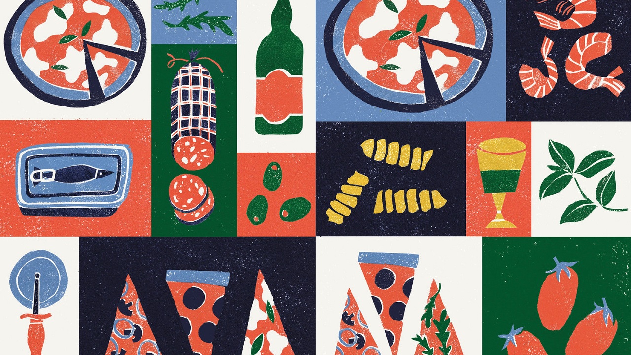
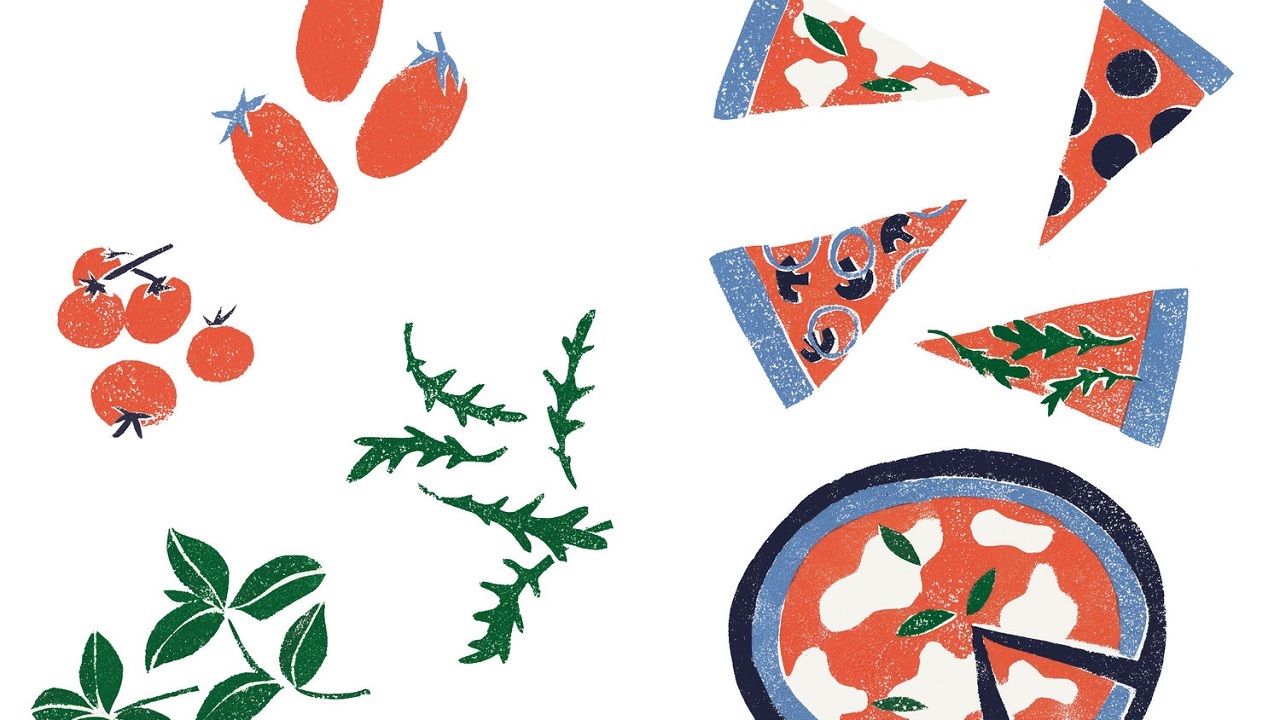
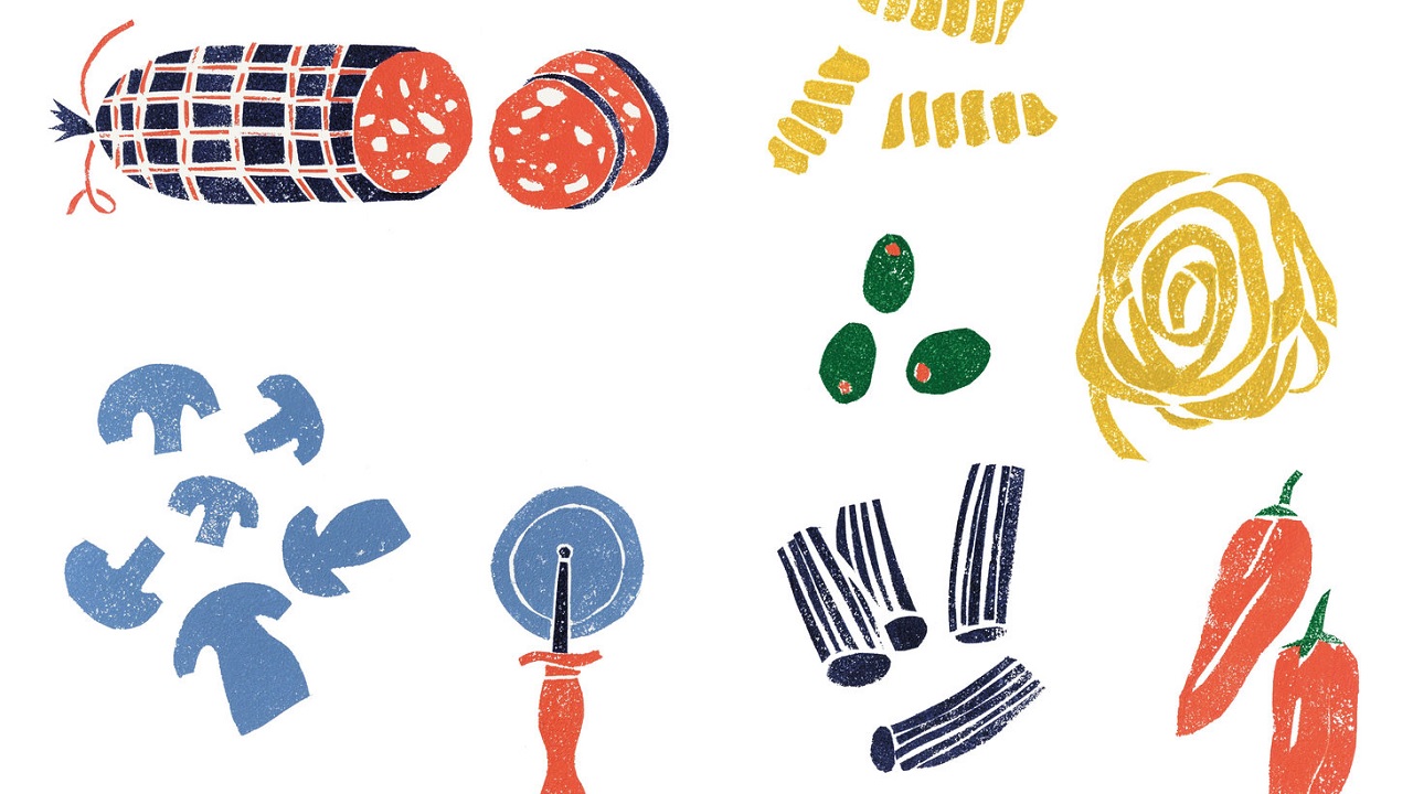
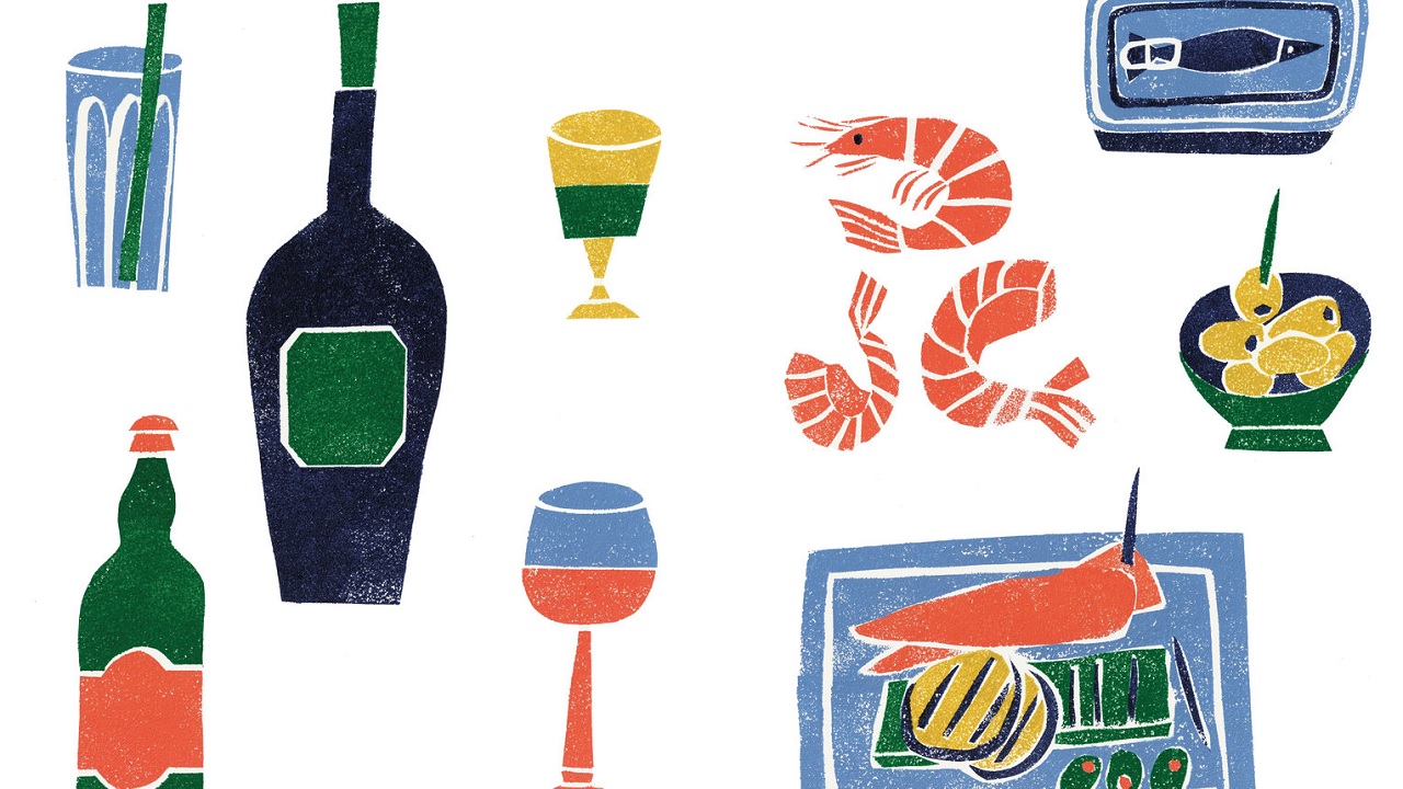
By combining her talent with the restaurant’s delicious dishes, she ‘dished out’ a series of playful illustrations that reflect the restaurant’s commitment to deliver tasty dishes served in a joyous atmosphere.
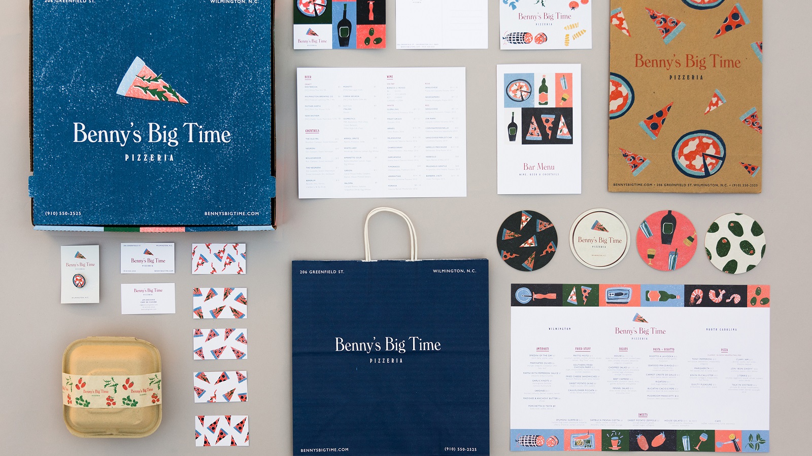
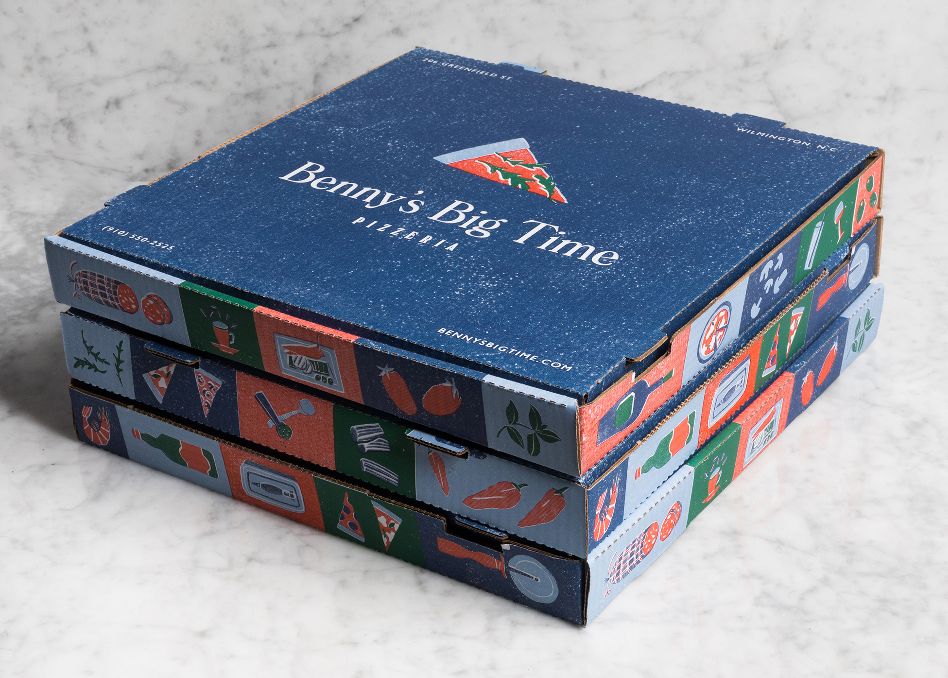
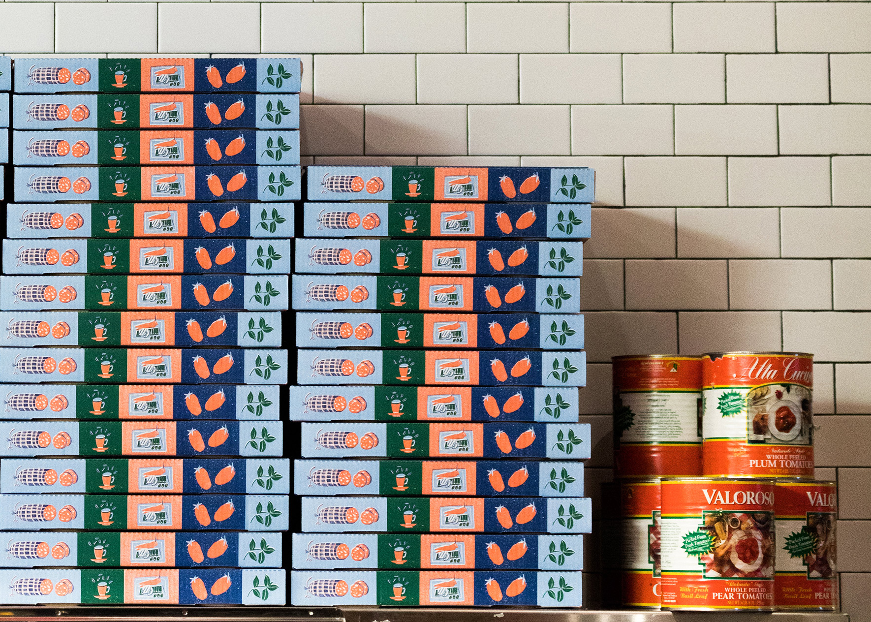
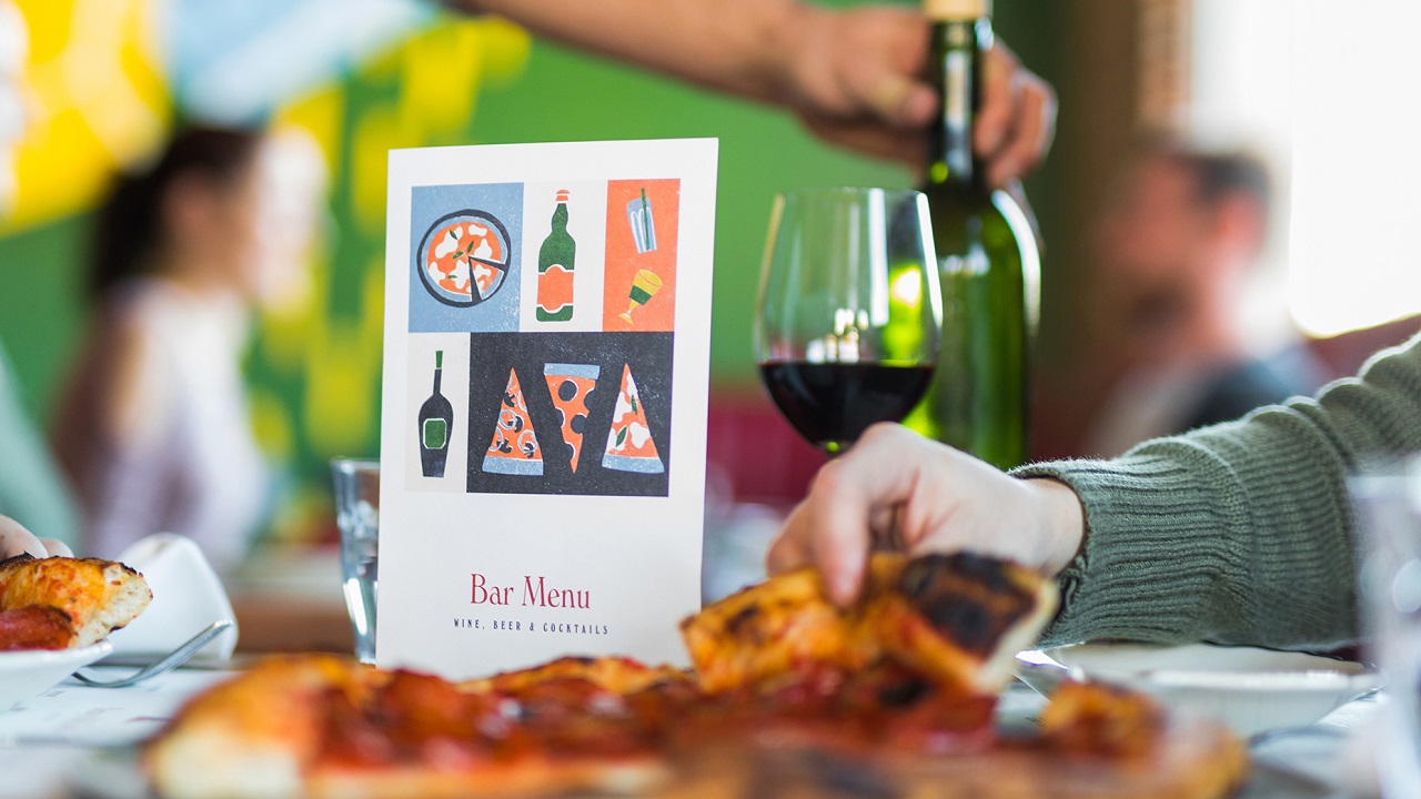
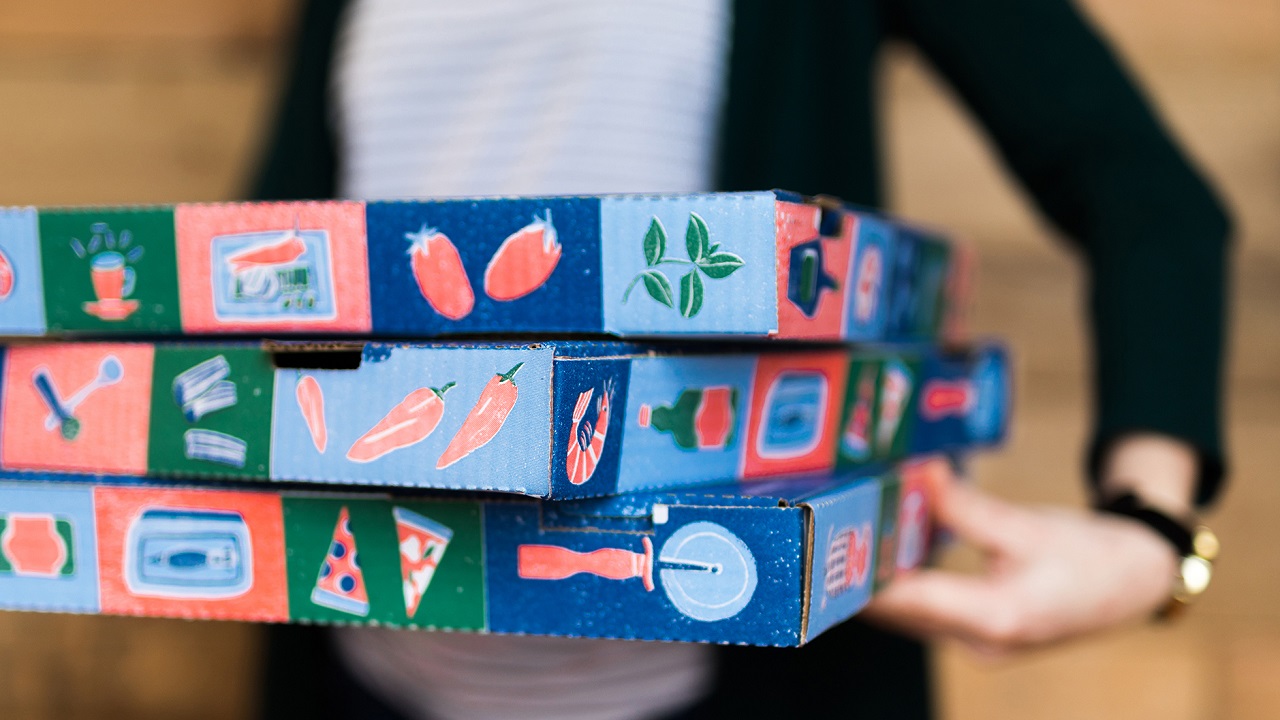
Her work can be admired at the top and bottom of the restaurant’s dinner menu, while the bar menu’s cover was entirely reserved for one of her illustrations. Moving forward, the pizza boxes, which are a part of the pizzeria’s takeout program, are embellished with 20 unique illustrations.
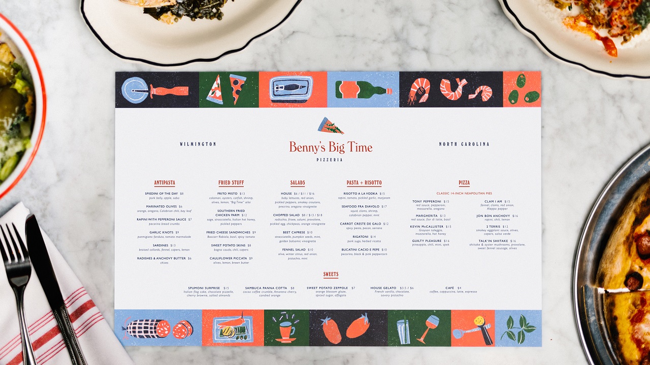
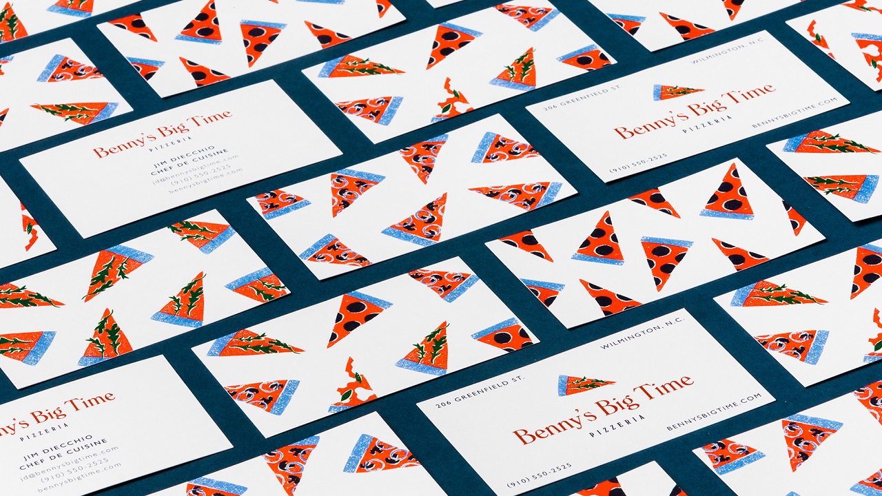
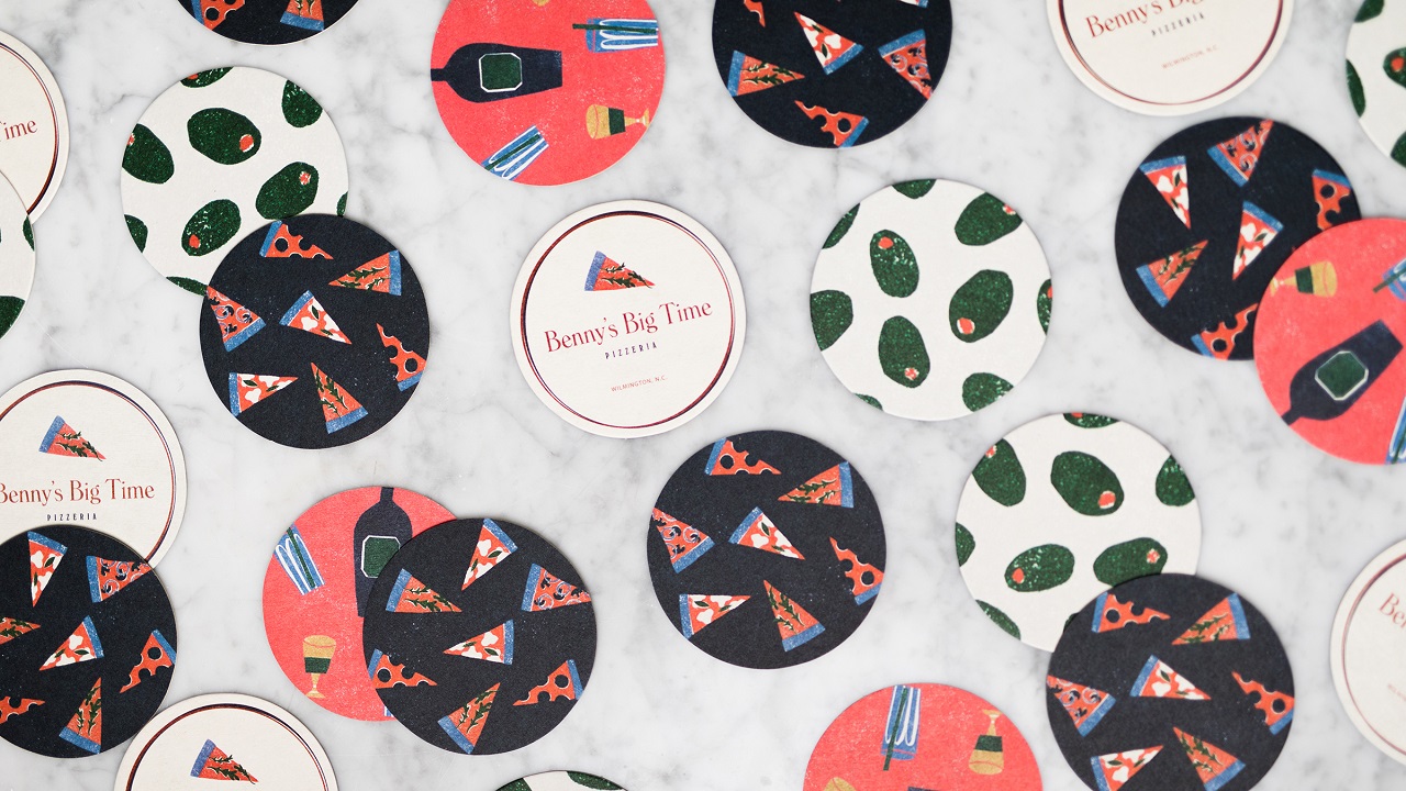
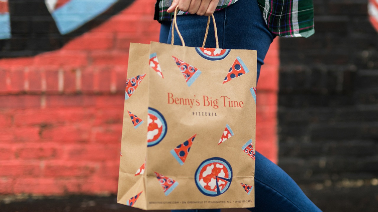
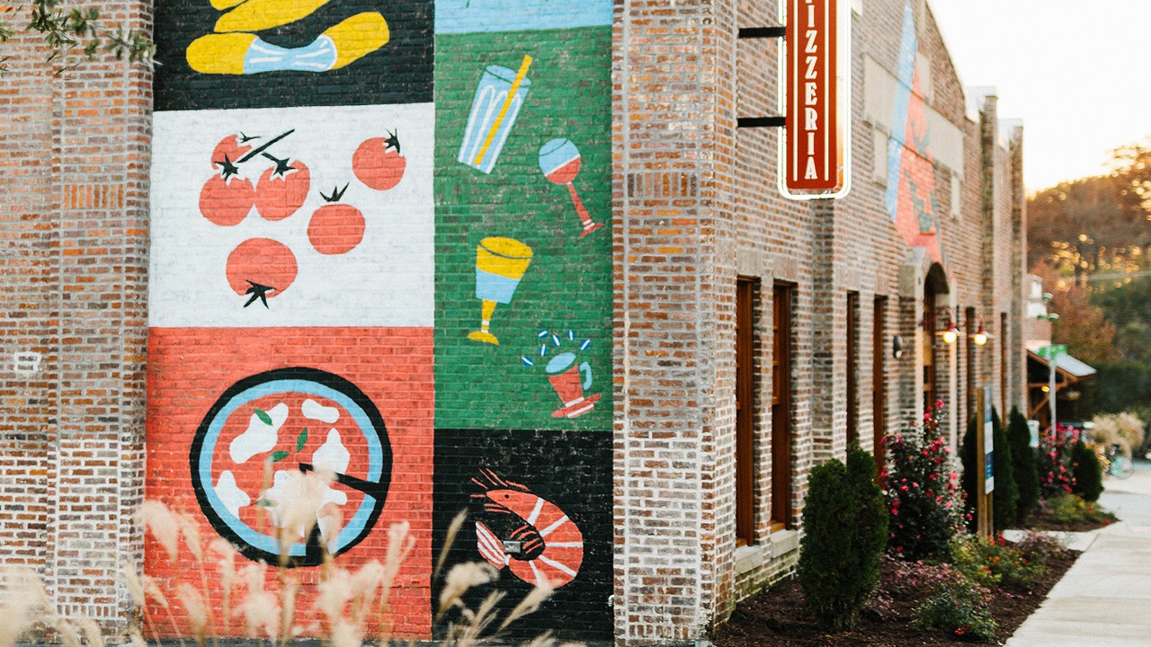
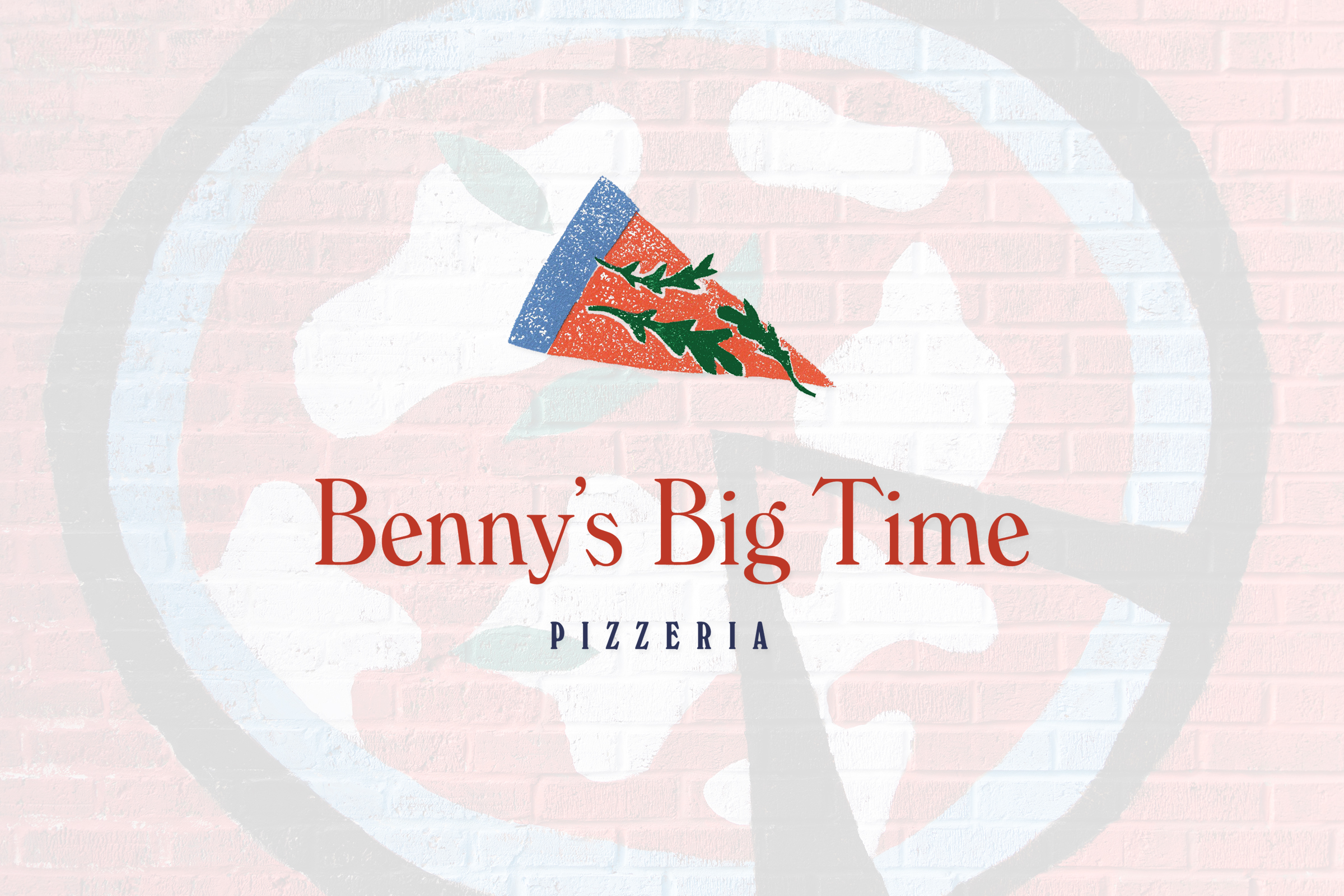
Other merchandise items include business cards, postcards, t-shirts, coasters, paper shopping bags, and murals that adorn one of the facades of the historic building that hosts the pizzeria. As for the logo, the agency chose one of the artist’s pizza slice illustrations and placed it above the restaurant’s name written using the Windsor typeface.
Credits:
Client: Benny’s Big Time Pizzeria
Agency: The Door