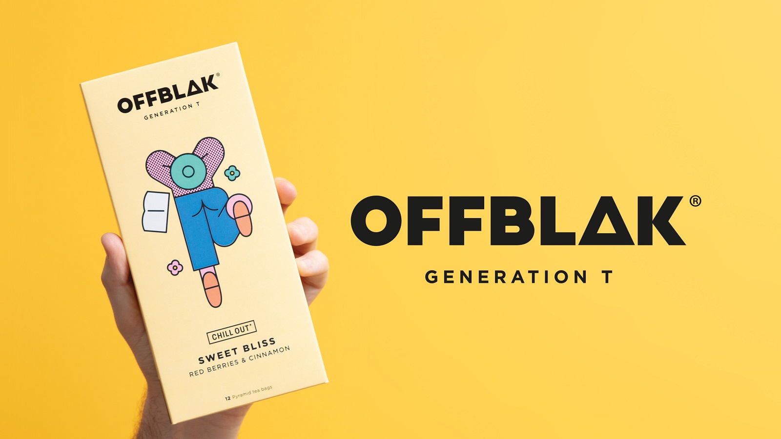
OFFBLAK, a new tea brand that delivers tastes and aromas that make one feel like experiencing nature, has launched in the UK just recently, with branding meticulously contoured by the London-based agency & SMITH. Looking to redesign the tea category, the creative studio crafted a visual identity that appeals both to Gen Z and Millennials, which & SMITH has playfully named ‘Generation T.’ The newly-implemented brand aims to target these generations through its beauty, status, and experience, all wrapped up in a personality that empowers consumers to “Drink tea like everybody’s watching.”
Dmitry Klochkov, OFFBLAK’s founder, believes that the beverage industry should attract consumers using different experiences. He launched the brand aiming to set an exciting aromatic adventure alongside a company that appeals to consumers who are health-conscious and not afraid to try and experiment with new things, spiced up with unique flavors. To fulfill this brief, & SMITH designed an identity that highlights the premium quality of the brand’s soft drinks.
“We want to be more than tea – much more. Today, natural ingredients are a given but often, good-for-you tea miss[es] the mark when it comes to taste. Our identity needed to redefine the category and capture OFFBLAK’s zero-compromise on taste and excitement while being brave and direct. We’re rule-breakers and the identity & SMITH has created really embodies that,” says Dmitry Klochkov in a press release.
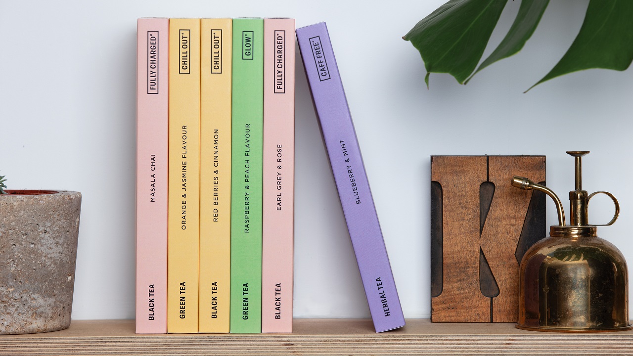
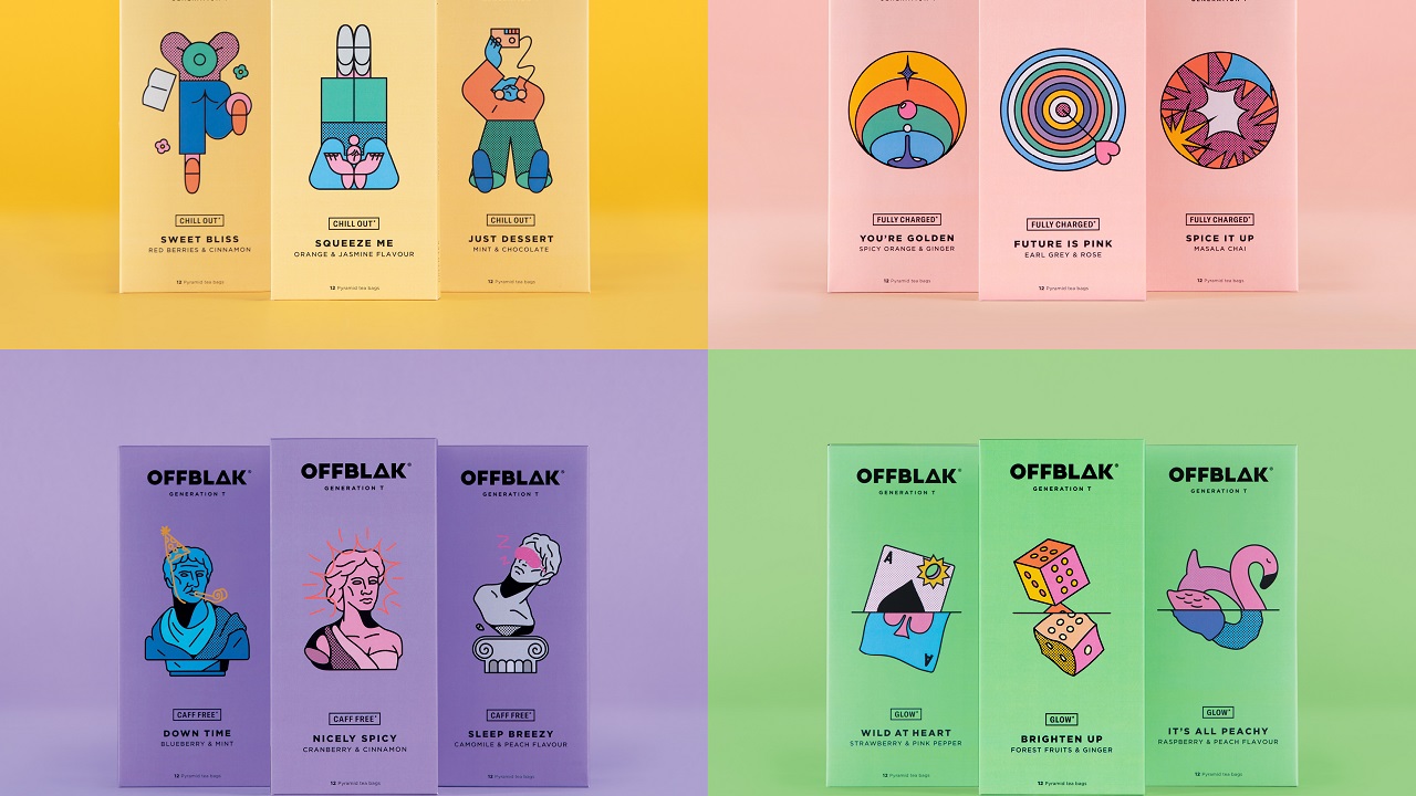
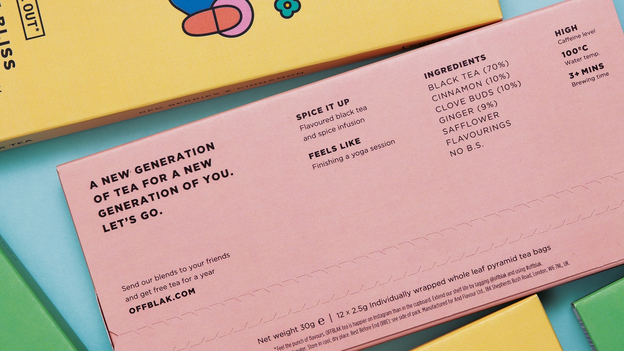
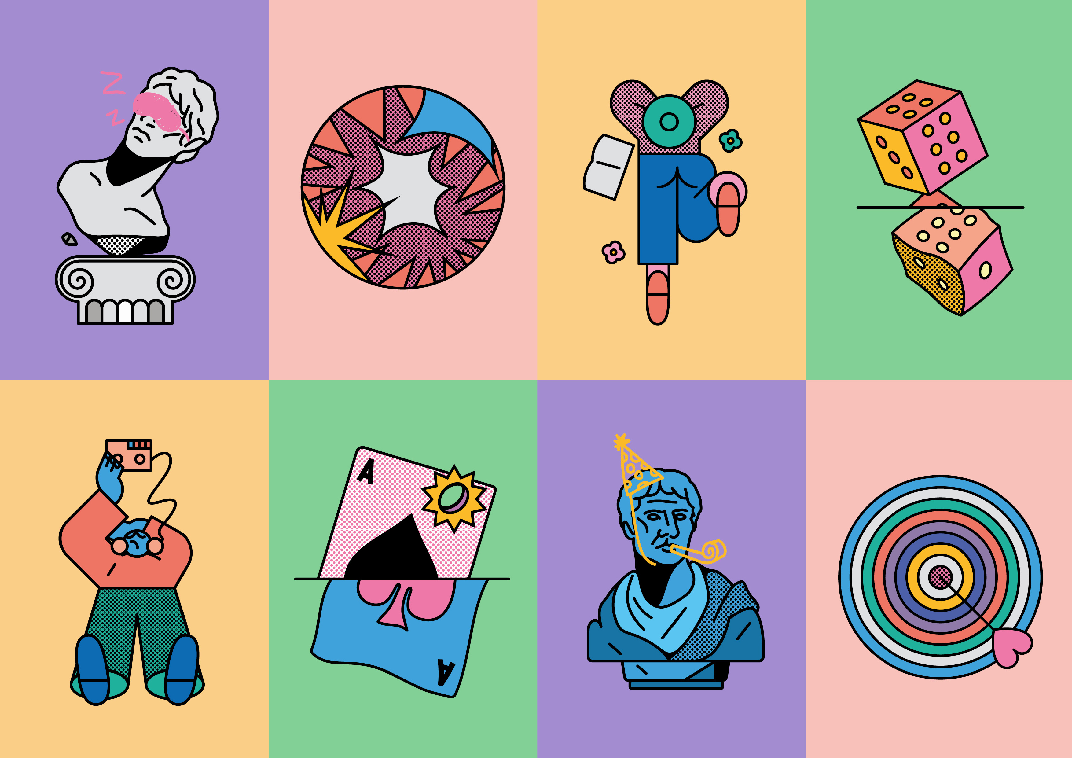
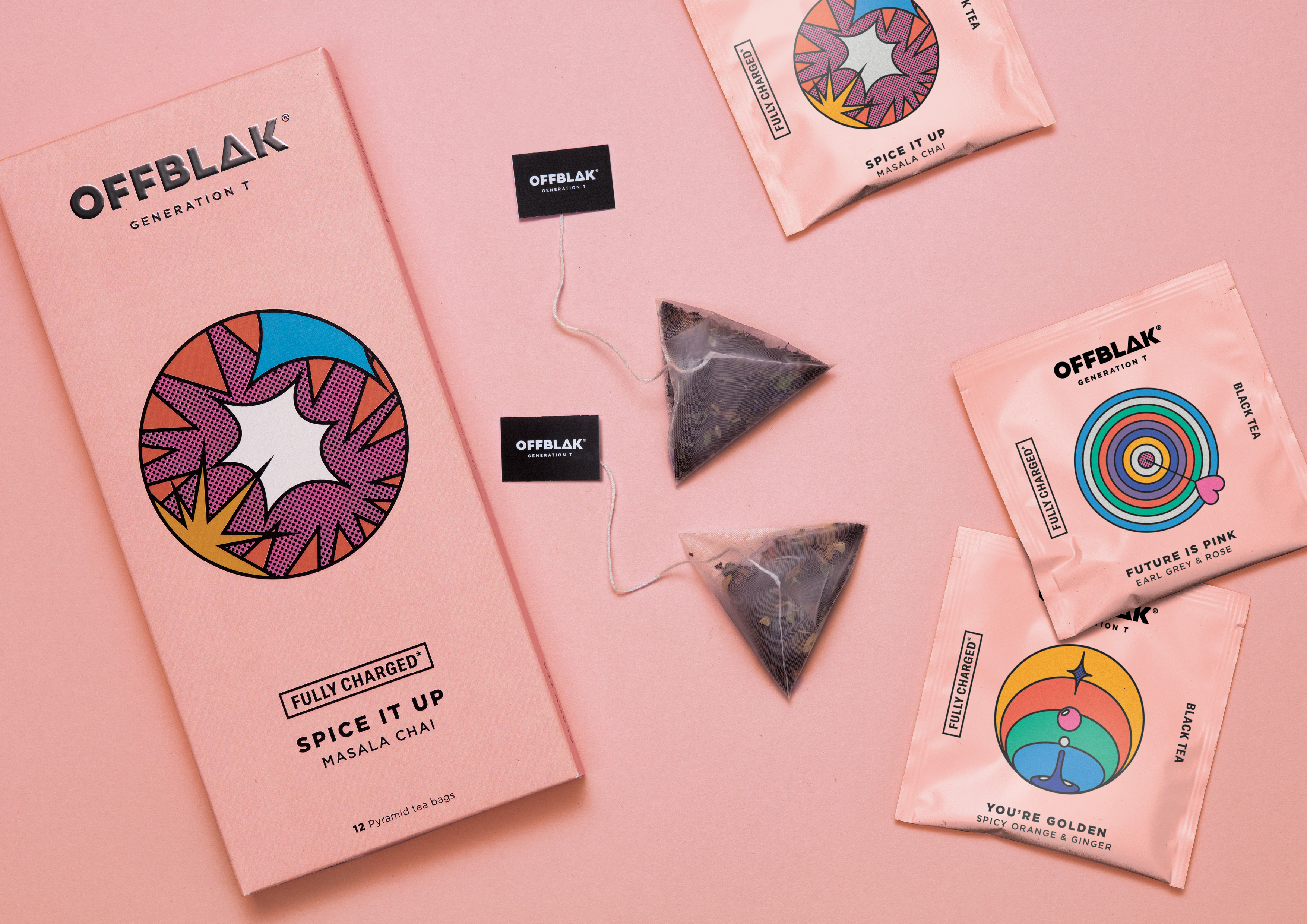
This tea company clearly wants to differ from other tea brands. To make it more appealing to consumers, & SMITH created a fresh identity with a pleasant color palette and diverse architecture that mark clear differences between the four core categories: Fully Charged, Chill Out, Glow, and Caff Free.
Each of these flavors englobes the benefits of tea in their visual identity—whether it is a detoxing tea or one with a refreshing flavor. This is further supported by the name each category carries: from ‘Brighten up’ and ‘Spice it up’ to ‘Squeeze me’ and ‘Down time,’ followed by details of the specific aromatic profile.
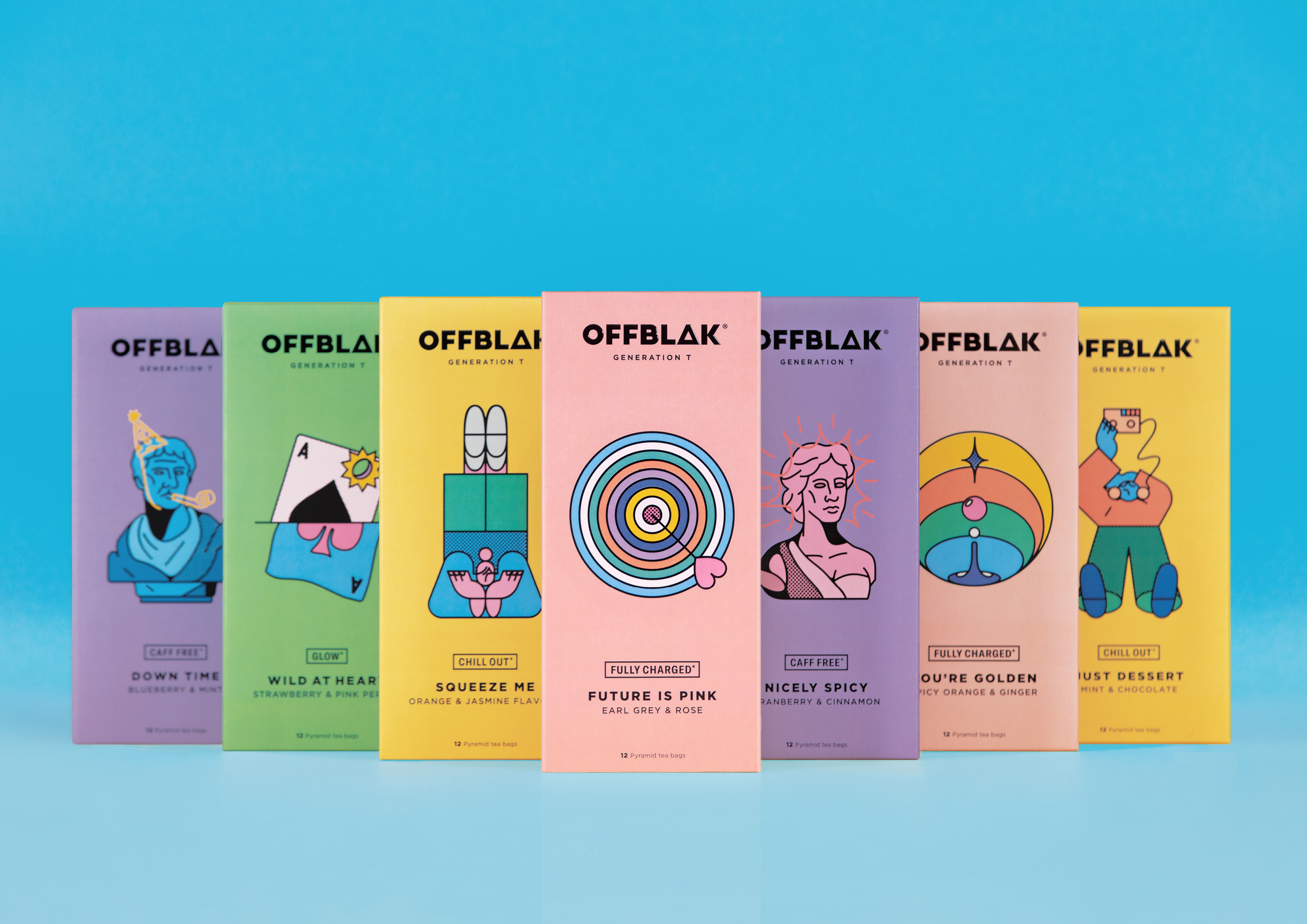
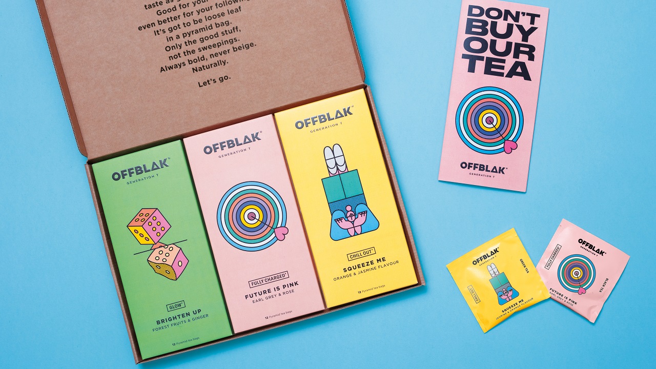
Tea packaging usually looks quite similar; it’s shrouded in a floral identity that speaks about the different tastes nature has to offer. But not OFFBLAK. It uses distinct visual elements to construct its own unique and bold packaging. Thanks to their collaboration with illustrator Thomas Hedger, & SMITH delivers a design that uses bright colors and fun illustrations that play with the consumers’ mind and mood. Each sub-range has its own style elegantly highlighted – such as a circular graphic figure, with each flavor profile depicted by a new illustration.
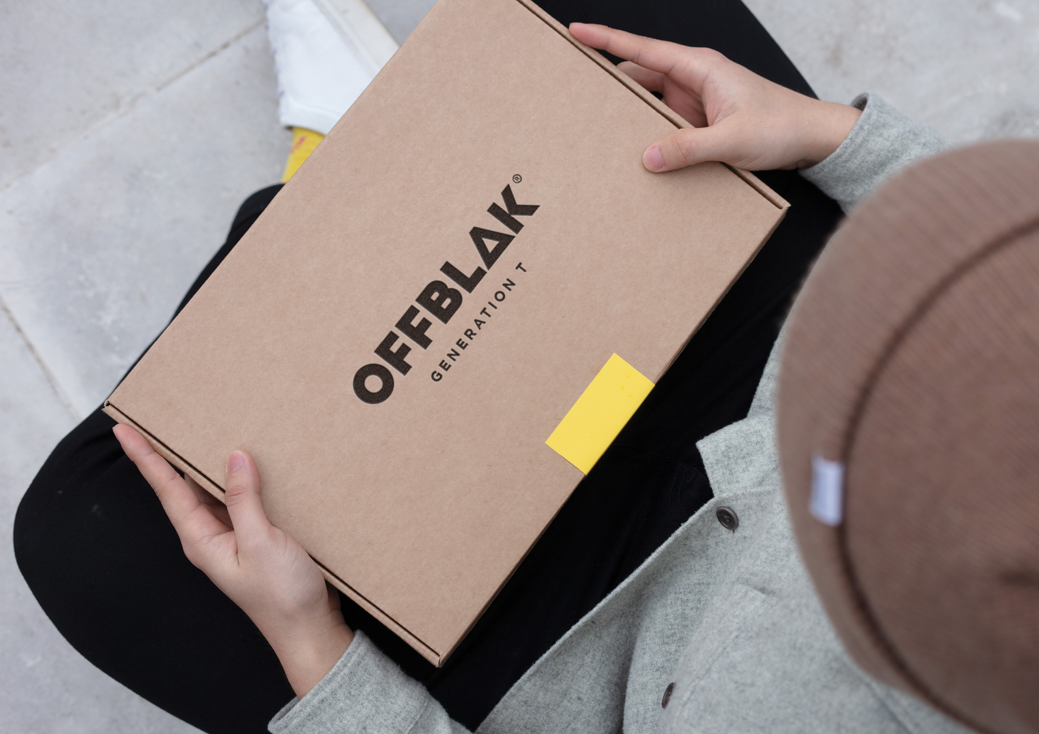
Designed to fit through a letterbox for a smooth delivery, each slimline box features information on its spine. Once several of them are lined up, the collection of tea can be admired as a library of drinks. OFFBLAK delivers its products packed in individual pyramid bags, which help drinkers enjoy the aroma each tea leaf has to offer, thus creating a unique experience with each cup.
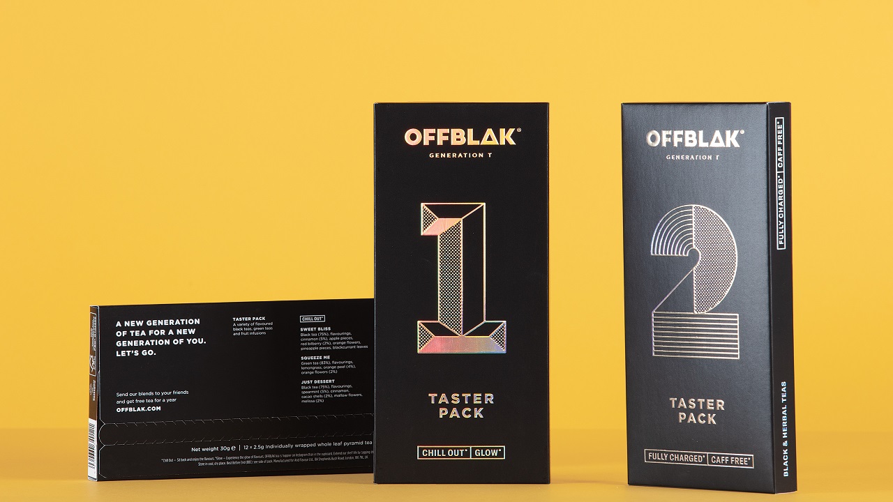
For & SMITH, tea quality and the taste of these drinks were a top priority. This is why they chose to embed this commitment into a brand logo that includes a triangular shape for the letter ‘A,’ elegantly portraying the shape of the tea bag.
Dan Bernstein, Creative Partner at & SMITH explains how they “looked at tea as we know it, how it is delivered – both visually and physically. We’ve given OFFBLAK the illustrative freedom that craft beer and coffee sectors have owned until now, with the flexibility to grow and develop the range with a truly ownable identity. OFFBLAK has an exciting attitude towards tea with an eye fixed on changing perceptions and standing out from the crowd. That’s right where we like to be.”
The eye-catching design is complemented by a ‘Don’t buy our tea. Try it.’ campaign, which has OFFBLAK further pampering its customers. Via its website, tea lovers were invited to send samples to friends and also sign up for a contest that promised them free tea for a year, all delivered as a combination of flavors in a slick black box with iridescent foil branding. Who fancies a cup?