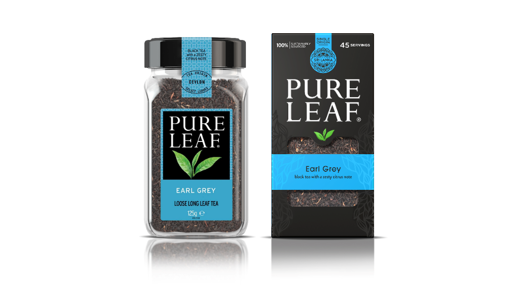
Tea brand Pure Leaf has just relaunched its premium tasty hot drinks in the UK and the Netherlands. But the relaunch doesn’t come alone: It is accompanied by a global brand and packaging redesign, all courtesy of creative agency PB Creative.
The company claims that there are no shortcuts to making exceptional tea, so it’s clear that their teas use high-quality ingredients, all sourced from top producers around the world. Pure Leaf’s tasty drinks are made with the help of the industry’s most reputable tea masters, while the brand prides itself on using traditional manufacturing ways to give birth to the ultimate ‘cuppa’. But somehow, all these features were left out from the visual assembly of the previous packaging. Thus, the brand decided to bring its strong heritage, philosophy, brand ethos, and provenance stories into the forefront. And what better way to do that than with a new packaging and brand refresh?
At this moment Pure Leaf approached PB Creative and asked the creatives to come up with a premium and modern design that reflects the brand’s real core values while also highlighting its eco-friendly products. So, the redesign was implemented to mirror environmentally responsible and first-class natural ingredients of the range and also to help the company achieve prominence in an increasingly busy category.
One of the first changes that took place was the change in packaging. The brand moved from plastic jars to a more sustainable material—in carton form—therefore mirroring the Pure Leaf’s intrinsic sense of environmental responsibility. The designers joined forces with packaging partners to outline a box structure that boosted the brand’s spirit and essence while highlighting the strong taste of the black, green, and herbal blends.
It was imperative to create a packaging design that sets Pure Leaf apart from its kaleidoscopic competitors. The London-based agency got inspiration from the original brand color—black—and used it as a background for the new design. This approach gave the brand the opportunity to express drama amongst the drinkers. Vibrant colors were chosen to emphasize the flavors, as well as create a sense of indulgence and make it easier for the consumers to navigate through the whole line-up. Thanks to the black canvas the colors popped up and provided the package with a luxurious look.
Lloyd Moffat, Creative Director, PB Creative, uncovered the strong background of the rebrand: “Building on the story of provenance and everyday premium quality was key to this brand redesign. Pure Leaf wanted to celebrate its story and the amazing quality of its products, which proved fundamental to our new look. We set out to achieve greater brand clarity and stand-out, and the results have an elegant, high-end look and feel.”
Javier Martin, Senior Global Marketing Director, Premium Tea Beverages, then described the perfect cooperation with the London-based agency: “PB Creative has been a breath of fresh air for the Pure Leaf brand. The agency’s expertise in ‘premium’ is exceptional and the ability to convert the brand’s positioning into the beautiful design is remarkable. PB Creative has great agility strategically and operationally. We are glad to have them as our design agency partner.”
Each tea box features spot-varnish finishes to further speak about the tea types. These neat features also provide a high-quality tactile look and feel of the boxes. To celebrate the essence and origin of each type of tea, the creative team sketched individual box tags, all accompanied by patterns which draw inspiration from each tea’s source, therefore pouring the foundation on the provenance messaging. We fancy a cup already! How about you?