There’s a huge variety of dairy products on the retail shelves nowadays. Picking the right one can become a burden for plenty of us. So, to make things easier, we tend to pick a milk bottle that’s the most good looking and appealing. A marketer’s dream! The Dairy Farmers of America (DFA) took advantage of this, and together with advertising agency Barkley, designed a milk bottle that aims to ‘steal’ consumers’ eyes. Mülü was launched to mark the World Milk Day and thanks to its packaging, it managed to boost the branding and visual identity of the thousand-year-old drink.
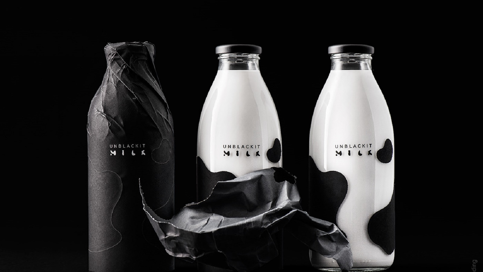
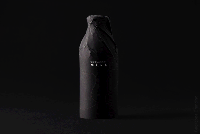
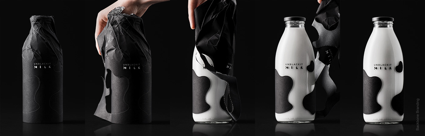
Yet, there’s another kid in town that rises to the occasion and will probably compete with Mülü. Introducing: “Unblackit,” a milk product that’s not like any other milk bottle you see on retail shelves. When you buy milk, you expect a white bottle. But not if you go out for a bottle of Unblackit. This lovely milk container comes in transparent glass and is all wrapped up in a black paper.
Such kind of packaging placed next to the commonly-white milk bottles sparks intrigue and makes the consumers want to find out what’s ‘churning’ inside. But Unblackit doesn’t stop there. After buying the product, shoppers will be glad to see the intrigue and mystery continue at their homes too. They just need to start unwrapping the bottle. While consumers are busy with unpacking the bottle, we at branding.news are preoccupied with ‘unblackiting’ Backbone Branding‘s design packaging for the product of the same name, the Unblackit milk. Now, let’s immerse ourselves in a visual ensemble that depicts marks left by nature itself.
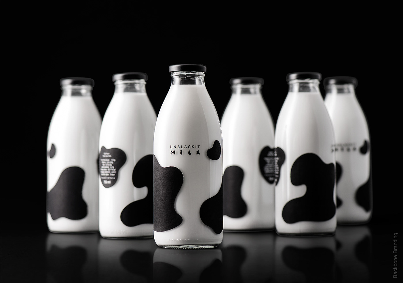
The stylized black spots which are left along the glass are intended to portray the same spots that are present on a milking cow. There’s an entire technology behind this neat feature: perforated paper with sticky spots. The last step of the unpackaging—which also gives the name of the product—is the process of unwrapping or “unblackiting.”
Besides the spots that visually remind everyone of a real-life cow, there’s also unique typography and a logo, which were developed in such manner as to fit the same spot-like pattern style. The team chose a classic glass bottle as the best suitable option for containing milk, mostly because of the fact that glass has a superior ability to keep the milk fresh, besides having an aesthetic appeal.
“As a result, we have created an interactive product with unique customer experience. A design solution with a strong merchandising feature and game factor, as well as its unique form of presentation, gives the product the competitive advantage, used for a successful introduction to the market,” explained Backbone Branding neatly on their Behance page.
Now, tell us, are you ready to unpack your black milk? Cos’ we certainly are! So, what are you waiting for? On your marks, get set, unblackit!
Credits:
Client: Unblackit
Agency: Backbone Branding