Dance is one of the oldest expressions of one’s feelings. It is what humans do to elegantly communicate, besides art, music and many others. Dancing also serves as an act of socialization across many cultures. Every decade, nation, or music style has its own kind of dance. However, today, we’re going to focus on just one: ballet! Yes, ballet – the art of dancing with passion. Its beauty and elegance are what makes the audience experience a deep connection between an orchestra and a dancer’s body. When compared to other kinds of dance, most of which you can perform on your own without extensive knowledge and experience, there’s one thing that’s essential for ballet: choreography! And a good choreography, above all, can brilliantly convey a story that moves the feelings of an entire audience.
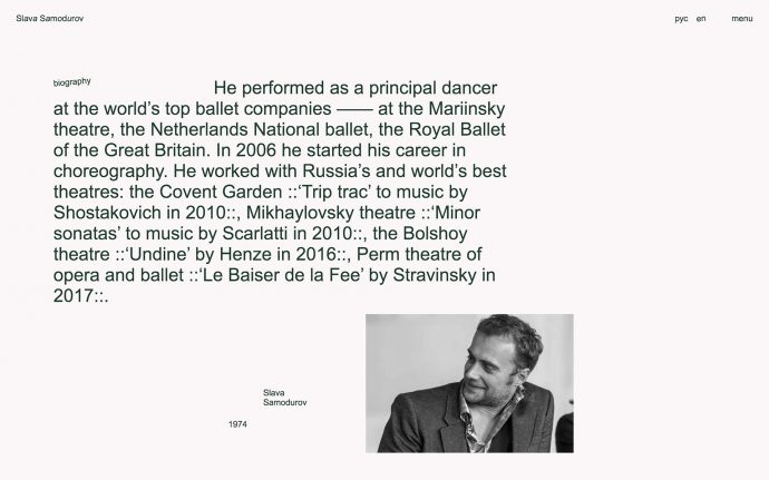
Slava Samodurov is an innovative choreographer who performed as a principal dancer at the world’s top ballet companies. Samodurov decided that it was time to visually express feelings he experiences while choreographing a group of dancers on the Internet. So, the dancer happily commissioned the artists at the Voskhod Agency to meticulously shape his online identity.
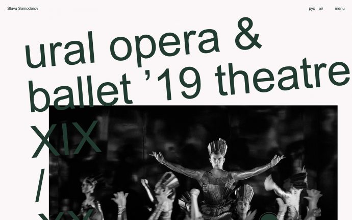
Inspired by the fact that Samodurov views the imperial art from the perspective of the 21st century and the fact that the ballet director uses tradition to experiment with the dance routine, the agency created an unusual website interface, which reshapes traditional ‘dancer’s book’ in such manner so that it fits into a modern and digital environment. This allowed the team to introduce a completely unique browsing experience.
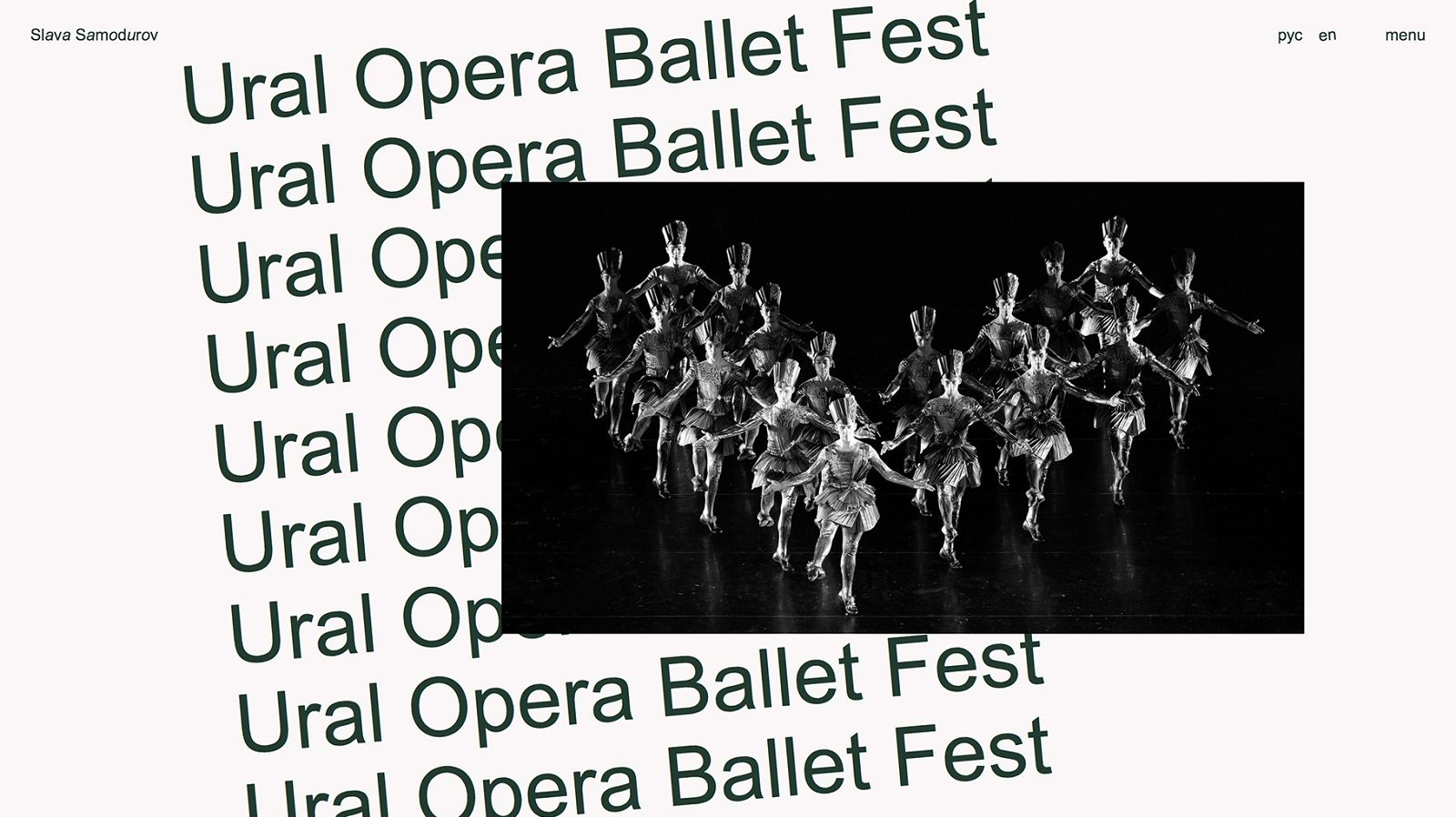
“Deep green color as the symbol of high art, a unique identity of punctuation acting as a metaphor of music notation, brutal poster make-up as the reflection of the choreographer’s character,” the team behind the creation of the website lists unique features. Besides these, visitors can admire beautiful typography—contoured to remind ballet moves—that was strategically placed around the site, waiting for the viewers to read them letter by letter.
The tasteful website design actually reminds us of another amazing work made by Voskod. Similar to the current work on Samodurov’s new identity, stands a design project made for Corpus IT school, where the agency used catchy visual elements—illustrations, iconography, typography, or animation—to outline the engineering spirit of the school. Only this time, the the star of the show was the cellular automaton, a language known by every programmer. The same minimalist design mingles through both campaigns, while the newest one lets the viewers discover the secrets that lie behind the logo and typography of the website by themselves.
You will do no wrong if check out both projects. When you’re done let us know which one you liked the most! We have our favorite, but we’ll keep it to ourselves…