After World War II — during an economic depression in war-ravaged England — brutalism became increasingly popular in the UK. The country was desperately seeking solutions involving cheap design and construction methods, government housing, shops, and buildings. Now, despite economic growth, designers use brutalist features to find a cheaper solution to express brands across the world. While some might still prove pretty expensive for many people, having such a brutalist version may end up being a cheaper solution and allow consumers to actually buy these products.
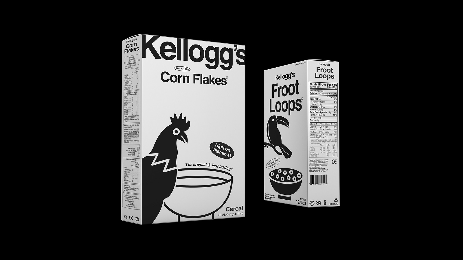
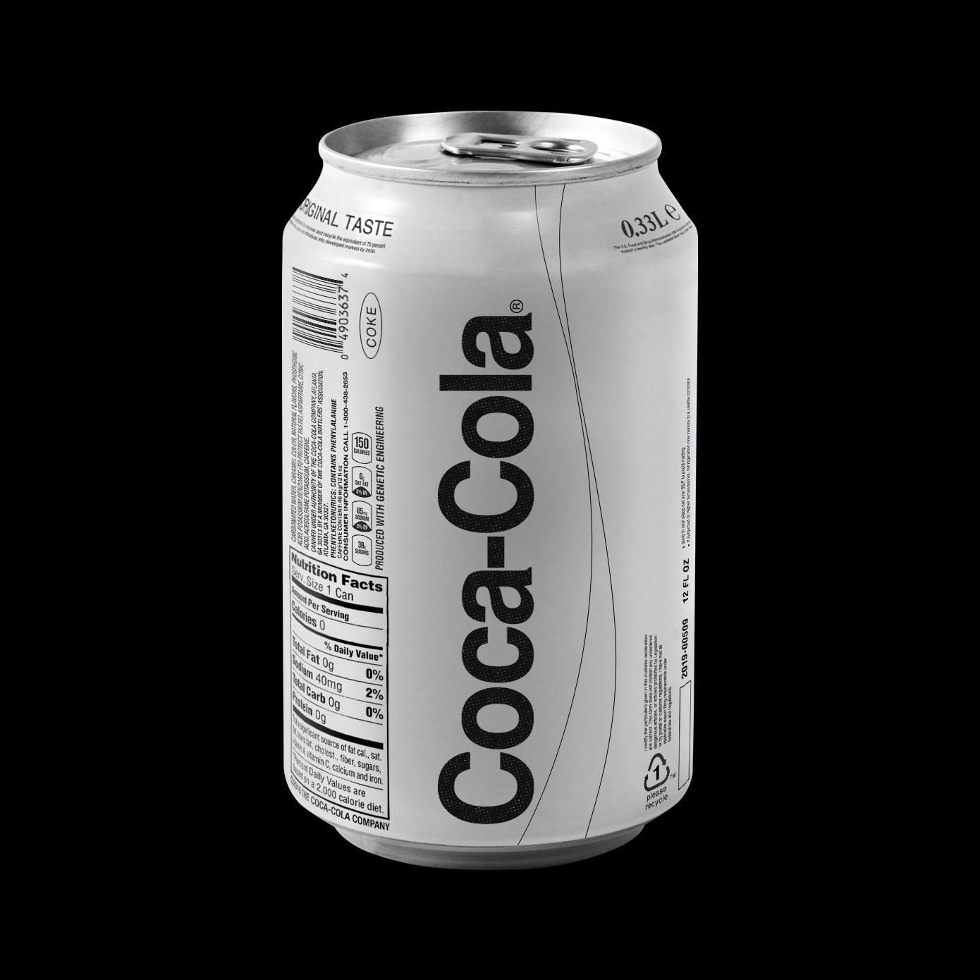
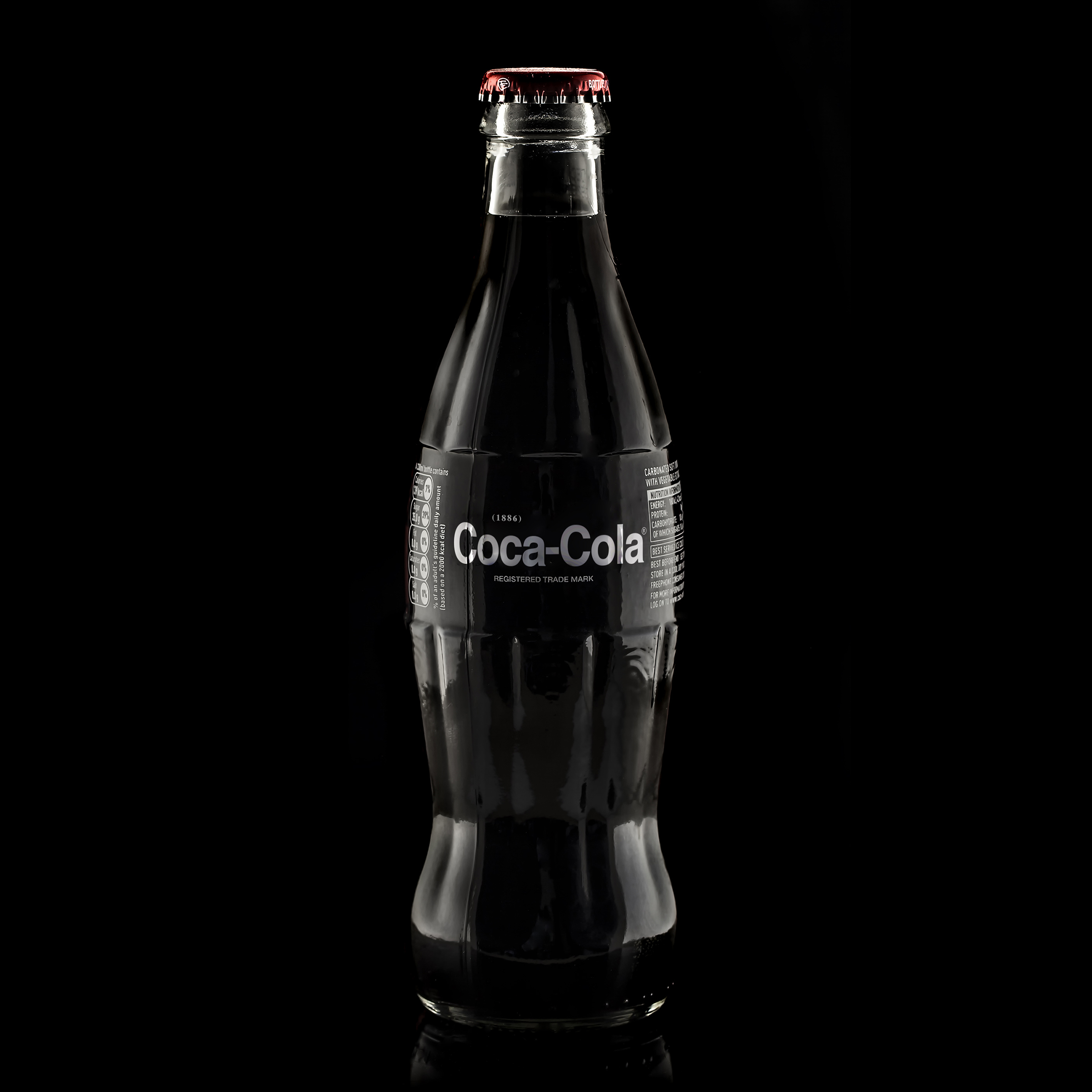
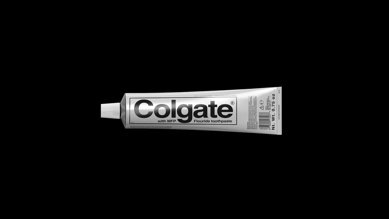
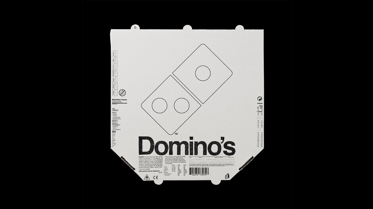
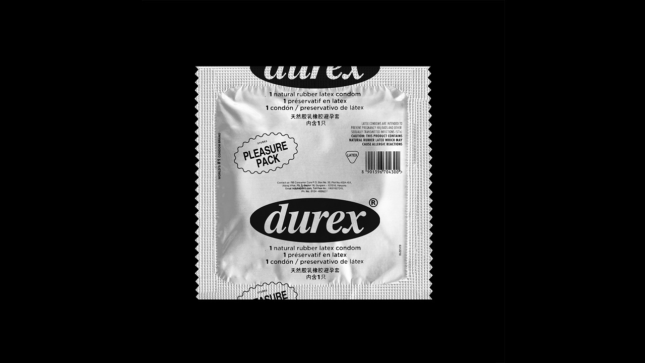
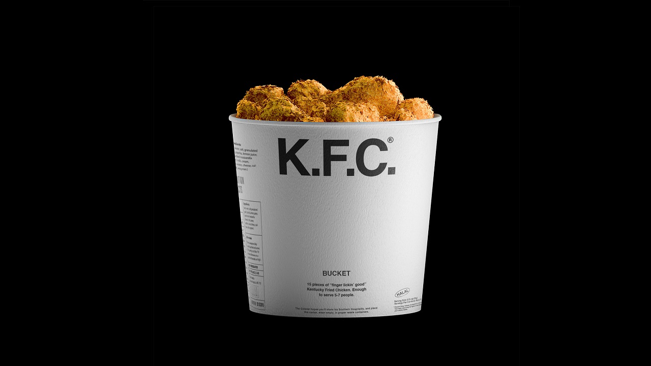
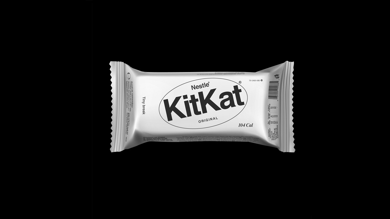
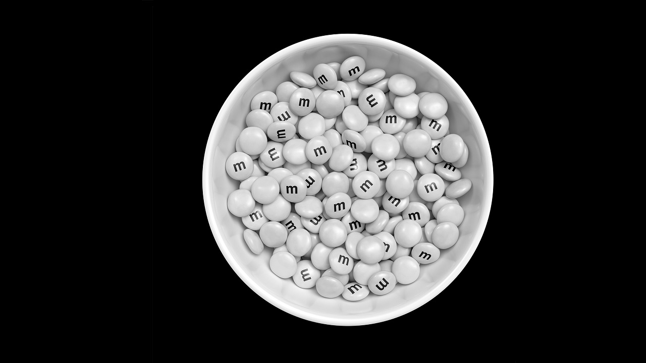
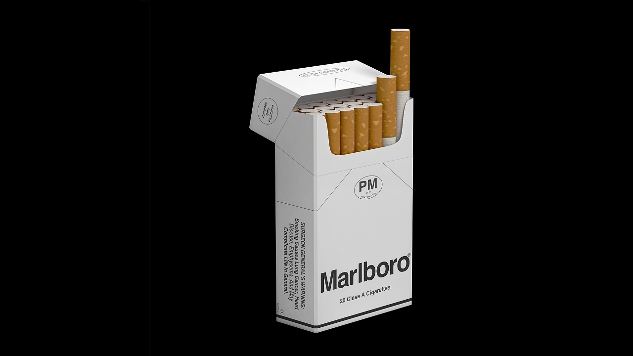
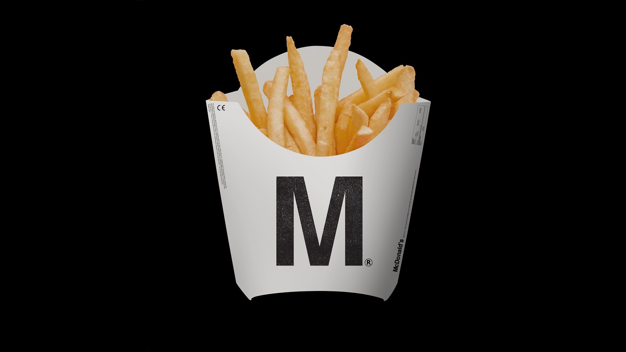
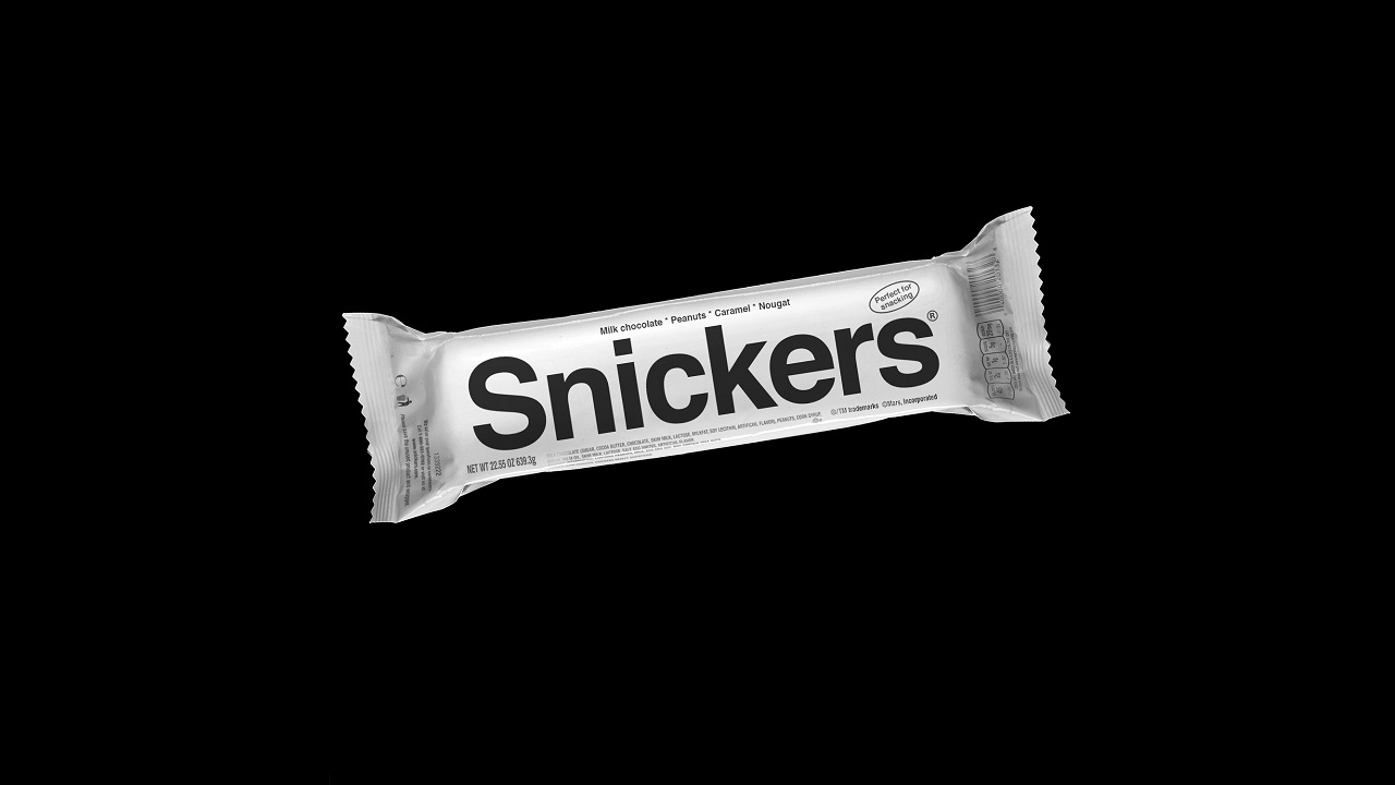
Take “Generic Brands” for example, a project that nicely combines brutalism and creativity from the skillful hands of Kunel Gaur of Animal agency. According to the artist — in a place where all brands are trying to get consumers’ attention — having a brand that’s totally blank might actually establish a stronger connection with them. “I wanted to experiment with stripped-down, product level communication behavior of known brands, sans the embellishments they’re typically identified with,” says Gaur.
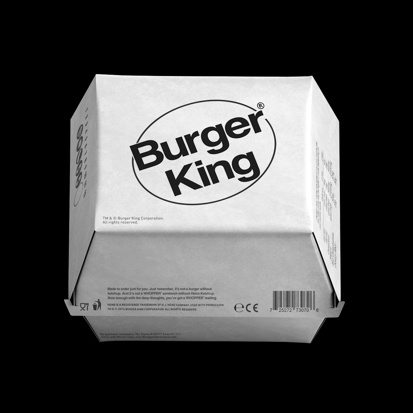
Thus, while Brutalism is making a come-back, the designer thought that this was the best time to express brand identity in a black-and-white version. Basically, stripping them down of their ‘colorful’ personality. Kunel thinks that, as a designer, “you’re constantly trying to minimize the ‘contemporary’ aspect of the design to come through in an otherwise functional approach you’re trying to achieve.”
He also adds that the project came with a lot of challenges: There are brands that are represented by mascots, whilst other use monograms or abbreviations to express their name. To simplify things, the artist decided to use pictograms, therefore keeping the brands closer to their original identity.
We at branding.news had a short chat with Kunel. When asked what he had in mind regarding the choice of the brands, he said that he picked the most recognizable ones, those which already have an identity and a packaging system. Also, the artist pointed out that these ‘guinea pigs’ had to be global so that people could associate them in some way. Oh, and by the way, some of the featured brands are also his favorites.
When considering brand identity, one would think that, without colors, the brand would end up with no recognizable spirit. But that’s not something that Kunel thinks: “An identity is more than the colors and type. Its name and the overall image of the brand/product that is embedded in our mind thanks to years of exposure to marketing and promotion by these brands. So even after subtracting the color and other graphic elements from the packaging, that name itself is enough for your mind to decipher and connect it to years and years of stored imagery affiliated to that brand.”
While the results are really promising already, Kunel doesn’t plan to stop there. Asked if he is going to continue contributing to the campaign, the designer said that he intends to explore it a little bit more. Plus, he is working on another project, titled “Market,” which will include artifacts along the same lines.
Curious what these brands think about their new looks? Well, you have to wait to get their answer, because Kunel didn’t get in touch with them. However, maybe with this article, the companies will notice their new look with no colors.
Help us spread the word, because: “In the future, everyone will be famous for 15 seconds,” Kunel concludes. Oh, and how right he is…
Credits: