Fonjōin brand identity brings together four elements of the Japanese tea ceremony. This concept of a Japanese specialist tea room created for an Instabul-based agency Branding to Be aims to convey the authentic tea experience with its philosophy, rituals, and atmosphere to the urban cultural scene in Western Europe.
The name Fonjōin combines two vital parts of Japanese tea ceremony whilst using well-known English phonetics. The first word, ‘Fon’ points to the Japanese tea masters titled as Raku, such as Sen Rikyu, which means “enjoyment of the ease of having fun”. The second word ‘jōin’ refers to the goal of the ceremony which is to “enter in a communion and the consideration of guests”.
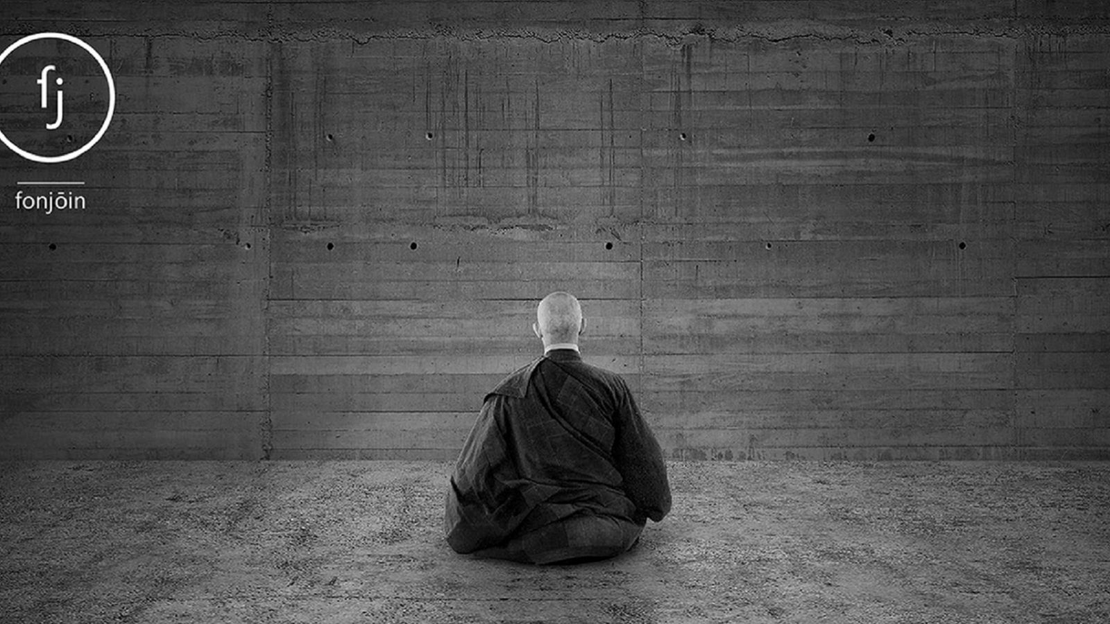
The Zen aesthetics are reflected within this highly visual branding strategy and highlight four key principles of a ceremony named ‘Cha Do’. These four principles are harmony (wa), respect (kei), purity (sei), and lastly serenity (jaku). Fonjōin logo combines harmony of the two corresponding forms within a uniting spherical form representing the calligraphic sign of Zen.”

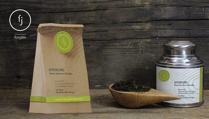
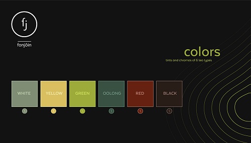
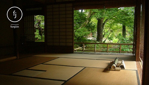
These patterns reflect both unique tea terroir landscape and walks in the Zen gardens which happen during these day-long tea ceremonies. The primary colour palette identifies the six colours of tea types along with their tints, complementing as secondary colours. Following tradition, rustic materials are used for packaging and utensils.

Credits:
Branding to Be