Since 1991, the public Franco-German TV network, ARTE, stands as Europe’s cultural pylon, broadcasting living arts and intellectual content to its broad audience. With high-quality TV programs that reach 60% of Europeans, the Culture Channel brings together millions of people, and stands for cultural diversity and multilingualism.
Because the channel’s identity couldn’t keep up with its dynamic broadcasting rhythm, a rebranding process was much needed. So, the TV network’s artistic director, Cécile Chavepayre, turned to Lambie-Nairn and British agency The Partners to develop the company’s fresh identity through a more modern, yet poetic approach.
Their brainchild, “ARTE — Europe’s cultural magnet,” represents the new brand idea that supports not only the company’s cultural diversity, but also their engagement to reach an even wider audience.
The name not only bears a metaphorical meaning, but also a literal one. The creatives imagined the ARTE logo as a magnet that magically collects and attracts all of Europe’s cultural information, assembling it together within itself.
To convey the physical attraction technique, the team created a series of animations for ARTE’s brand idents, stings, and promos, with individual stories and themes for each of them, highlighting all topics approached by the TV network.
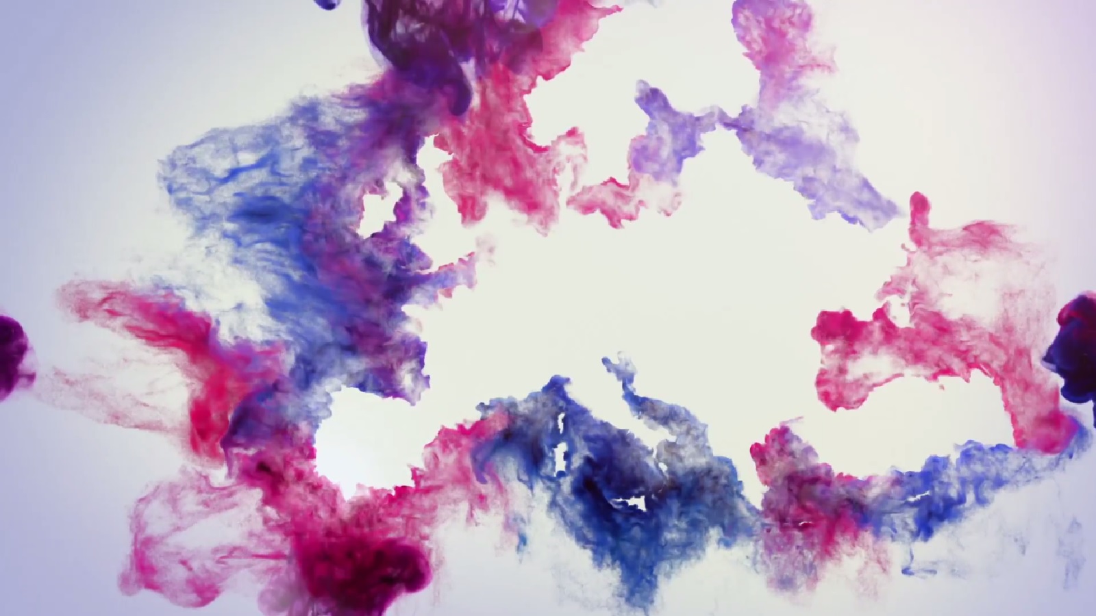
The visuals reflect the idea that all of Europe’s culture is absorbed into one specific place, ARTE. The animations for the brand idents open with the old continent’s borders contoured either by stars, water drops, or colored dust clouds that magnetically attract each other to form the company’s logo.
Based on the idea that attraction is the main message of the brand, the idents of program category express a more literal approach. Here, the company’s logo is depicted as the main character which plays the role of a magnet, around which different objects belonging to specific topics allure and stick to the brand’s symbol by the end.
Along with these vivid concepts, which can be interpreted in many different ways, the TV network redesigned its Promos and OPS. These feature the Barna Stencil font, specially chosen by The Partners to emphasize the magnetic effect of the logo. Random pieces of unrecognizable components flow on the screen and are eventually drawn together, forming words that are simply dragged by the ARTE emblem.
The animation’s diverse content of culture is seen by Cécile as “a breath of air that lets us take our time, take the time to dream, understand or forget, radically resisting the frenzied tide around us.” Created by sound design agency Echoic, all scenes are supported with relaxing background music, which imitates the sound of the magnetic tensions and perfectly harmonizes with the moving images.
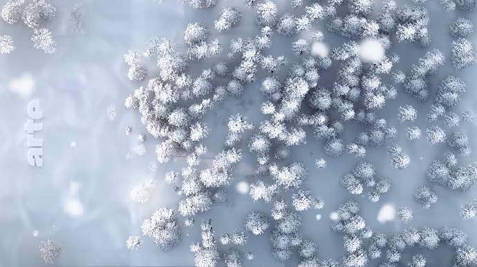
Developing a new approach for the broadcaster proved to be a difficult mission for the artists. To draw in all of the viewer’s eyes, the team needed a lot of space to capture every detail of the logo’s attractive magnetic feature. To expand the space offered by a 16:9 screen, they turned the ARTE logo 90 degrees and placed it either far or center left on a vertical axis, giving the creatives plenty of room to put their innovative ideas to work.
As a promoter of diversity, ARTE’s multilingualism aims to bring people together not only from the old continent, but also beyond it. The new personality of Europe’s cultural epicenter brought a D&AD award to The Partners and Lambie-Nairn. Their new identity is also reflected across digital and print, sharing a message that resonates with the viewer’s interests in a warmer and friendly way.
Credits:
Client: ARTE
Agencies: The Partners, Lambie-Nairn
Stuart Radford, UK Creative Director, The Partners
Graeme Haig, Design Director, Lambie-Nairn
Producer Jo Brock, Lambie Nairn
Senior Designer, Jonathan Brodie, The Partners
Sam Evans, Strategist, The Partners
Suzanne Neal, Account Director, The Partners
Animation and motion design:
Brand Idents: Found Studio
Programme category idents, stings, promos and OSP: Nathan Bayliss, Joe Maker, Julien Pietri, James Pykett
Sound design: Echoic