From Europe to Far-East Asia and from the subtropics to the arctic regions, Russia impresses through its immense territorial stretch. Besides its amazing world-record size, Russia is also known for its impressive cultural heritage. There are so many things to say about the largest country in the world that we could fill the whole site with them.
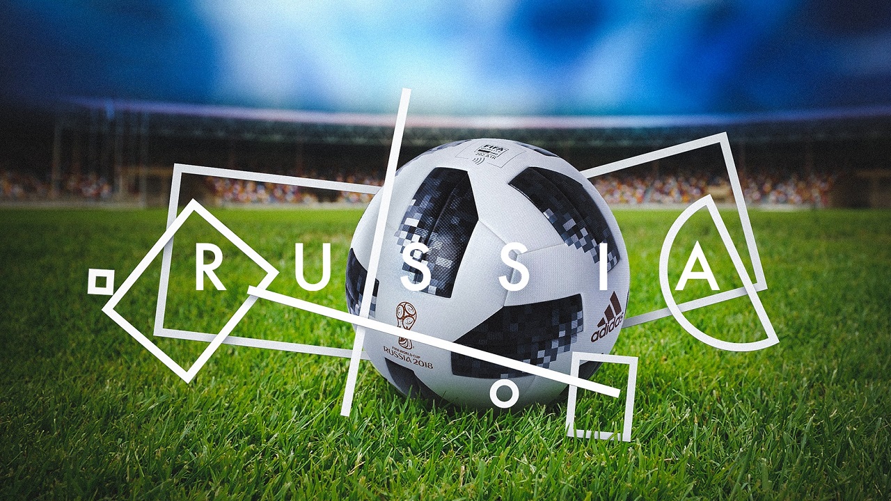
Included by the World Tourism Organization in the top of 10 most-visited countries in the world, the chances of you visiting the former communist country are pretty high too. So, as a tourist in Russia, you will get the opportunity to explore some of the country’s greatest treasures. To attract even more tourists and also to honor this year’s major football event—the FIFA World Cup—being hosted there, the Federal Agency for Tourism of the Russian Federation launched a design contest called “Tourist brand of Russia” in 2015, in which it asked the participants to craft the country’s new tourism brand.
Over 480 logos and 600 slogans were submitted. A year later, thanks to the support of the Ministry of Culture of Russian Federation and the Association of Branding Companies of Russia, Rosturism unlocked the second round of the competition.
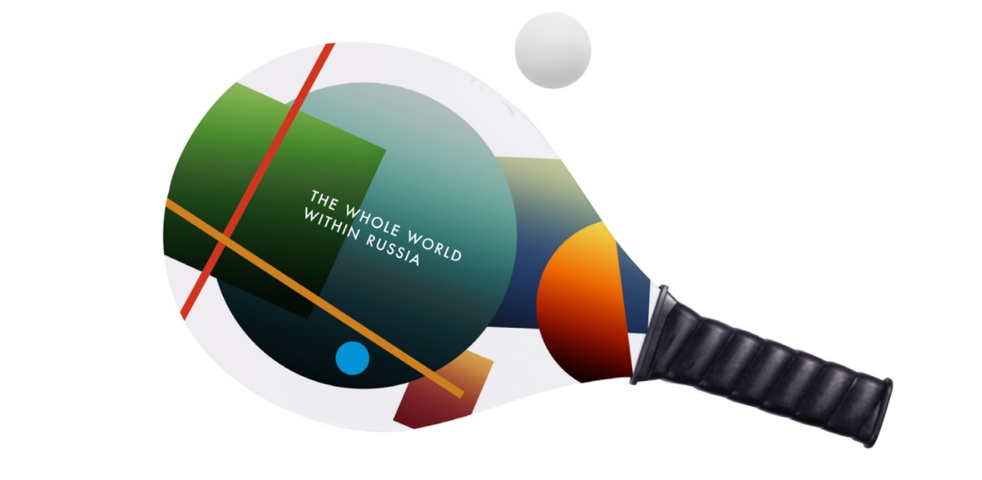
Only 10 projects were selected, which were subjected to the public vote. The three projects that gathered the largest number of votes then entered the contest’s third round. After a deep analysis, the jury chose the best idea and, at the end of 2017, announced the winning concept: “The Whole World within Russia,” as seen by Vladimir Lifanov, Ilya Lazuchenkov, Egor Mysnik, Denis Schlesberg, and Erken Kagarov.
Contrary to the expected, the artists who developed the concept of the new tourism brand did not exploit Russia’s traditional symbols to communicate the true values of the country. And let’s face it: using the image of St. Basil’s Cathedral in Red Square would have been too cliché, and not a winning one. Rather, the designers observed the nation’s cultural heritage, analyzed it, and carefully embedded its greatest features within the visual identity.
Aside from being the motherland of more than 144 million residents, the country gave birth to plenty brilliant minds who donated their talent to enrich the nation’s cultural legacy. This is the place in which art, music, and architecture harmoniously blend with folk, legends, and traditions to tell a timeless story. So, how can one englobe all these features into a teeny-tiny new logo? Well, the artists’ answer is definitely Suprematism!
Founded by Kazimir Malevich in the early 20th-century, Suprematism is an art movement in which a series of geometric forms take the main stage to form an abstract complex. Alongside Constructivism, Suprematism is a part of Russia’s avant-garde spirit, having an honorable place in the country’s visual sphere.
Inspired by the aesthetics of this trend, the creatives used its graphic elements to create the brand logo’s foundation onto which Russia’s national identity will proudly sit on.
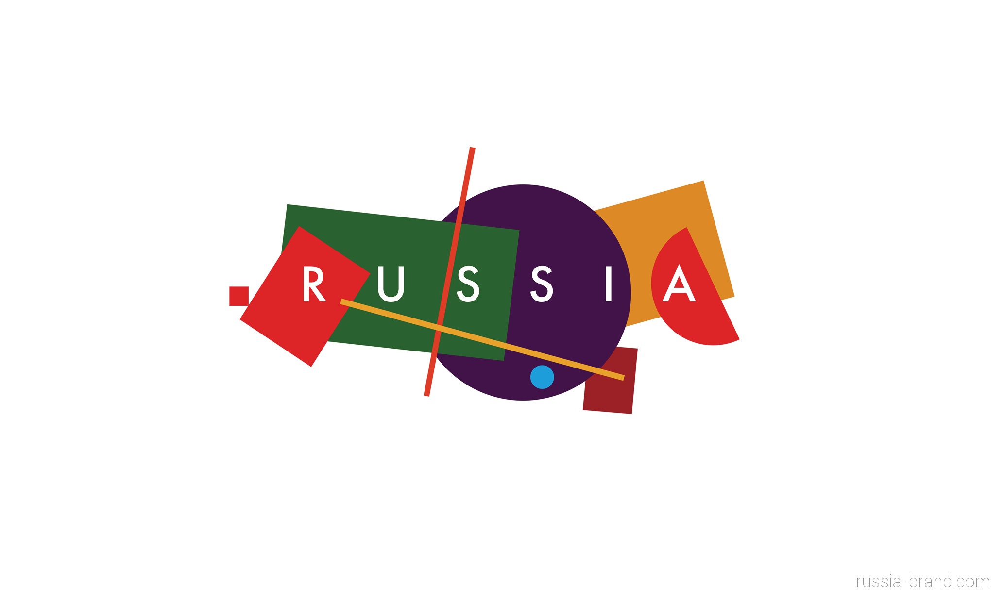
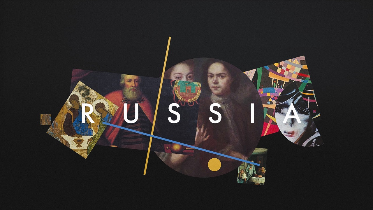
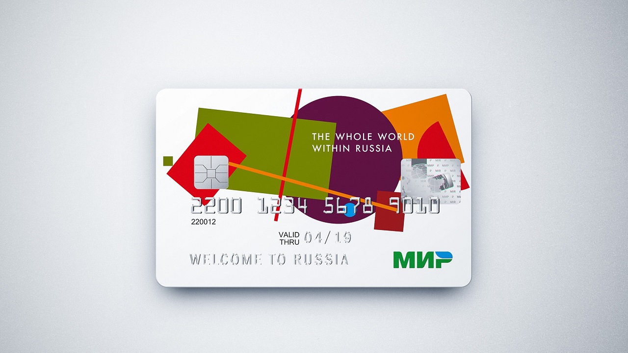
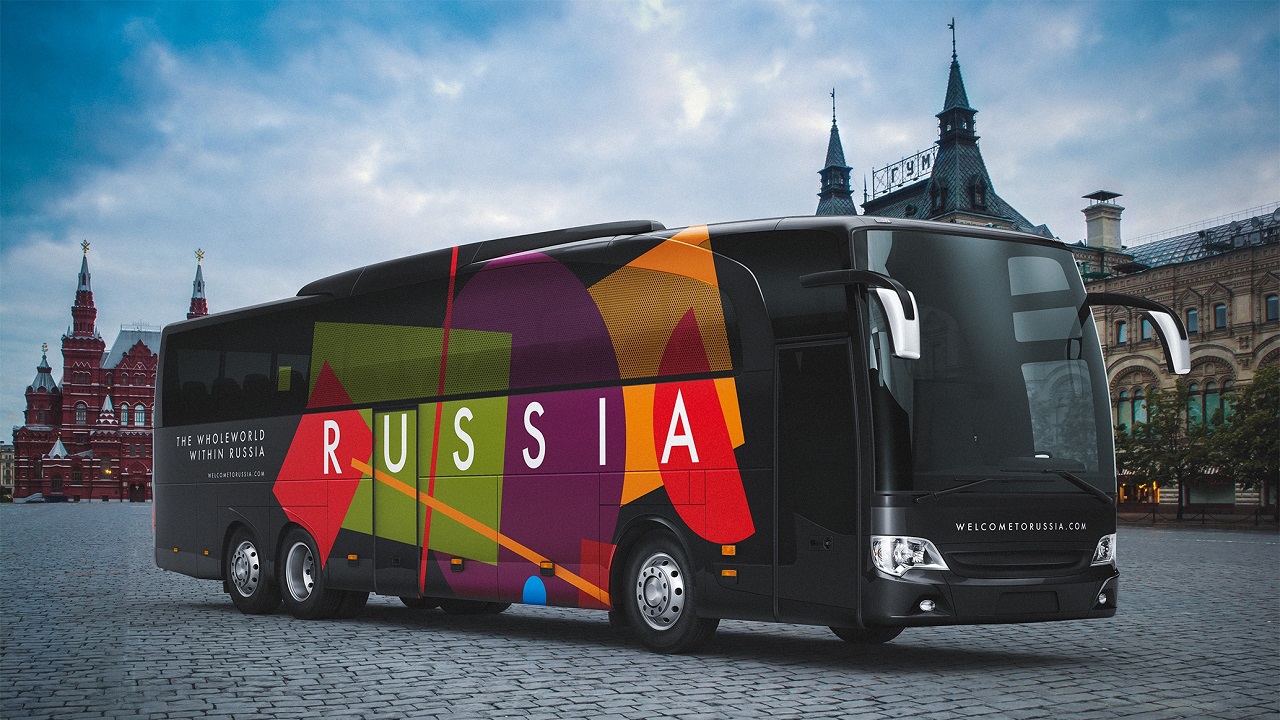
The artists’ interpretation is at least brilliant: they use different geometrical shapes and place them in such manner that, when viewed as a whole, they reveal a map of Russia. When analyzed piece by piece, one can see that each form represents, in fact, a major region of the country.
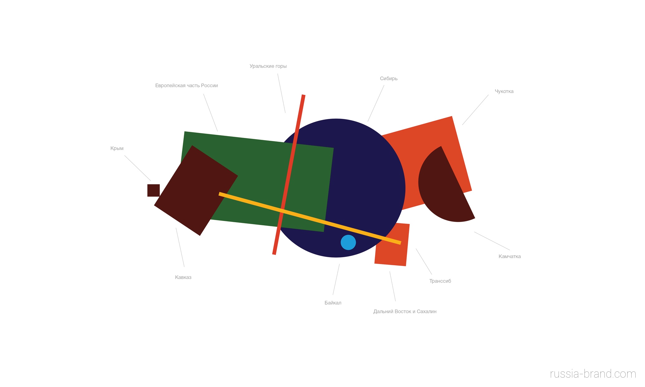
Starting in the northwest and stretching out to the northeast, they represent Crimea, European Russia, Siberia, Chukotka, Kamchatka, Far East and the Sakhalin Island, Baikal Lake, and the Caucasus. The red line, which stands for the Ural Mountains, elegantly shows the natural border between the European part of Russia from the Asian one. The yellow line hides yet another clever symbol that stands for the Trans-Siberian Railway.
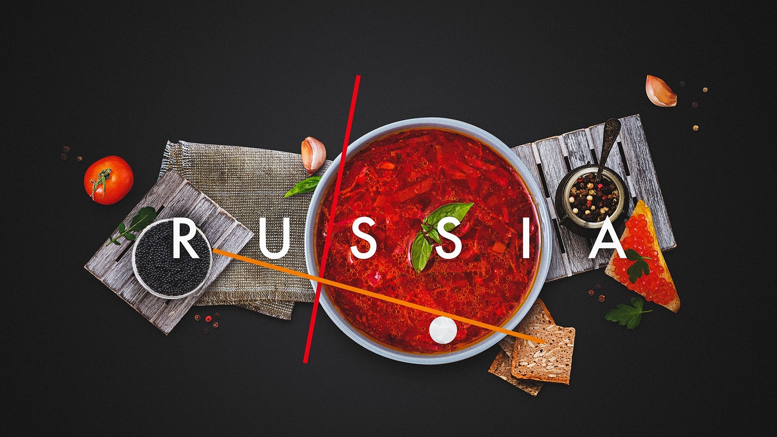
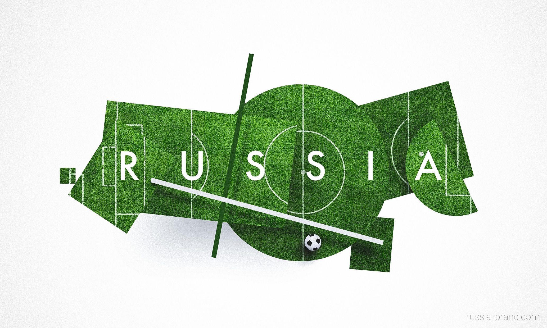
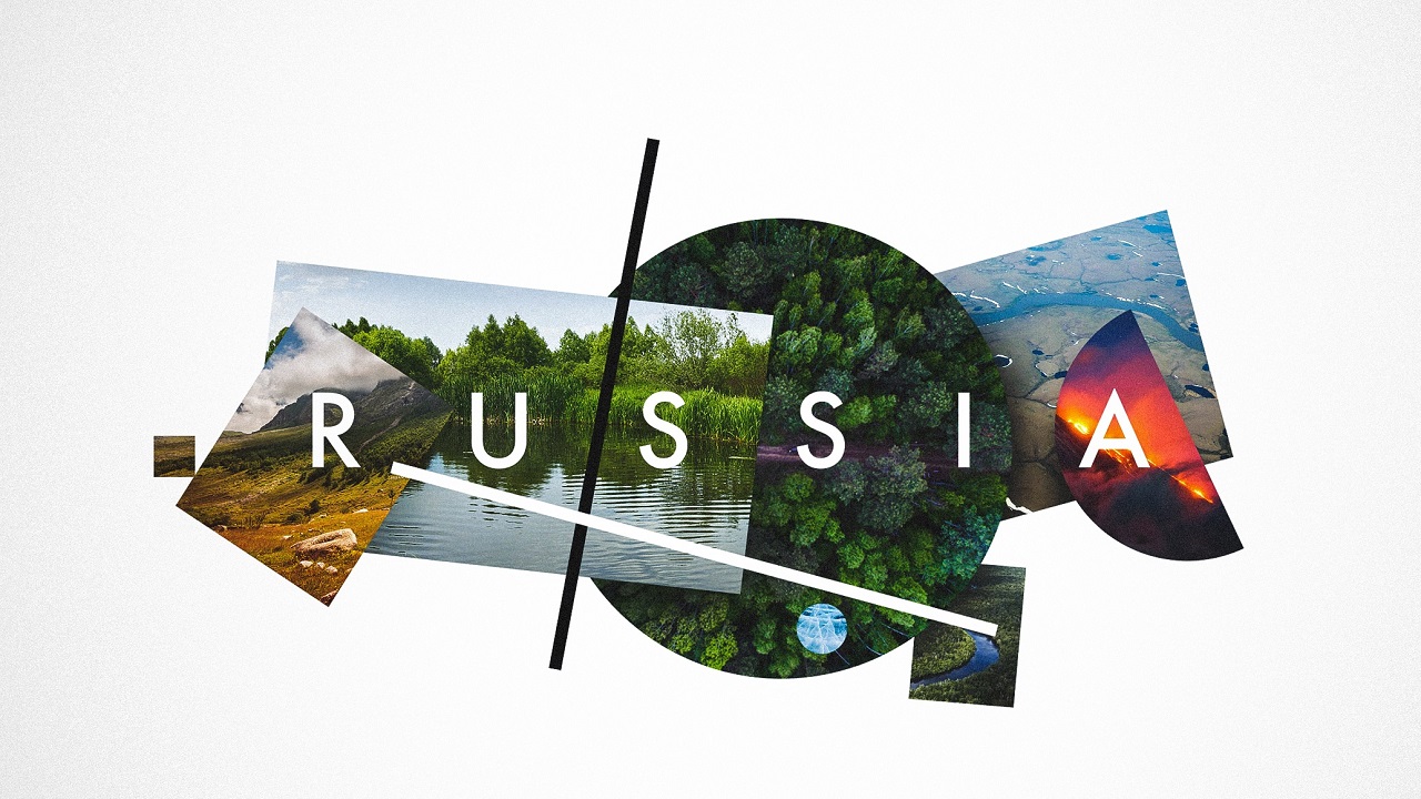
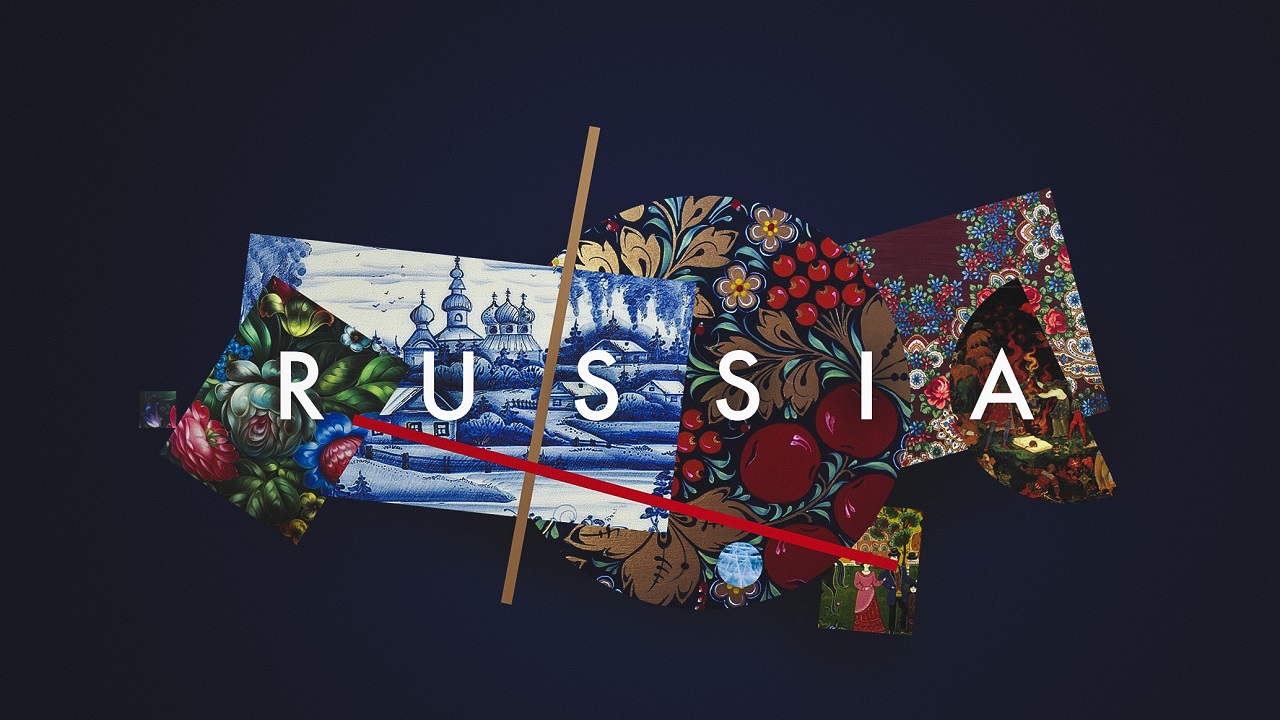
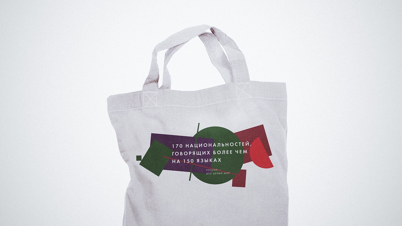
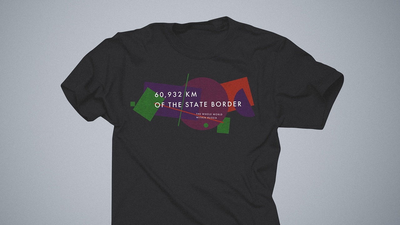
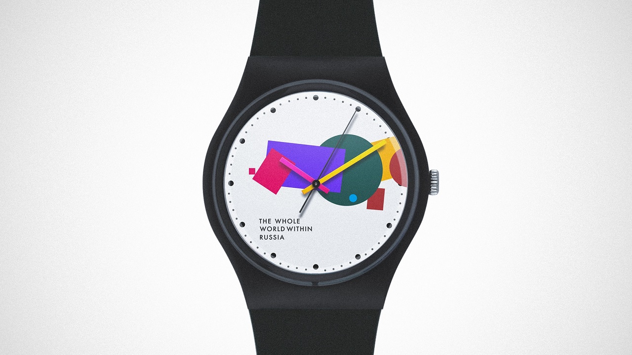
But what makes this logo really good is the fact that it molds to the country’s diverse society. Each shape is adapted to welcome different representative illustrations from around the country. The nation’s culture, sports, cuisine, and nature are among just a few examples that found their place in the new tourism brand identity.
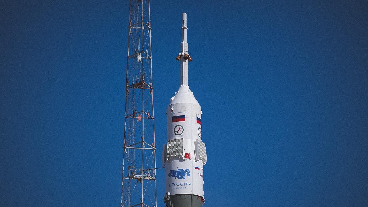
In the team’s vision, the “round and angular” identity—as Vladimir Lifanov of Suprematika calls it—will be a perfect fit on billboards, bags, T-shirts, watches, credits cards, buses, and, why not, space rockets.
“Russia gave a lot to the world and this is something that we want to highlight for those who will come to discover it. We invite to the country that strikes with its scale – people, ideas, feelings, everything,” said Ilya Lazuchenkov, the Managing partner at Plenum Brand Consultancy.

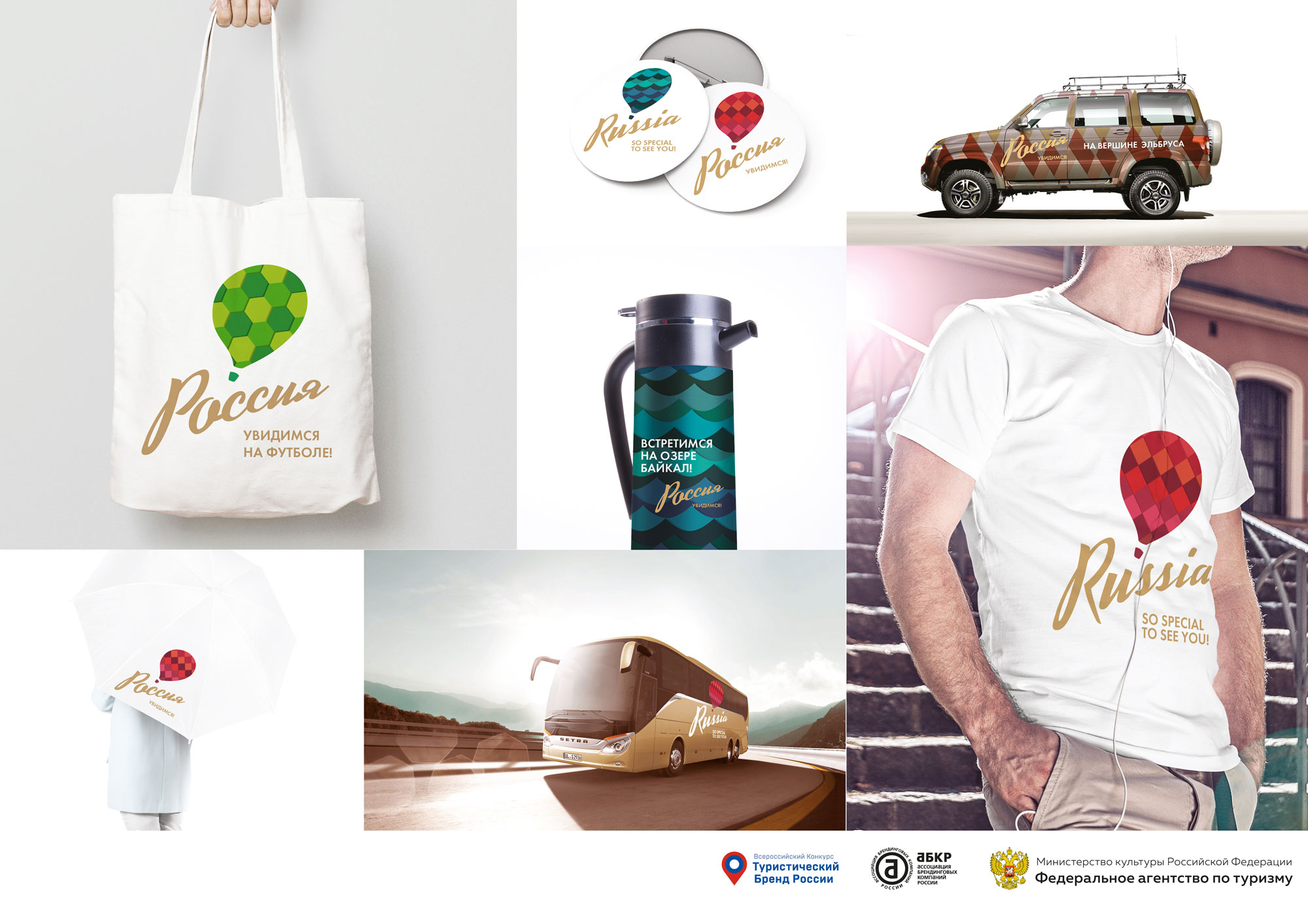
Although this definitely is a genius interpretation of Russia’s national identity, we couldn’t help ourselves from not taking a sneak peek at the other two final projects. “Towards New Impressions” uncovers a metaphor for an endless journey, with a balloon that stands in the forefront being an invitation to explore the country’s magnificence.
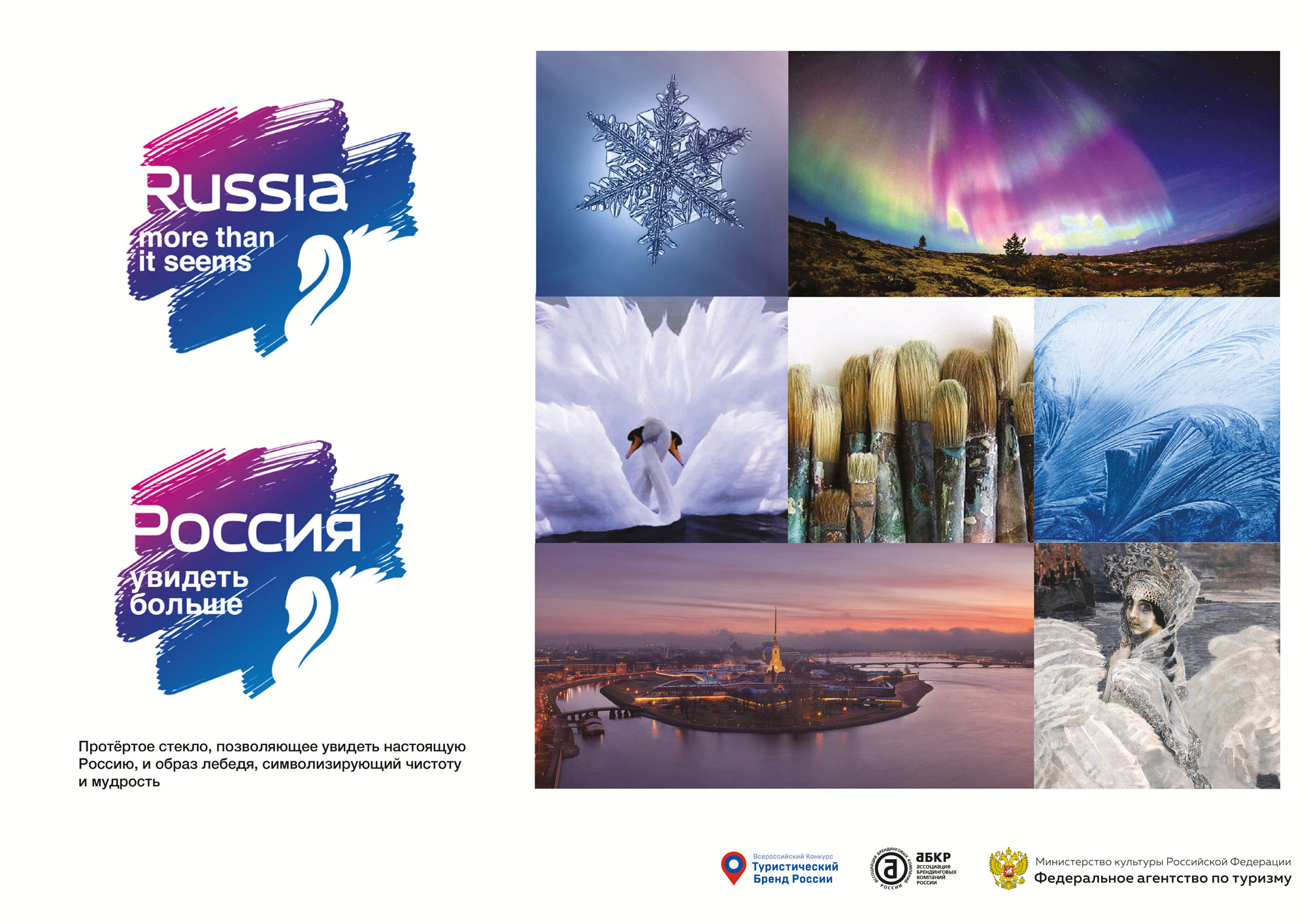
“More than it Seems” looks to be a bit “colder” than the previous project, but even so, it conveys an emotional message which states that Russia, even though is considered to be a “frozen” country, can seduce those who are approaching it with sincerity. How about you? Which project do you like the best?
Credits:
Project: The World Within Russia
Federal Agency for Tourism of the Russian Federation, Association of Branding Companies of Russia