Unfolding over the span of four days, this year’s Paris Book Fair opened its arms to warmly welcome more than 150,000 visitors and over 30,000 industry professionals.
Amongst 1200 exhibitors who came from 45 different countries, was Franck Dalboussière, founder of French start-up Yoteq, who anxiously waited for his glorious moment to announce a new bold concept he had been working on since 2016. Rumor has it that Yoteq’s pièce de résistance shows a modern device that has potential to offer easier access to culture. Especially when it comes to book-reading.
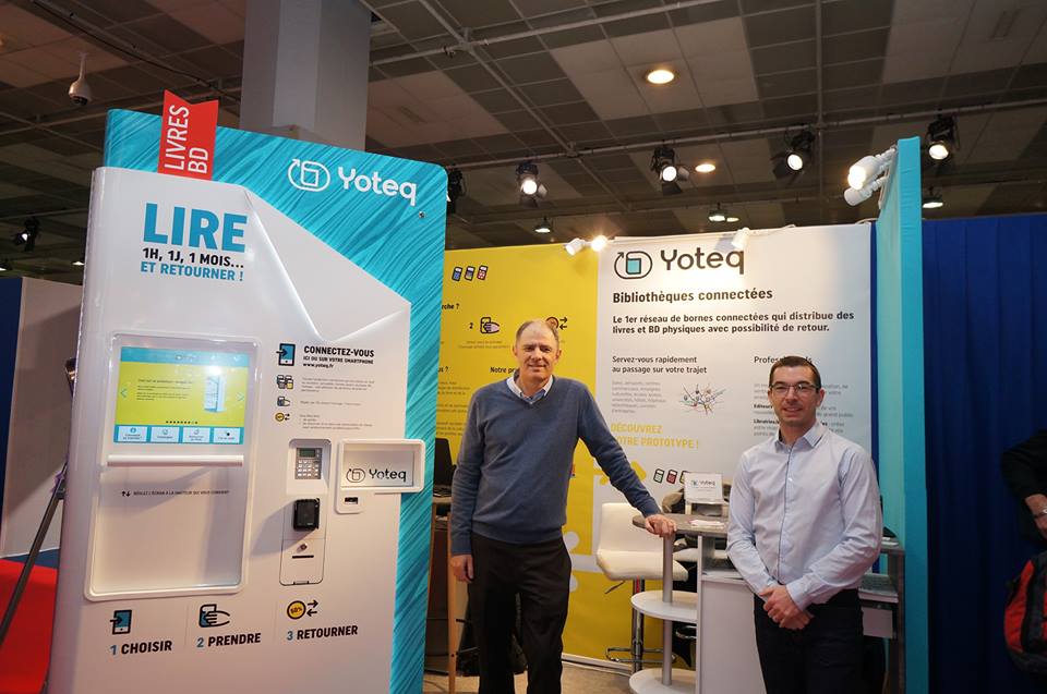
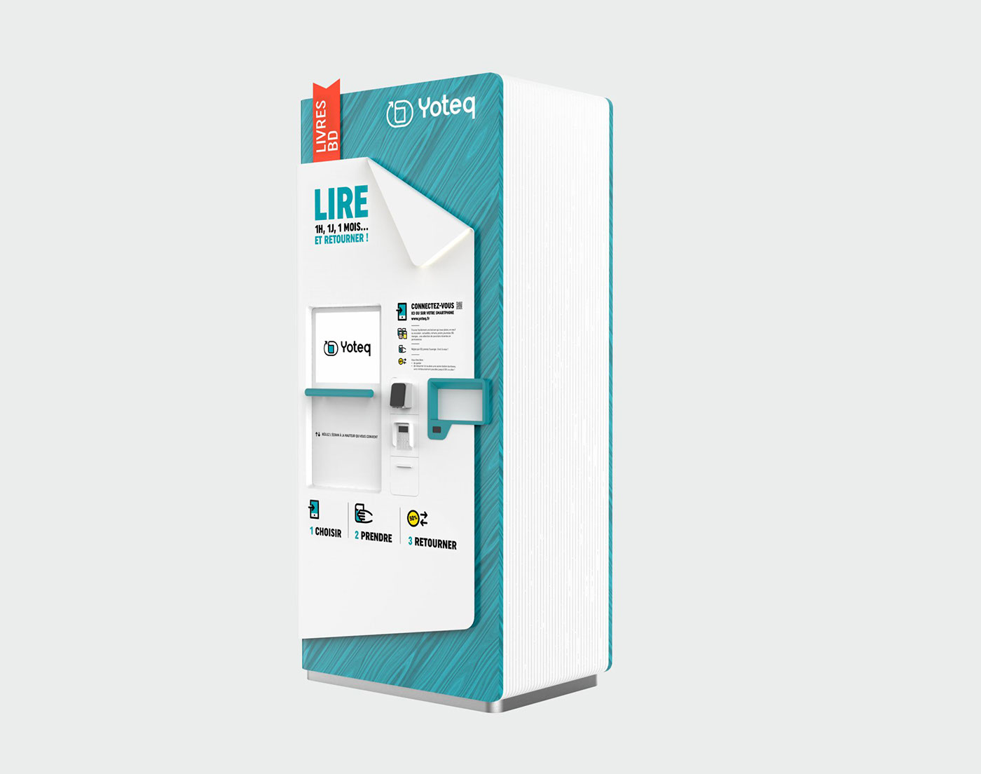
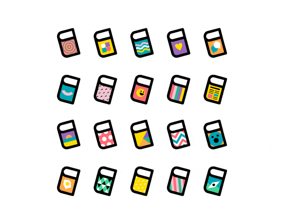
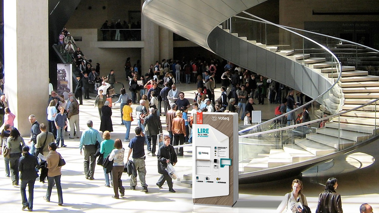
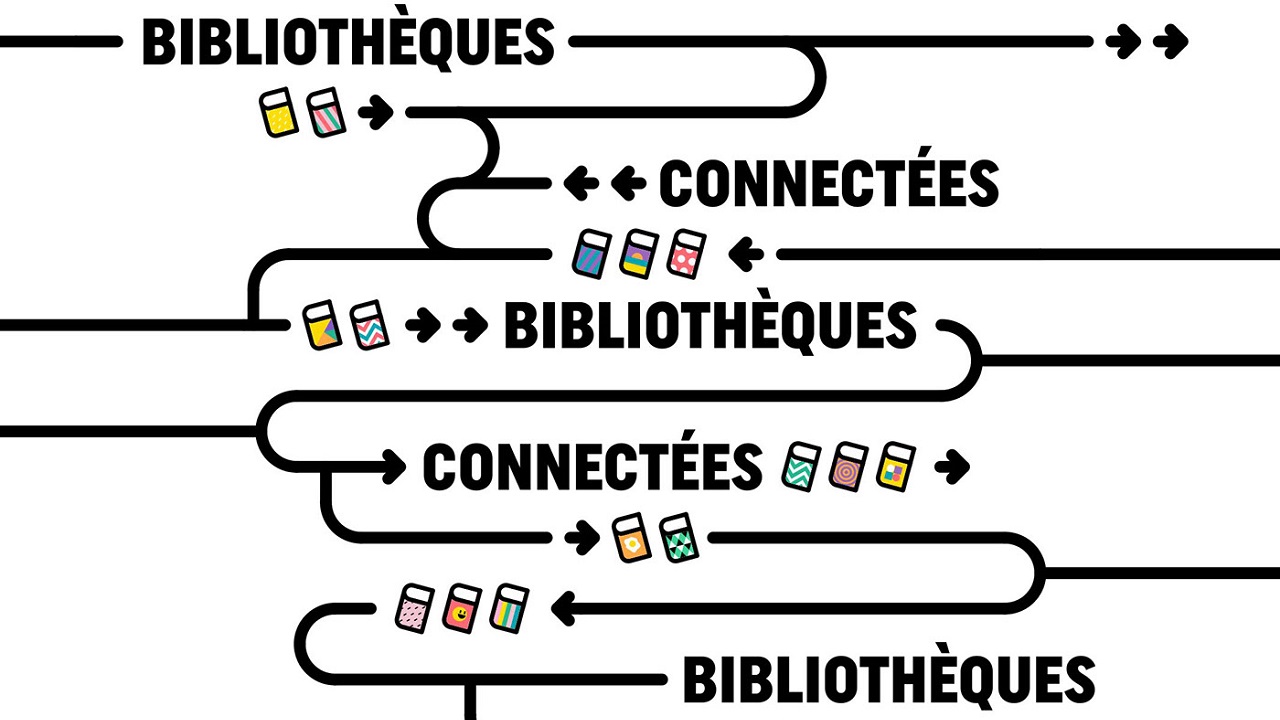
The newly-launched company managed to build the world’s first network of connected libraries that dispenses books with the possibility of returning them. The centerpiece of this innovative project is a series of vending machines, each containing hundreds of books and comic strips.
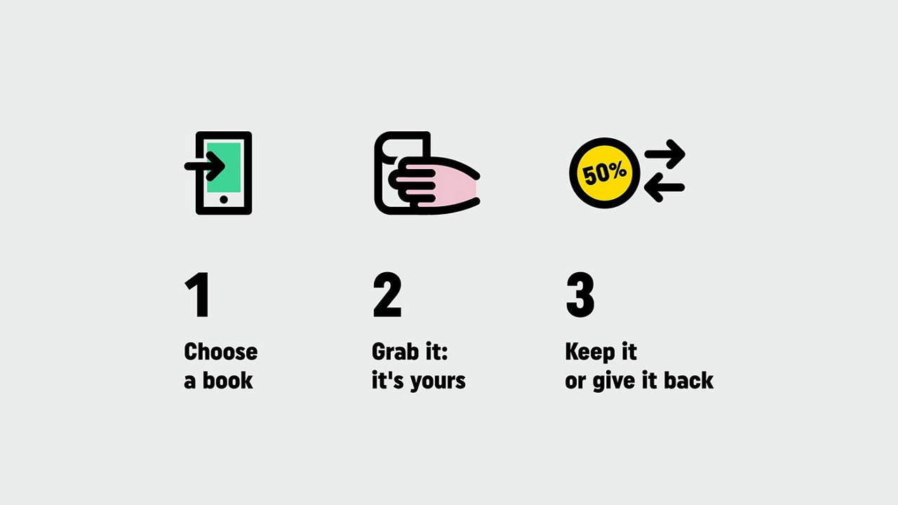
By combining physical and digital, the inventive automated stations give city dwellers a chance to access the wonderful land of culture by picking up a book and returning it after reading.
As a newcomer, the business needs to gain the customers’ trust. One way to reach the clients’ hearts is by delivering high-quality products. The other is through a strong branding image.
The start-up has both of them: nearly 300 books hosted in each vending machine are accompanied by a fresh visual identity on which the creatives of French design studio Brand Brothers have been working since early 2017.
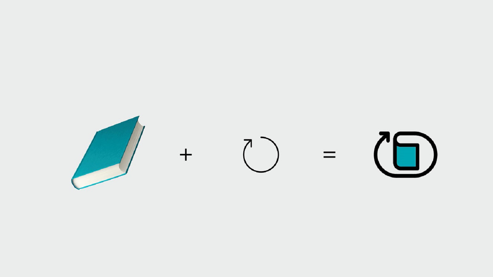
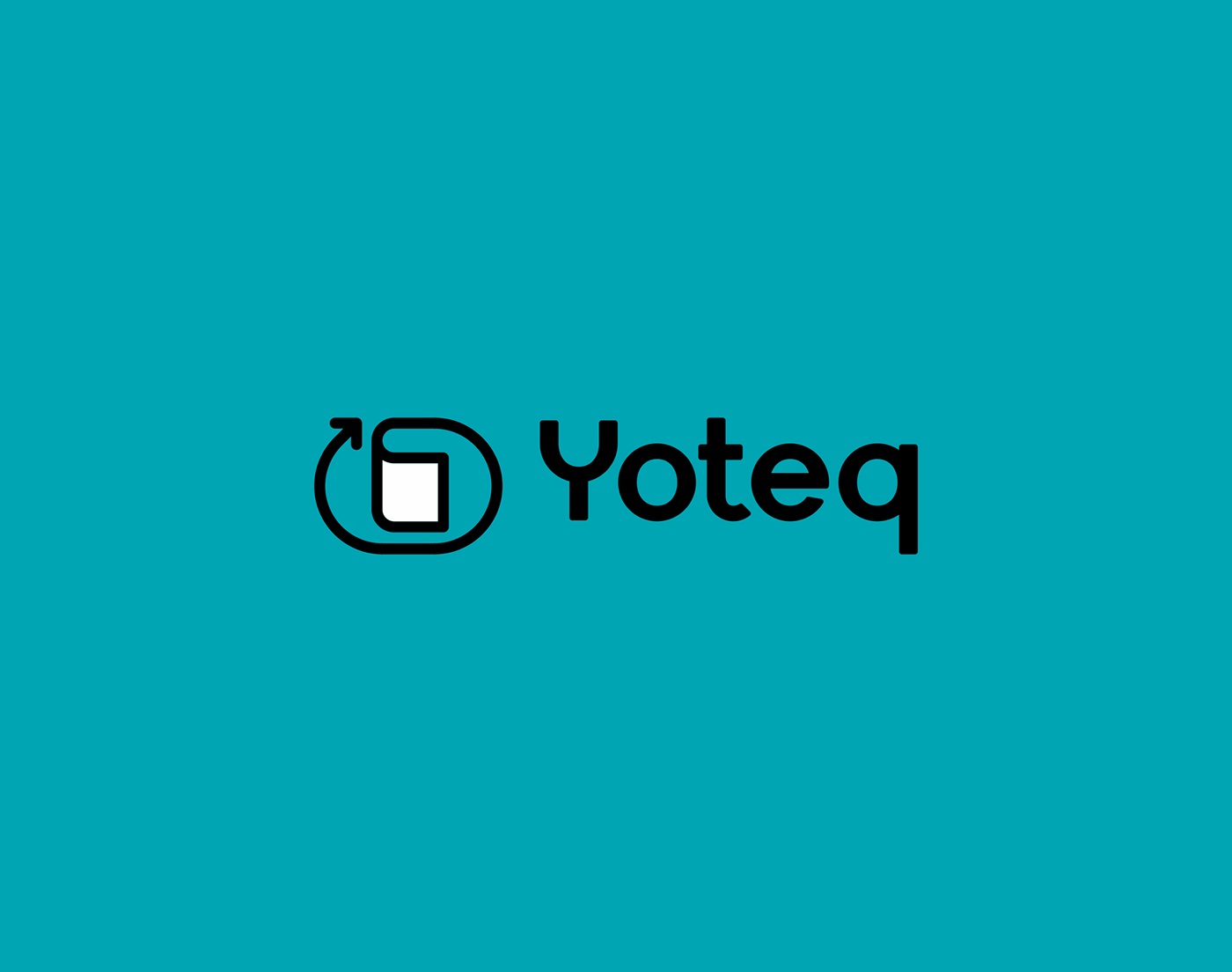
Inspired by the fact that each product can be easily returned to Yoteq terminals, the artists creatively defined the brand’s logo so that it mirrors the start-up’s eloquent personality.
The result comes as a simple, yet expressive, symbol that blends a book edge with an arrow that gently describes a circular route, thus reflecting the possibility of the book to be returned in the terminal and ready to keep company to another hurried client.

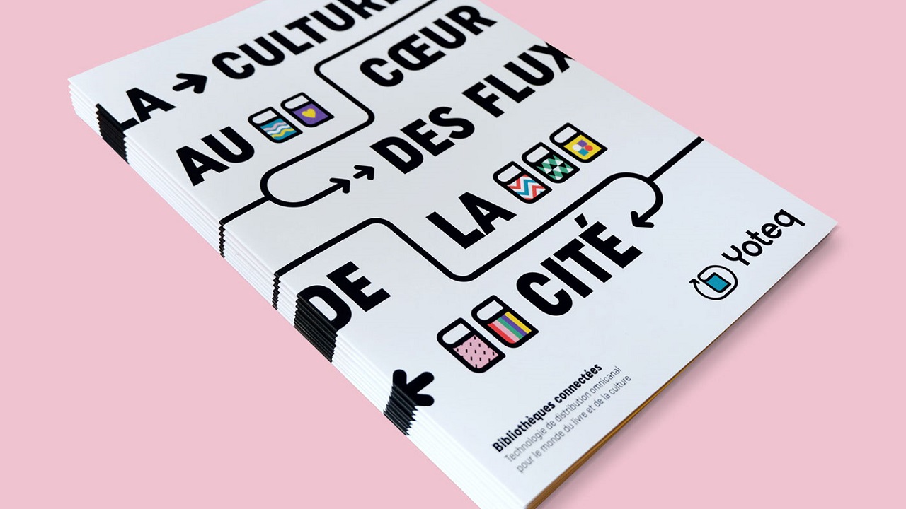
To develop Yoteq’s graphic language, the artists blended the diversity of literary styles with people’s movement and their pleasure to read. Then the studio added more visual tones and started to accentuate Yoteq’s visual identity with new vivid elements.
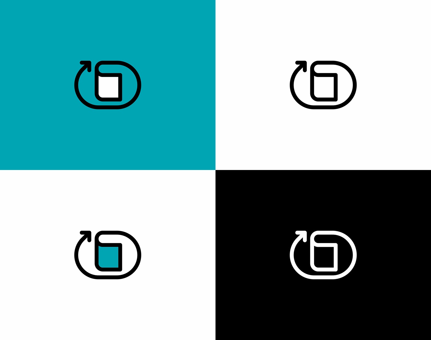
Thick lines and a rich nuance of blue were carefully blended so as to obtain an airy and simple logo that can draw anyone’s attention. The brand’s name stands at the right of the logo and is written in a bold typeface, so it can be visually scanned with ease.
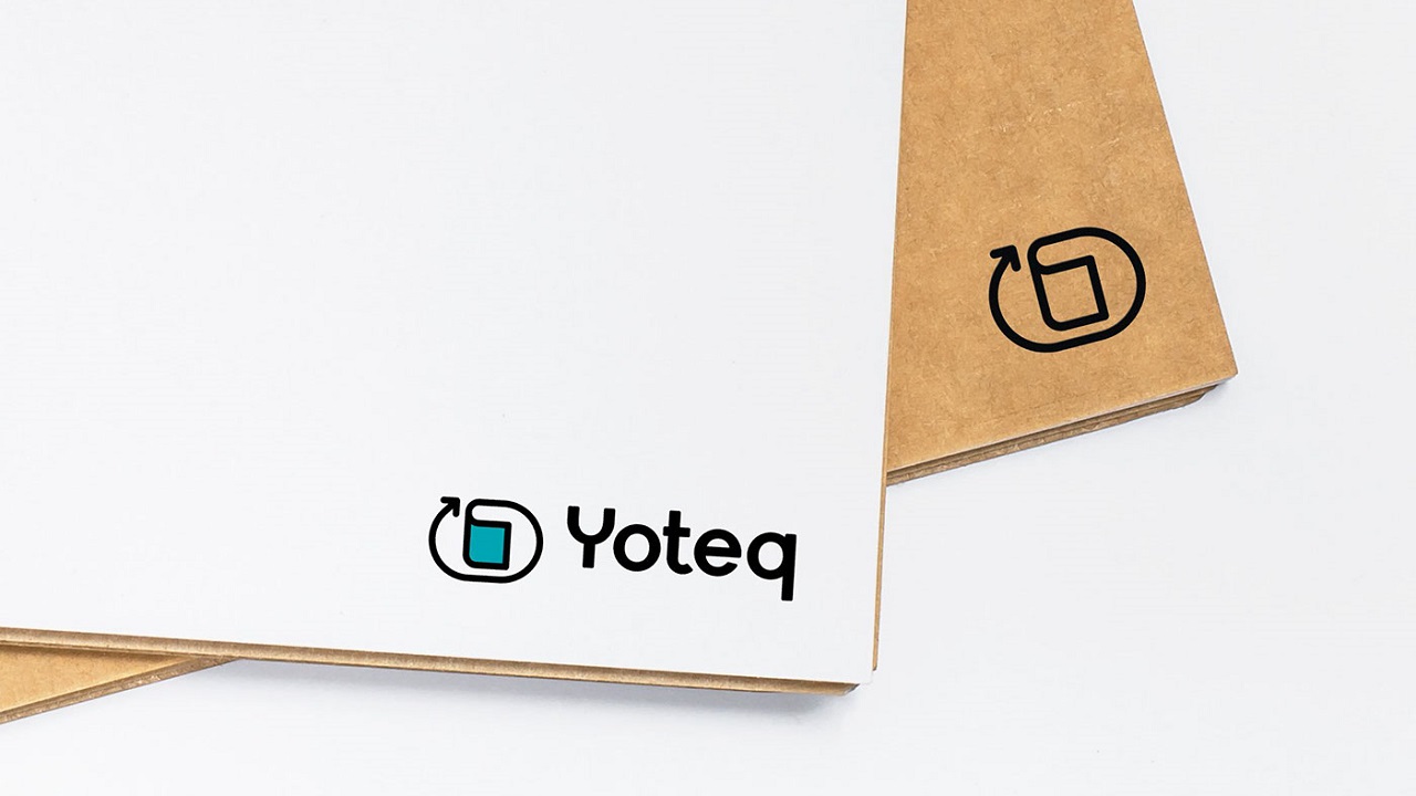
You can also admire the aesthetically pleasing personality on collaterals such as business cards, magazine covers, and the brand’s website. Also, with the help of product designer Pierre Charrié, the team dressed the book dispensers and structured the branding for the company’s official launch.
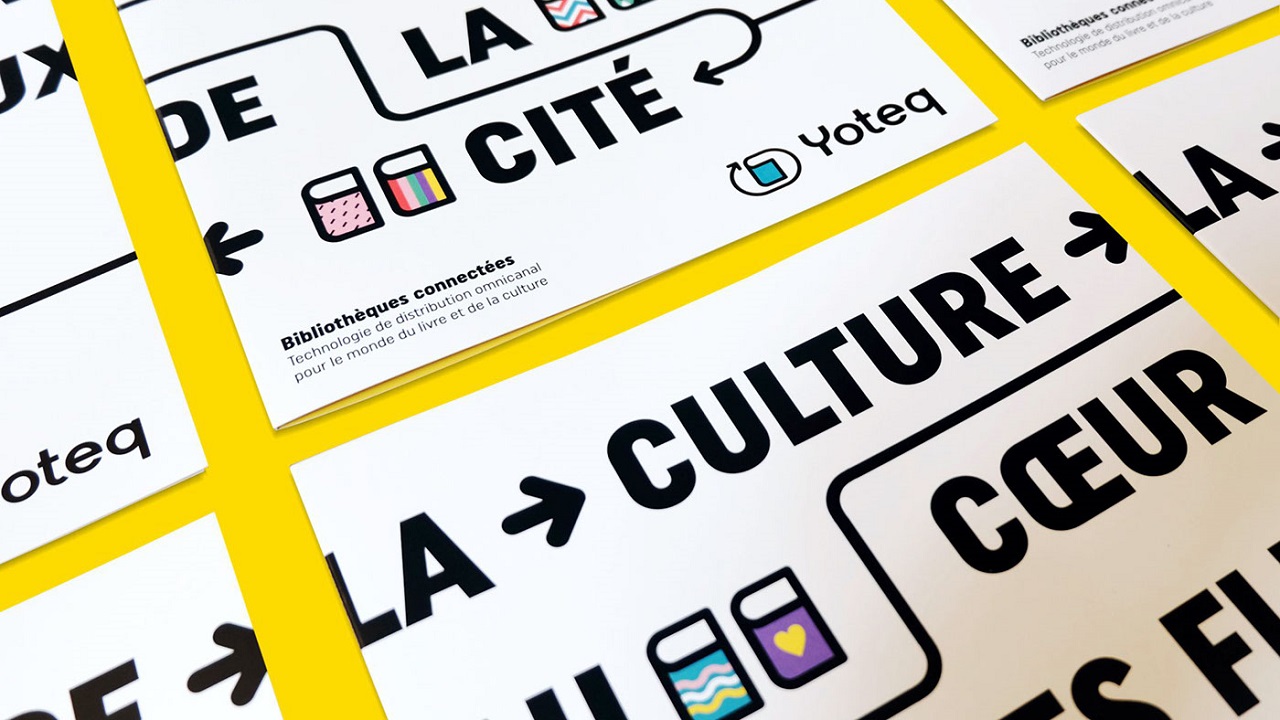
“Yoteq’s primary vocation is to take a book to places of transit and to simplify its acquisition. We have chosen to go beyond the classic graphic territory of literature and the world of publishing, to offer a visual identity based on the simplicity of use, innovation, diversity, and access to culture,” claims the agency.
As a result of a partnership with the SNFC, Yoteq announced that the first automated libraries will be deployed in 5 stations in Paris and the inner suburbs by the end of 2018. Here’s how it works:
Credits:
Client: Yoteq
Agency: Brand Brothers
Video: IDBOOX