The Fig & Olive restaurant group was founded back in 2005 with locations all across the United States. The family-run business has always had its gates open to people who want to immerse themselves in a luxurious Mediterranean experience. This fresh concept present in the restaurant’s cuisine aims to feed both one’s body and mind. But Fig & Olive was thirsty for more. The brand wanted to touch their clients’ souls with creativity. Originality. Authenticity.
In other words, it wanted to boost its appearance. That’s why the restaurant decided to add some more sophisticated ideas and ingredients to spice up its looks. To do so, Fig & Olive enlisted the most creative chefs from its playground to complete the beautiful metamorphosis.
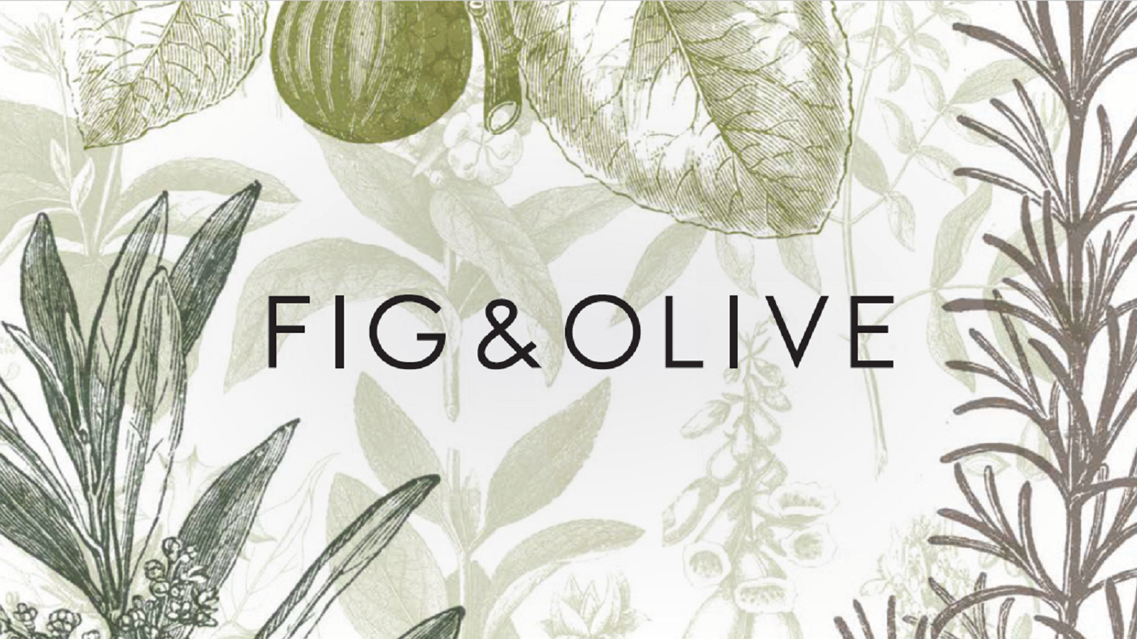
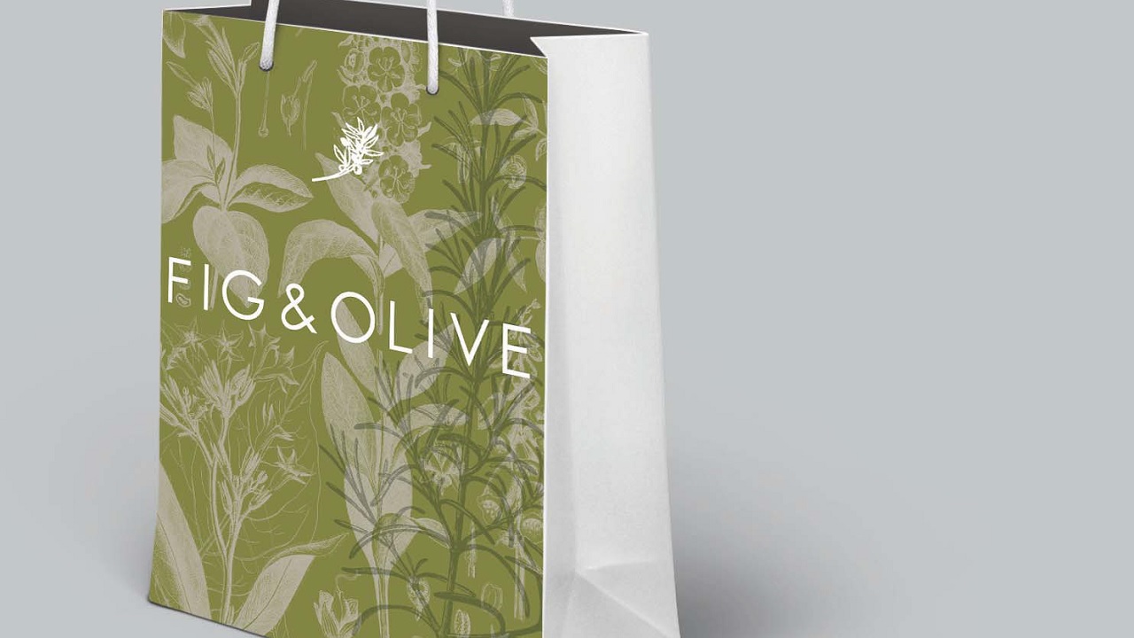
As an appetizer, we’ll start with the logo that morphed from plain notes into a more nicely-shaped design. Although it looks sophisticated due to the pattern on which it sits, the logo remains quite airy and invites guests to read it with ease.
“Legibility of the logo is important, especially when it’s used with a pattern,” claims the brand. But despite this statement, it managed to choose a background that is really bold in terms of design, and with lots of shapes and lines that overlap the logo. So where does one draw the line? When such logo-pattern combination can become a success and when can it be a complete disaster?
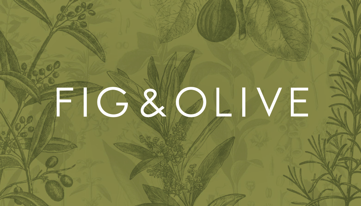
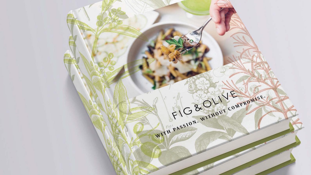
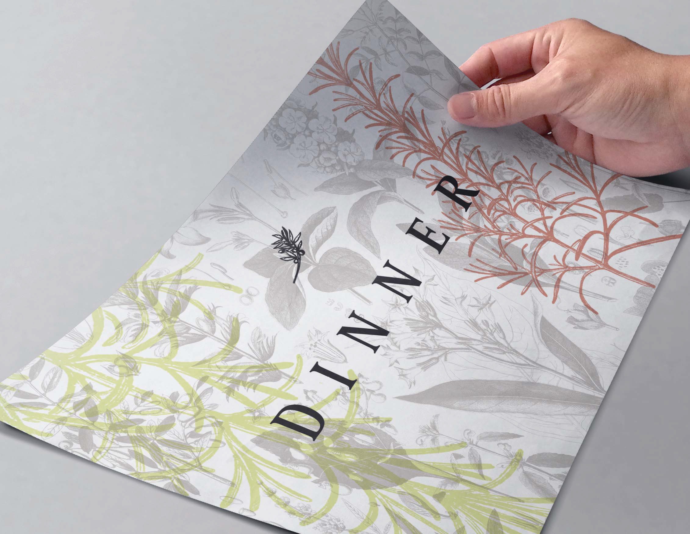
We at branding.news asked Cory Bronson, Vice President of Marketing at Fig & Olive, what their strategy was: “Our visual identity was to take vintage engravings of food, plants, and herbs. Then we added overlap, bold color combinations, and a timeless, modern edge. It’s a luxurious escape from the everyday. That’s what our visual identity ultimately conveys. With patterns reflecting the diversity of the flavors that we offer, they form an energetic and distinctive look that can be subtle or bold, monochromatic or colorful, but most importantly reflective of our passion to create beauty without compromise.”
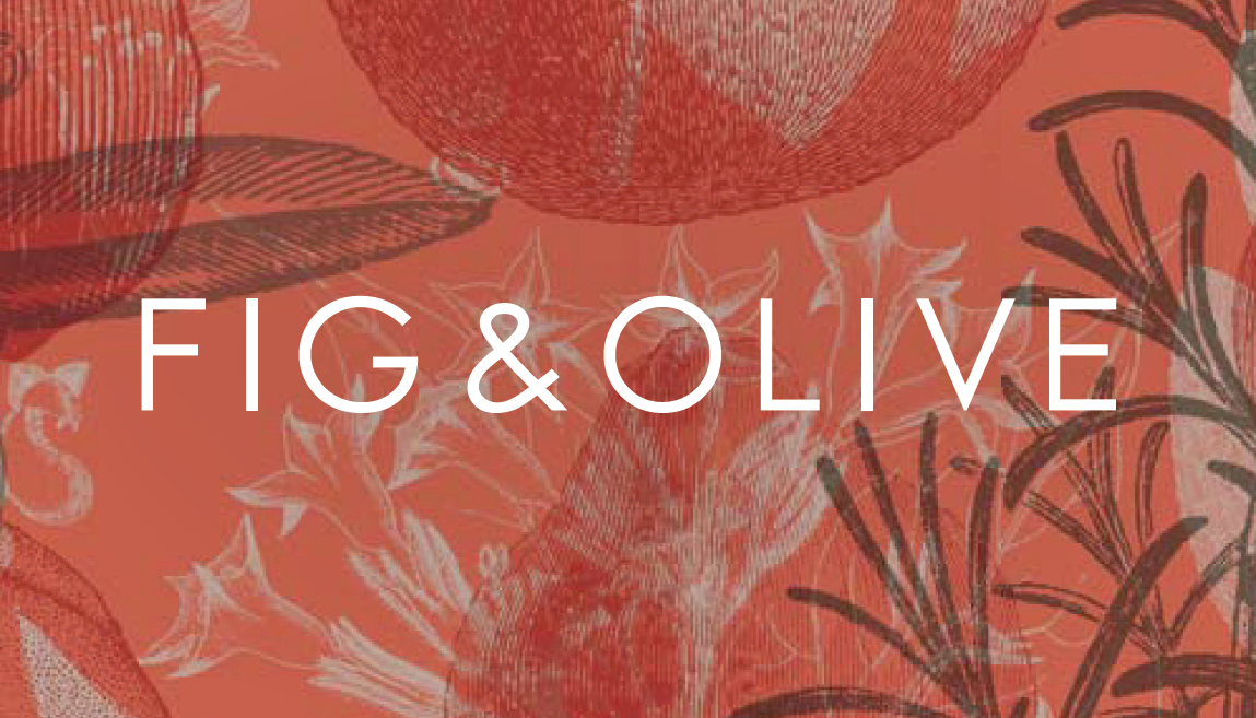
Bronson also added that the keyword to their visual identity is the color palette because, according to him, it does not only help them convey the brand idea, but it also serves as a unifying element that can heighten brand recognition. Thanks to the combination of fresh colors, the result comes as simple and refined, while not being overly complicated. “The color palette for interiors is based on traditional colors that you see in the south of France, Italy, Spain – whitewash walls, natural hues of terracotta, green of olive tree leaves,” adds Olya Volkova, the designer behind Fig & Olive’s rebrand.
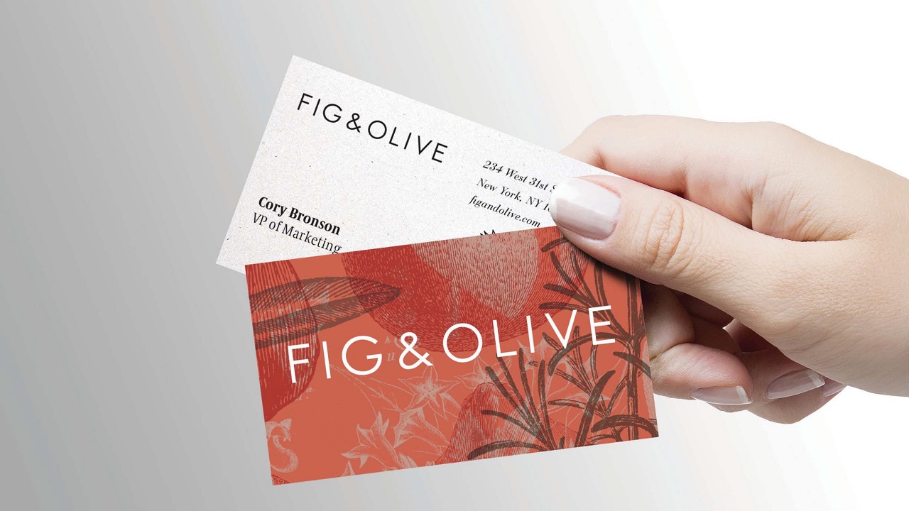
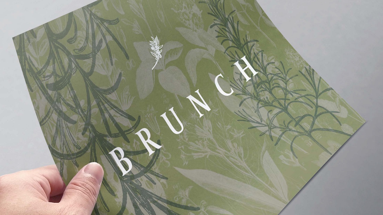
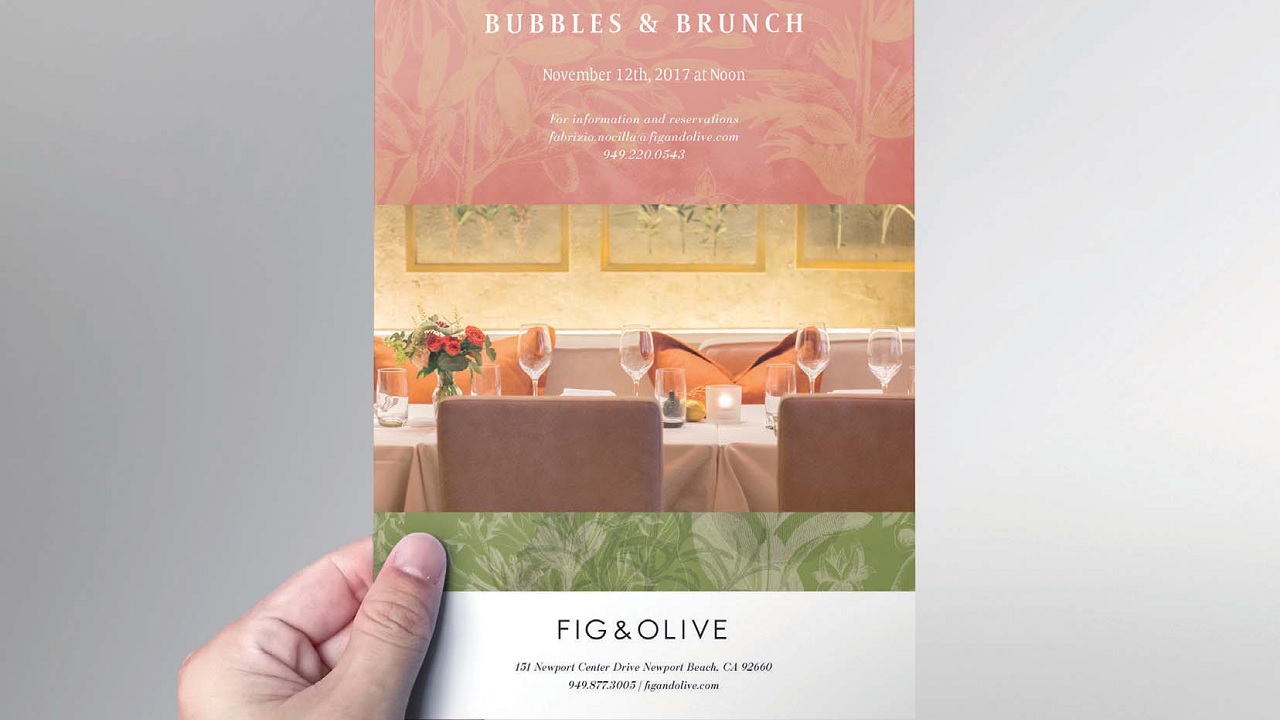
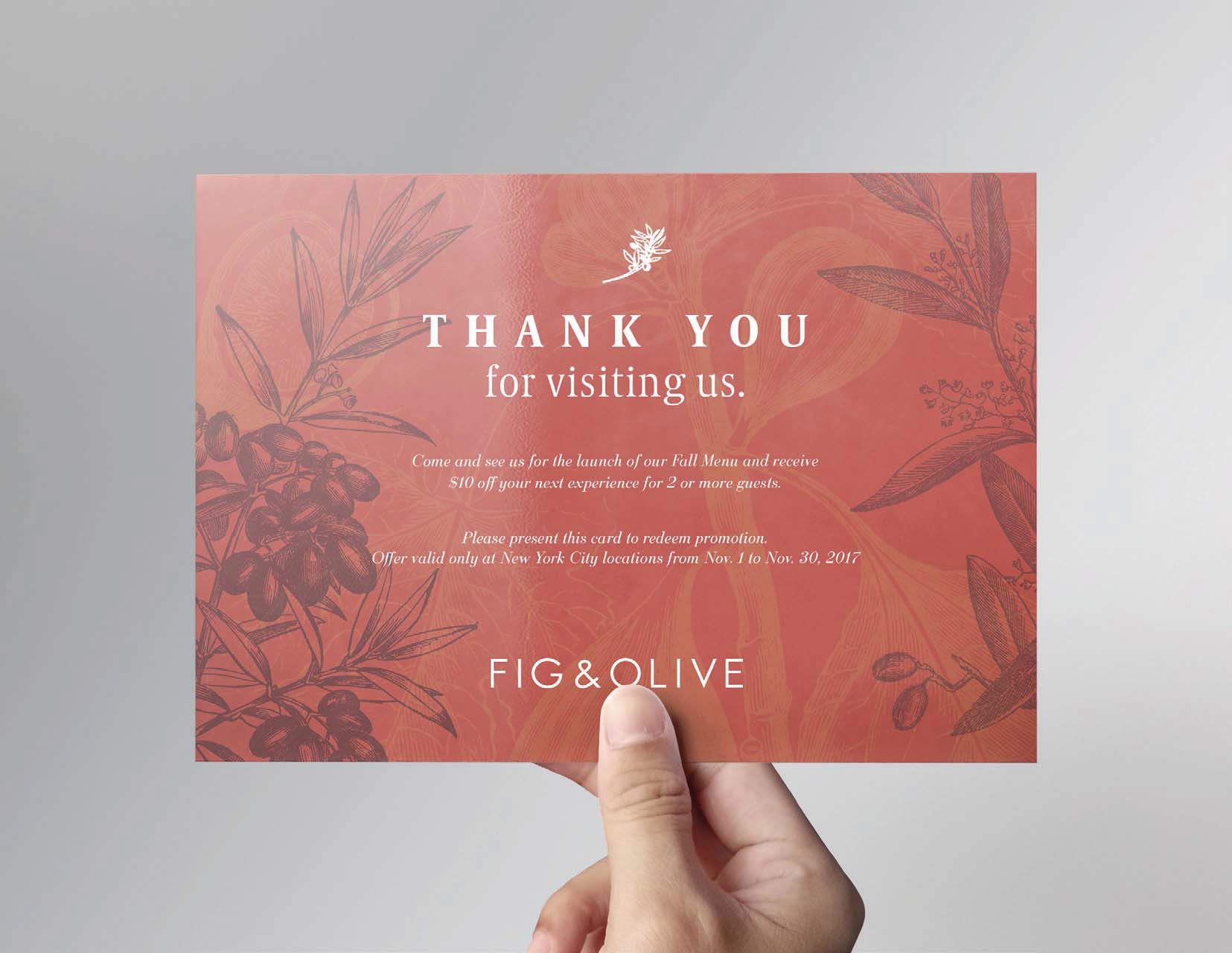
The colors can be admired not only on the interiors and the logo, but also across various other merchandise items, including business cards, menus, print, and online use. Plus, the visual statement embellishes a line of newly designed signature olive oils and balsamic vinegar available for purchase in-store at all of Fig & Olive’s locations, or online via Amazon Prime. And if you haven’t had enough, you can also get yourselves a set of branded matchboxes in all of the restaurants. Moreover, the brand aims to unveil a new line of uniforms that wear the same bold visual signature.
The restaurant went through the process of rebranding to build a stronger connection with its audience, which spreads across all generations. And although Fig & Olive has a solid base of guests among both the Generation X and Baby Boomer cohorts, the number of Millennials who want to try the restaurant’s delicious dishes is also continuously growing.
“We continue to focus on delivering on the entire experience and use our food, service, design, and music to deliver the experience. This ensures that our guests receive all that they expect plus a bit more. High levels of service, food quality and ambiance are all requirements of our guests, and, if we can achieve that, we meet and exceed expectations across all generations,” said Shaun Smithson, Chief Executive Officer at Fig & Olive, in an interview with branding.news.
So how does the new visual identity set the restaurant apart from other similar eateries? Volkova says that the main concept the creatives used in this visual adventure was to communicate the feeling of coziness, elegance, and of a chic place. Fig & Olive abounds in places that wait to be discovered. “It is like being invited to your best friend’s house and you start off in the living room with a drink and move on to the dining room to have wonderful meal and if the weather permits you to dine on a terrace and for an aperitif you are invited to a special place upstairs,” explains the artist.
Fig & Olive’s locations definitely look like home. And now we’d like to experience it as if it would feel like home. And while looking at the visual identity that spins around the restaurant, we cannot argue: this is a place where the design feeds your creativity whilst the cuisine enlightens the taste buds even of the most demanding connoisseurs. Long story short, this is the spot where imagination perfectly merges with gastronomy.
Credits: