Norway is a country full of equality, freedom, and heart-shaped waffles. And ice. Norway has ideal environmental temperature and humidity to allow the development of ice crystals from the initial hexagonal prism into numerous symmetric shapes.
Nowadays, apart from popular winter sports such as ice-hockey, ice-skating and also popular cross-country skiing, ice is also connected to the country’s third largest network operator (with a share of 21% based on the number of subscribers) and provider of voice and wireless data services, Ice.
For over ten years, ice.net has provided unique land coverage with their mobile broadband service across Norway. In June 2015, the company launched mobile telephony and became a full-fledged mobile operator in both the private and corporate markets. Moreover, in addition to obtaining a market share of mobile subscriptions at record speed, the brand has launched its new visual identity that features a new symbol, iconography, colour systems and digital behaviours. And the main theme? Yes, you’ve guessed it right – ice crystal!

The latest makeover of the ‘world’s coolest telecom brand’—dedicated to looking after its customers—comes from the studios of an award-winning brand practice, SomeOne.
One of London-based agency’s motto comes to mind here: “We don’t change symbols, we create symbols of change.” And that is exactly the case of the new identity.
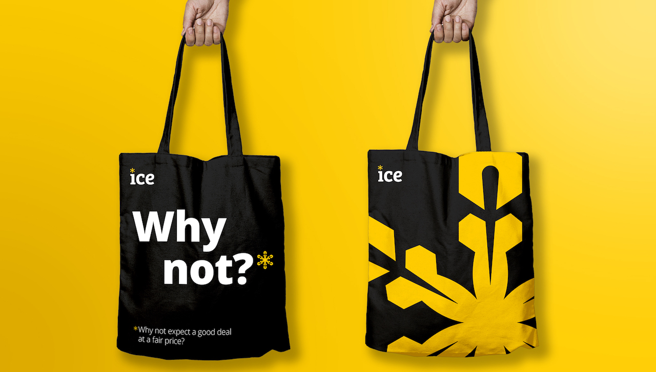
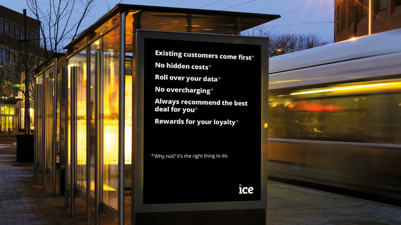
The agency has been working with Ice to help build them into a customer focused, customer experience brand. One that is ready to do things differently, one that truly listens to customer needs, and one that doesn’t simply accept things for the way they are. Together they came up with an entirely new strategic visual and verbal branding system that spins around a combination of asterisk and the ice crystal symbol.

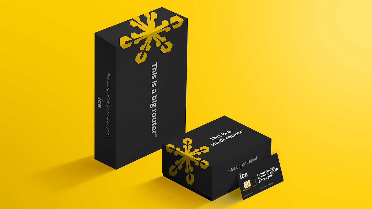
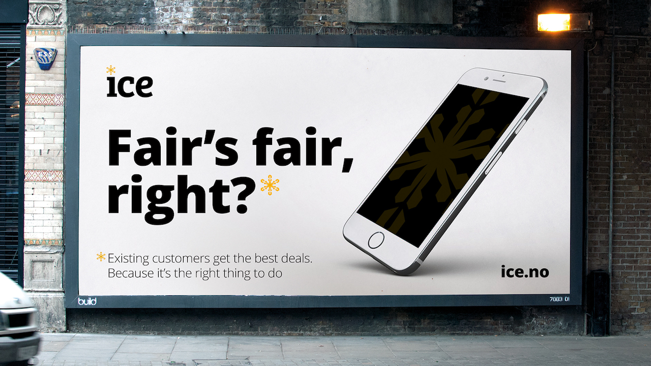
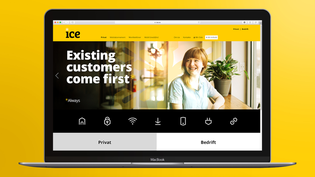
Usually, an asterisk symbolises small-print, a catch, or something that needs qualifying, but for Ice and SomeOne it means good news – a good deal, and something genuinely of benefit to the customer. The Founder & ECD of SomeOne, Gary Holt, explains that: “The ice crystal is used in a positive way throughout the brand and communications, to highlight the positives.”
The ice crystal symbol is thus used both as a literal representation of ice crystal and as a more lateral application as an asterisk, designed to be highlighting the benefits of the Ice brand. These include a challenge to the status quo, to be fair, transparent, on the side of the customer.
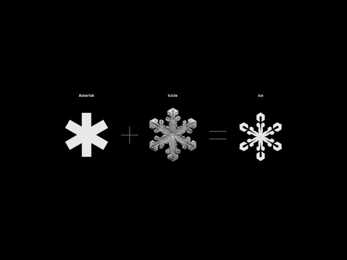
The new identity comes as bold and simple and features a new symbol, borne of the name. In the simplest sense, the symbol is an icon, an ice crystal, but over time it is designed to signify everything ice stands for. A together they create something strong, a layer that can easily hold a bunch of bulked-up ice-hockey players. And the new identity bears fruits, as it helped achieve an increase of 79.3% in service revenue year on year while spanning the mobile market share to 5.1% since the rebrand.

SomeOne’s Senior Account Manager, Lucy Aebischer, further describes the process behind the new identity: “Transforming the ice brand saw no stone left unturned. Much like the brand itself, the relationship worked best through simple, transparent and constant communication. “Keeping things clear” was engrained in the team from the start, which made for a smooth and happy working relationship. It’s always exciting to see a sector shift and a brand pave the way for others.” Just check the designs yourselves and see how it shows positivity even when you put the ice crystal directly in the sun… With Ice, you don’t need to worry it will melt down.