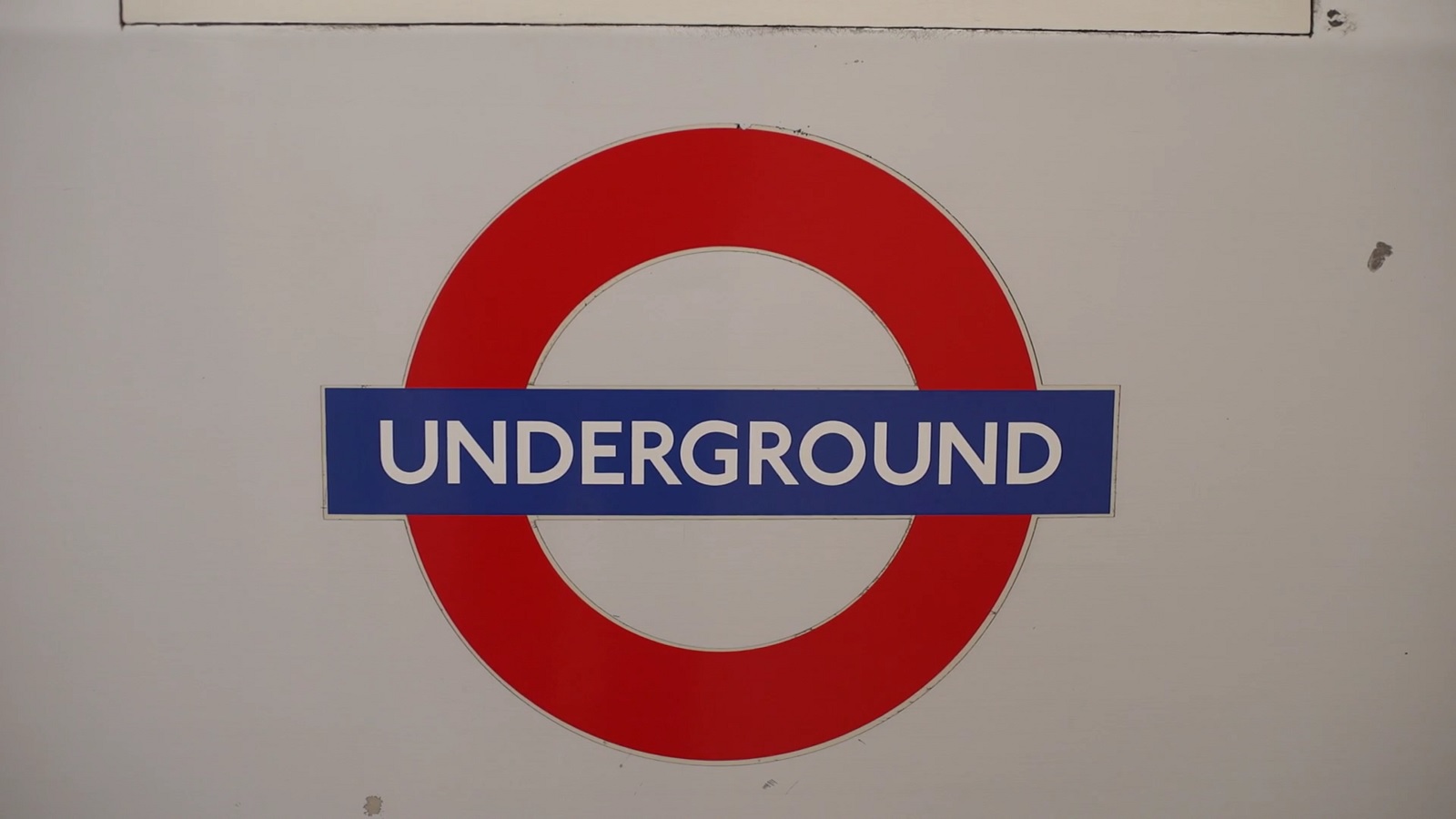
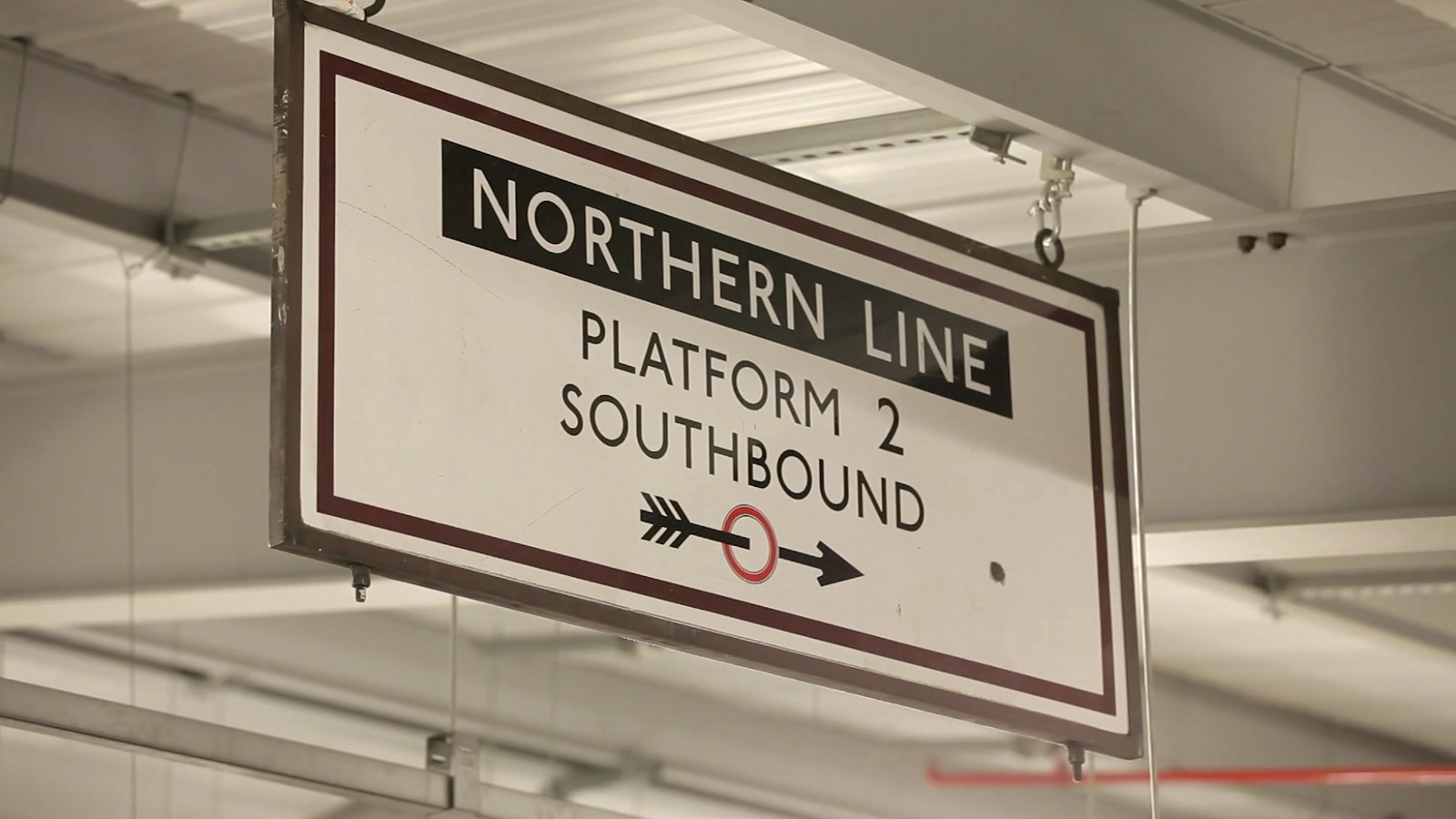
If you have ever lived there, travelled there or visited London as a tourist, you have definitely seen it. Without it, you wouldn’t have probably made it on time and got lost. Crowds of rushing people need it for better orientation in the vast tunnels of London Underground and in other means of transport. What are we talking about? Johnston – also labelled as “the voice of London”.
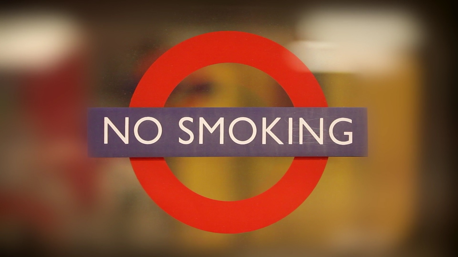
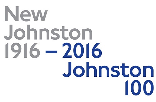
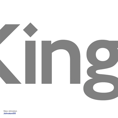
For the first time in 100 years this iconic typeface, that helps millions of people on their every-day travels to reach their destination, is going through an interesting change. To be fully fit for the digital era, the all popular typeface, Johnston Sans, is being updated by Transport for London to appear initially in printed materials and later on across the network with the first place it can been seen being announced very soon. So, we can expect something to cheer about in the everyday struggles of commuting within London – Johnston100.
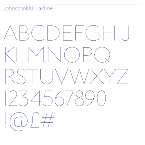

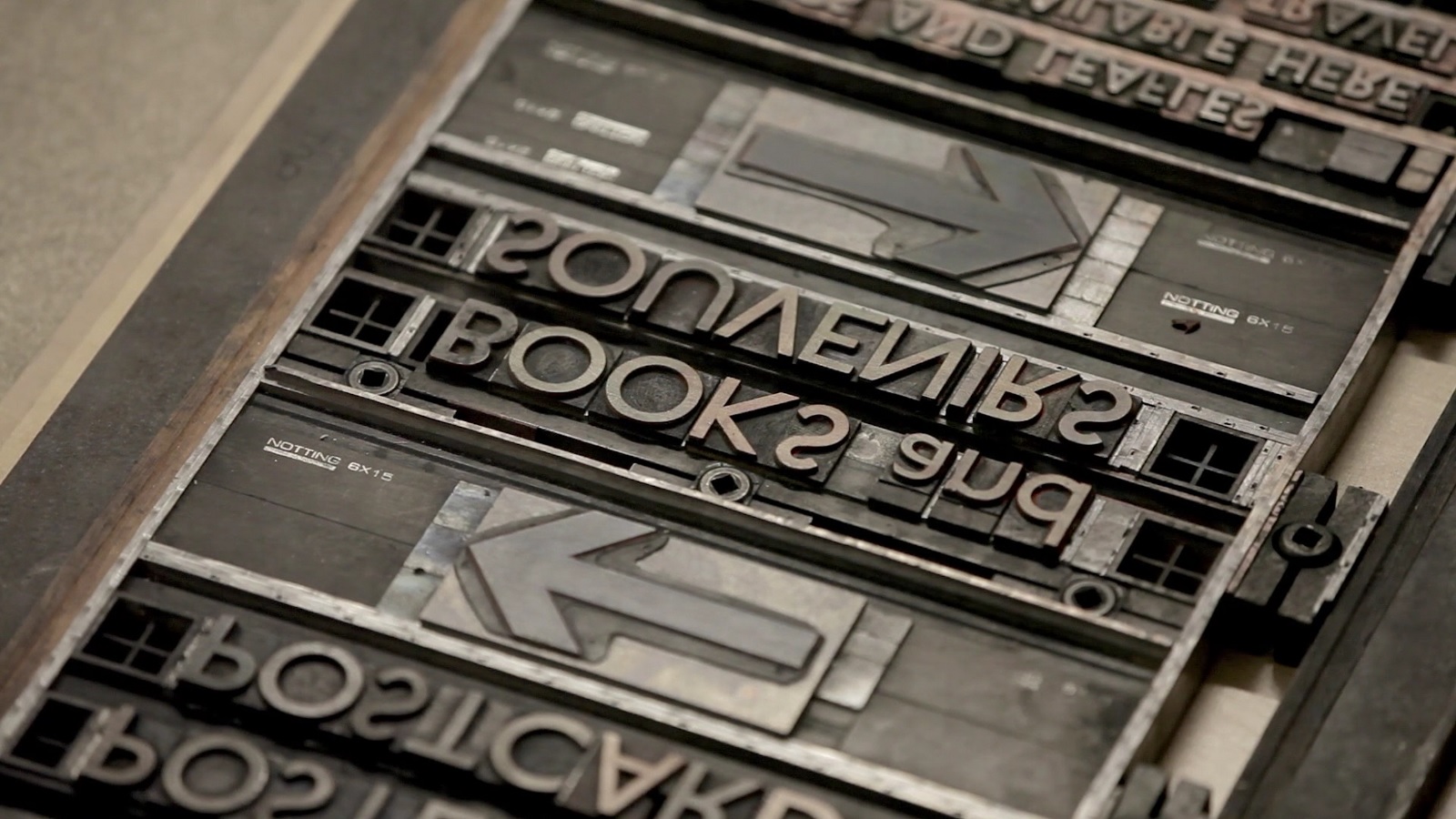
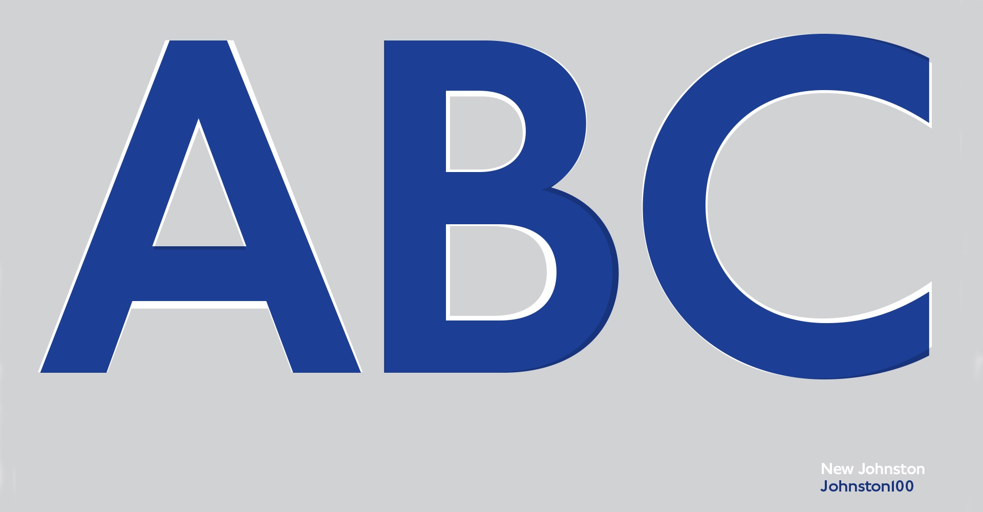
The re-mastered version of the unique typeface crafted by Monotype needed addition of hashtag (#) and at (@) symbols, a light figure of the lower-case “g” to be kept, and plenty other changes that are almost invisible to an untrained eye. Yet when you take a closer look at the pictures around, you can definitely spot the difference. Let us know whether you like it in the comments below.
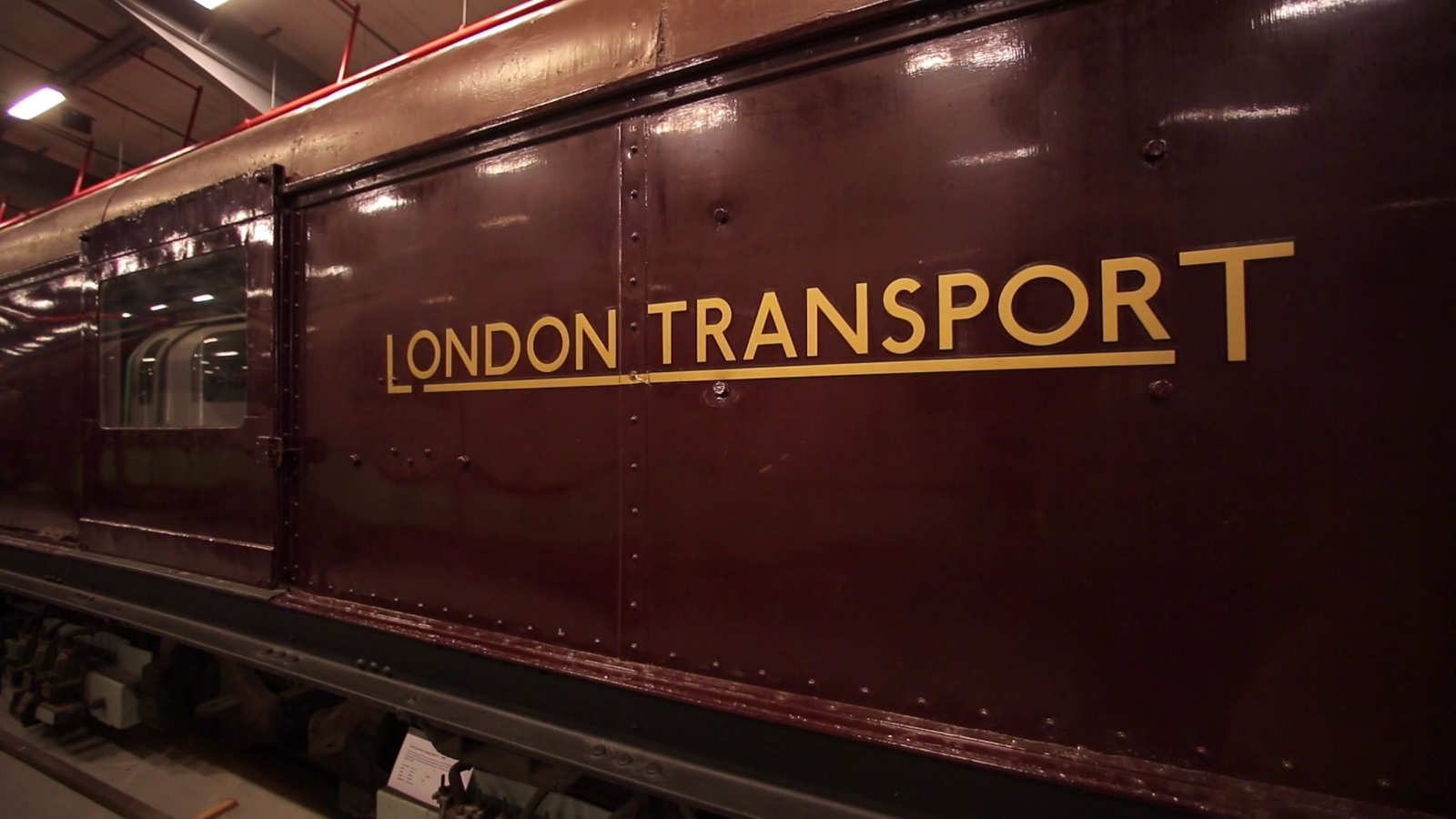
Jon Hunter, Head of TfL Design, said: ‘Over the past 100 years Frank Pick‘s vision and Edward Johnston‘s typeface has served London well. TfL is committed to protecting this legacy and over the years we’ve worked closely with designers such as Eicchi Kono and most recently Monotype Type, to make subtle changes to the typeface. Releasing the updated Johnston100 typeface is an important step forward. We hope this version of the ‘lettering of London’ for the digital age, will last for another 100 years and beyond.’ Let’s also hope that the new designs will remain such excellent class as the ones used at the beginning of the 100 years of existence of Johnston typeface.