A major problem that our society is facing right now is discrimination. There are a lot of areas in which differences between humans have been manifested over time, but in today’s age, one of the most frequent ones is discrimination in workplace policies.
As far as LGBT is concerned, things have evolved in a positive way in recent years, with many people fighting against all odds for equal human rights. Along with other companies that support LGBT rights – such as Skittles (who removed their rainbow completely to show support for the community), Apple, Adidas, Coca Cola, Nike, Starbucks, Tiffany & Co., and many others – the giant tech producer IBM started a new campaign that aims to fight the anti-LGBT movement. According to the company, discrimination towards any human being is unacceptable, and they have chosen to fight it by adopting a new strategy.

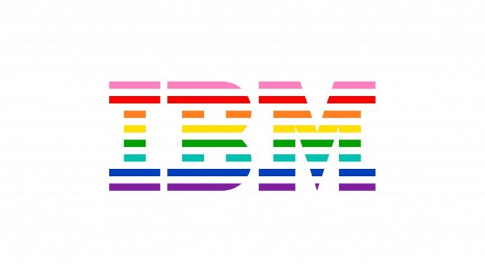
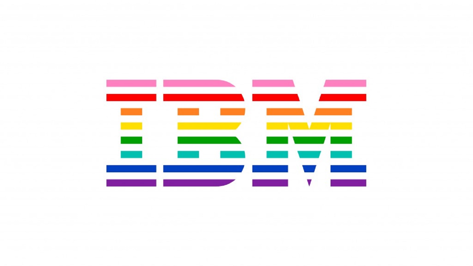
Since the beginning of the 20th century, IBM has struggled to establish equality between men and women. Now, IBM is one of the leading companies fighting against discrimination in workplace policies. And the company has unveiled an updated logo – a rainbow version of its previous one – to show for it. IBM’s Chief Diversity Officer, Lindsay-Rae McIntyre, declared in a press release that this updated symbol is the company’s way of fighting for basic human rights. IBM has actually received a perfect score of 100 points within the Human Rights Campaign’s 2017 Corporate Equality Index, a measurement of the support and benefits a company offers to LGBTQ employees.
“Today, I am proud to introduce a new symbol that will represent IBM’s ongoing push for diversity, acceptance, inclusion and equal opportunity – a rainbow version of our iconic 8-bar logo. The rainbow is recognized worldwide as the symbol of LGBT equality, and we are proud to fuse it with the emblem that has represented our company for more than four decades,” declared Lindsay-Rae McIntyre.

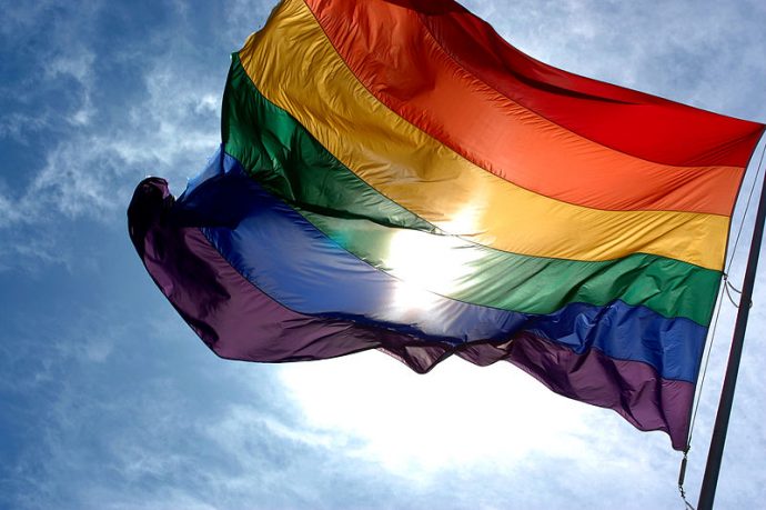
The rainbow flag has been an LGBT symbol since the 1970s when it was created by artist Gilbert Baker. Initially including 8 stripes, the current flag has only 6 stripes, and now represents the LGBT community and a hope for equal rights between all humans. As expected, the IBM logo represents the rainbow flag, but unlike the original one, the new symbol has 8 stripes. Basically, this can be seen as a demonstration of IBM’s efforts “to influence nondiscrimination workplace policies consistent with basic human rights. The logo will be used in conjunction with diversity focused IBM programs and initiatives, and also in our pro-diversity advocacy,” adds McIntyre.
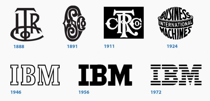
IBM was founded on June, 1911, and was known as Computing-Tabulating-Recording Company (C-T-R). After a few years, in 1924, CTR came to be recognized worldwide as International Business Machines, or IBM. The history of IBM’s logo started when back when it was still CTR, while the symbol that we know today was only designed in 1972 by graphic designer and art director Paul Rand. Along with his team, Rand found out that a company’s success is based on well-designed logo: “The value of the logotype, which is the company’s signature cannot be overestimated,” wrote Paul Rand. After over a decade of hard work, Rand introduced stripes to the IBM logo in an effort to introduce a feeling of movement within the symbol. Since then, the company’s logo hasn’t changed at all.
Until now.

Credits:
