Brand’s image, or signature, is a vital element that can establish a notable identity among consumers. Without a good identity design, the brand would hardly win the loyalty of its customers, nor create a stable relationship with them. However, to find its new voice, the Norwegian eyewear company Kaibosh realized that their current identity was a little inexpressive and approached Swedish design agency Snask that proved to be a perfect fit with their motto to “create new brands and rejuvenate old ones.”
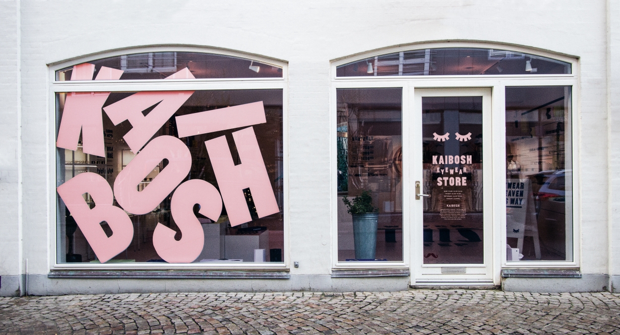
The creative minds of the studio managed to reflect the ’morphogenesis’ of the old shop into a new one with a compilation of beautiful images for the store. This way, the studio gave words a new meaning by turning written letters into soft visual shapes.
A similar idea of words transformed into images was previously presented to us by designer Ji Lee, who launched a book in 2011, named Words as Image, showing how magical the relationship between letters and shapes can be.
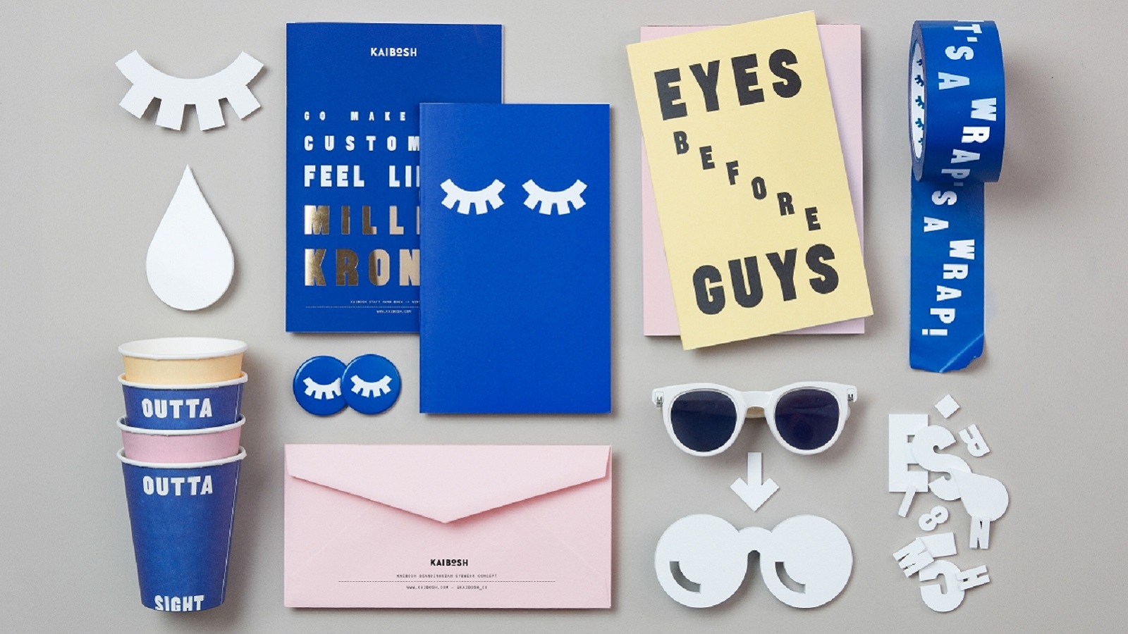
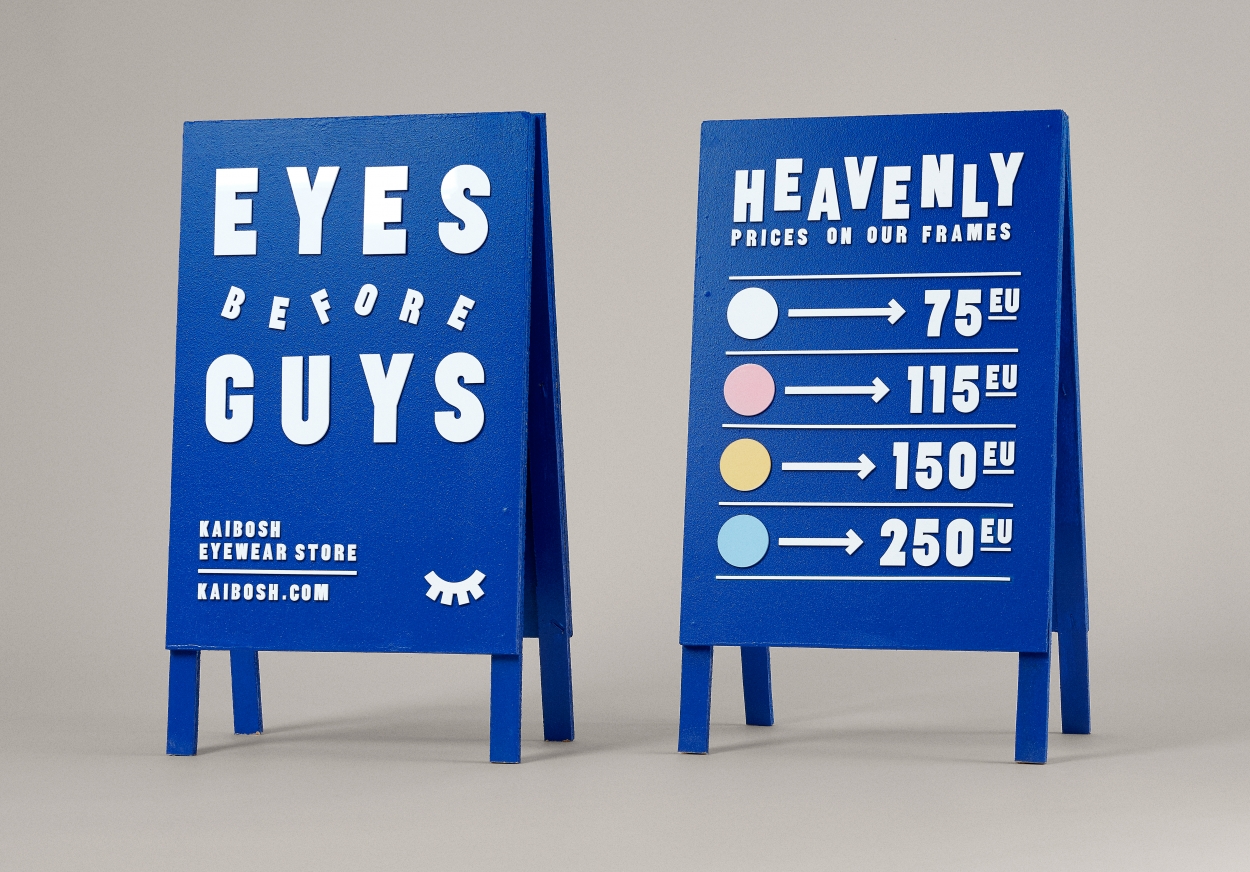
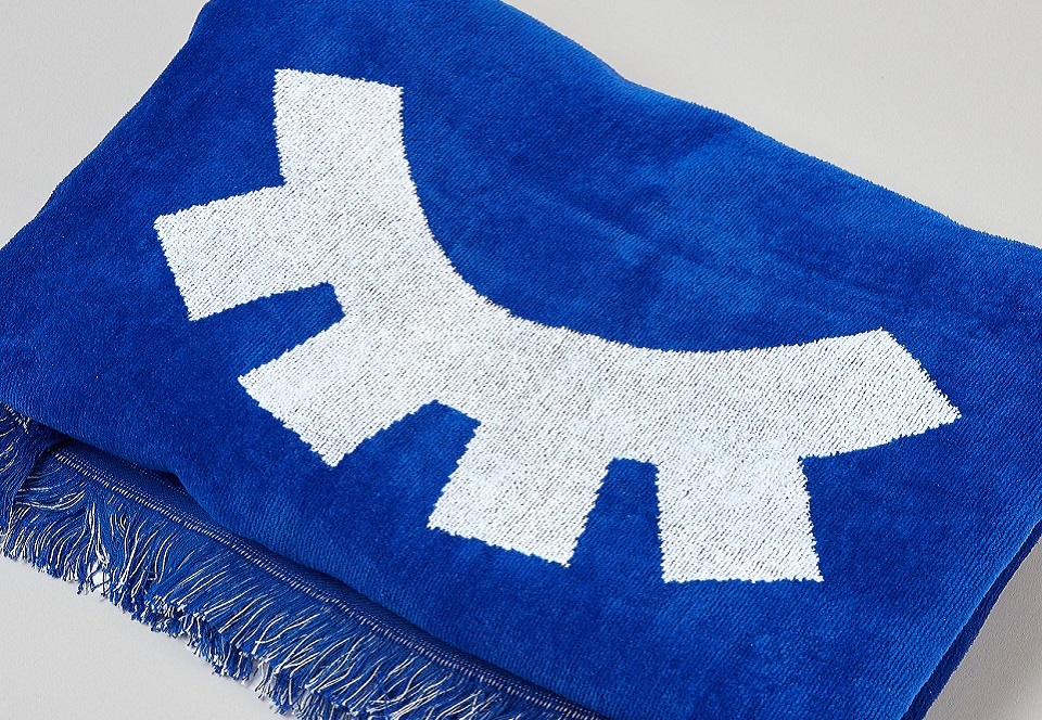
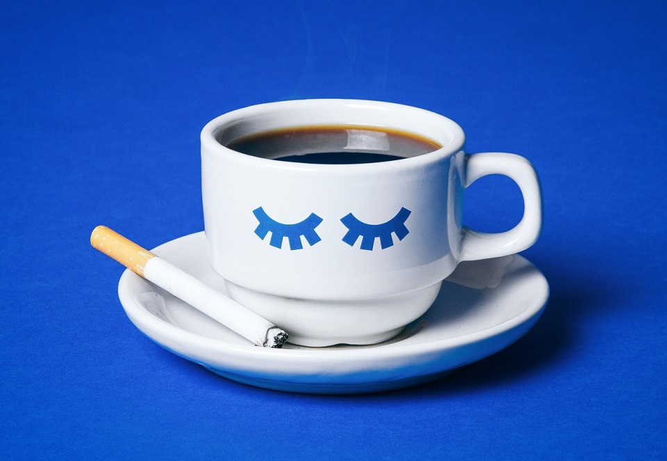
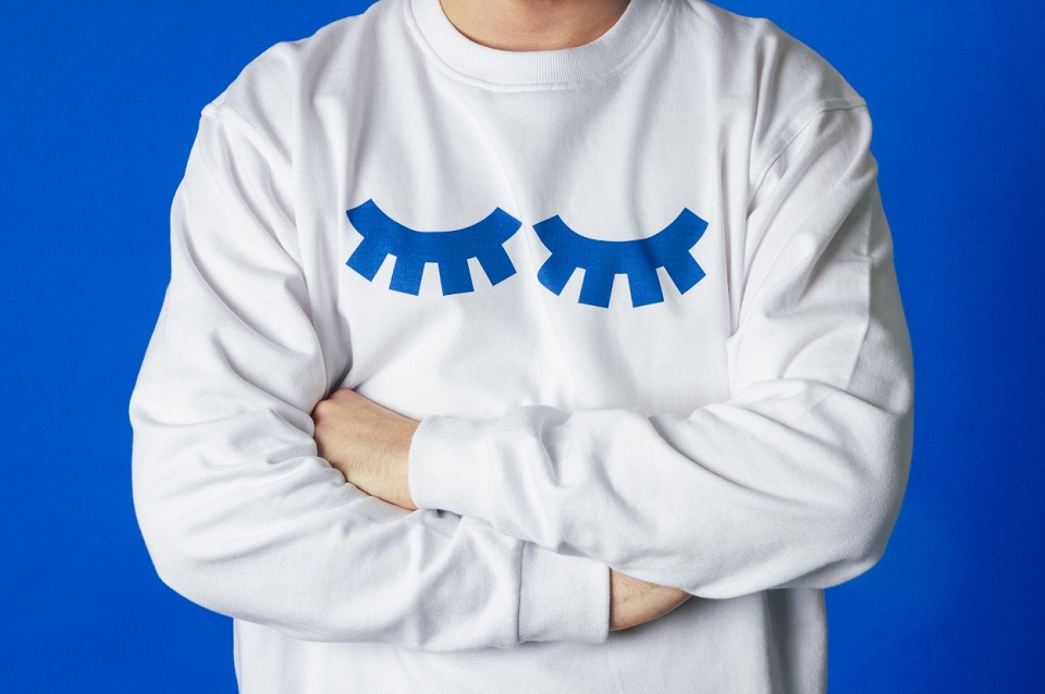
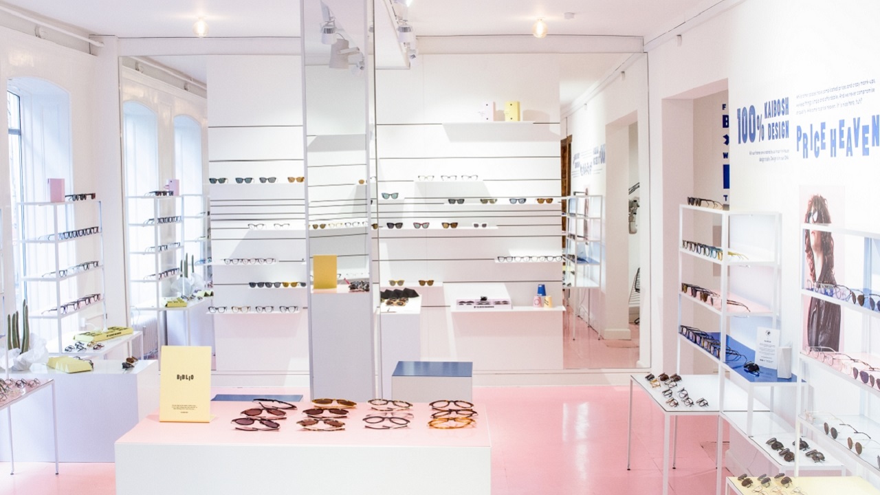
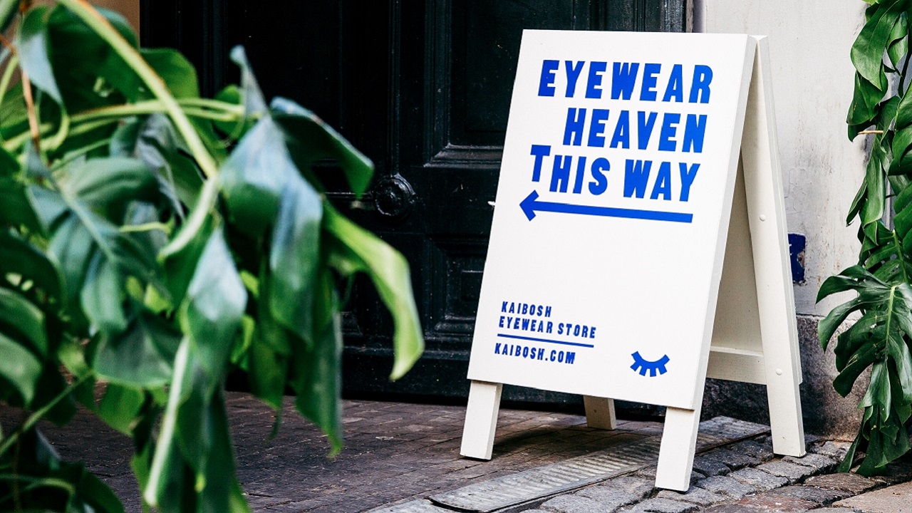
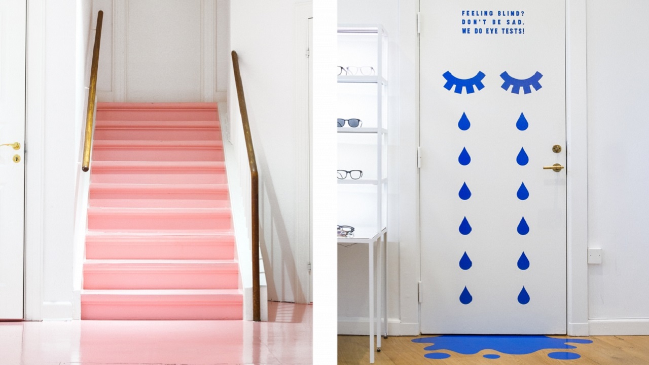
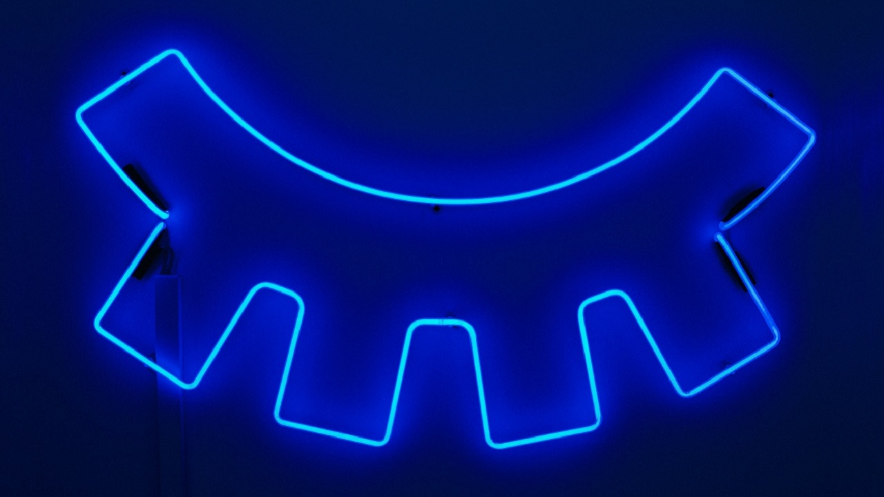
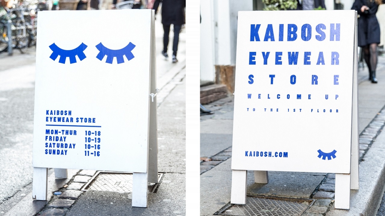
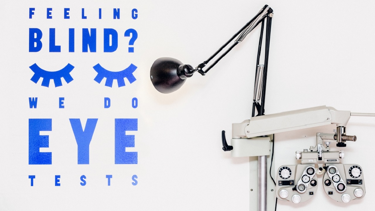
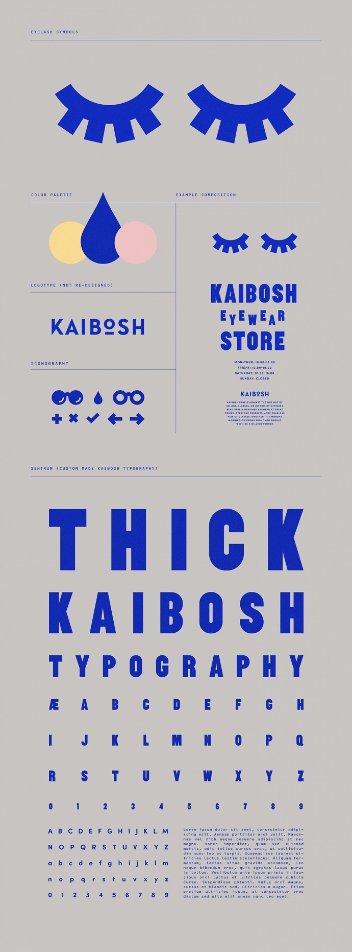
With the intent to build a unique profile for the optic shop among its competitors from the same niche, the Stockholm-based design studio added a number of key elements within their work, including two eyelashes “as a symbol to distinguish the identity as well as use as graphic elements for many different scenarios.” With the studio’s help, the eyewear company has now a new brand image, which can truly describe their real, bold personality.
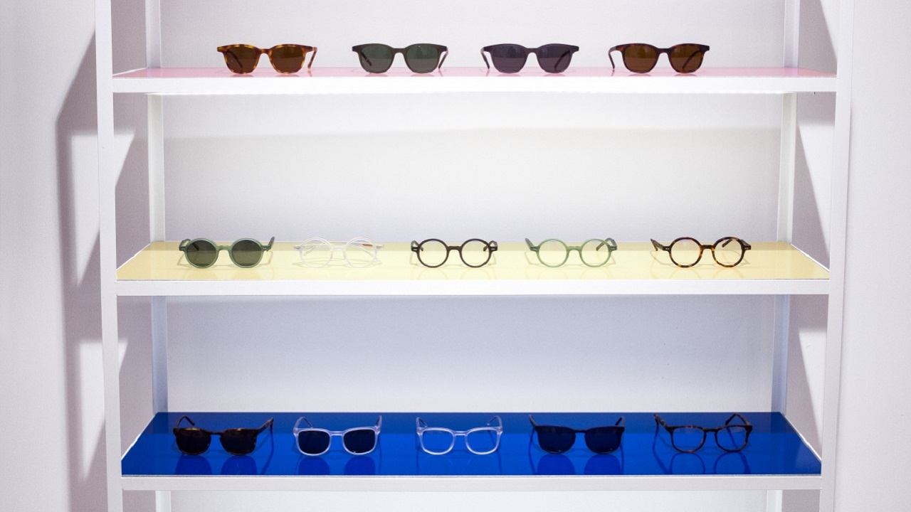
Chasing “unconventional ideas, charming smiles and real emotions,” the studio decided to keep the old logotype, but also introduced new brand features like bags, towels, T-shirts, mugs, packaging, signs, ads, posters, and even recreate the aspect of the store.
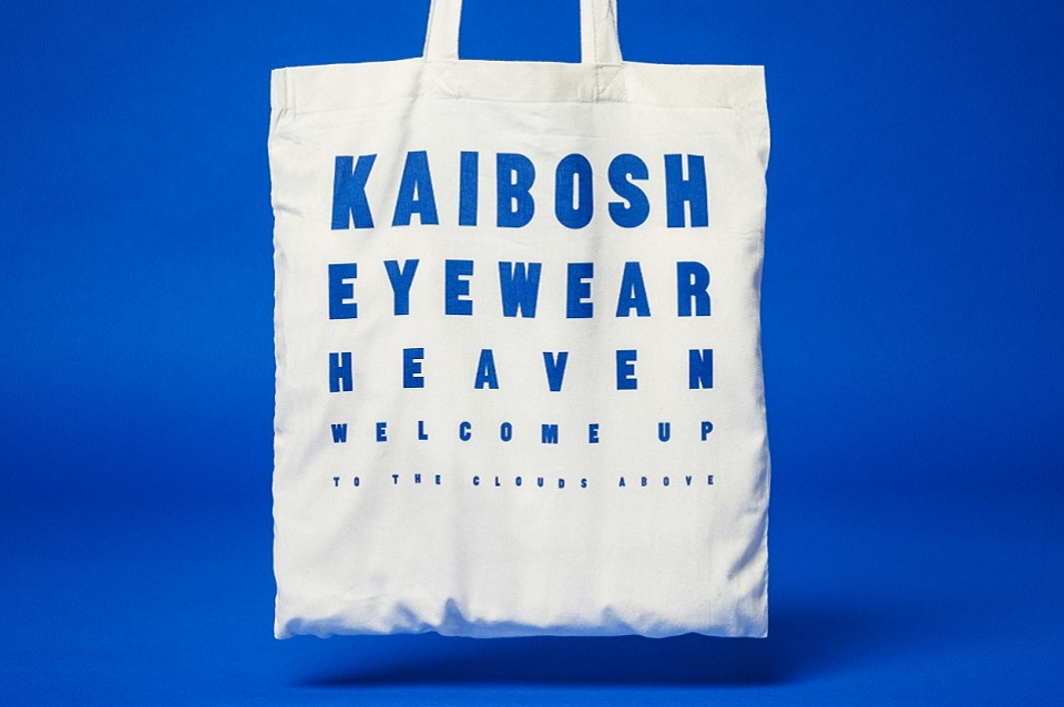
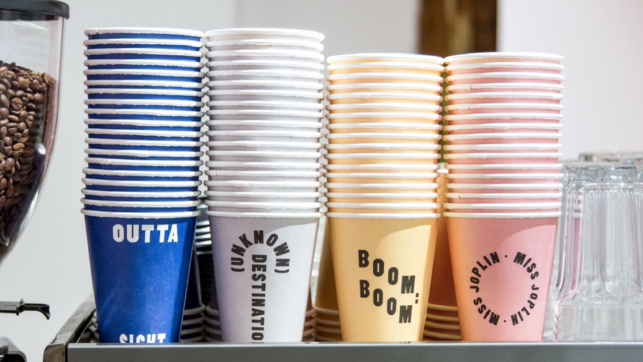
“We got contacted by the Norwegian eyewear company Kaibosh. […] They felt their identity was too clean and they wanted to be more expressive and outgoing,” Snask explains on their website. Speaking further about the process of reinventing the Kaibosh brand, the creative design studio said: “We started out writing their brand platform and tonality where they would use much more copywriting in their communication, from promotion material to walls in their stores.”
A similar call was made by the news portal Indiatimes, when the overload information pushed the readers to go to its competitors, so a good way to reinvent the website was needed. With a new Identity, the news portal gained the status of the largest social publisher on Facebook globally, in December 2016. Let’s see if the eyelashes will be so successful for the Norwegian brand. Let us know in the comments which campaign you like better.
Credits:
Client: Kaibosh
Design Studio: Snask