Their exotic spirit and culture combined with a colorful lifestyle highlights Brazil as a sophisticated nation, especially when it comes to Rio de Janeiro’s residents who seem to be fueled by the warm rays of sunshine. The second-most populous municipality in Brazil, known for its wonderful beaches and cheerful residents, stands as a source of inspiration for a soft drink that refreshes even the most hot-blooded spirits of the tropical city.
Originally founded in the mid-1980s, the tropical fruit juice brand Rio embraced the residents’ typical characteristics by introducing a soft drink with a strong, and fruity tropical flavor. Although it delighted the taste buds of the most demanding consumers at a time when only the rich could afford to travel to such exotic places, today the fruity balanced beverage is available to everyone. Yet considering that its visual identity hasn’t changed in the last 30 years, the design of the soft drink, which claims to be a part of Brazil’s DNA, may have become outdated.
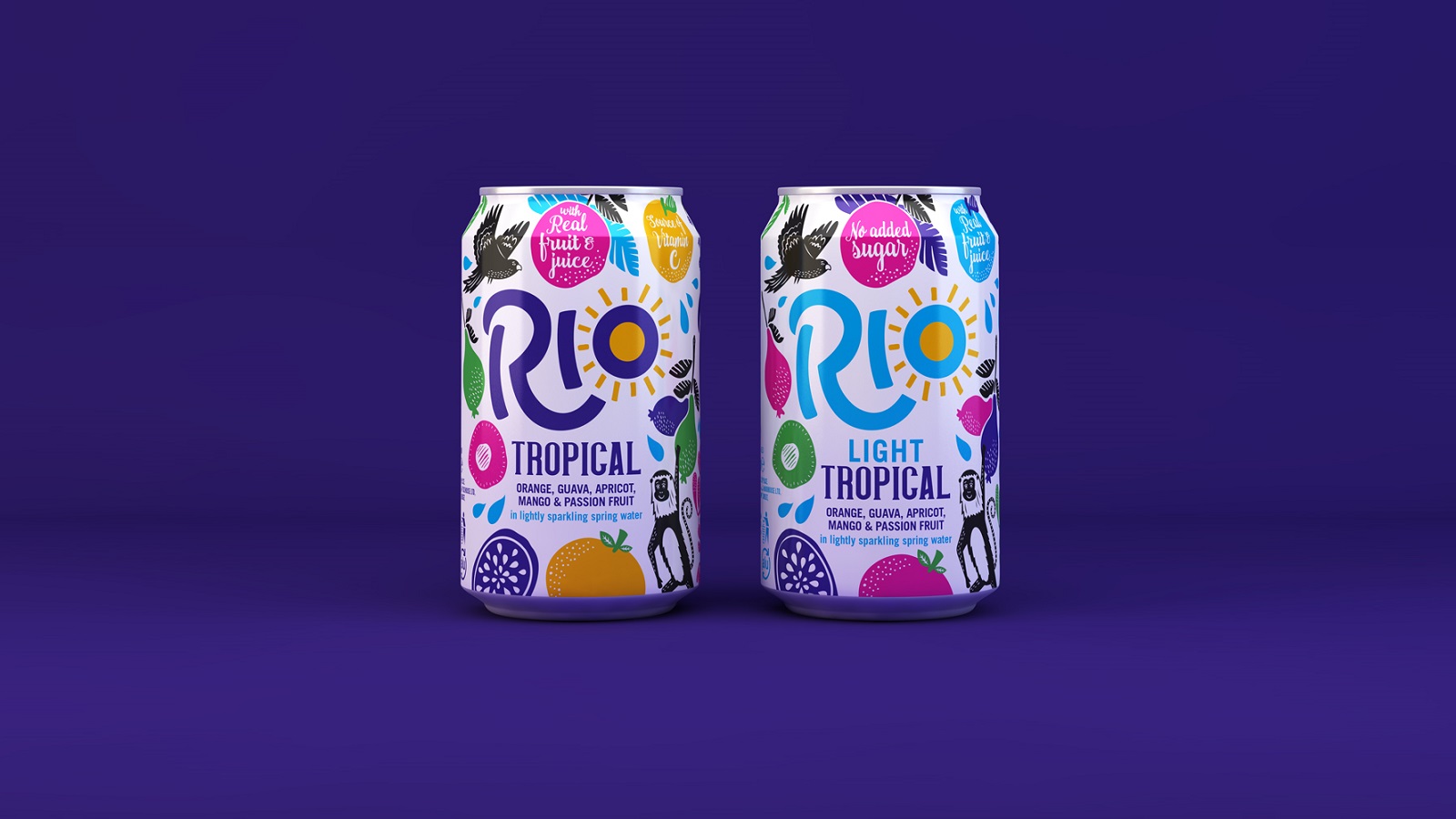
Enter the creative agency with a central philosophy of bringing their experience and talent in to reinvent a brand, Pearlfisher. To maintain the beverage brand‘s vivid identity, while also targeting the youngsters who are eager to quench their thirst, Pearlfisher was assigned to redesign the visual identity of the drink. Featuring a cheerful signature, Rio’s new identity floods the consumers with a perfect dose of vivid colors and tasty flavors, celebrating the power of the sun.
Yael Alaton, Strategy Director at Pearlfisher, explained they used this as a strategy to highlight the balanced and healthy side of the beverage: “In considering the role that Rio plays in the life of its consumer – a younger, down-to-earth demographic with a balanced approach to health – we have identified a chance for Rio to own a ‘feel-good moment’ in a day and a set of brand principles inspired by a central strategic vision: ‘Celebrating the Sunny’.
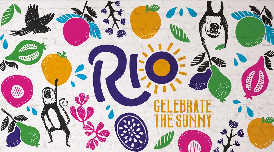
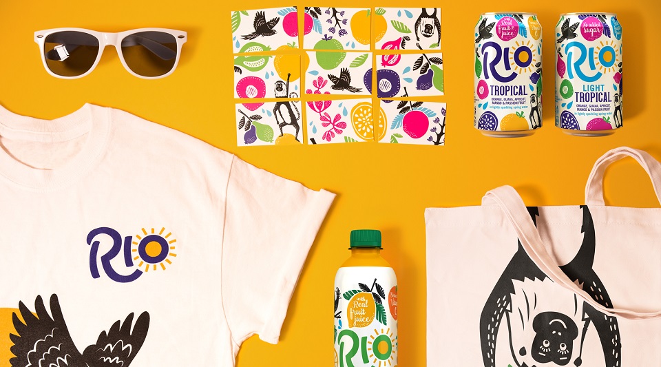
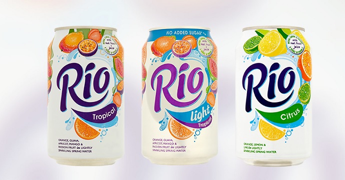
The new vibrant image encapsulates the key features that make the South American country so distinctive: sweet fruits, colorful flowers, exotic animals, and even a sun strategically placed over the ‘O’ in ‘Rio’, strengthening the personality of the refreshing soft drink. Also, to make the brand/customer relationship even stronger, a visual voice was given to the brand, which is now heard across the company’s social media pages.
Speaking about the reinvented identity of the two Rio variants – Tropical and Tropical Light – Brand Manager of Rio, Danielle Obbard, declared: “Pearlfisher’s designs champion the quality of Rio’s ingredients of real fruit and lightly sparkling spring water while celebrating the unique vibrancy of its taste and embodying our brand belief of Celebrating the Sunny. The re-brand will allow us to carve out an ownable, distinctive space in a rapidly evolving category.” Will you have a sip of the sun?

Credits:
Client: Rio
Agency: Pearlfisher
Founding Partner and Chief Creative Officer: Jonathan Ford, Pearlfisher
Strategy Director: Yael Alaton, Pearlfisher
Strategist: Molly Rowan-Hamilton, Pearlfisher
Design Director: Poppy Stedman, Pearlfisher
Senior Designer: Lucy Roberts, Pearlfisher
Designer: Charlie Garrod, Pearlfisher