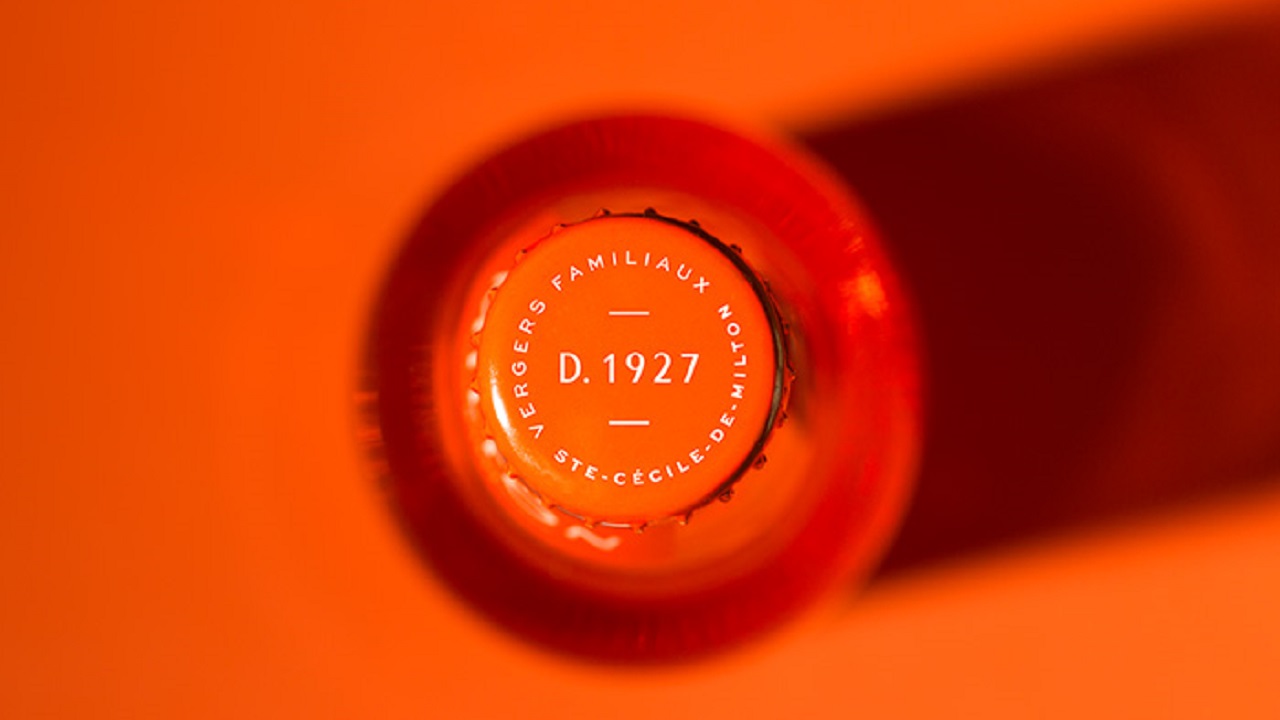
The nutrient-rich soil in Sainte-Cécile-de-Milton, Québec, is exactly what apples need to reach a fresh and healthy maturity. In 1927, these lands welcomed the Lasnier family who started cultivating the delicious fruits. In 1987, after modernizing the orchard, the small business Les Vergers de la Colline is born, and it becomes the region’s much-appreciated supplier of apples and other apple-derived products.
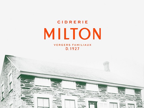
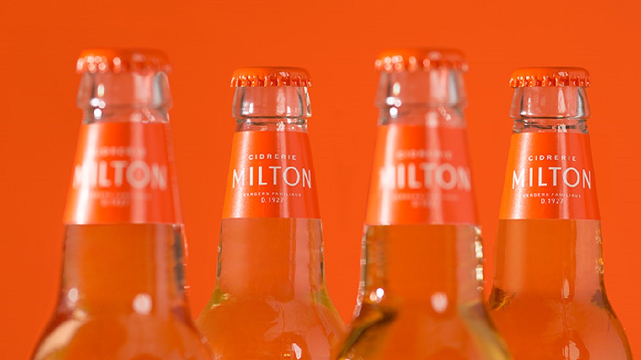
Twenty-four years ago, in 1993, the company decided to turn apples into cider, an action that prompted the business’ officials come up with a new name. In 2015, the cidery changed it to Cidrerie Milton. The desire to constantly improve their services made the company approach lg2 agency to identify a creative way to boost the cidery’s visual identity among their target audience.
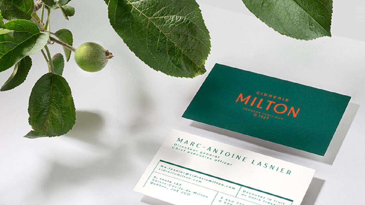
The fully integrated agency, which finds “original, engaging ideas that are purpose-built for the most relevant channels,” introduced a new identity for the Canadian producer, which can be found across logo, print, and typography. To strengthen the brand’s relationship with its clients even more, the creatives also thought of a bold packaging design for one of the company’s tasty drinks, Cid.
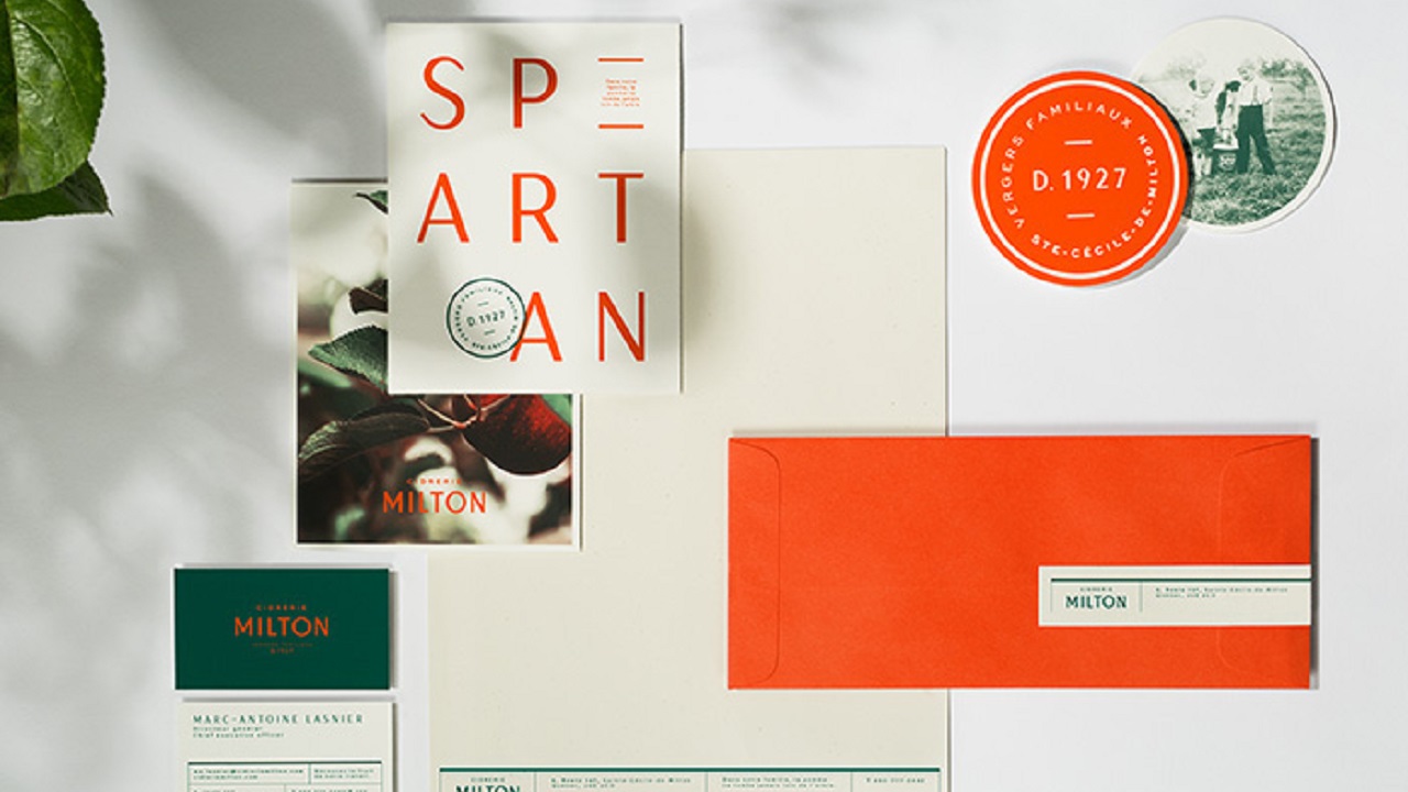
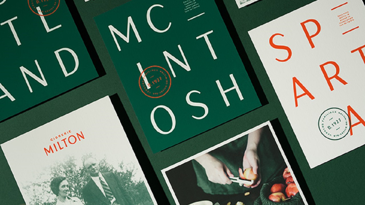
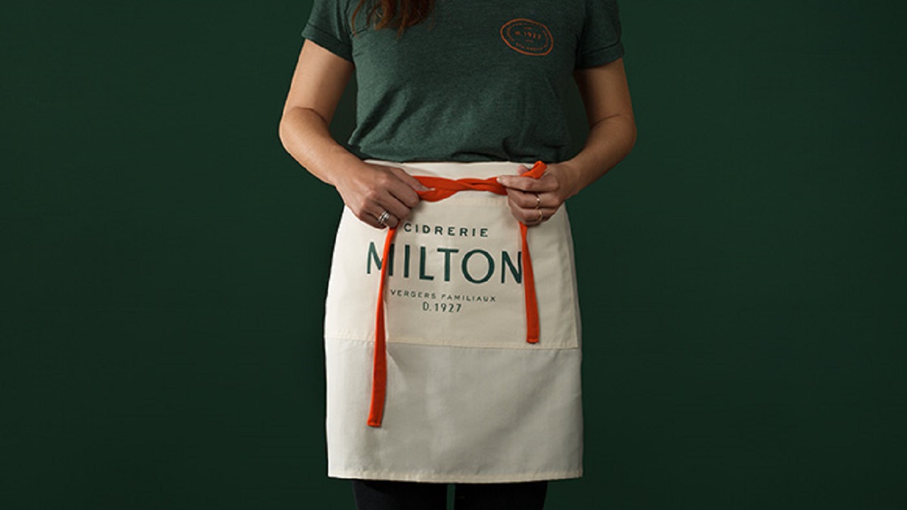
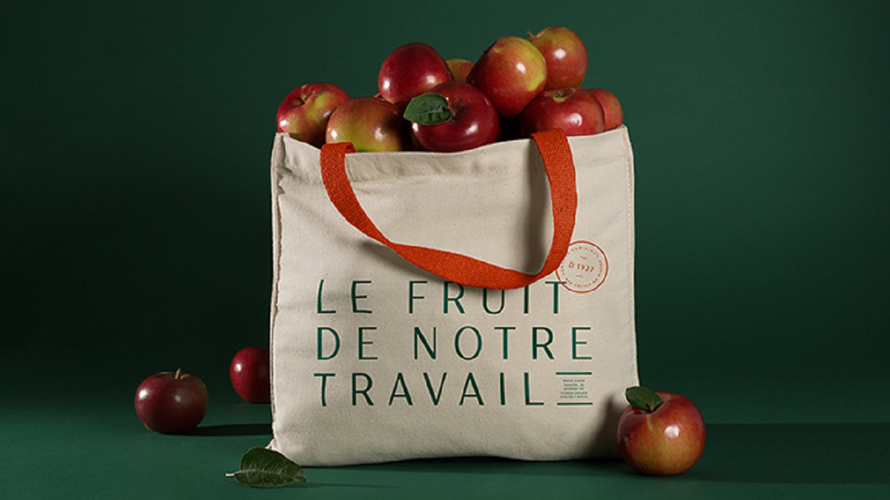
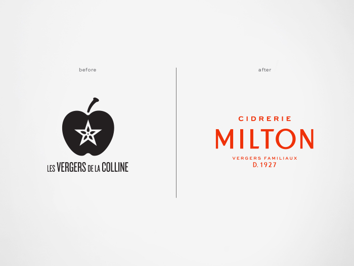
In terms of identity, the team chose to reflect the spirit of the cider-maker through vivid and natural colors. The naturalness of the raw material was the specific feature that pushed the agency to use a mix of green and orange. These distinctive shades reflect not only the fruits’ sweetness but they also mirror the company’s long history, while simultaneously protecting its rustic heritage and personality.
Marc-Antoine Lasnier, the cidery’s General Manager says the new identity reflects both the smallest details and the unique things that make the company shine within the industry: “For 90 years, our family has shared a passion and know-how for apple-based products. This new identity, which is at the heart of our business strategy, better represents who we have become over this time: an innovative, expert, authentic, and bold company that is above all motived by the exceptional quality of its products.”
Even the appearance of the logo has undergone major changes. The old emblem, which embodied a black apple with a white star centered in its middle, was re-developed to a more up-to-date one. Although simple, the recently-updated symbol depicts the company’s name written in an elegant font that communicates the premium beverages offered by the Québec-based cider house in a graceful and stylish manner.
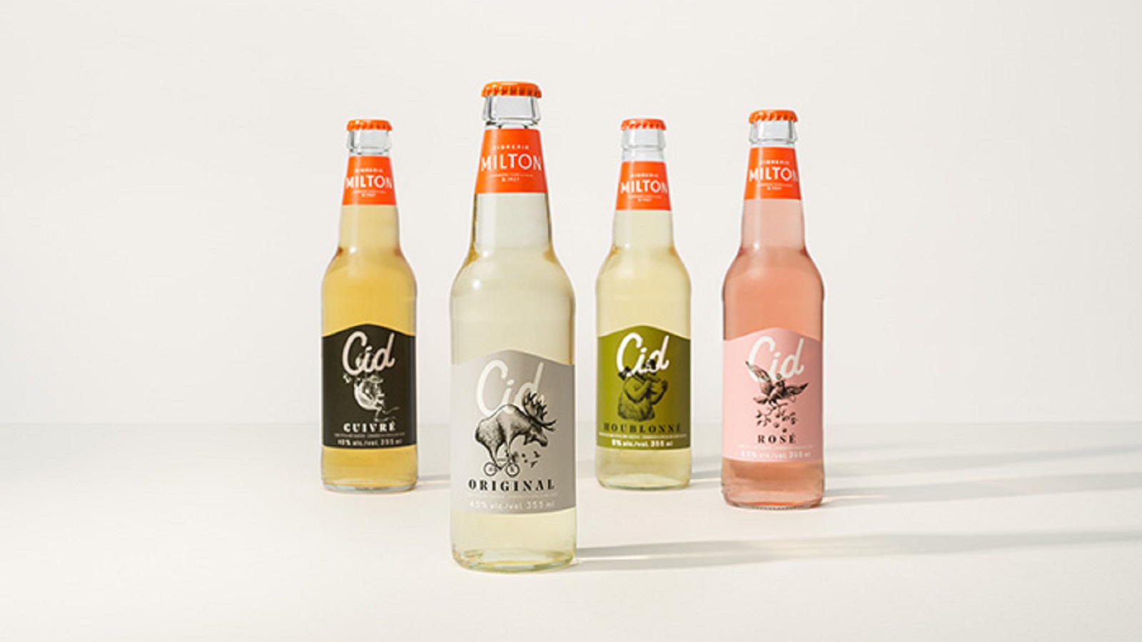
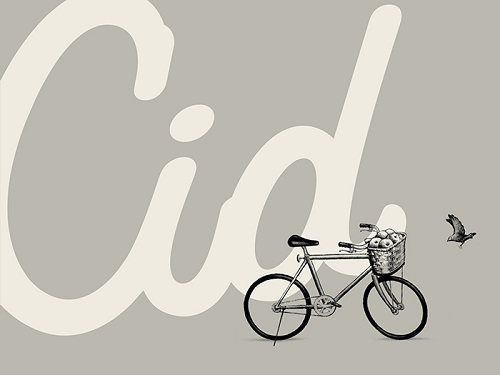
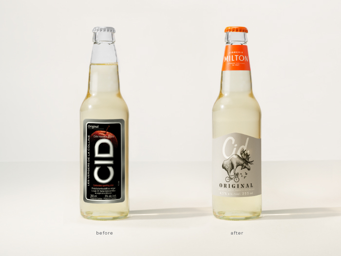
As for Cid’s packaging design, the Montréal-based agency has opted for an approach that blends some classical attributes with rather witty ones. While the text printed on the bottles’ labels and stoppers carries the family’s tag-line, the playful dose is introduced by illustrations that depict weird animals doing random stuff, while each of them represents the company’s brewing range of ciders.
“For Cid, we created a style that manages to be both classic and fun. […] Again, tribute was paid to the company’s boldness while effectively speaking to a younger target,” proclaims David Kessous, Creative Director for Design at lg2.
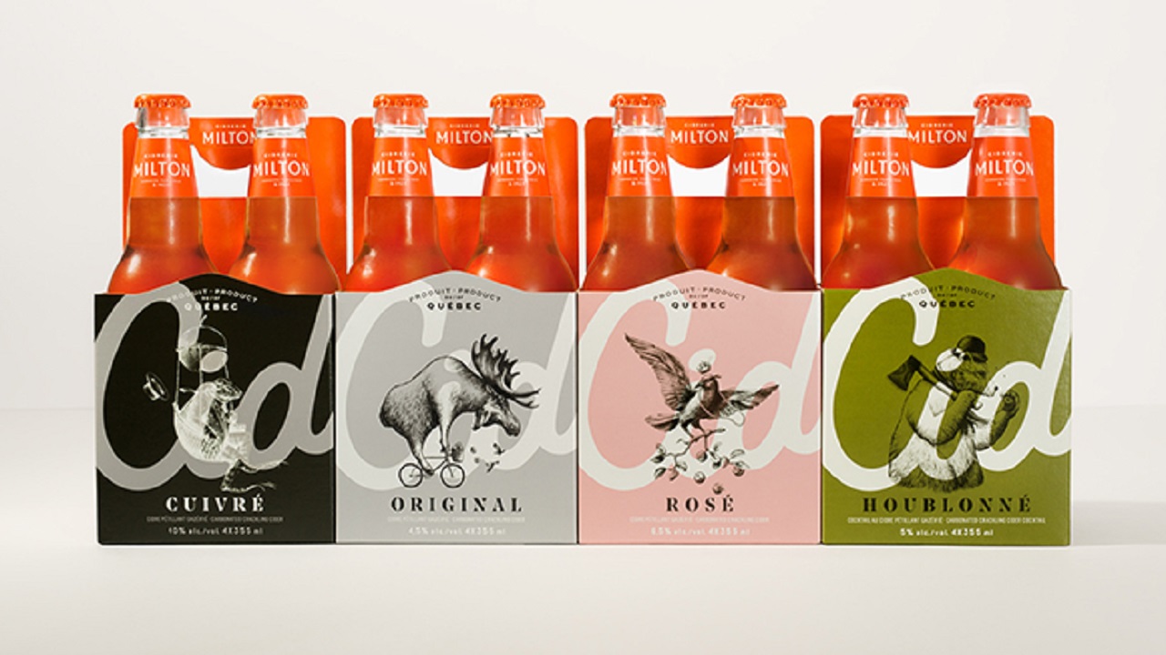
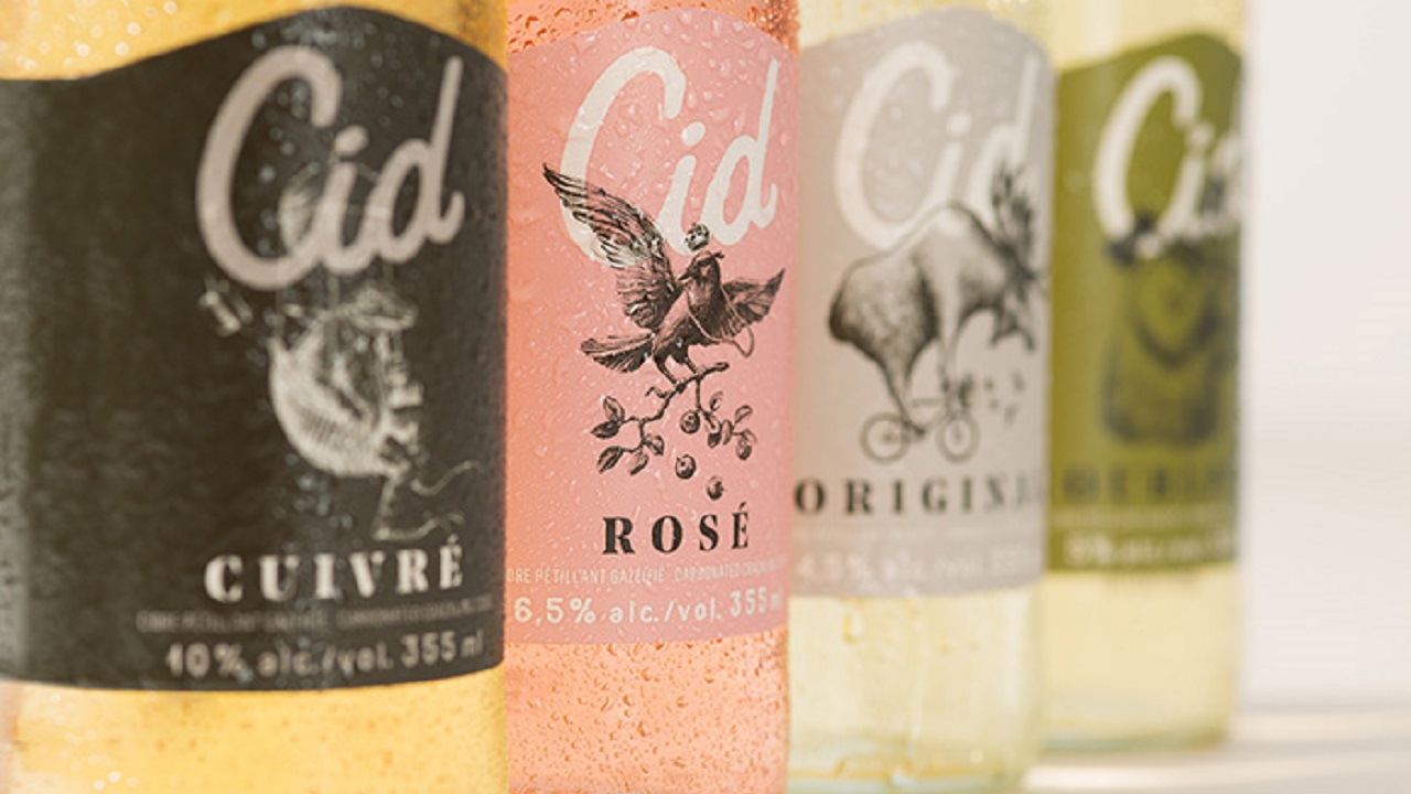
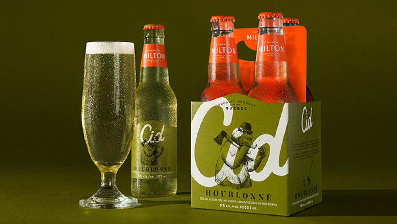
Compared to the previous bottle design, which expressed a monotonous-like action, the new version is more suitable for recreational times. Whilst the ‘past’ label used a black and gray background that displayed a half apple hidden behind the beverage’s name, the redesigned one shares cheerful colors and personified animals, tempting anyone to quench their thirst with a fresh sip of the savory drink.
Credits:
Client: Cidrerie Milton (Marc-Antoine Lasnier and Stéphanie Arès)
Agency: lg2
Creative direction: David Kessous
Creative: Sophie Valentine
Strategic planning: Pénélope Fournier, Marc-André Fafard
Account services: Ingrid Roussel, Marion Haimon
Illustration: Marc Tellier
Graphic production, print: Julie Hotte
Image editing: Joanie Évrard and Frédéric St-Denis
Production management, print: Geneviève Demers