The Armani family has under its umbrella 10 different labels of sub-brands that are visually connected to the public. Perhaps the best-known brands are Giorgio Armani, a premium and sober fashion line dedicated to both women and men, Emporio Armani, the second brand of Armani labels that embraces a modern note, and Armani Exchange, bearing a fashion statement inspired by street-chic culture and dance music; with the latter also considered to be the most affordable label of the luxury brand.
And it’s Armani Exchange that has drawn our attention in particular. With a strong presence of over 25 years in the fashion industry, Armani Exchange has had plenty of time to craft a strong visual identity that makes the public recognize the brand even when they get just a short glance at its logo.
However, the company wants to be seen through the new eyes of younger audiences. To do so, the brand teamed up with Anagrama Studio in order to identify a new visual personality that would speak the youths’ language. Passionate about design and with a well-developed sense of aesthetics, the studio identified a new visual strategy that emphasizes, improves, and reinforces the brand’s relationship with its young customers.
Joining forces and ideas with the brand’s internal strategy department, the Mexico City-based studio started its creative process by changing the brand’s most powerful visual element: its logo.
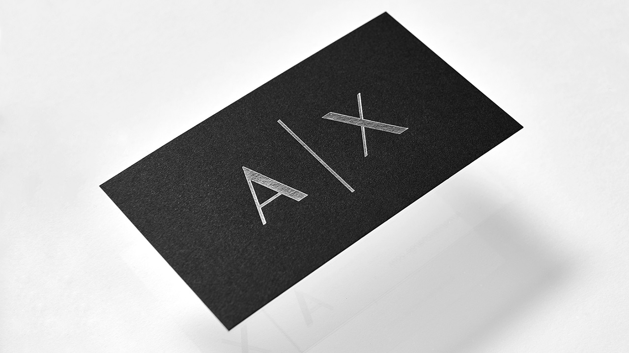
New appearance of the well-known symbol seems to keep the same overall aesthetics and clearly, there’s not much of a difference between the ‘before and after’ look. At a closer glance though, one can notice that, compared to the old logo, the most recent one embraces a more modern aspect and is ‘more readable,’ according to the agency.
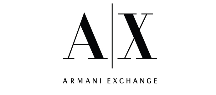
Known by its A|X acronym, Armani Exchange marked its brand presence within the fashion industry through its classic typographic style. Moving our gaze to the new brand signature, one can notice that the artists made a slight change in terms of typography, replacing the old typeface with a more youthful one.
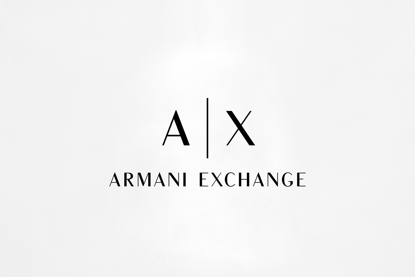
The contrast of the logo is contoured by small – yet quite visible – aesthetic differences. In some places the lines are thicker, while in others, the approach follows thinner lines, delivering a similar elegant style inherited from its visual ancestor.

But unlike the bold aesthetic spirit of the previous emblem, the current one does look cleaner. By opening up the spacing between the symbols, the creatives transformed the logo into a minimalist one, which, with its simplicity, embraces a sophisticated design that mirrors the brand’s core values.
The fresh visual signature doesn’t alter the brand’s personality too much. In fact, it proves that the company is committed to delivering the same top-quality products that transform the usual shopping experience into a more comfortable, relaxing, and pleasant one.
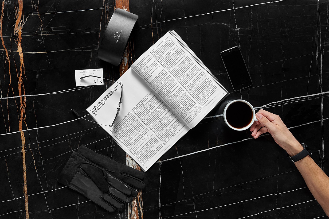
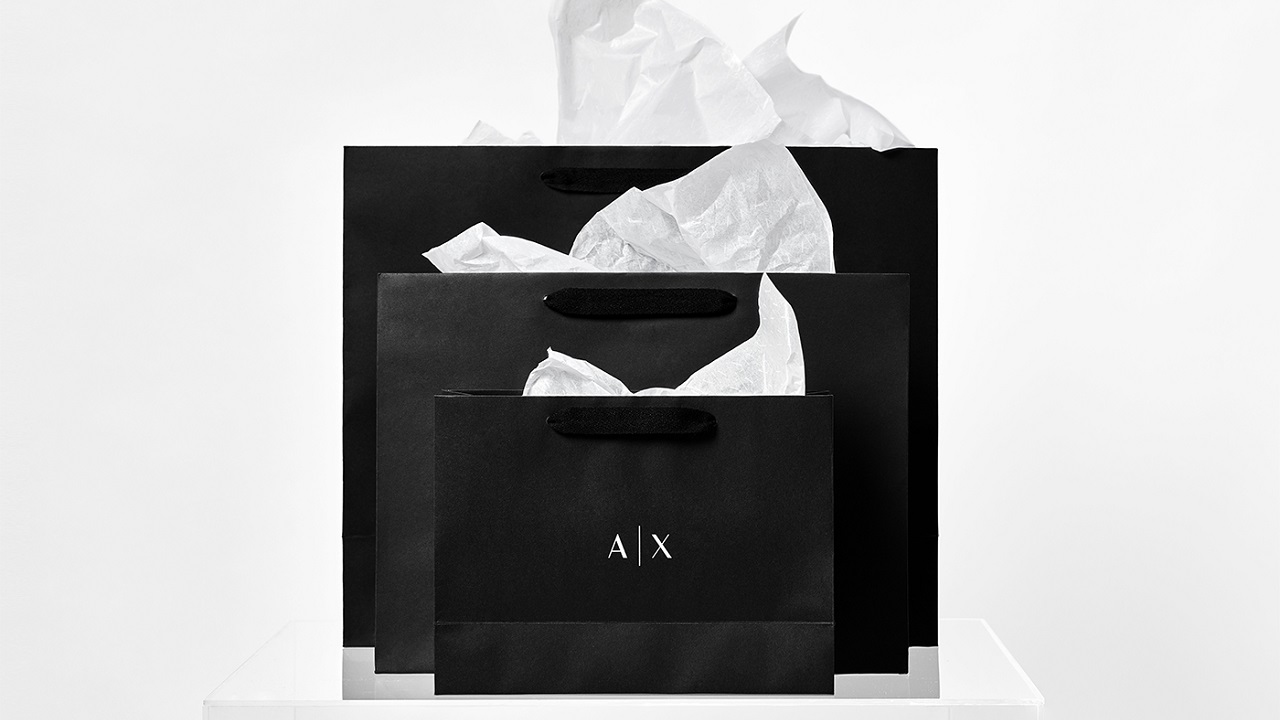
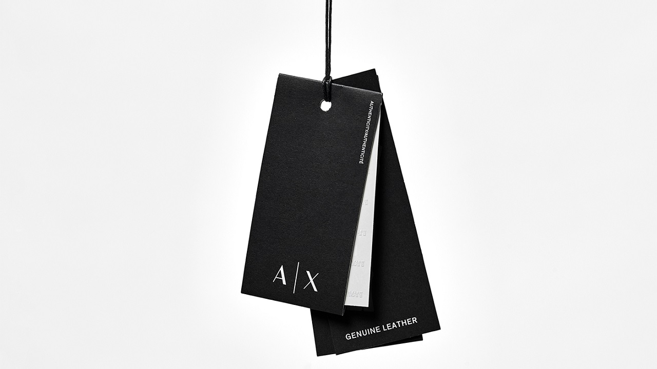
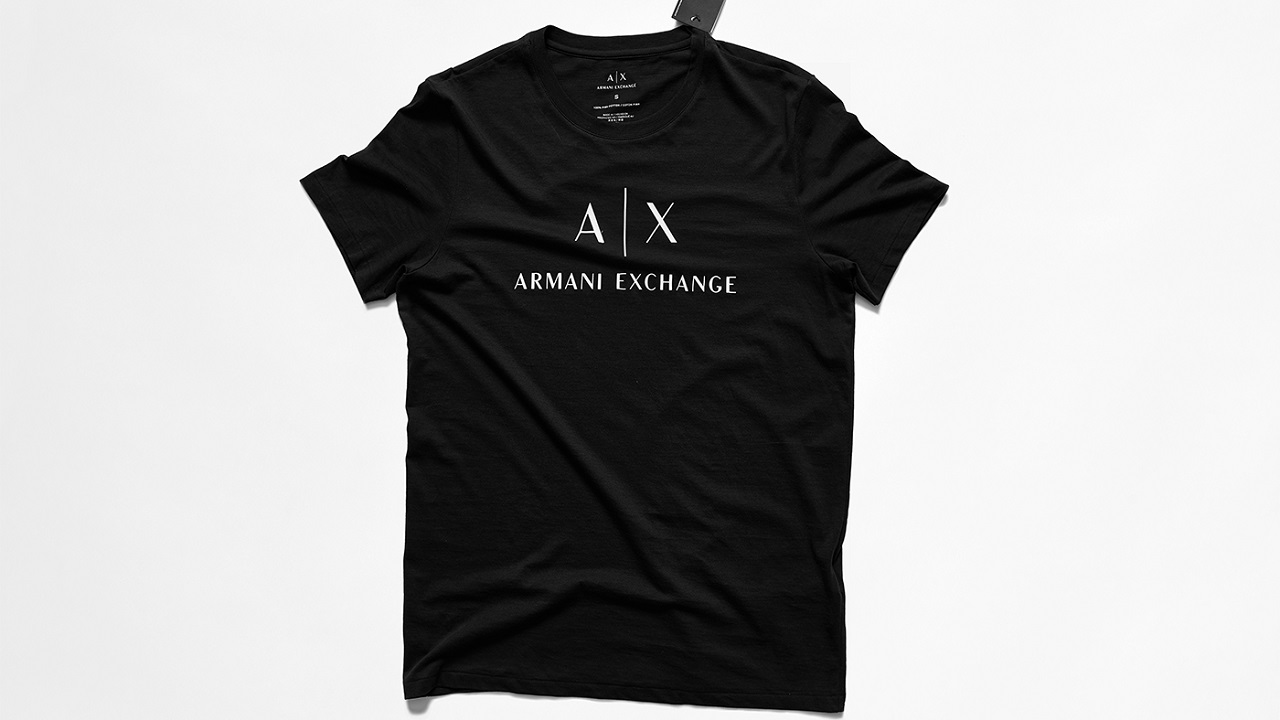
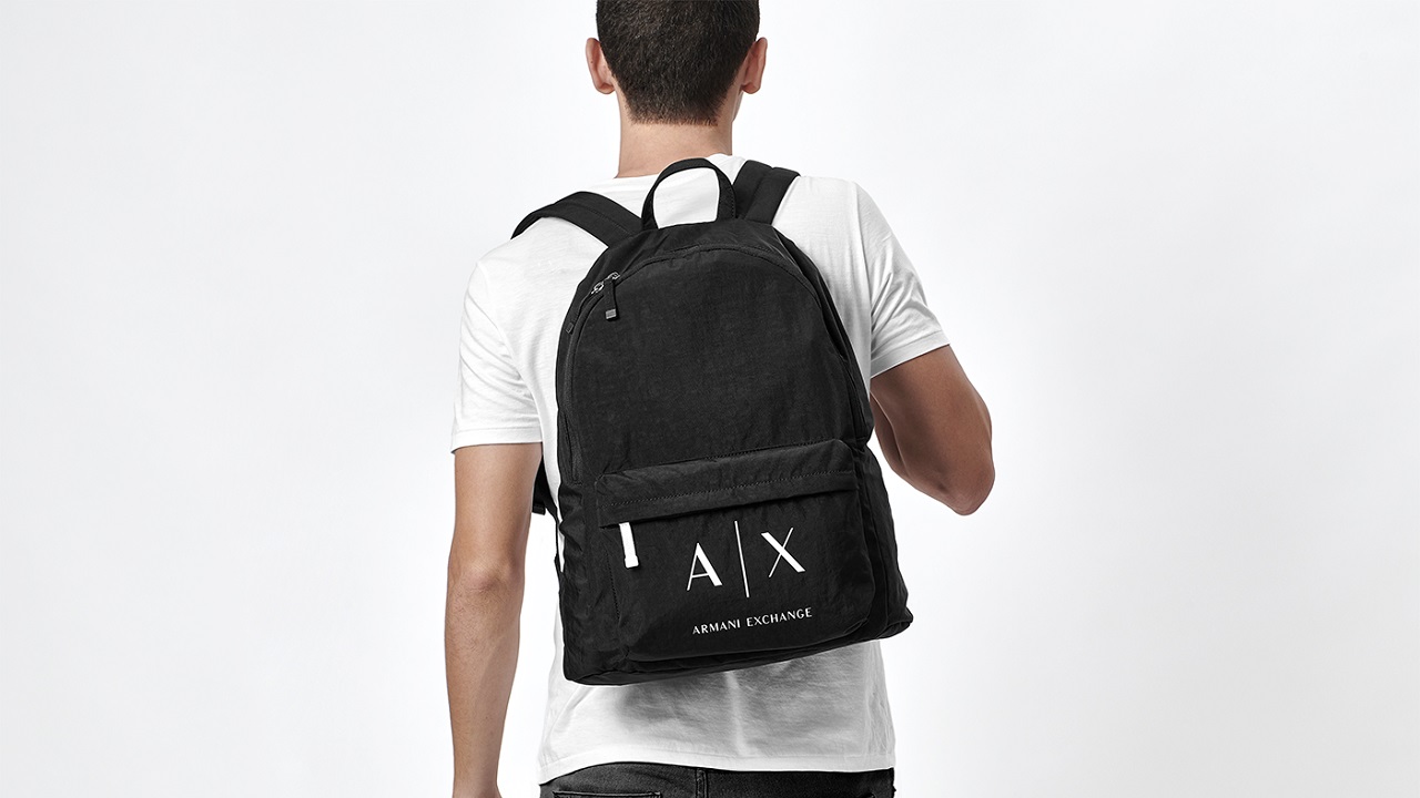
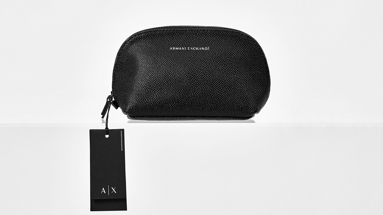
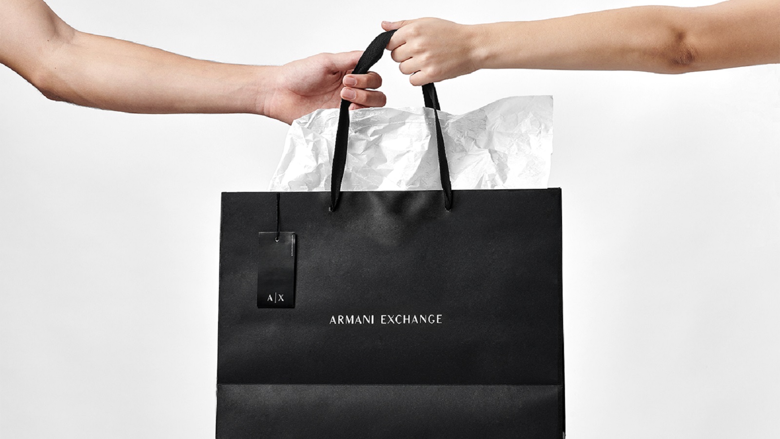
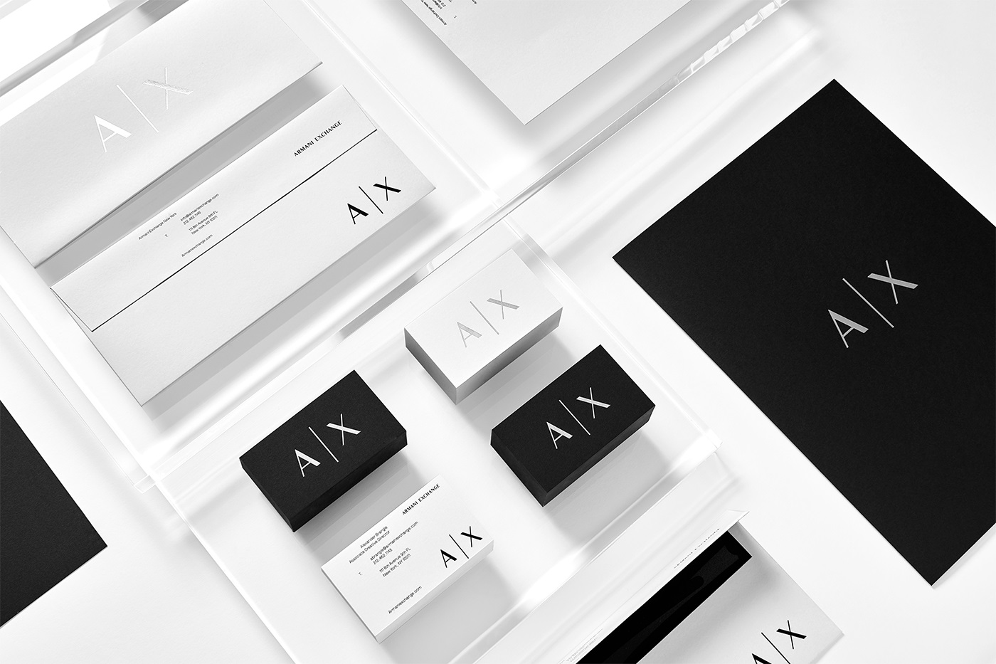
Speaking of which, to allow consumers to immerse themselves in a complete Armani shopping experience, the artists printed the new logo on packaging, labels, and business cards. Moreover, the elegant pattern is proudly worn by a series of garments, thus enabling fashion-addicted consumers to be part of the brand’s premium personality.
“Our solution included a strategy of arranged typographical adjustments that work in diverse brand applications including packaging and stationery,” said the artists on the studio’s Instagram account.