Dried fruits and vegetables are a Vietnamese thing. Really! They usually get served around the Lunar New Year, also known as ‘Tết.’ This is the time when locals and visitors are greeted with an explosion of colors and delicious candies which indulge all of one’s senses. The tasty snacks have gradually become part of the locals’ DNA. They are believed to bring good luck and are considered to be a great gift for either a local or even a tourist.
Inspired by this lovely tradition, young artist Anh Nghiet Nguyen created a visual signature for a local candied fruit brand, Nhà. The brand’s name stands for “Home” in Vietnamese. It pushed the designer to englobe a series of traditional motifs within the packaging design only to make locals feel more like home wherever they are.
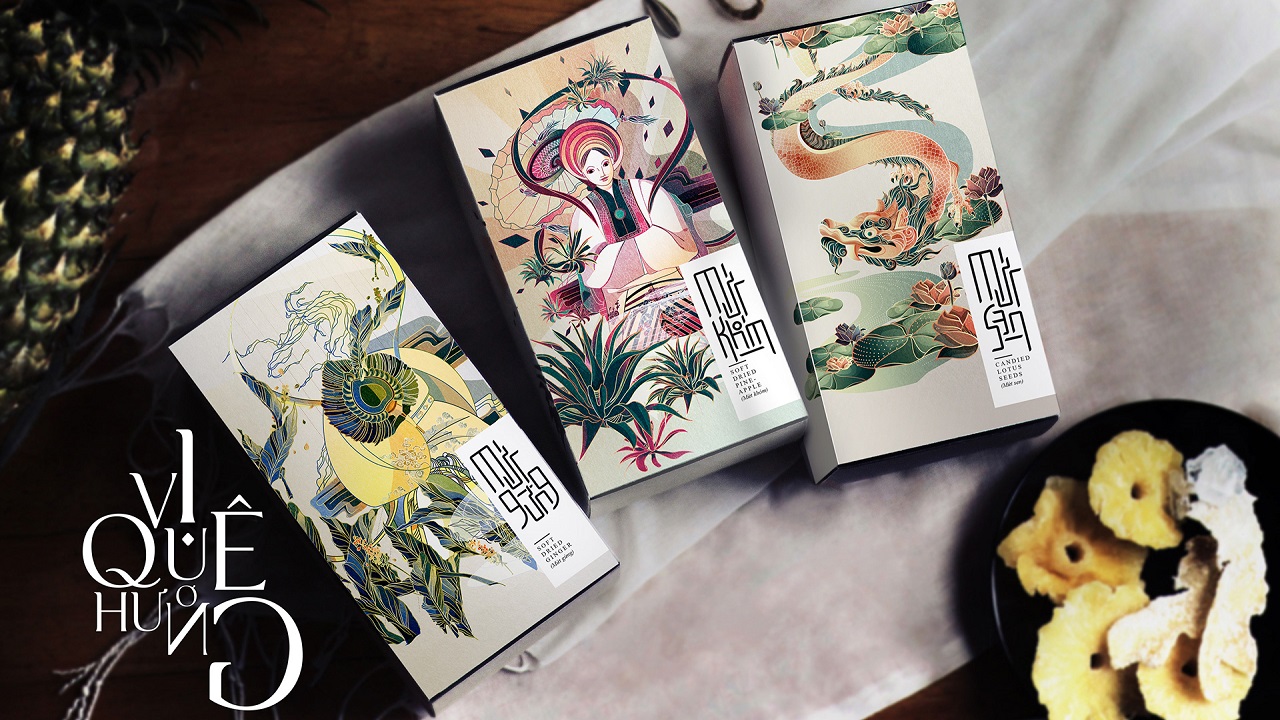
The Vietnamese mythology plays the main motif in these illustrations, the pack of each product being embellished with an image of one of the gods that take care of nature and bring a state of well-being into the locals’ lives. The product range includes Mứt Gừng – Soft dried Ginger, Mứt Khóm (Dứa) – Soft dried Pineapple, and Mứt Sen – Candied Lotus Seeds. Each product is dedicated to an image of either the God of Rain, the God of Sun, or the God of Wind.
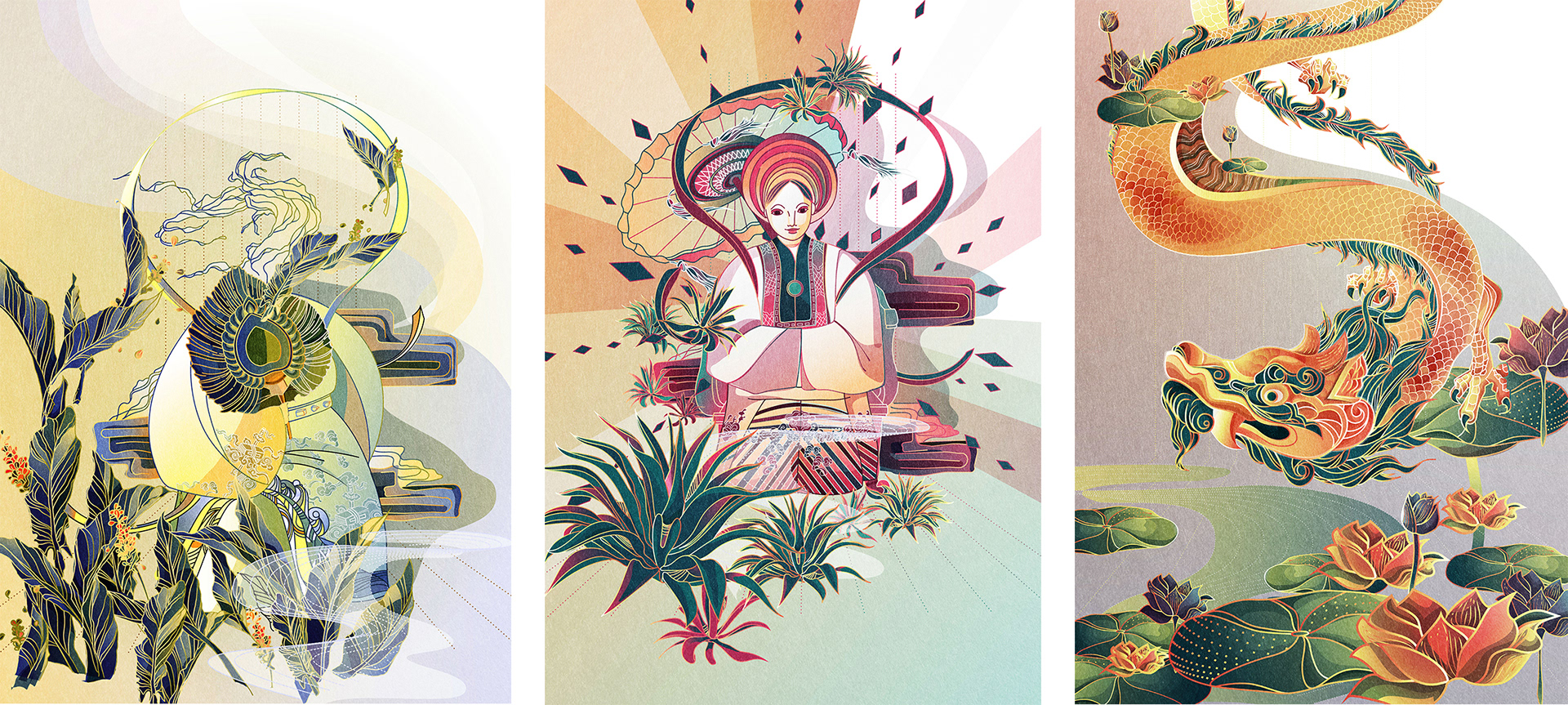
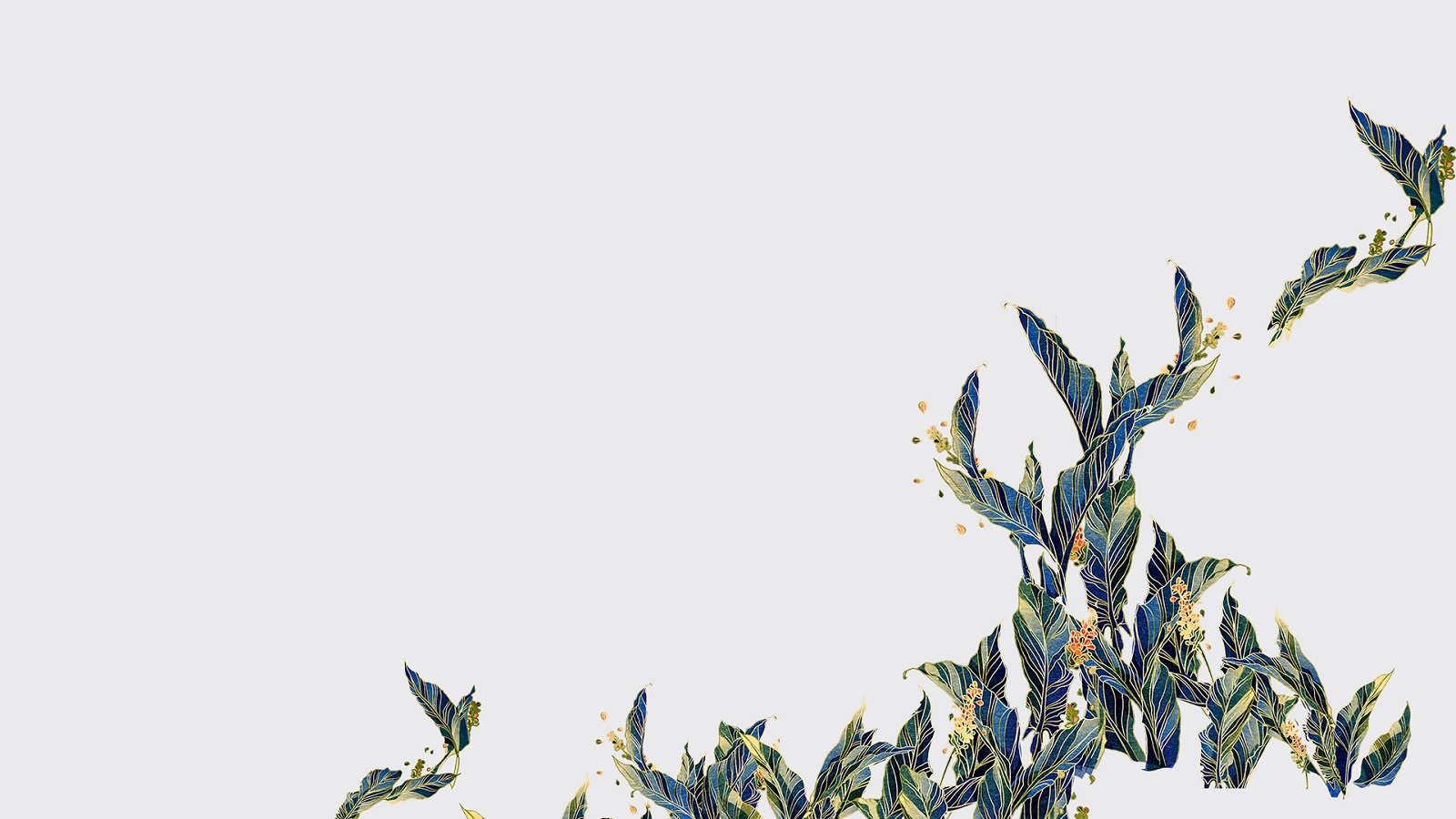
To contour the deities, the artist used smooth lines, pale shades, strong colors, and fine details, while making a complex background. Using a trick to fool the eye, the visual assembly seems to be dynamic, mainly because of the energetic line work that follows the trajectory of the curved elements. As a result, the whole visual ‘collage’ gives the impression that the structure is in motion.
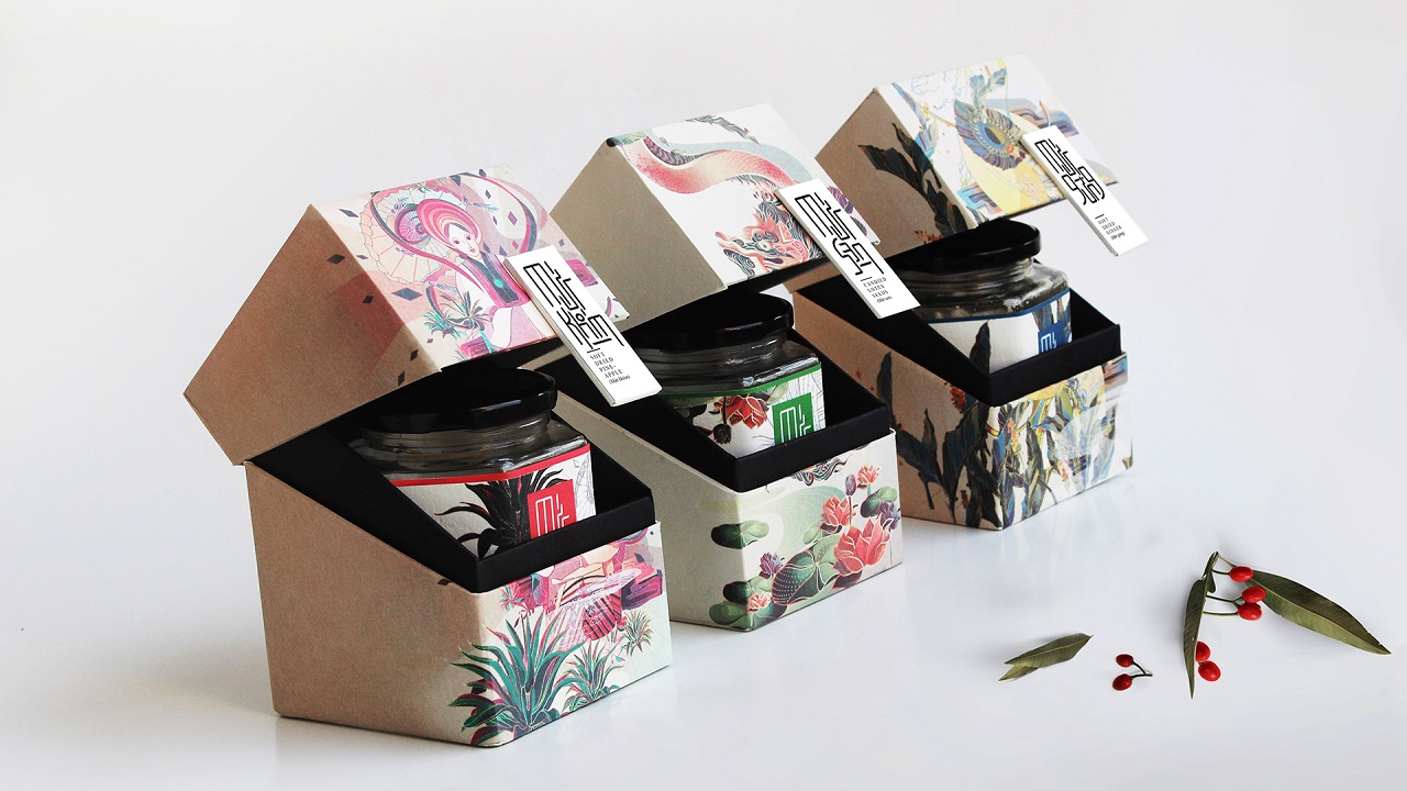
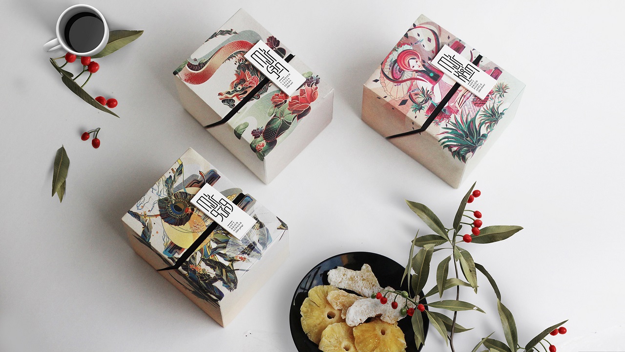
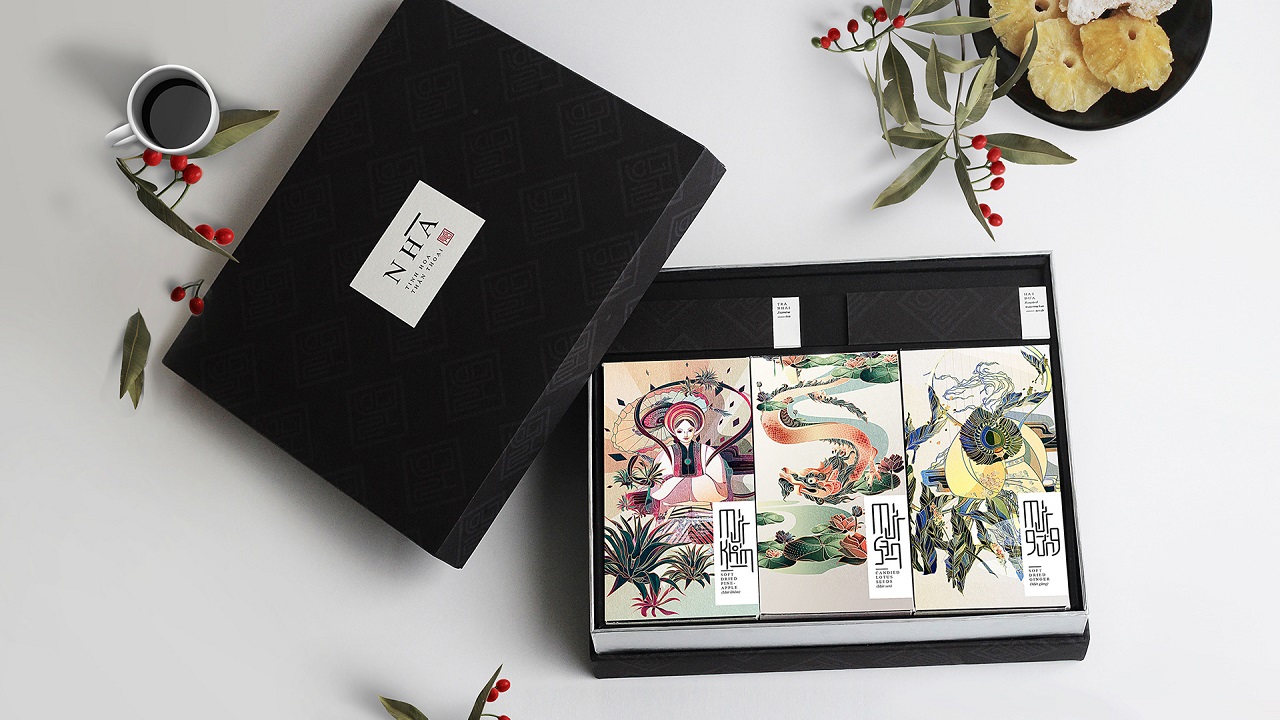
The candied fruits are stacked in a package that is built on the Matryoshka doll ‘principle.’ They come in a big black box that bears the name of the brand. Inside it, there are three other boxes, each wearing the artist’s style and a tag that describes the flavor of each product.
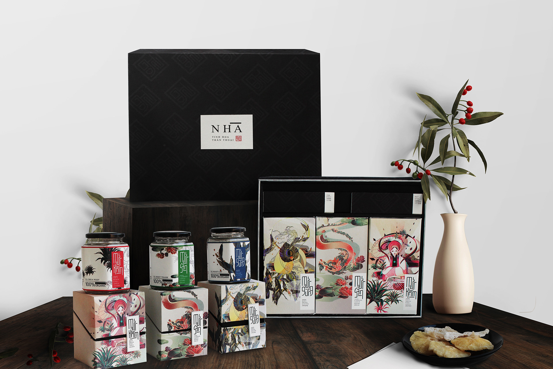
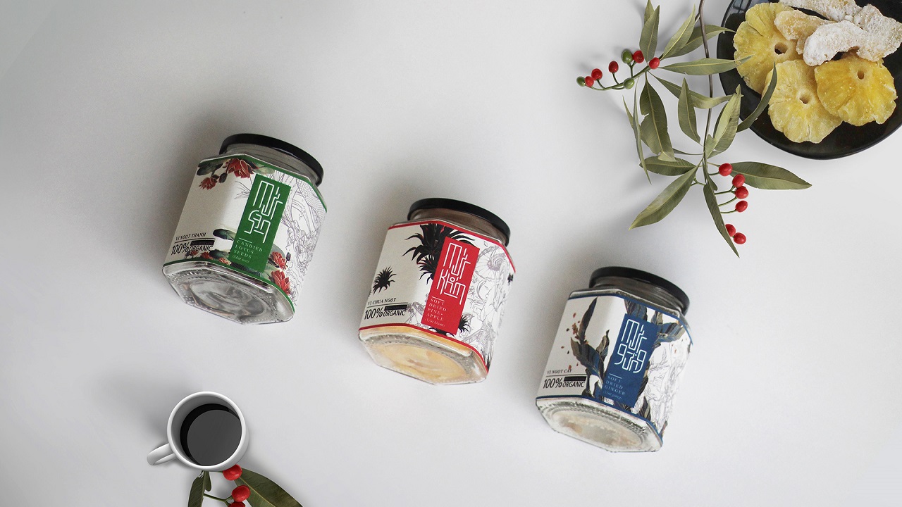
These highly-colored boxes give birth to other tiny packs, which have a square shape, an atypical opening, and the same design pattern as the one that lies on the surface of the ‘mother-box.’ Finally, beneath these eye-catching boxes, there are jars that host the sweet treats. Unlike the other layers, the last one carries a label that reminds very little of the above-mentioned motifs. Instead, its aesthetics are contoured by a series of lines that appear to be pencil-drawn. We’d call this “mouth-watering design”.
“As Candied fruit is Vietnamese traditional food, I wanted to bring a traditional feeling throughout the products and hope that it can be a meaningful and ideal gift set to Viet people, Viet people abroad and foreign friends,” said the artist.
Are you ready to dig in? Because we definitely are! Unfortunately, as we don’t have any of the tasty products, we’ll start ‘unpacking’ their images and leave them below, so that you can admire at least the sweet visual treat.
Credits: