Starting in 1948, Soo Zee 23, a restaurant specialized in traditional Chinese beef noodle soup, has delighted the taste buds of almost three generations. Now, the company optimistically looks towards the Australian market, where the beef noodle soup should be presented in an authentic way.
Helped by the Creative Method design studio, the brand has set to establish a stronger connection with the younger audience. Stubborn and ambitious by default, Soo Zee 23 wants to step on the red carpet of packaging design in an authentic manner. One that abounds in tradition but still needs to remain quite modern.
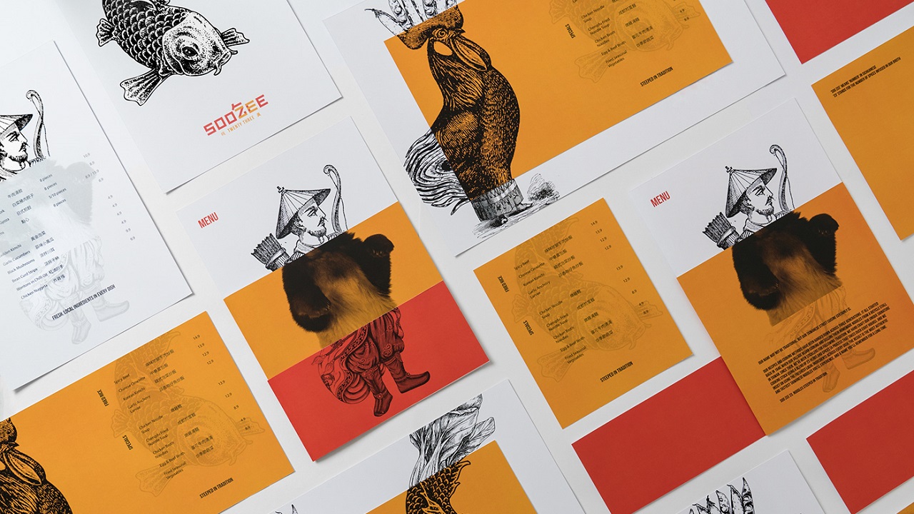
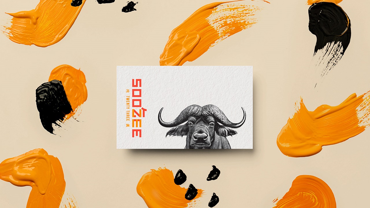
The Sydney-based agency took care of it all and designed the new visual identity so that it combines all the required features by Soo Zee 23, which are traditional and modern Chinese elements, as pleasant, elegant, and vibrant as possible.
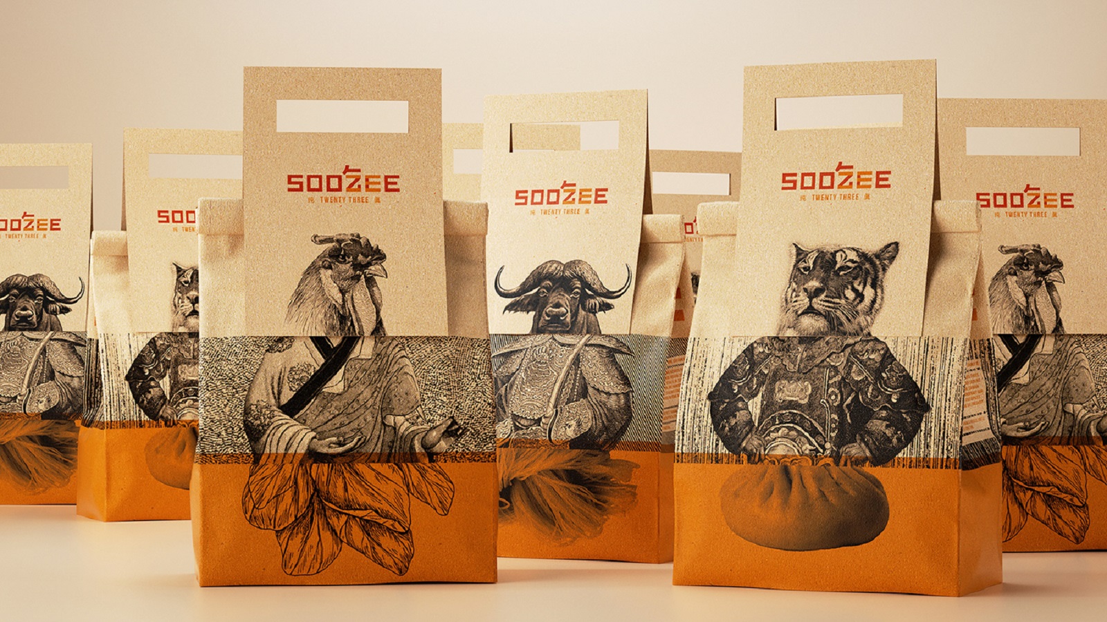
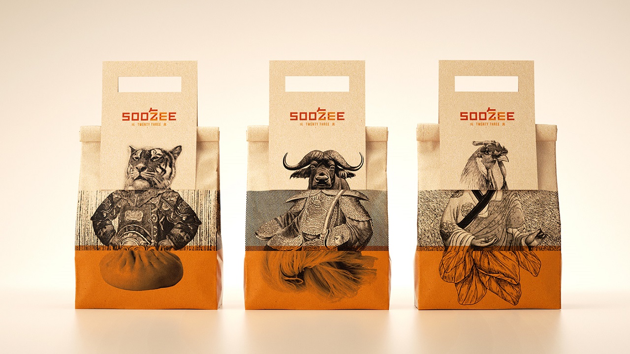
Soo Zee 23’s broth is made using 23 herbs and spices. The whole manufacturing process takes up to eight hours. Patience is a virtue, so after such a long wait, the customers are greeted with a dish that perfectly combines all the ingredients, giving birth to a tasty and delicious dish. Or more nicely put, a dish that is authentic. A feature that is deeply embedded in the visual identity’s genetics.
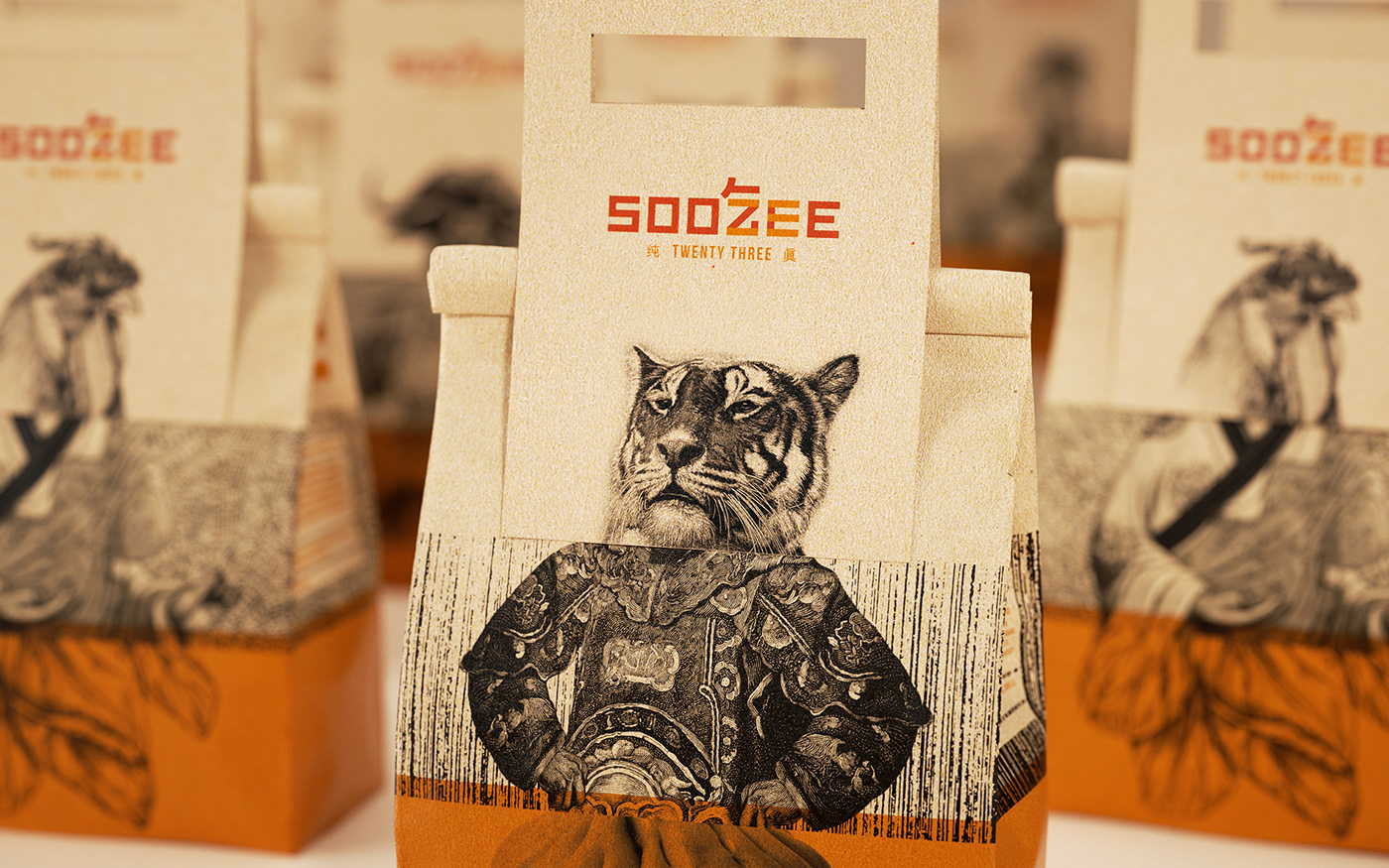
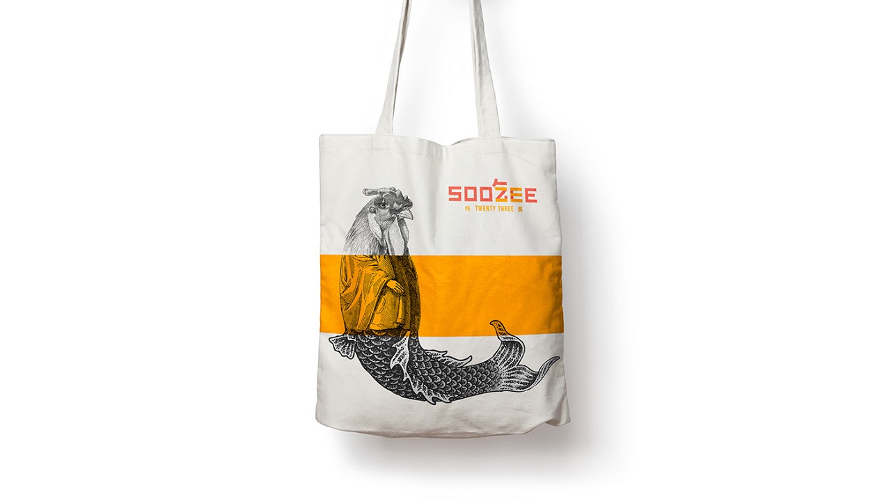
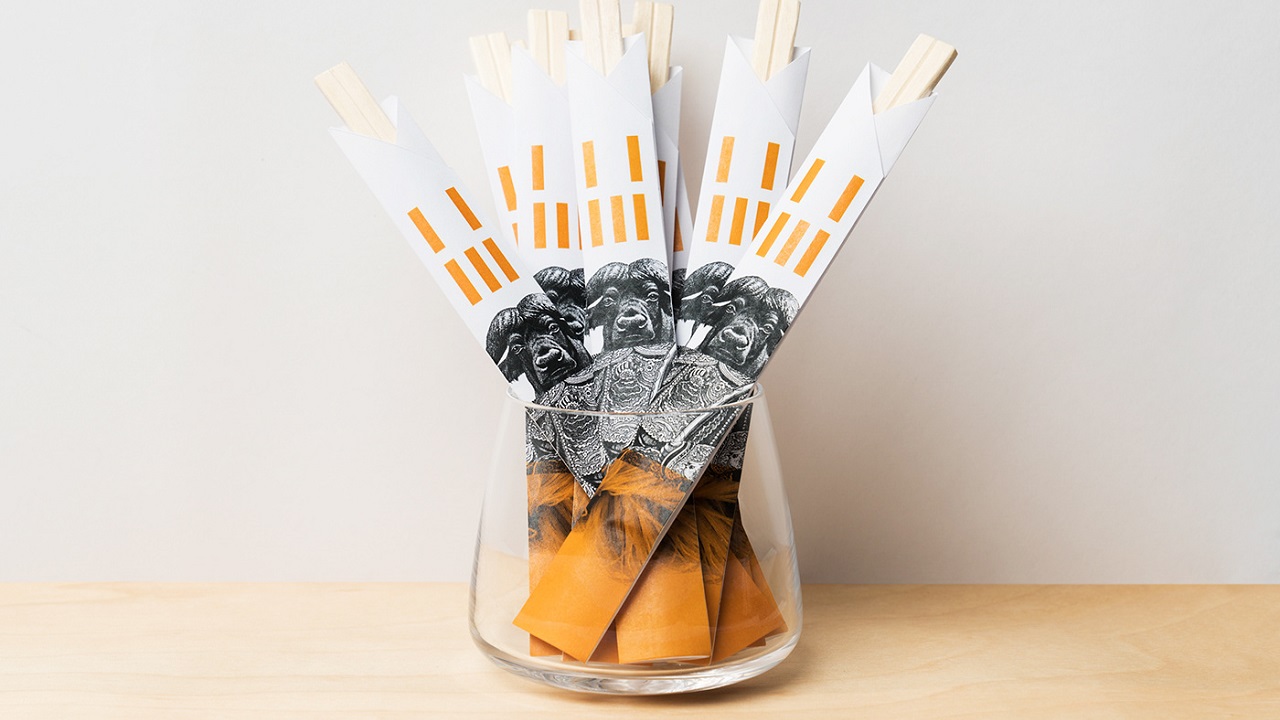
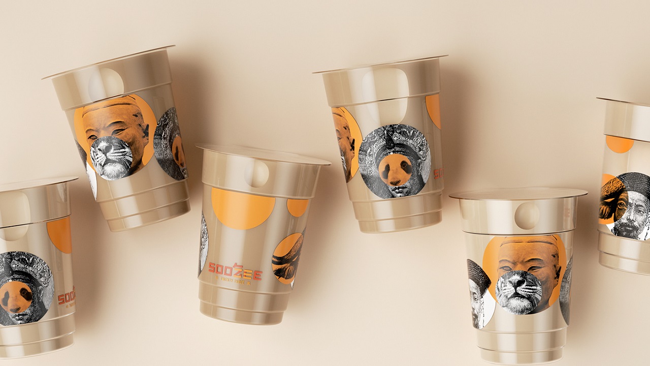
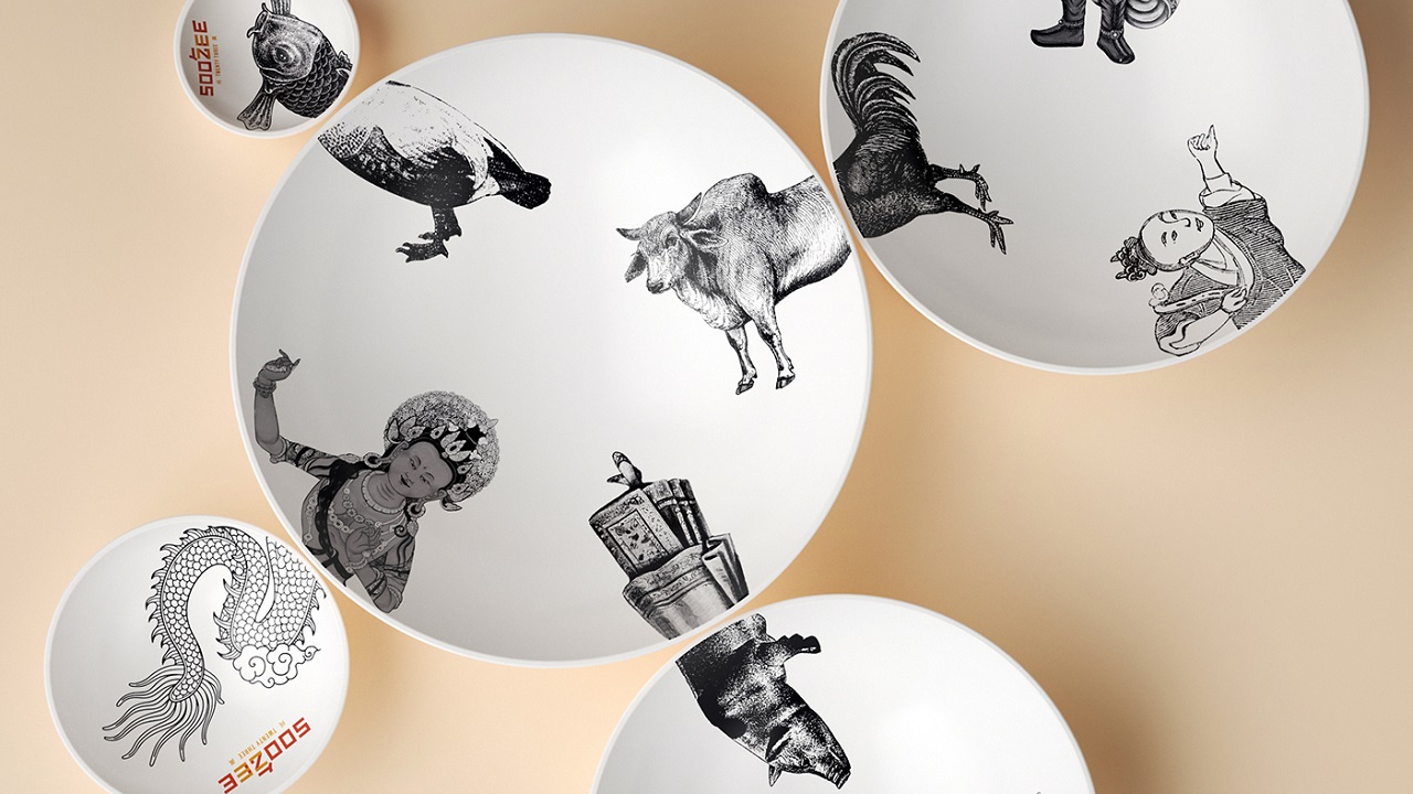
To visually express the meal’s dynamism, the creatives crafted a packaging design that introduces a series of drawings which seem like they have nothing to do with each other. But when the collaged imagery clicks into place, it results in an energic assemble, one that enchants both the eyes of the viewers and lures them into discovering what lies behind the interesting packaging. Or rather inside it.
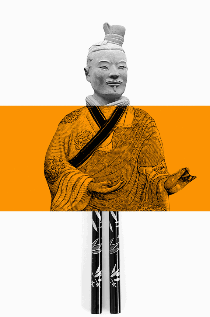
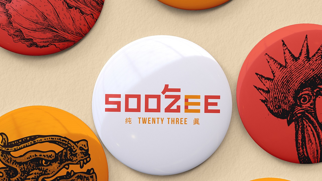
Designing the visual signature of a broth is quite difficult. But this is exactly what the artists looked for: something challenging. Just like the imagery, the brand name has been crafted in layers so as to reveal a more complex ensemble.
Soo Zee is Sichuanese for ‘number,’ whilst 23 stands for the number of blended herbs and spices used to craft the delicious soup. The Chinese symbols for the words “eat” (吃) and “23” (二三) are also featured in the visual signature, nicely complementing the authenticity of their specialty cuisine.

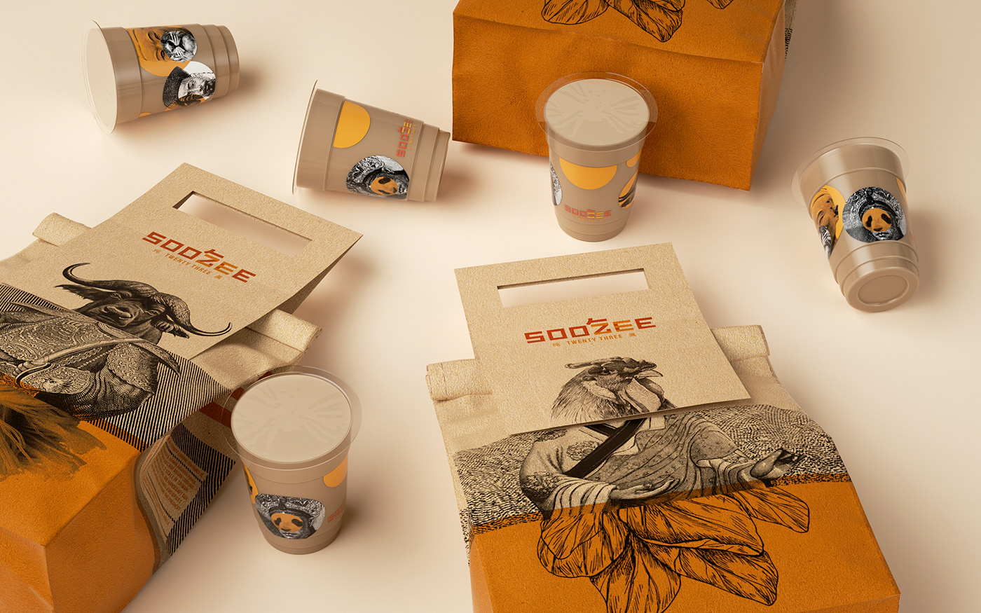
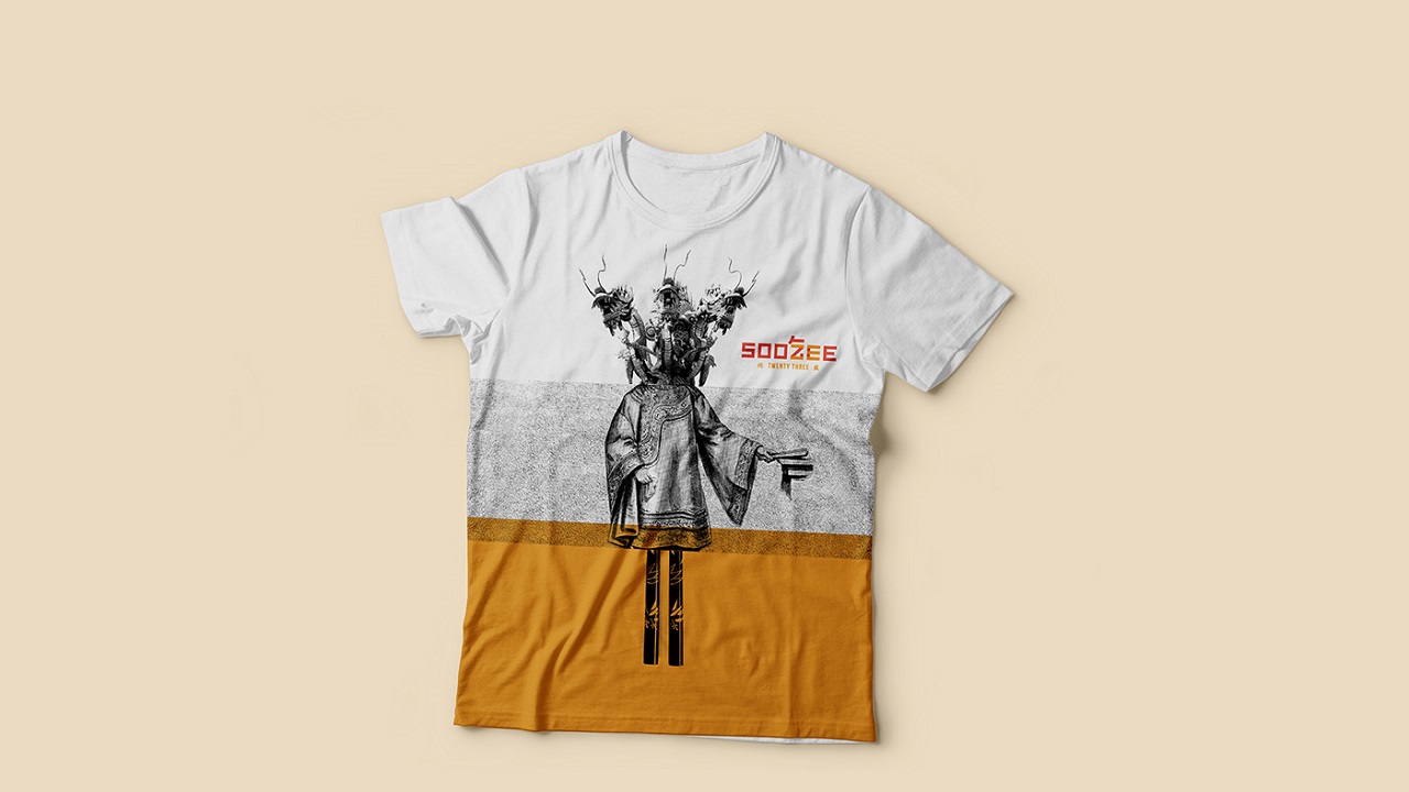
The Creative Method was responsible for creating Soo Zee 23’s name, logo, identity creation, graphics, apparel, menus, tableware, a website, and packaging. Well, there’s no need to say more… Just check out the rest of the project yourselves. We promise that it will be an experience you won’t forget pretty soon. And will probably get a craving for some spicy broth!
Credits:
Client: Soo Zee 23
Agency: The Creative Method
Creative Director: Tony Ibbotson
Graphic Designer: Emma Lucia
Client Services Director: Nicole Rippey