Breweries usually get famous for their crispy tasting beer, immaculate designs, or long and impressive history. Jarošov Brewery is a bit different. It was indeed founded back in 1688, but it wasn’t until 1994 when it came to be well-known to one of the fussiest nations when it comes to beer, Czech beer lovers. In this week’s ThrowBrandThursday, we take a look at how Jarošov slipped into their minds and also the ones of the general public with a hit song “Jarošovský pivovar” (or Jarošov Brewery) from a Czech pub-rock band Argema.
Unfortunately, musical success and almost iconic status were not enough to save the brewery from being closed down at the end of 1997 because of financial troubles and growing debt. However, almost a decade later, while being backed by a new investor, the Jarošov Brewery returns with a range of craft beers prepared according to the original recipes. The now microbrewery was seeking a new visual identity.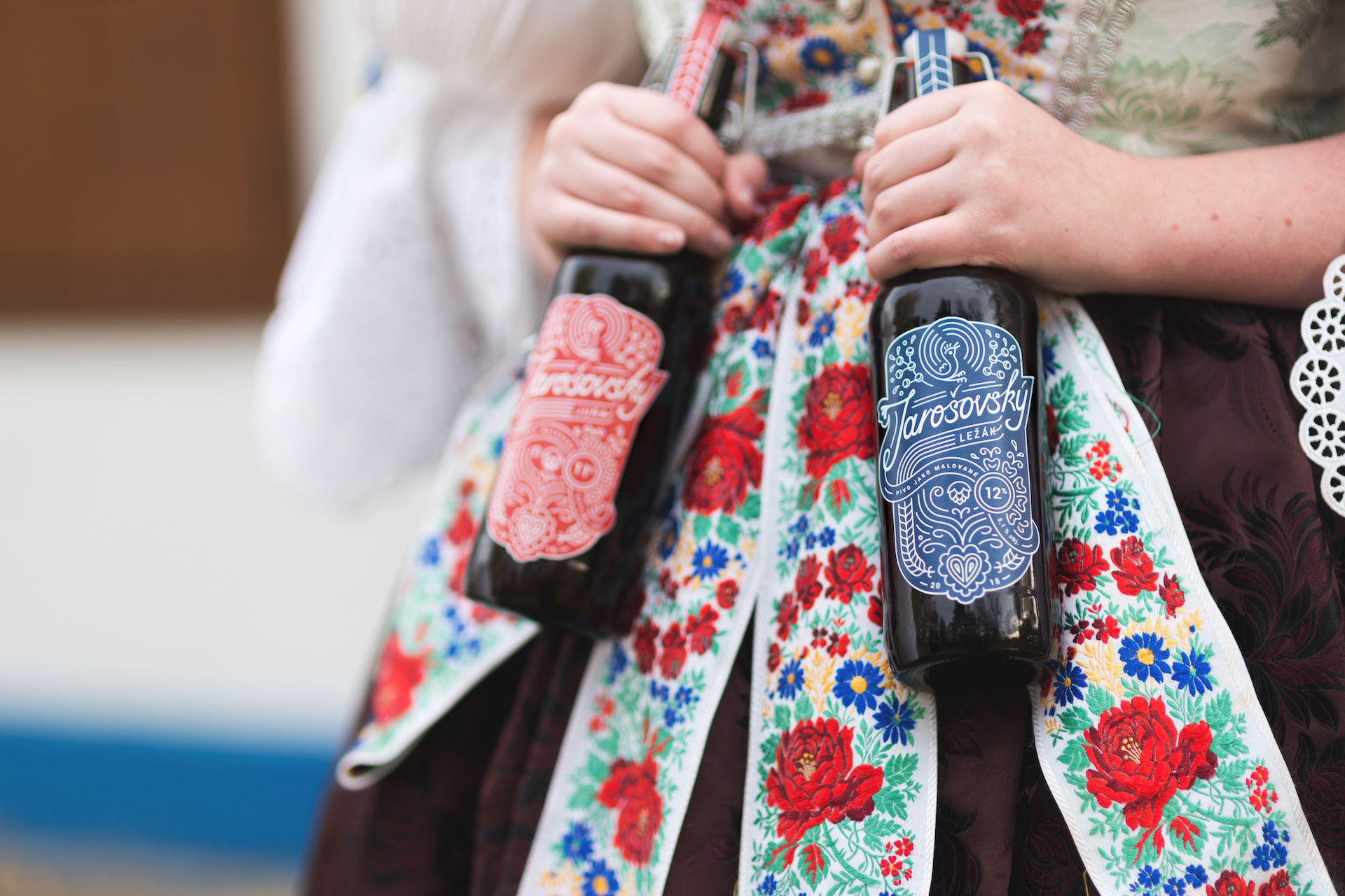
And this is when Little Greta enters the stage. The Czech creative agency has been operating in Great Britain for over four years and at first struggled in the extremely saturated British agency market, which boasts over 27,000 companies. During these hard times, the company got work from direct clients more or less sporadically and instead operated as a “white label” provider of graphic design, websites and multimedia for local agencies.
Their British partners would outsource a project to them, and thus the agency came to work for renowned names such as Heineken, Nike, Acer, Pitney Bowes, or Vendavo. Yet, a couple of years later, under the steady arms of Jan Blažek, the Managing Partner at Little Greta, Tomáš Nedvěd, the Account Director and partner, and Čestmír Benda, the Marketing Director, the agency found their niche in a sector where the Czechs can definitely distinguish themselves – breweries. And now, let’s focus on Little Greta’s playful design for the Jarošov Brewery.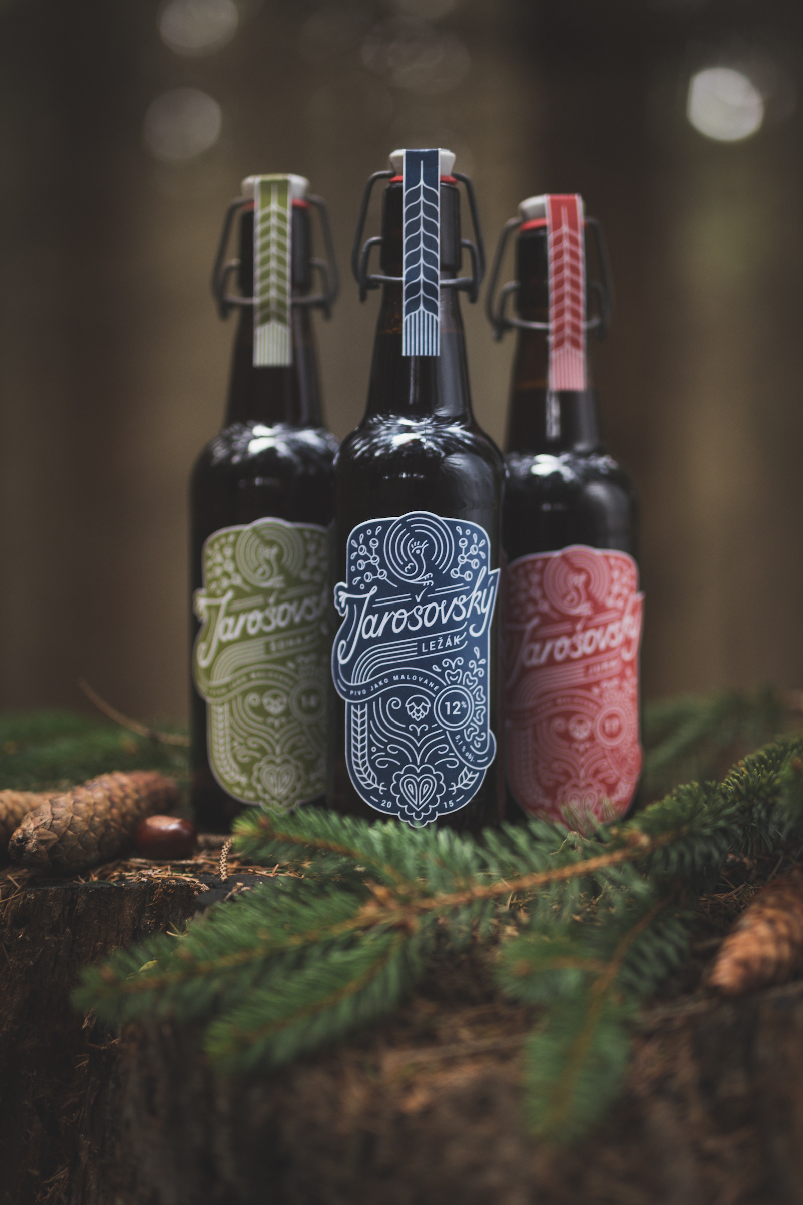
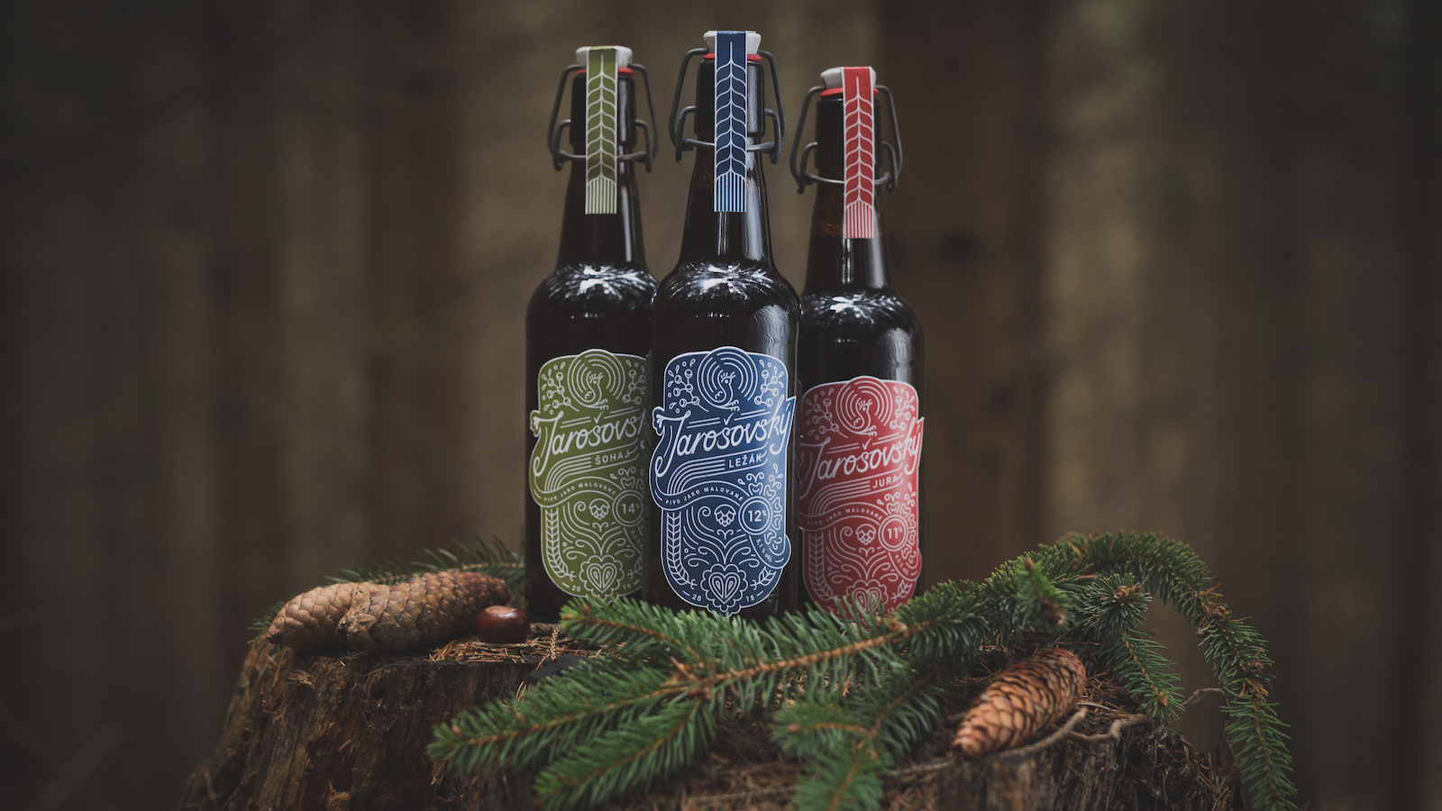
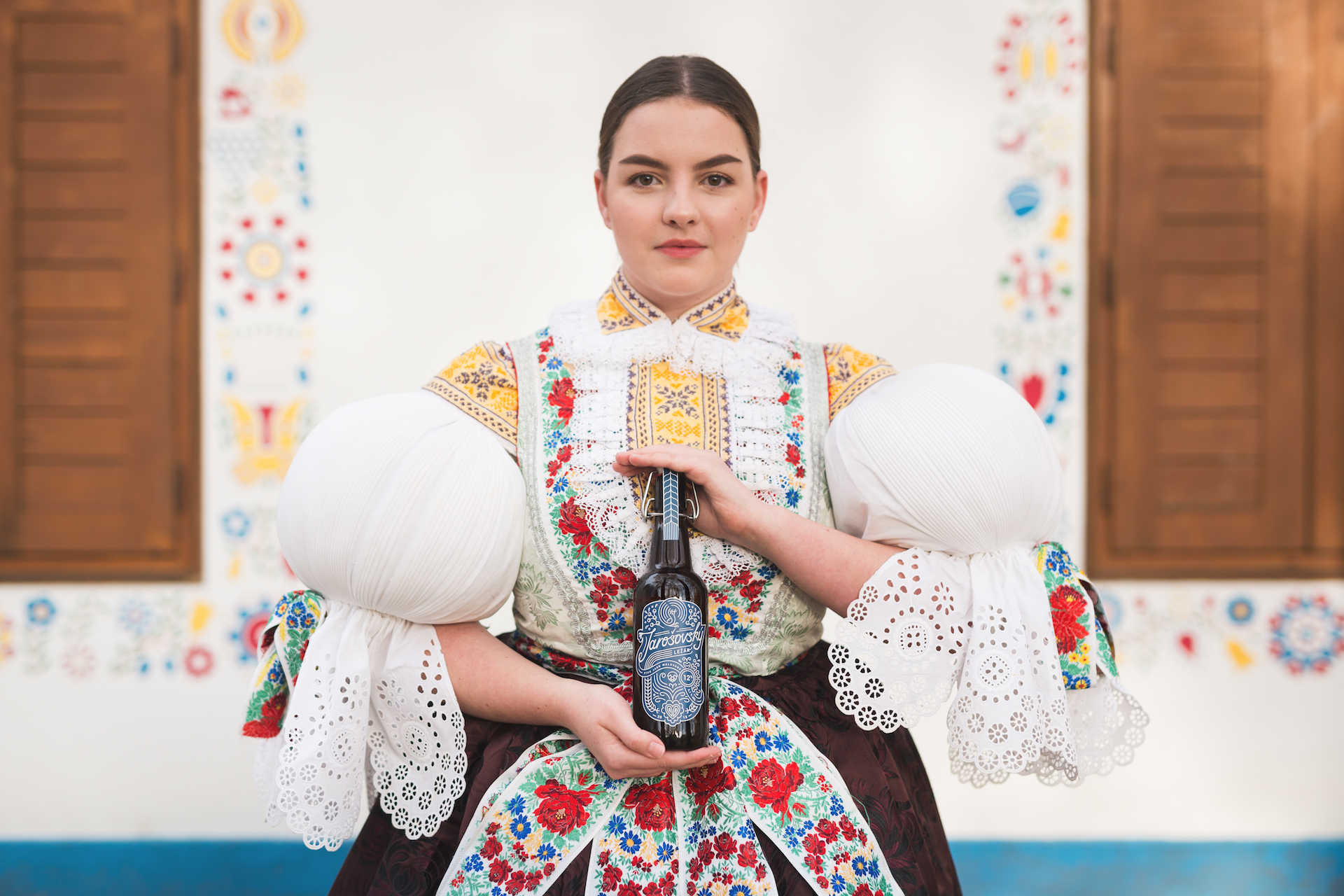
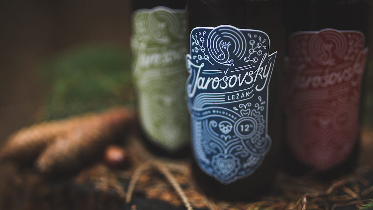
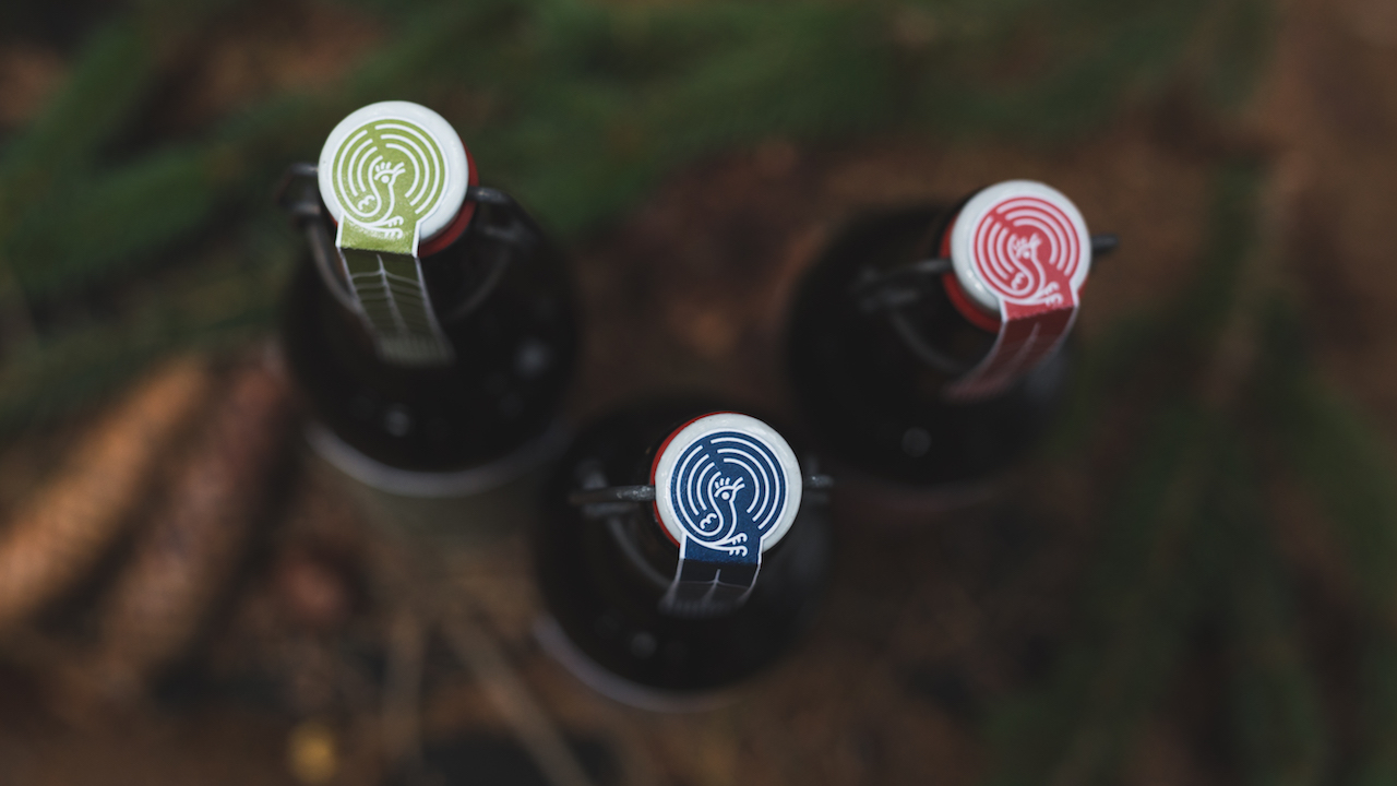
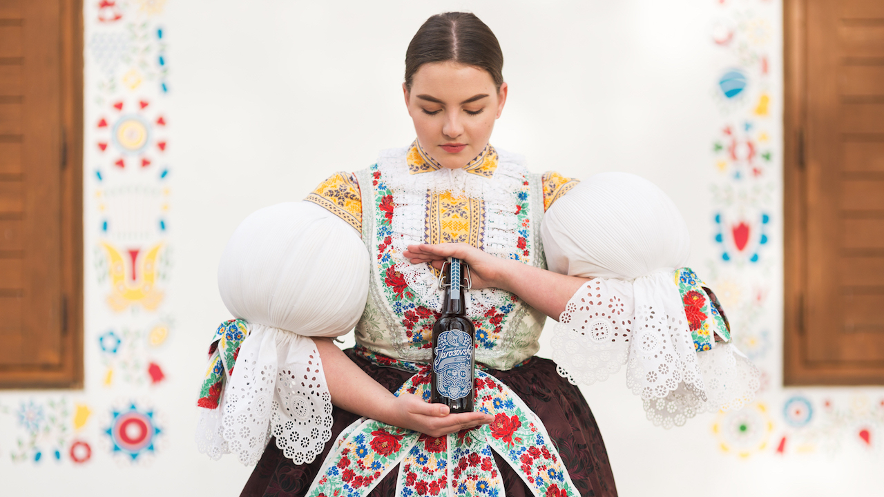
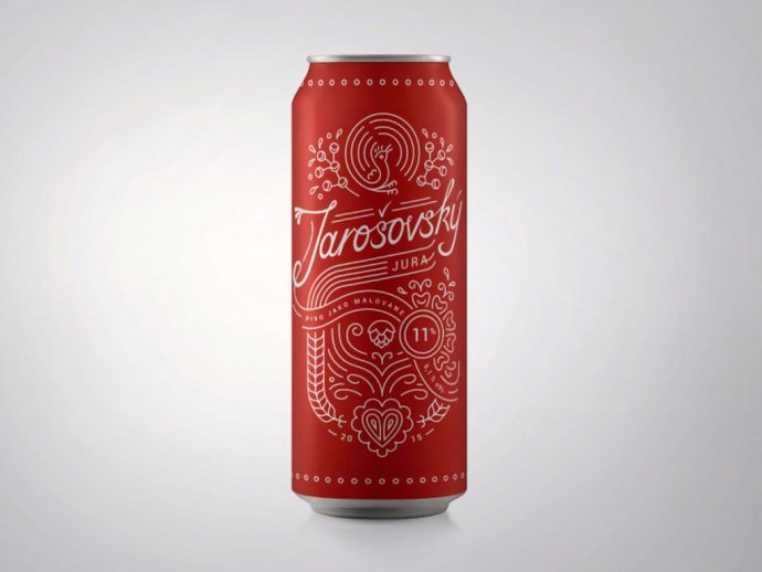
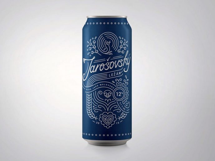
As you’d expect, the agency’s ‘little-but-great team’ are all craft beer fans, so winning the pitch definitely tasted great for them. For the visual language, the agency drew inspiration from the symbols of Moravian Slovakia (or Slovácko)—which is also the brewery’s location—and included images from botany, folkloric architecture and traditional folklore.
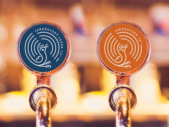
As these traditions are still alive in the region, the identity remains relevant while it definitely bears a modern feeling too. Also, the cockerel motif represents resurrection, which embodies the brewery’s recent return to life. Apart from the cockerel, the visuals feature a (common) crane and a heart. Two Polish Art Directors at Little Greta, Pawel Ratajczyk and Mateusz Słowakiewicz, managed to combine all three motives from the Slovácko region with typical beer symbols—hops and barley—as well.
The work received aplenty of awards including the IDA Design Award and the A’ Design Award, with the latest one being the most prestigious award in the design world, the Red Dot Award. The awards for Product Design and Communication Design have been granted by the Design Zentrum Nordrhein Westfalen in Essen since 1955.
The distinctive “Red Dot” has become established as one of the most sought-after seals of quality for good design and every year there are thousands of designers and studios from over 60 countries competing for the award. Tomáš Nedvěd, one of the agency’s owners, smiles and says: “Last couple of months have been a real success award-wise. Since November, this has been our sixth creative prize. But, the Red Dot award still stands above all of them. Sometimes people even describe it as an Oscar for designers.”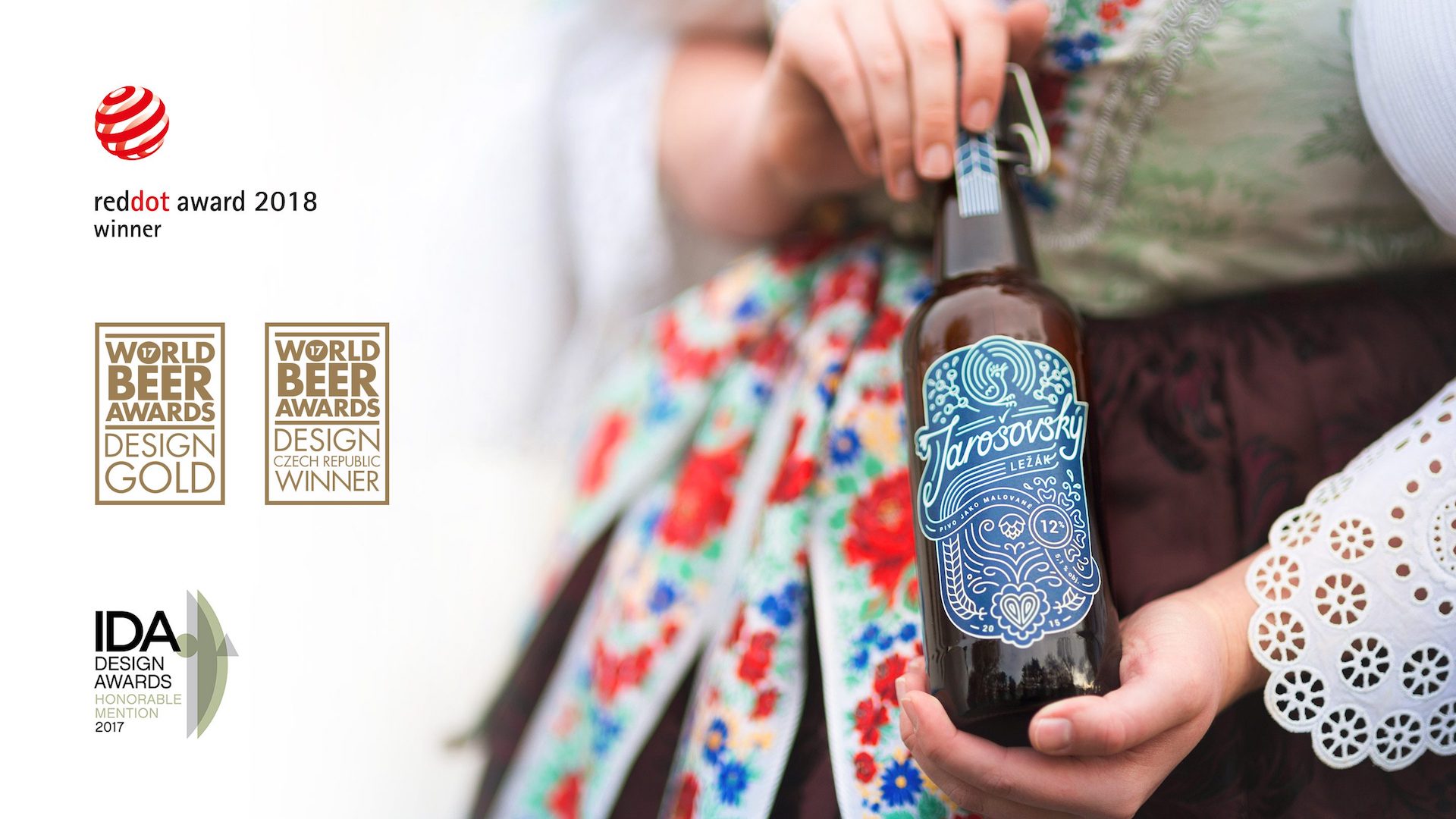
Moreover, with two design awards for the Jarošov identity, Little Greta was the most successful Czech agency at the prestigious 2017 World Beer Awards. Just admire the work below!
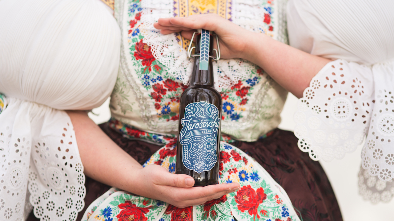
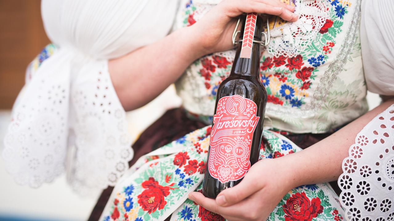
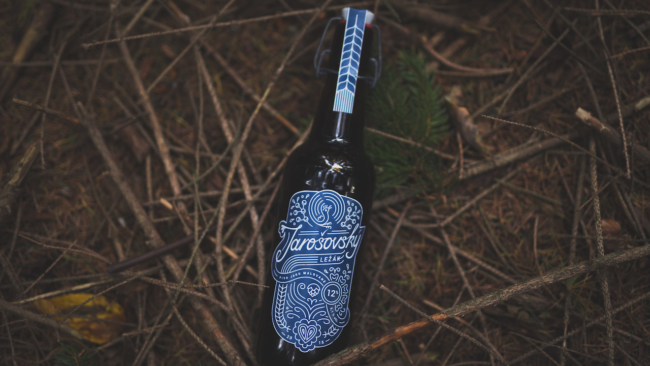
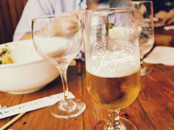
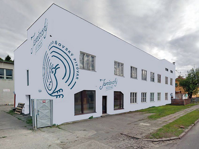
Understandably, the new identity was applied across many channels. Apart from the bottle and can design, this also included—most eye-catchingly—the brewery’s own façade. Let us know what you think about the unusual design in the comments.
Credits:
Agency: Little Greta