When Bushe bakery opened up its doors to the public in 1999, it did it to delight the senses of the city residents living in Saint-Petersburg and Moscow. Somehow, the coffeehouse chain fell in love with the locals from Russia’s second-largest city, who could enjoy a latte or a tasty croissant in one of the 40 locations spread across the town. Poor Moscow was left behind, as it had only a single Bushe café.
Now, things are about to change, as the bakery has some big plans in mind for the coffee lovers living in Russia’s capital city. Two more locations are about to be opened in Moscow soon, each of them being specifically designed to follow a new format.
With all these changes in its portfolio, Bushe thought that now is the perfect time to redefine the brand. The previous identity no longer fit the personality and the company’s real spirit. Therefore, some changes had to be made, especially to reflect the brand’s core values.
It takes a lot of guts to make changes when the world has already made a certain image of who you are. Change can be good, or it can be a big failure. While being aware of this, Bushe still wanted to go all in. But to make sure that it wouldn’t fail and ruin what it had built so far, the bakery joined forces with branding agency Suprematika, which contributed with visual ideas that shall help the coffee house strengthen its connection with the consumers even more.
Keeping in mind that Bushe has gradually become one of Saint-Petersburg’s essential symbols, the Moscow-based agency started to craft the bakery’s visual identity. “We attempted to put a sign of equality between the city and Bushe by a new corporative style because the major part of their deals is dedicated to Saint-Petersburg: the team works with various street projects, musical and dancing festivals, museum exhibitions. They even directed two films (Piter by, Piter by Каста) about the city they love,” explained Vladimir Lifanov, Suprematika Creative Director, in a press release.
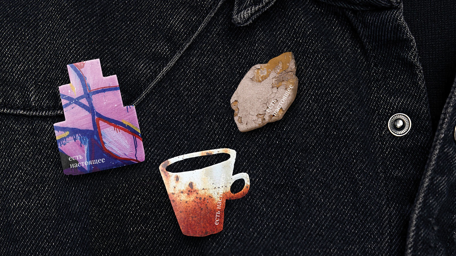
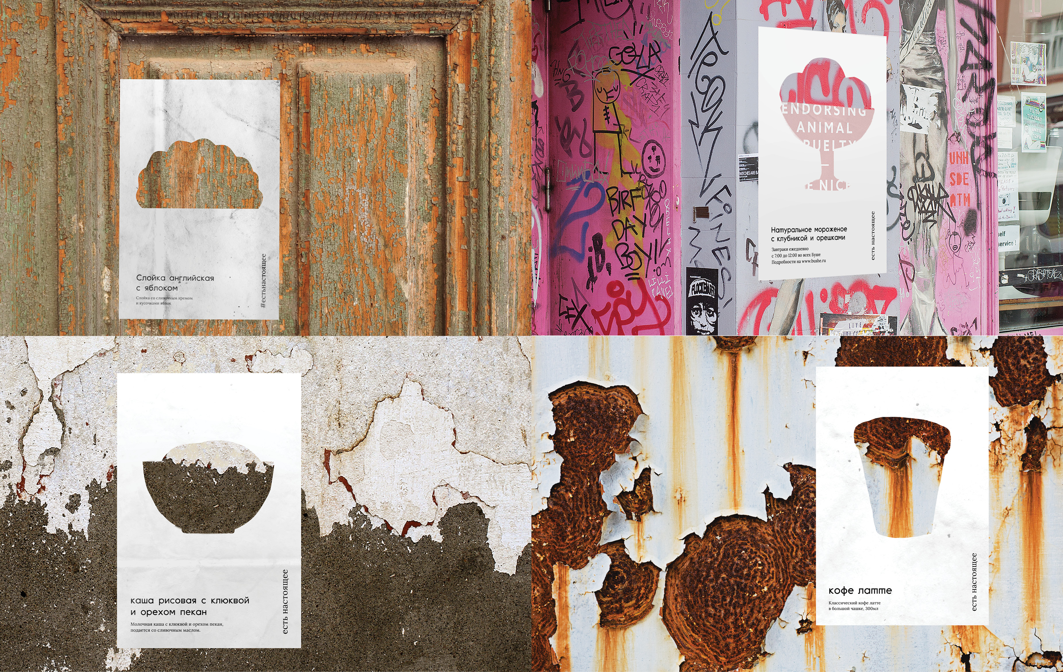
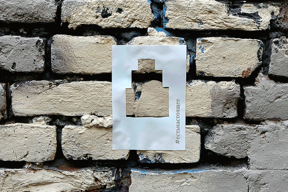
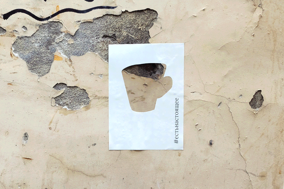
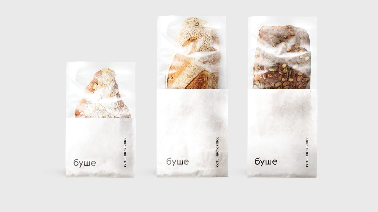
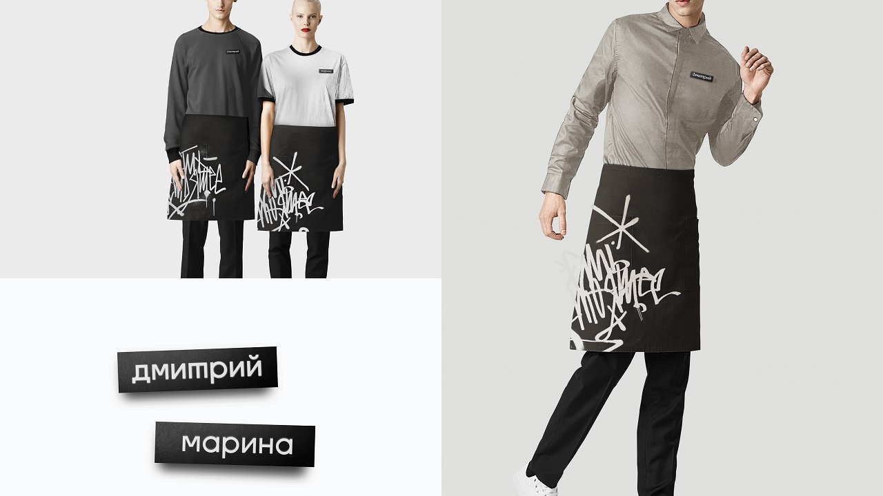
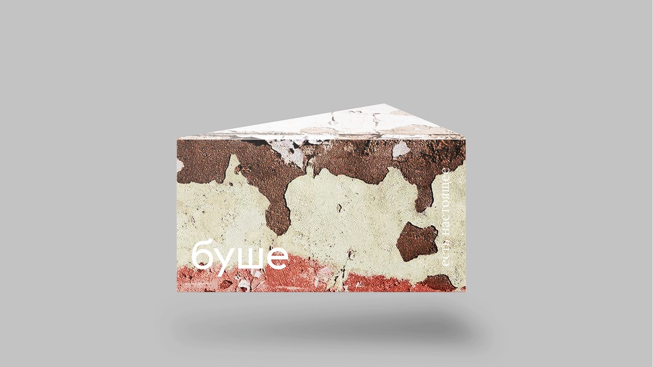
Inspired by Bushe’s philosophy—which is expressed via a simple statement “Eats/It’s real”—the agency slowly gave birth to the bakery’s hip visual identity. The boosted personality borrows Saint-Petersburg’s texture lines, its color palette, and some black and white scripts.
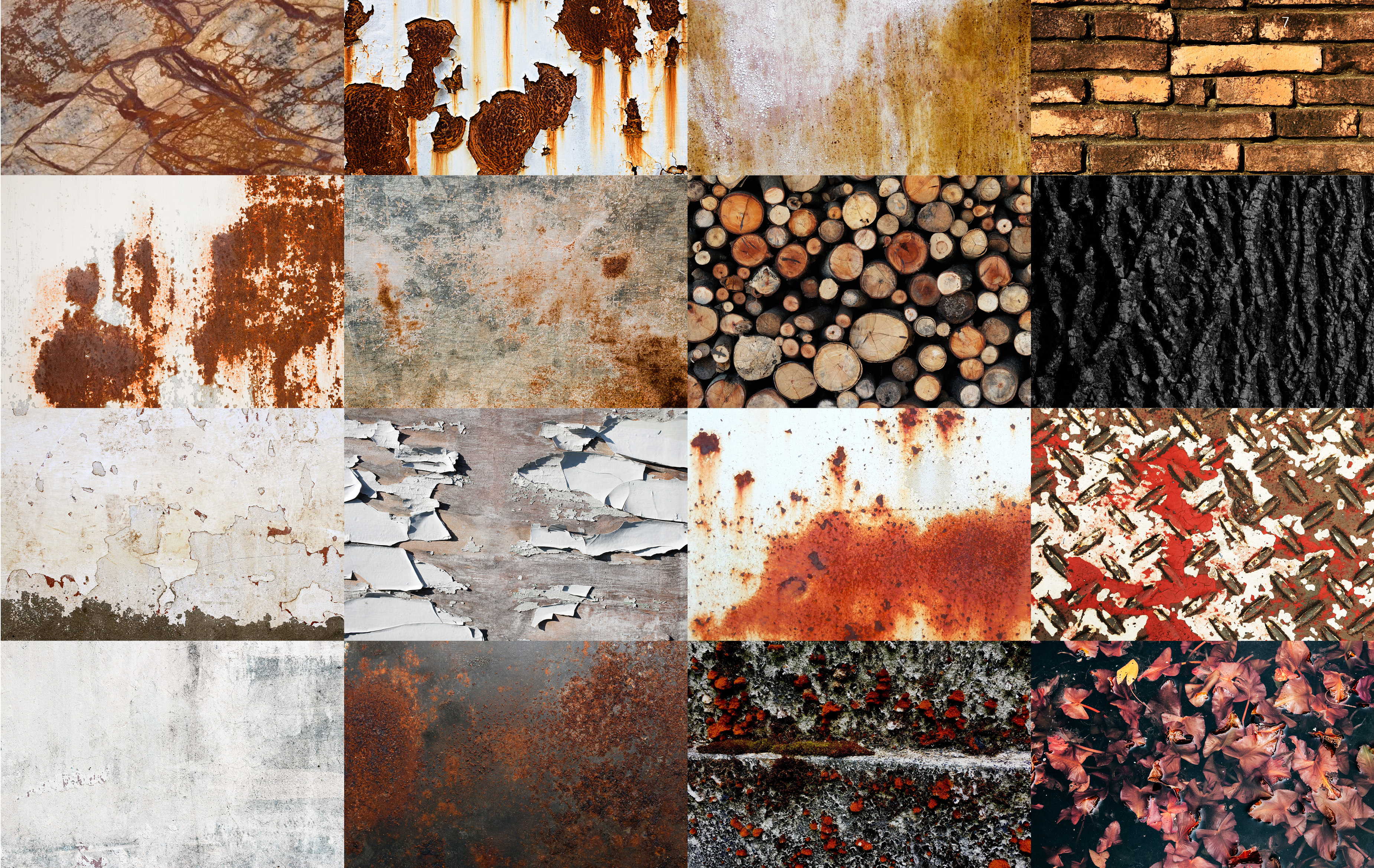
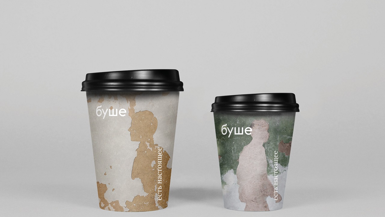
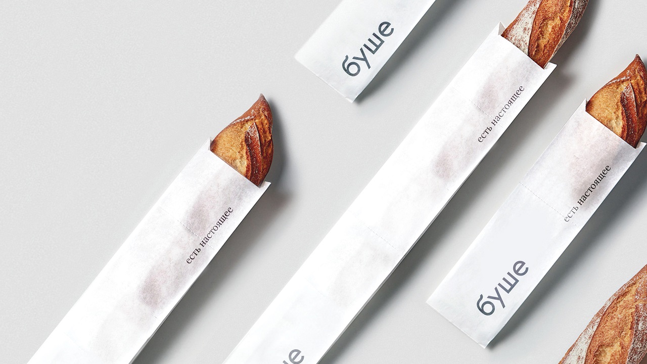
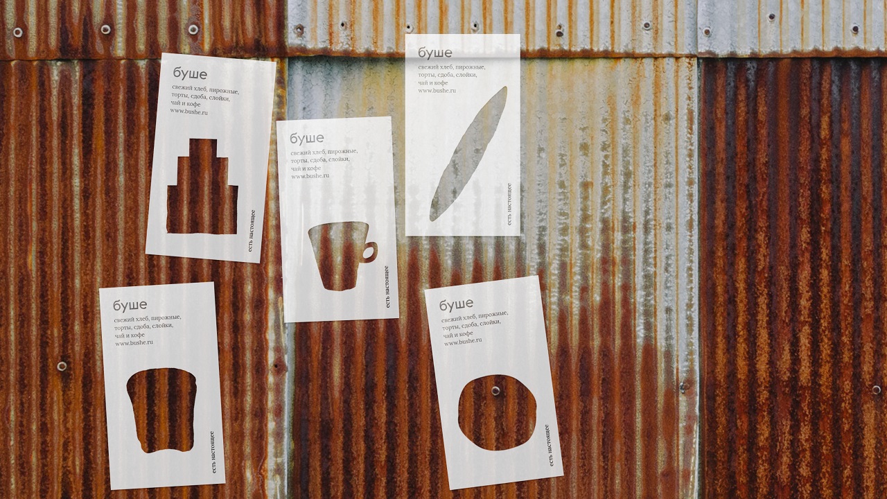
Moreover, the city’s color palette is also reflected in the interiors, which follow the same aesthetics that embellish St. Petersburg’s streets. Also, we can admire the visuals of the city environment on all kinds of printed products, such as posters, souvenirs, package, cards, but also outdoor ads.
Bushe’s OOH ads are not your usual advertising posters. In fact, Suprematika created them in such way so as to engage the entire town space within the bakery’s delicious story. For example, the posters carry the contours of the houses that one can find across the city. But the key to this campaign stands in a series of screens, which Bushe used to change the visual essence of the environment.
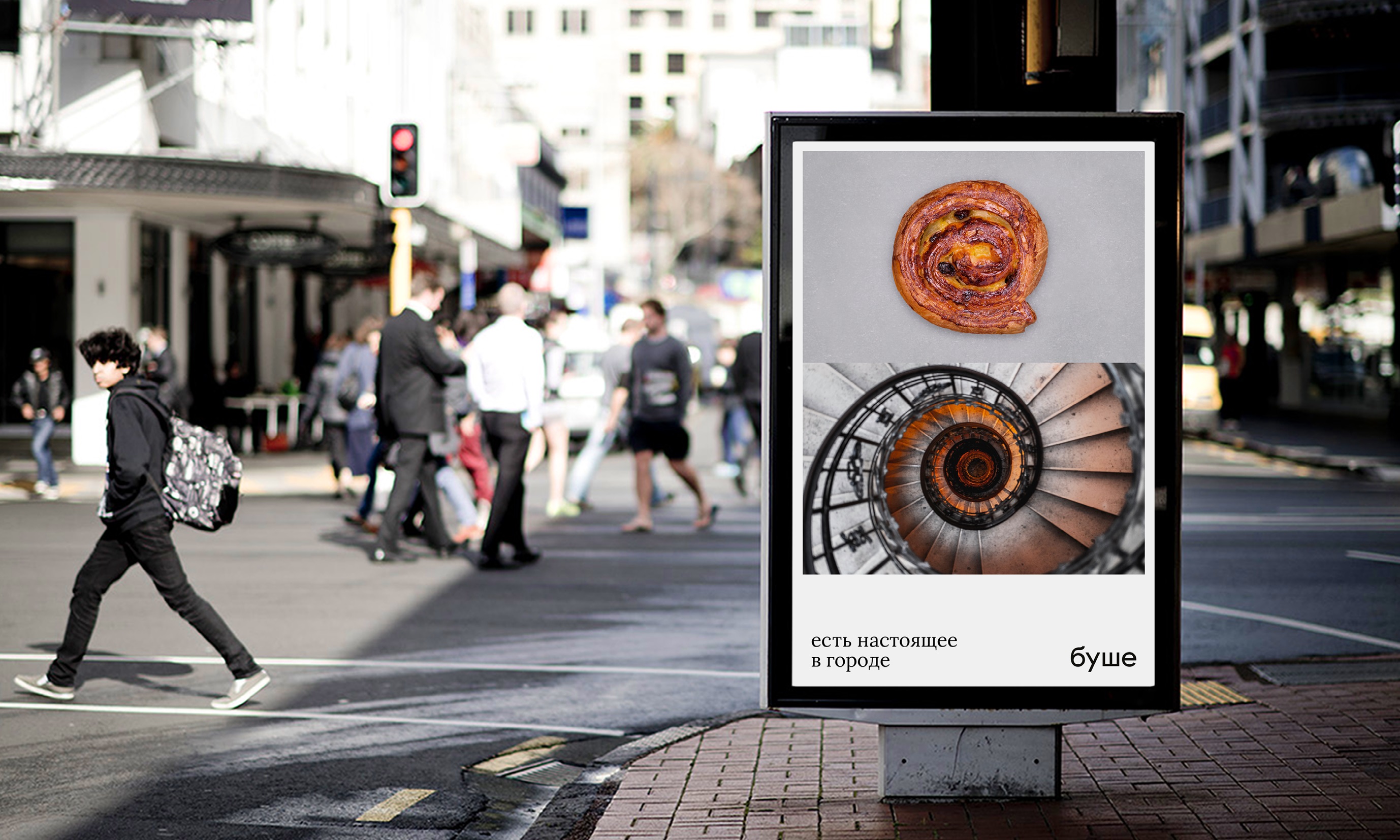
That’s why the locals will see out of their windows ads and graffiti that remind various tasty objects such as a cup of black coffee, a baguette, or a cake. Don’t you just want to wrap the visual identity around such coffee cup and slowly sip the tasty drink? And enjoy a nice croissant?
Credits:
Client: Bushe
Founder and owner: Oleg Lega
CMO: Roman Pevzner
Project director: Eugenia Pes’yakova
Agency: Suprematika
Creative director: Vladimir Lifanov
Project manager: Marina Lokteeva
Designers: Vladimir Lifanov, Eugenia Maximova, Valeria Vaizehovskaya
PR-managers: Marina Lokteeva, Ksenia Lipilina