Located in the historic heart of Yerevan, Armenia, Gastropolis Food Market treats its clients with 12 different dishes, which present a great way to tickle the taste buds of the most demanding gourmets. But aside from delivering a wonderful culinary experience, the restaurant is a perfect place to also embark on an aesthetically-pleasing journey. One that gives customers the opportunity to admire the wonderful cuisine of Gastropolis while tasting the beautiful design lines, which embrace the visual profile of the restaurant, with their eyes.
This might actually remind you one mesmerizing experience that we wrote about a while ago. A multi-sensory spiritual cooking adventure for all the senses. Indeed, it was even called the same, but today we’re not talking about the cooking school Gastropolis. Our main subject is the restaurant Gastropolis, which serves another type of visual scenario, one cultivated by professional artists and aged by the experts at design studio formascope.
“If you love your food, you gotta love Gastropolis,” is the restaurant’s motto. Yet, we’d like to add the following: If you love design, you gotta love what the Yerevan-based studio did to boost the bistro’s visual essence. Designers at formascope were challenged to develop the brand’s concept and visual identity. Mainly, the artists had to keep in mind that their subject is a very diversified place.
So, how can one translate all the variables into one image that perfectly reflects the brand’s true spirit? According to the formascope’s team, Gastropolis’s branding was built following the “form as a language of communication” concept. That means they have based it on the beneficial relationship humans have with food. To visually represent this strong bond, the artists crafted a sort of “plate-cutlery” motion that can also be seen as a formal embodiment of the restaurant’s corporate style.
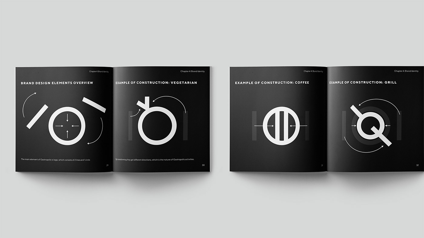
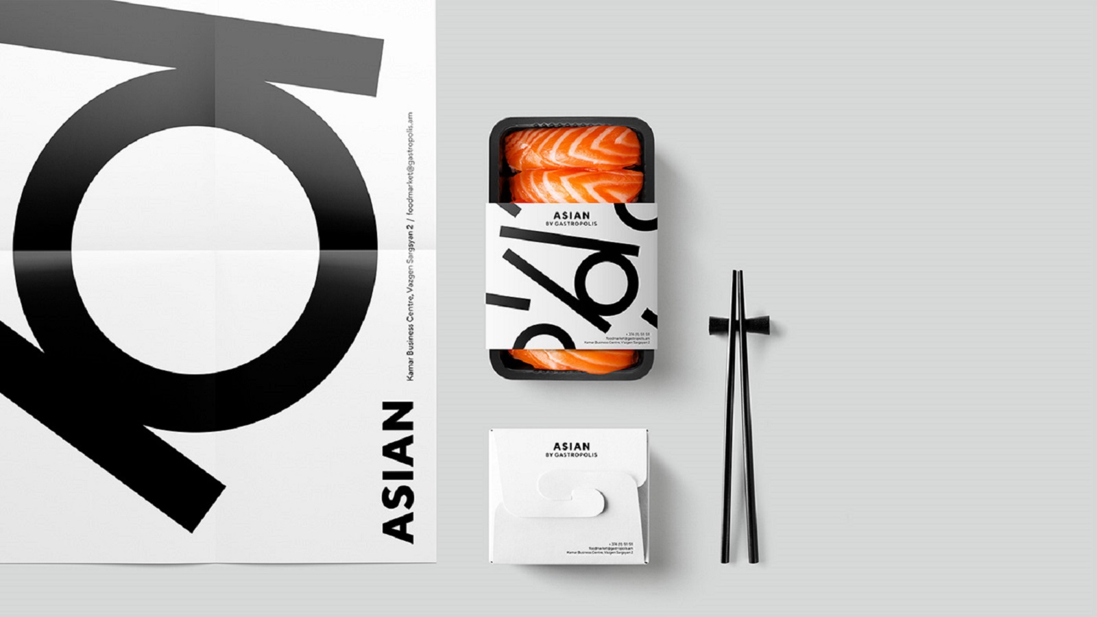
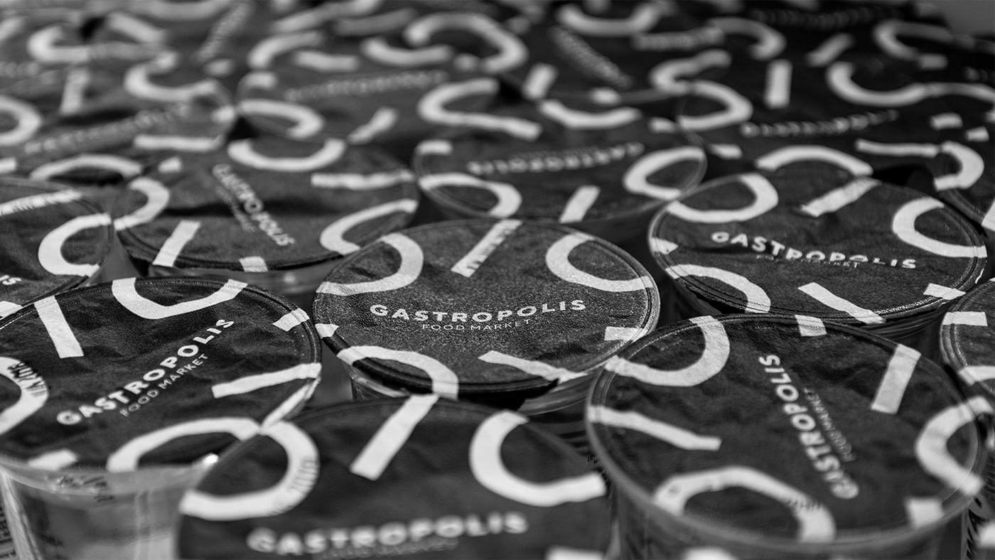
The restaurant’s brand identity was to be crafted following simple lines, shapes, and ultimately, content. Based on these criteria, the artists cooked up Gastropolis’s new ID which is made from the combination of two forms and three elements. One circle and two lines. But although this logo might seem simple, it is definitely sophisticated enough because the specific symbol doubles as a strong foundation of the brand-style language.
“These 3 shapes symbolize plate cutlery, that in turn, create communication with food. The simple idea that became the basis for creating the brand of Gastropolis,” said the artists behind this project.
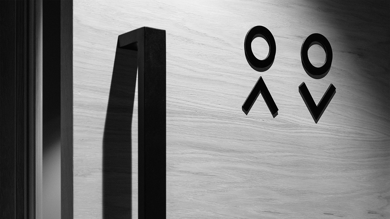
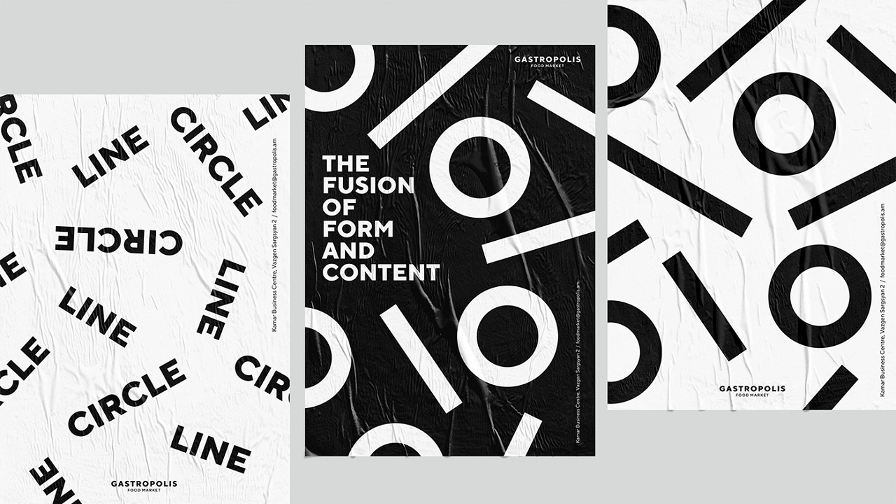

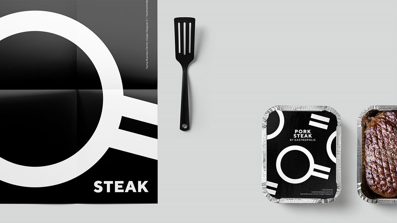
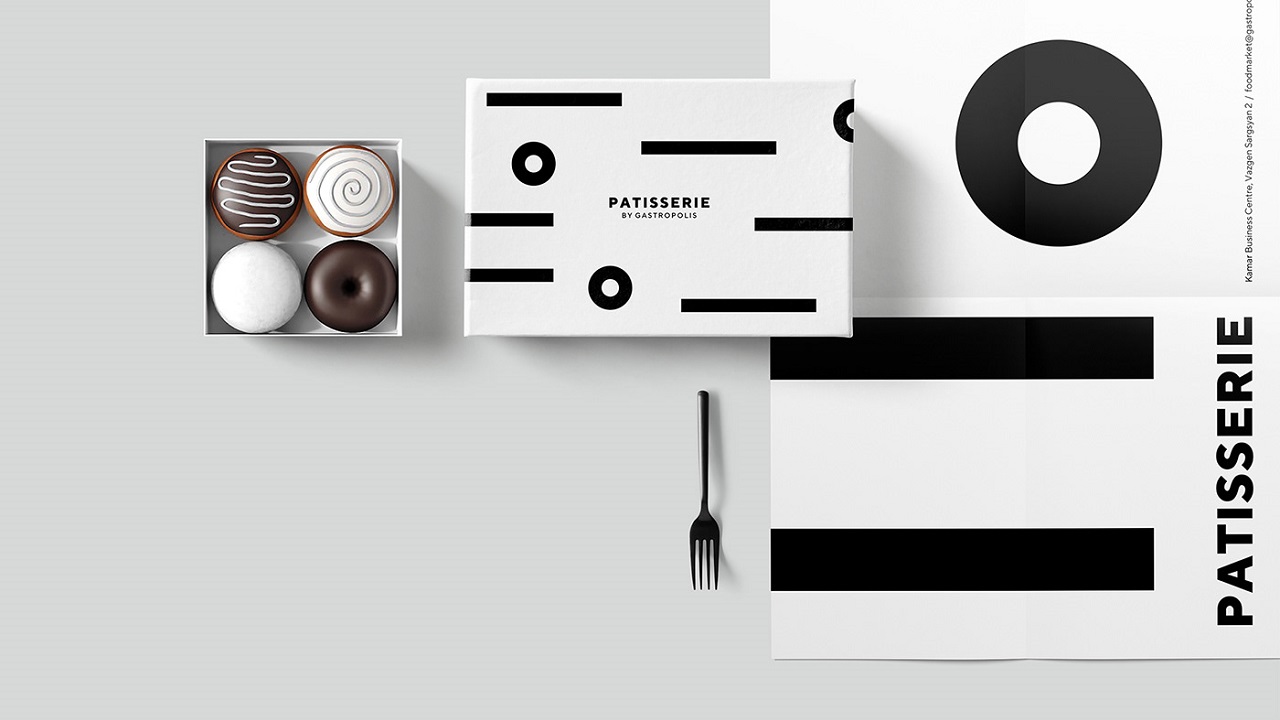
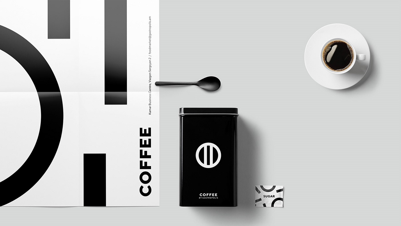
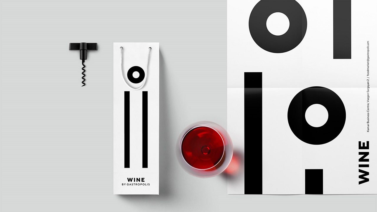
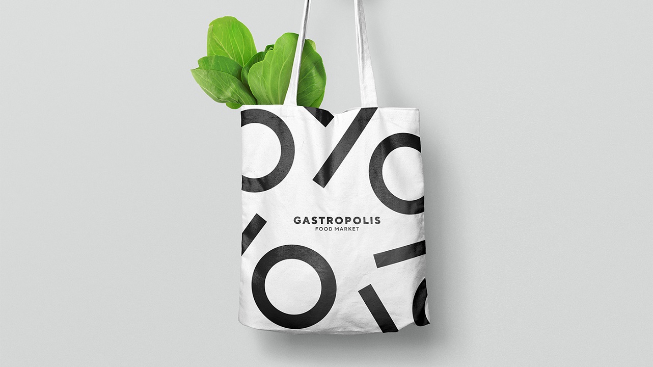
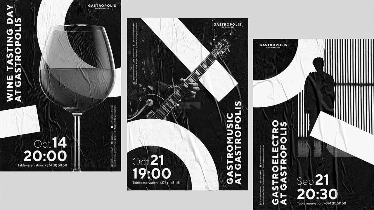
Using the same shapes, the logo can be seen constantly changing its form, contouring various culinary images. Just like in a tango dance, one shape seduces the other, revealing, in the end, a series of different patterns that create the wonderful world of Gastropolis: Pizza and Pastaria, Asian, Salad Bar, Vegetarian, Armenian and Mediterranean, Intercontinental, Wine Bar, Coffee Shop, Patisserie and Bakery, Steak House, and even a supermarket.
It’s time for you to immerse in this intense culinary and aesthetically-pleasing world of Gastropolis by watching the video below. Enjoy!
Credits:
Client: Gastropolis Food Market
Studio: formascope