UPEND, the gin crafted with passion by duo Matt Mckee and Chris Lofrese, is set to be launched in late February 2019. Prior to the highly-expected launch of a spirit that pays homage to the history of gin, the founders decided to tease fans and other design enthusiasts with a bold brand identity and packaging, courtesy of Nude Brand Creation. Although being the new kid in the alcohol town, the gin is a distilled the way that it puts the spotlight on honoring the long tradition of gin brewing. Moreover, the new drink unfolds in a scenario that includes a modern twist.
Coming right from the hands of the two friends, the idea of crafting a premium gin comes from a journey, during which the couple flirted with the idea of drinking a gin with different flavors. The high-quality liqueur has juniper and a bold botanical recipe at its foundation that includes coriander, lavender, licorice root, cinnamon, clove, and citrus, all blended perfectly to deliver a taste that impresses even the most demanding spirits connoisseurs.
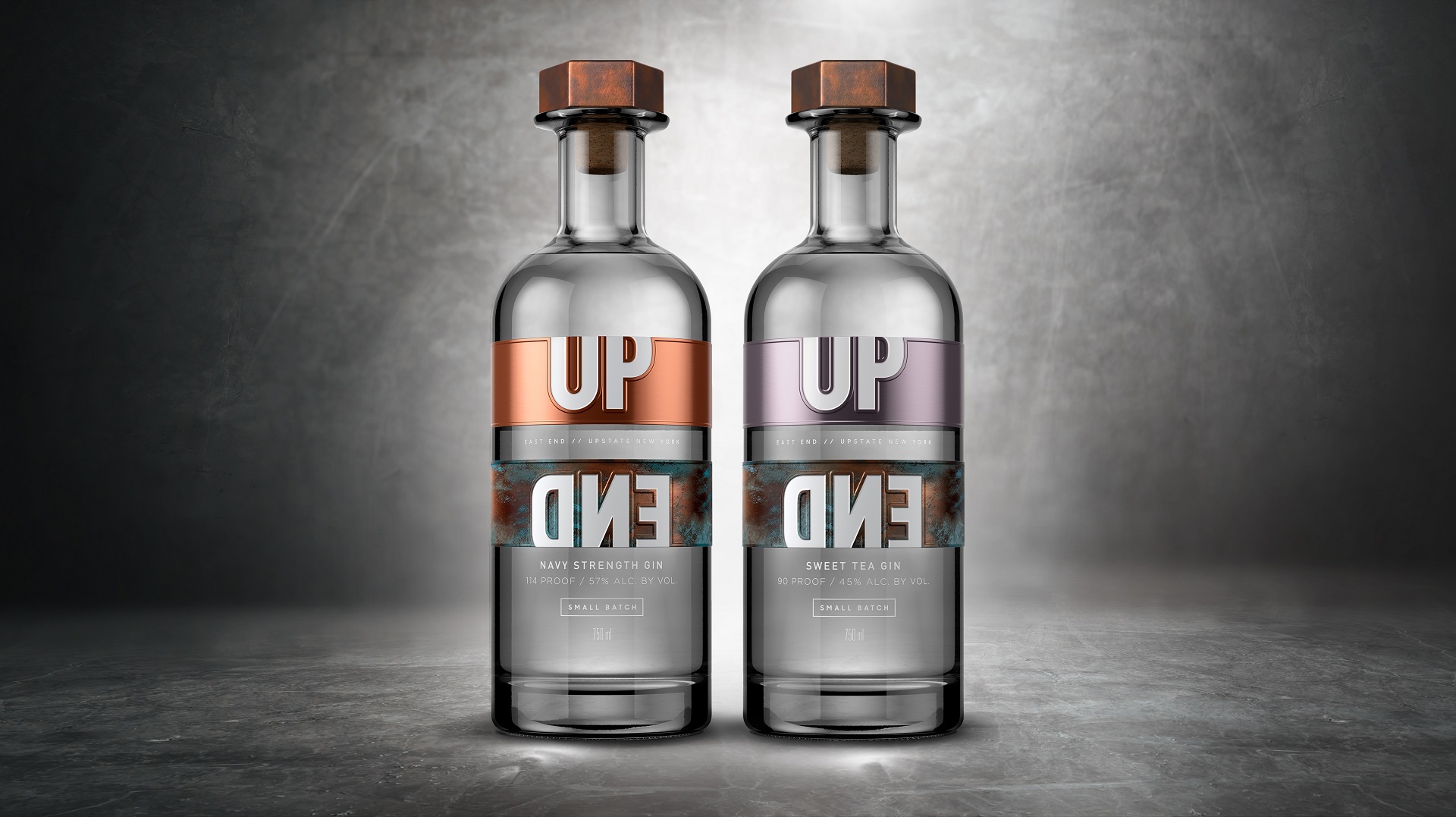
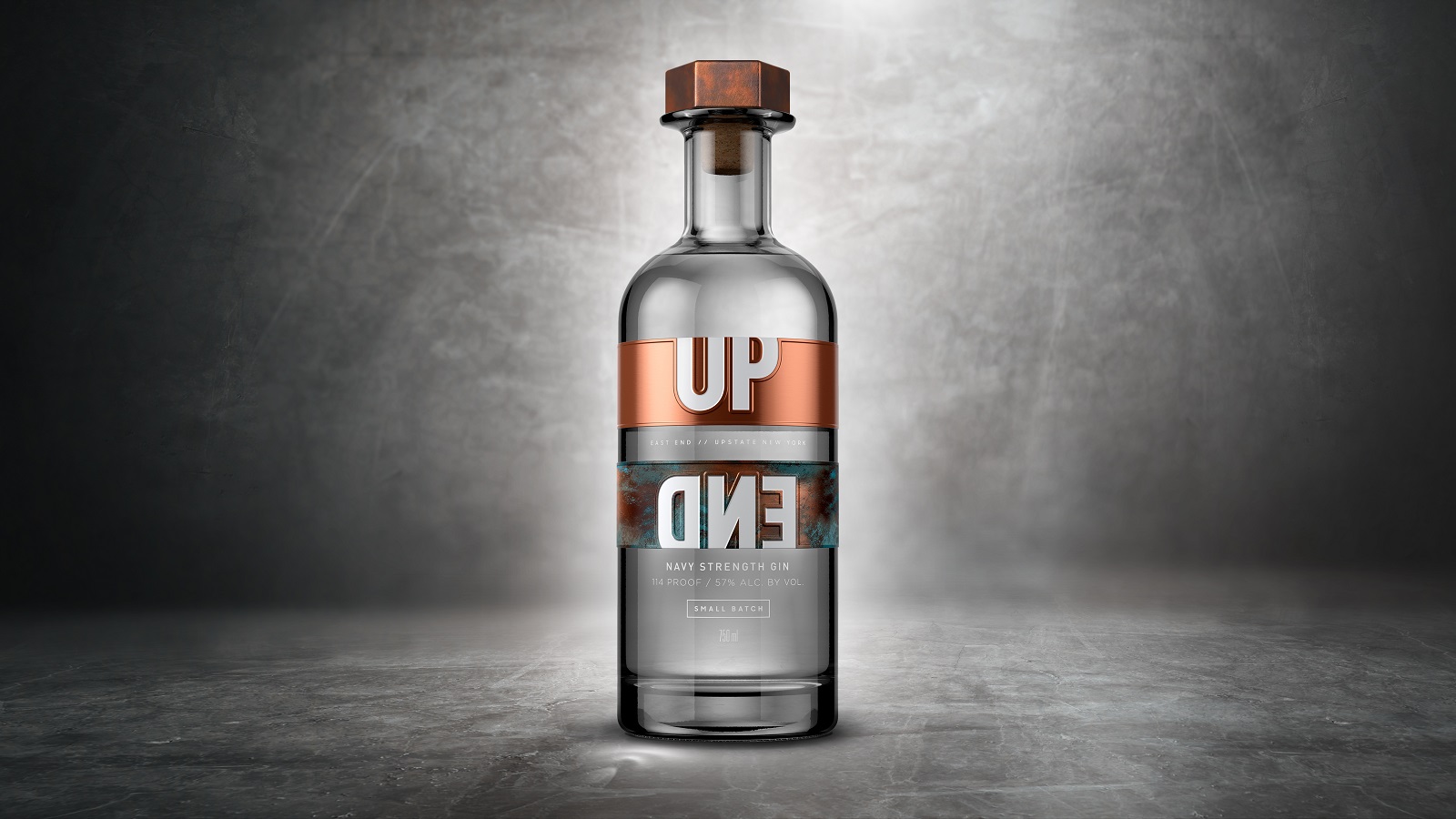
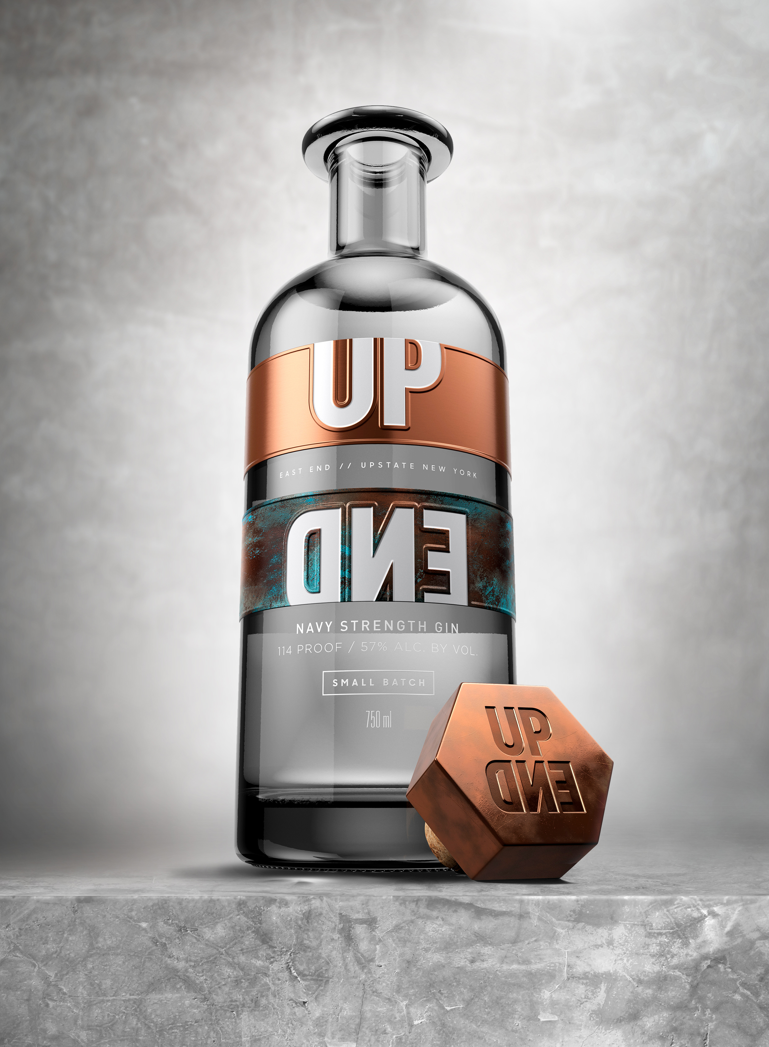
Whilst the duo used different backgrounds to redefine the gin, the creative team from the London-based agency also englobed different strategies to deliver a unique visual experience. First of all, let’s talk about the recipient, the bottle, for which the artists draw inspiration from the urban environment of the iconic New York City. The designers also took into consideration the traditionally-aged copper stills, which are reflected within the whole visual assemble, especially in the stopper.
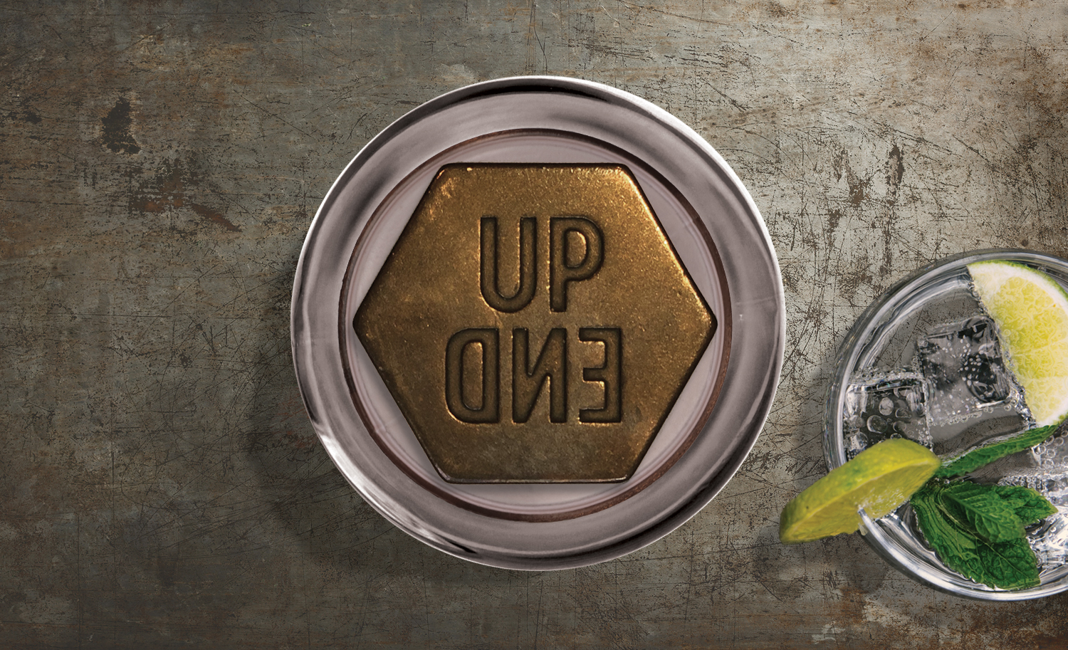
Speaking of which, the stopper comes as a premium die-cast metal-top plug decorated with an antique barrel plated with copper finish. The bottle’s facades proudly carry the labels, each printed onto a flexible aluminum layer. This allows the branding mark to be sculpted over the top, allowing the thick, metal stock to be highlighted and more prominent.
To contour such packaging, Nude worked tirelessly to find exceptional materials that are beyond mediocre. And they certainly did just that: the bottle’s look breaks away from perfect finish and delivers a design that fits anywhere, mostly into any city. Even the shape of the vessel reflects the urban environment, shrouding the viewer into a mysterious coat each time they admire the impressive bottle.
“Working really closely with Matt and Chris over the last year has helped craft a totally unusual and eye-catching bottle that will not only stand out on-shelf but also the test of time. Unlike a lot of the heavily crafted and intricate designs out in the market at the moment, UPEND gin aims to be disruptive in an increasingly overcrowded environment,” said Tony Enoch, Partner at Nude Brand Creation, in a press release.
Matt McKee added: “Unfortunately, many view gin as a singular flavor profile that they either love or hate. Chris and I want to change that perception by reinvigorating this classic spirit which has an extraordinarily wide definition. We developed a range of familiar yet bold recipes that accentuate the diversity of flavors that gin can deliver.”
Just a few more days separate us from the official launch day of the (presumably) well-tasting product. But until then, how about the visual aesthetics that dress up this gin? Just like McKee said, you either love it or hate it. If you ask us, we would say that we absolutely love it! How about you?