High-end Belgian ingredients mingle with the finest liquors to deliver a range of cocktail-inspired ice creams and sorbets. That’s LiQ, a new unusual ice-cream brand, which offers lower sugar desserts that use stevia rather than sugar for a lighter alternative. It’s not only the taste delivered by the brand that is interesting to us. What has drawn our attention is the company’s packaging design and identity, which you can admire in all its ‘cool’ glory below.
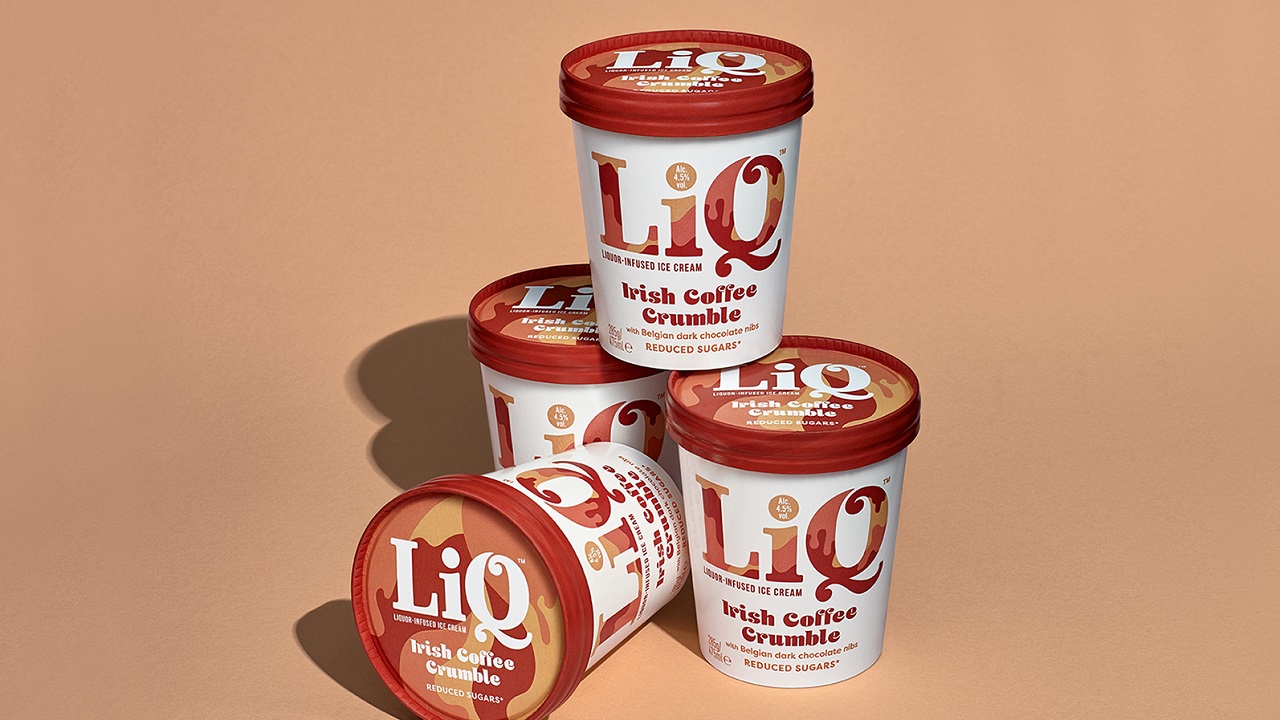
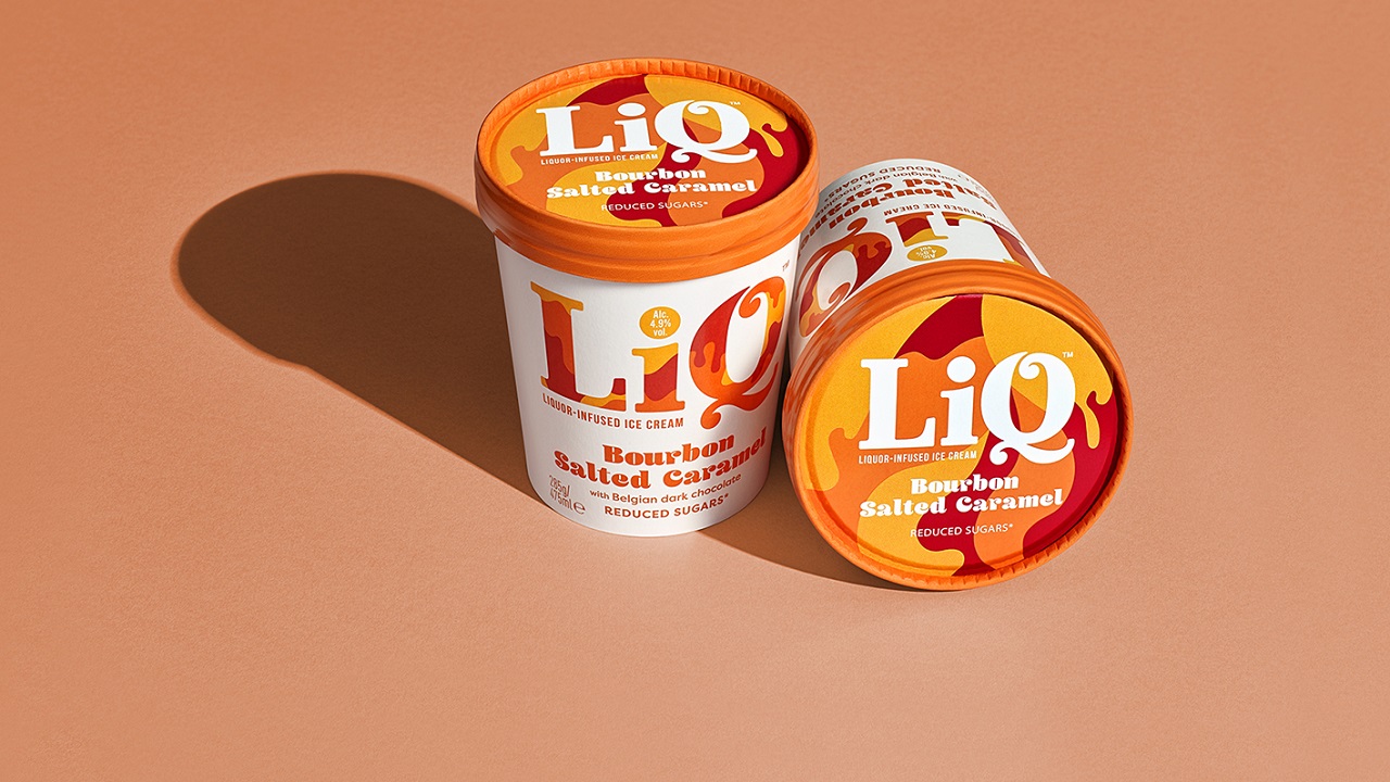
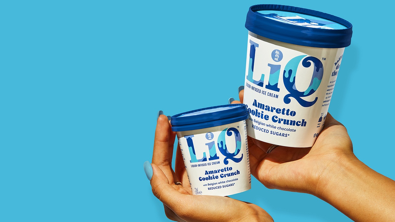
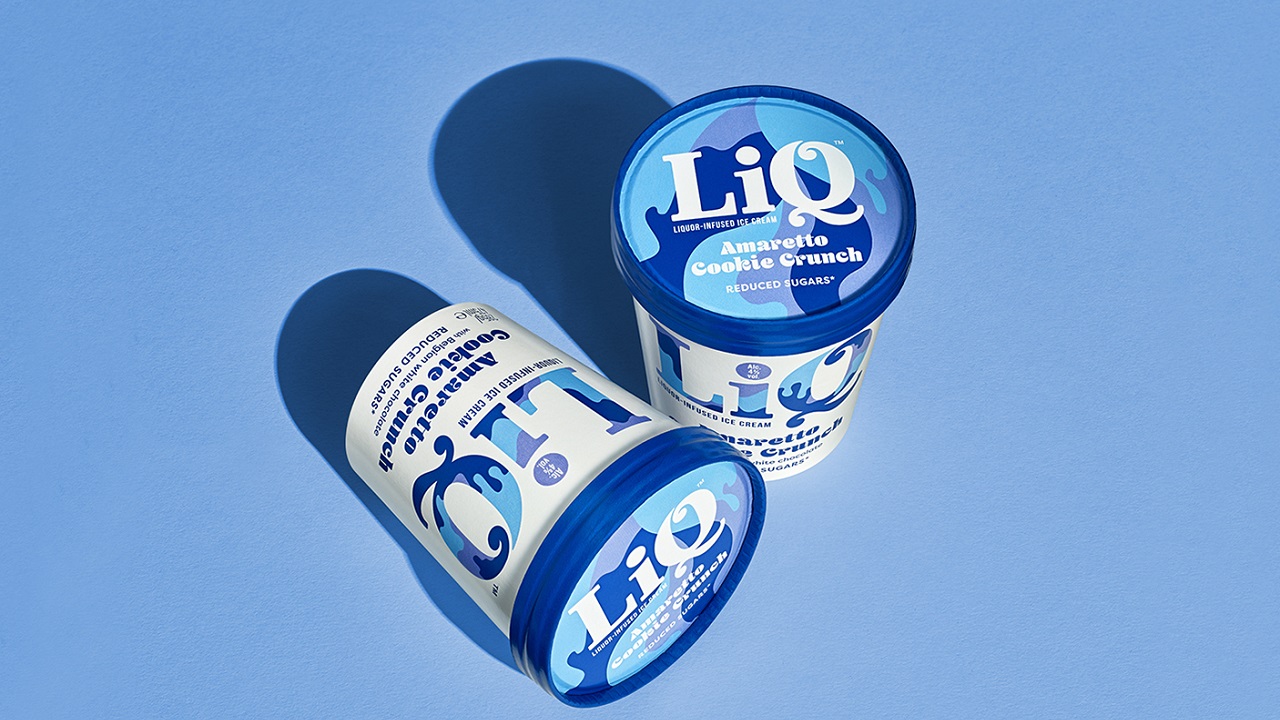
Created by London-based B&B studio, LiQ’s latest packaging features a white background with a series of ‘creamy’ different patterns. The containers reinforce the lightness of the product and a clever blend with strong bright colors brings together an ensemble that reflects the sorbets’ distinctive flavors: bourbon, amaretto, and whiskey. Yes, ice cream with alcohol, yay!
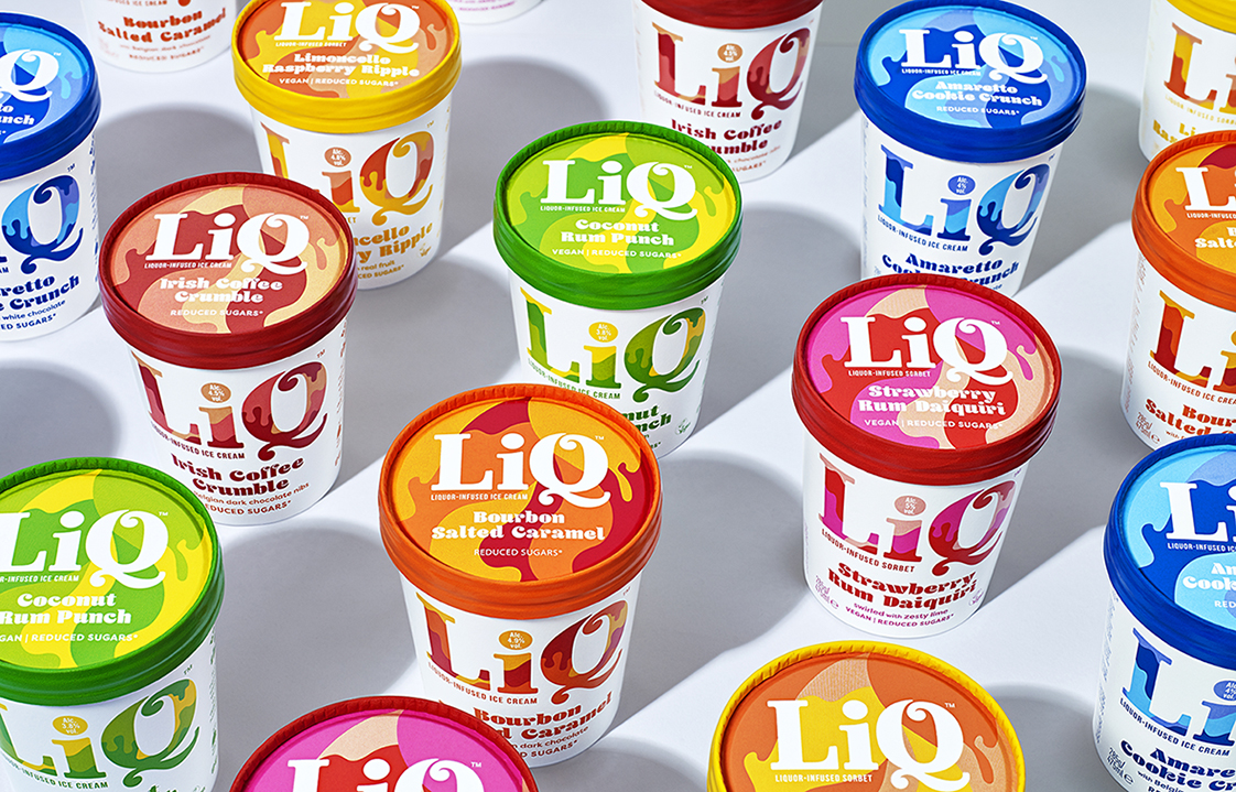
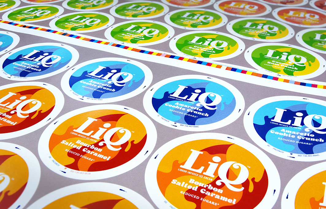
B&B filled up both the lid and sides of each pack with a large-scale logo, ensuring that the LiQ brand is instantly recognizable amongst other competitors. Through the package’s strong tone and color palette, the visual and verbal identity expresses the company’s real core values.
But what’s best is yet to come: Each of LiQ’s ice cream tubs and spoons is one-hundred percent biodegradable. The creative experts at the London-based studio developed a clever color palette which enables all flavor variants to be embedded in a single production run, rather than individually. This allowed the company to use biodegradable packaging printers, proving that when one uses the right design, aesthetics, and production expertise, they don’t have to compromise their splendid looks.
“LiQ is a brand that celebrates the indulgence of ice cream and the sophistication of well-crafted cocktails in a playful way. It’s decadent, stylish and grown-up but with a tongue-in-cheek attitude that extends beyond the pack into the full brand world, from social media to pop-ups,” explained Shaun Bowen, Creative Partner at B&B studio.
“As we prepared to unveil this exciting new brand to the market, we knew we needed a powerful brand identity to stand out in such a competitive space. B&B studio captured the brand’s personality perfectly, with a cheeky attitude and sprinkle of wit but always in good taste. Not only does our new identity ensure that LiQ catches the eye on-shelf but its inbuilt flexibility sets a strong foundation for the long-term growth of the brand,” Jorgo Struyve, Founder of LiQ, uncovered further plans.
This summer is so hot that we are ready to try all the six flavors that the brand came up with. What about you? Which one is your favorite? Don’t you worry though: If you can’t pick a flavor, you can always choose the packaging design that suits you best! Whiskey, wink wink!