Advertising for lighting products is not an easy task. Yet, if you have the right amount of imagination and creativity, you can conquer the world, of lighting at least. Like designer Angelina Pischikova and illustrator Anna Orlovskaya managed to achieve with their project for Belarus’ largest supplier of electrical goods, CrazyService. What was just a simple light bulb for others, for the artists it represented an item that could bring attention to nature’s most wonderful, tiny things: fireflies. The intriguing packaging hides science, physics, and entomology almanacs. Basically, the packaging design comprises of the tale that helped Edison’s imagination to come up with a lightbulb.
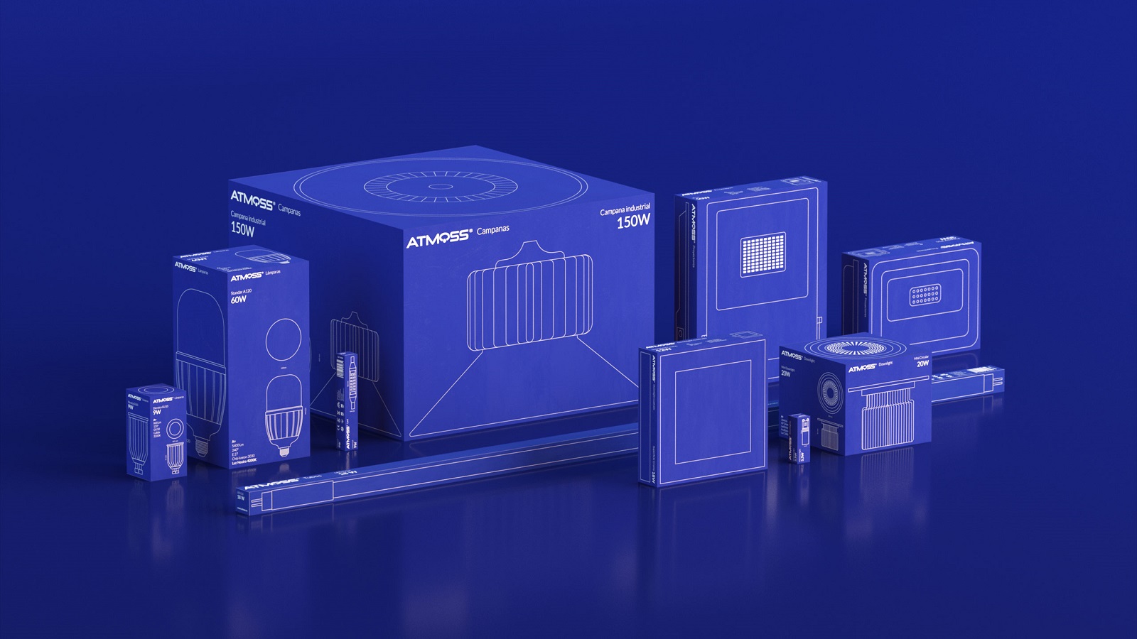
Even though, this was an award-winning idea, we have something else lurking in the shadows of illuminating world: Atmoss, a popular Spanish brand for lighting products and electrical equipment. Before, Atmoss’ packaging design for its products looked plain, so the company approached graphic design studio Evangelisti y Cía to help unveil its new look. When the artists reviewed the packaging, they stumbled upon several problems and challenges. According to the creatives, the products included too much information and missed visual coherence. So Atmoss needed a new design that would help make the brand stand out.
Atmoss had the potential to become a recognizable, simple, and functional brand. That was the concept that lied at the foundation of the new packaging design. In the end, the artists translated these exact three features into action.
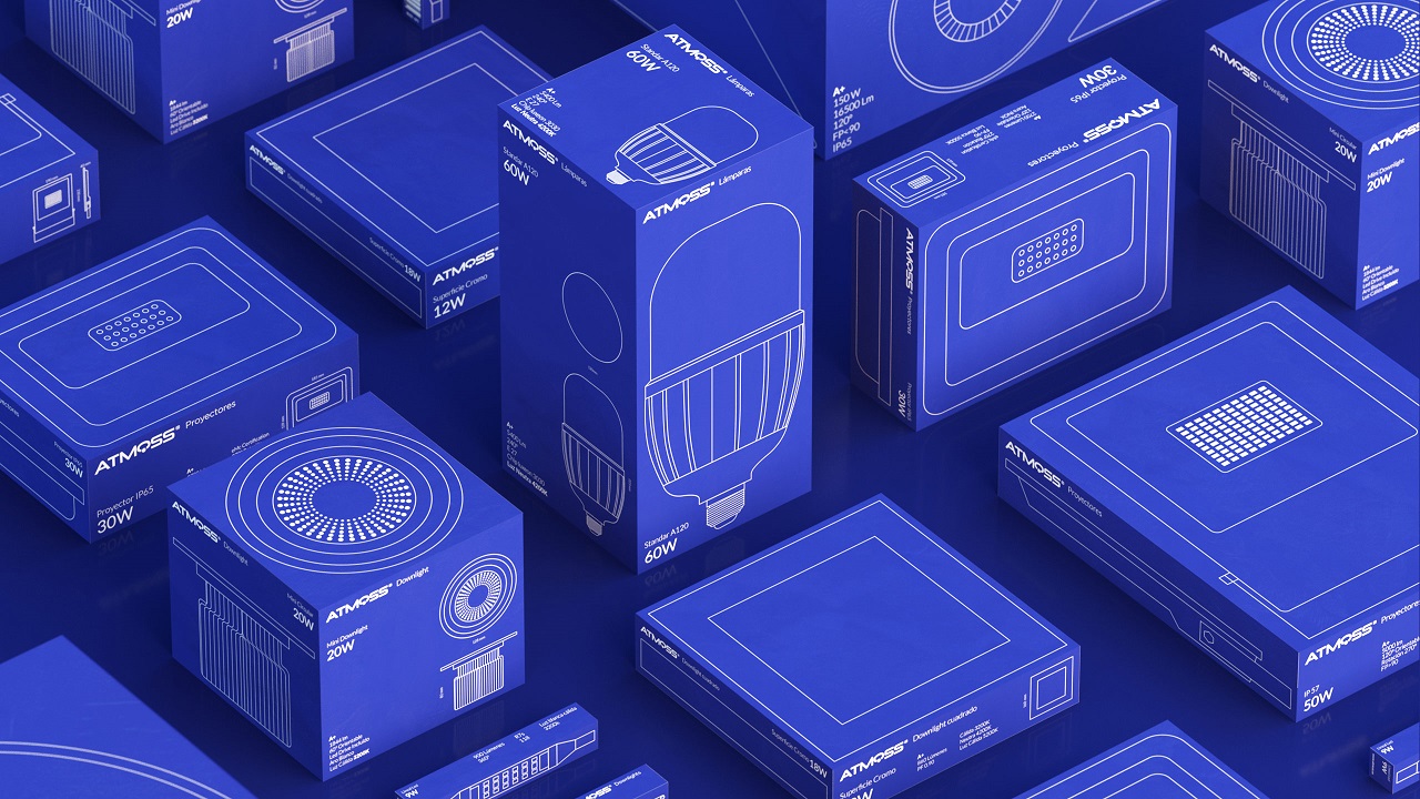
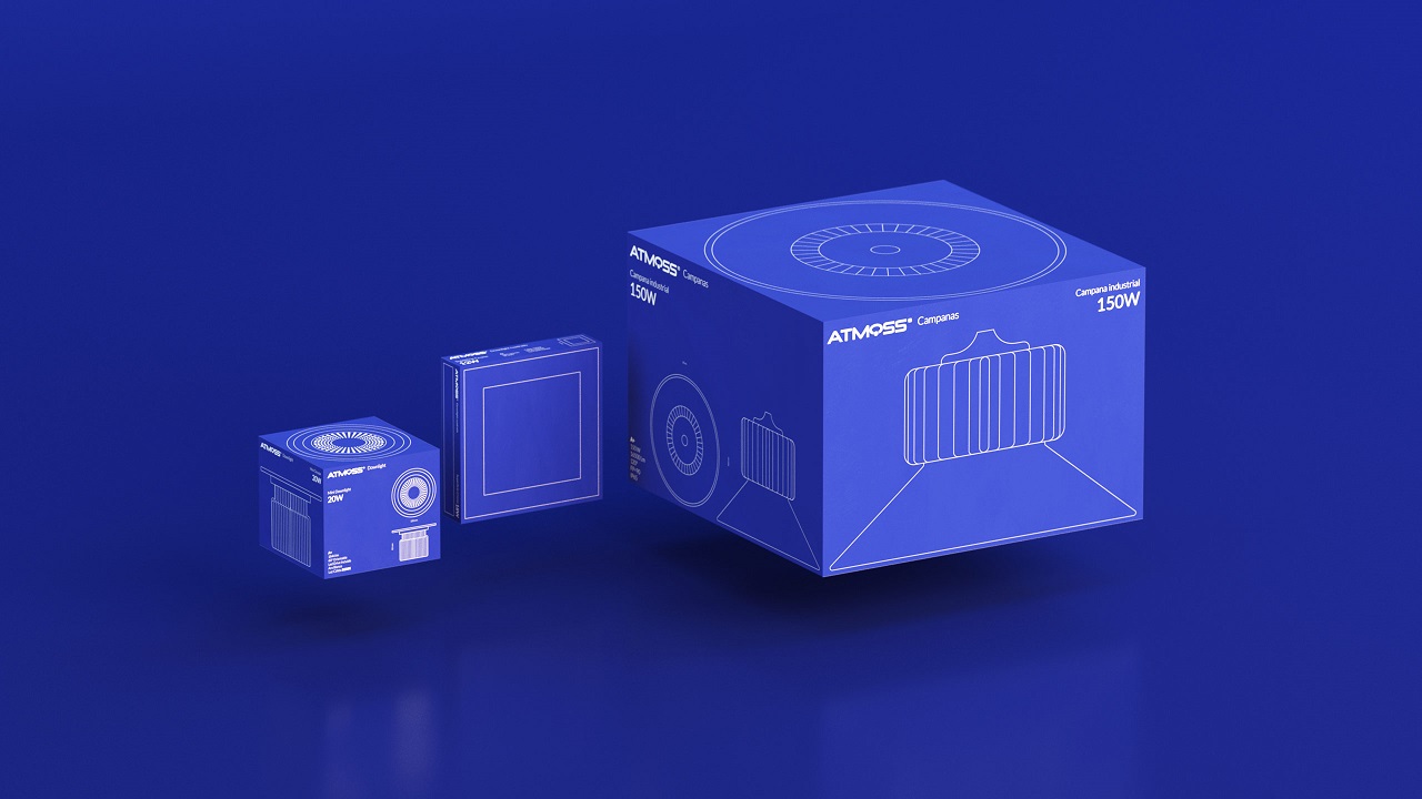
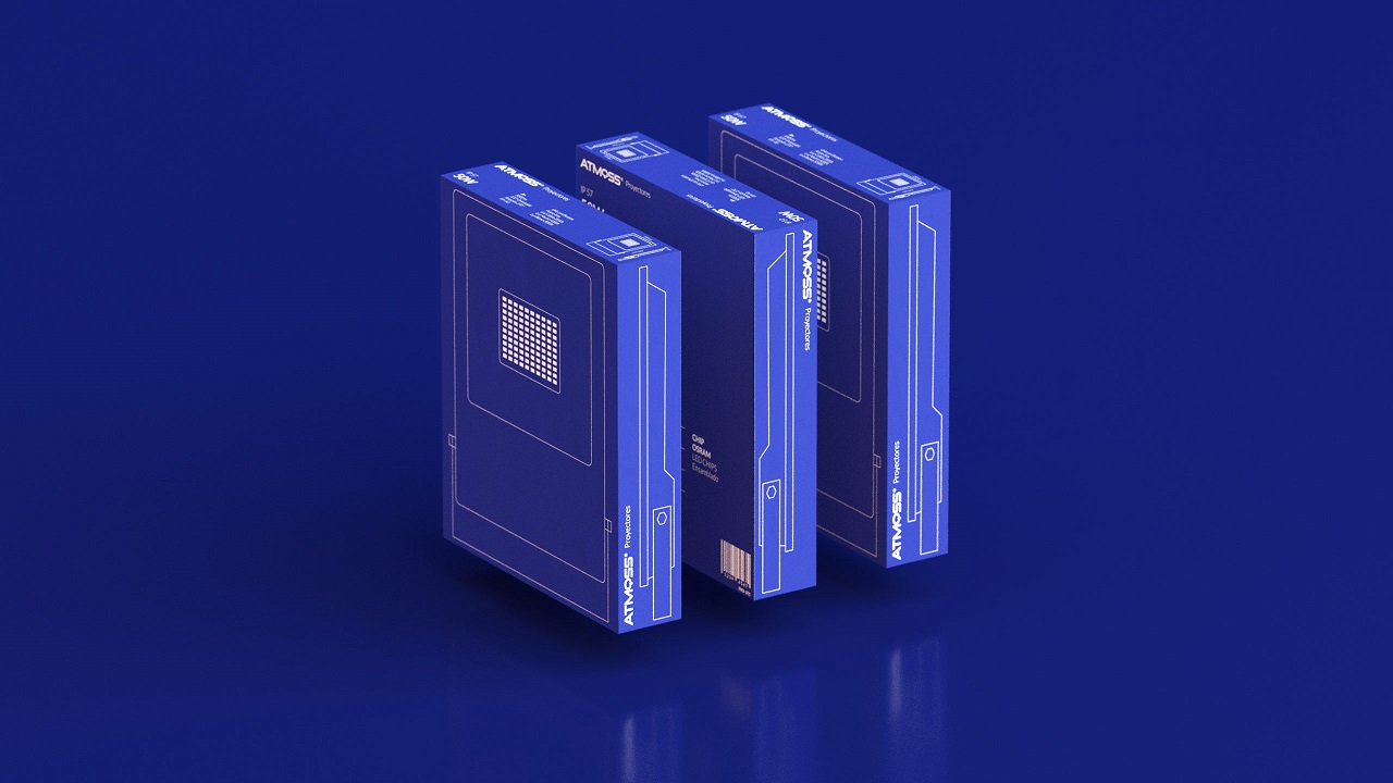
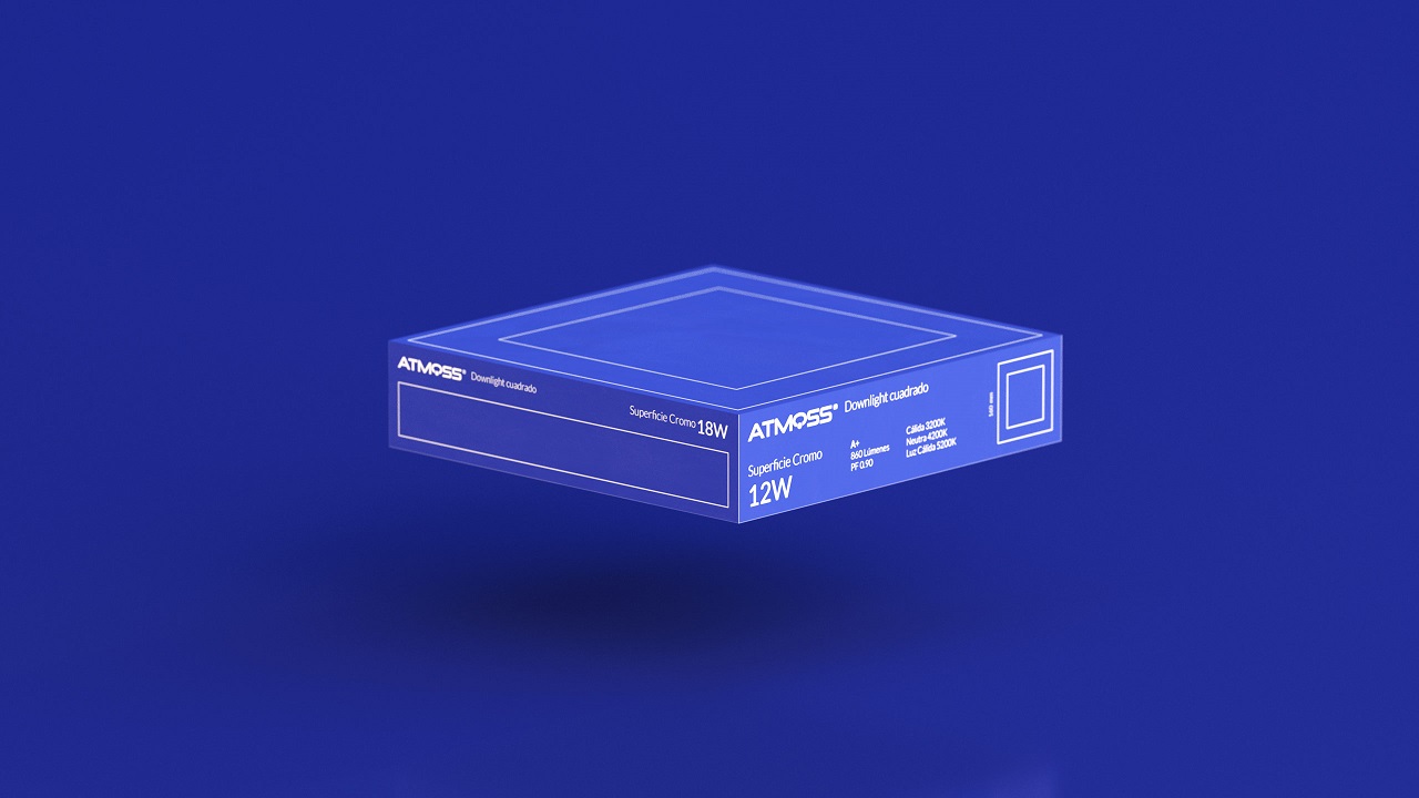
First, they decided that Atmoss needed a content hierarchy. Then, it was absolutely necessary to organize and normalize all the technical information of each product. Lastly, the creatives highlighted the features that are most important to distributors. The artists then chose not to use images of the products to feature on each box. Instead, they agreed to transform the boxes into a cohesive canvas that exhibits the product as it is before it reaches the target customer.
“Thus, we take advantage of all the faces of the box and, on its front, we concentrate all technical information that the distributor needs to be able to choose the right product as soon as he looks for it. This proposal provides a distinguishing value compared to their competitors,” says the agency behind the project.

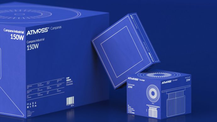
The artists believe that their design is fully aligned with the final consumers’ needs. They say that it is an important thing to differentiate a product from the other, and that you should be able to do so at a simple glance.
The results are amazing: The packaging design features an intelligent and efficient design that reflects the brand’s commitment to delivering high-quality products. In addition, the packaging offers the possibility to “read” the products to the distributors.
“This project is a stimulating challenge: knowing how to underline the characteristics of each project to differentiate from competence and work out well for both the brand and the final consumer. And that is just what we wanted to achieve with the new Atmoss packaging,” concludes the agency. So, how about you — the final consumer. Have a look at the packaging design and do let us know if the agency succeeded to finish what it had in mind.