With so many competitors appearing on the alcoholic-beverages market, Premium Italian liqueur Opal Nera felt that the time has come for a fresh rebrand – in order to better appeal to the consumers. Experiencing a drop in its popularity, the brand reached for Denomination‘s skilled help and asked the agency to create a more luxurious identity and a fresh new look for its products in order to re-establish itself as the premier producer on the competitive market.
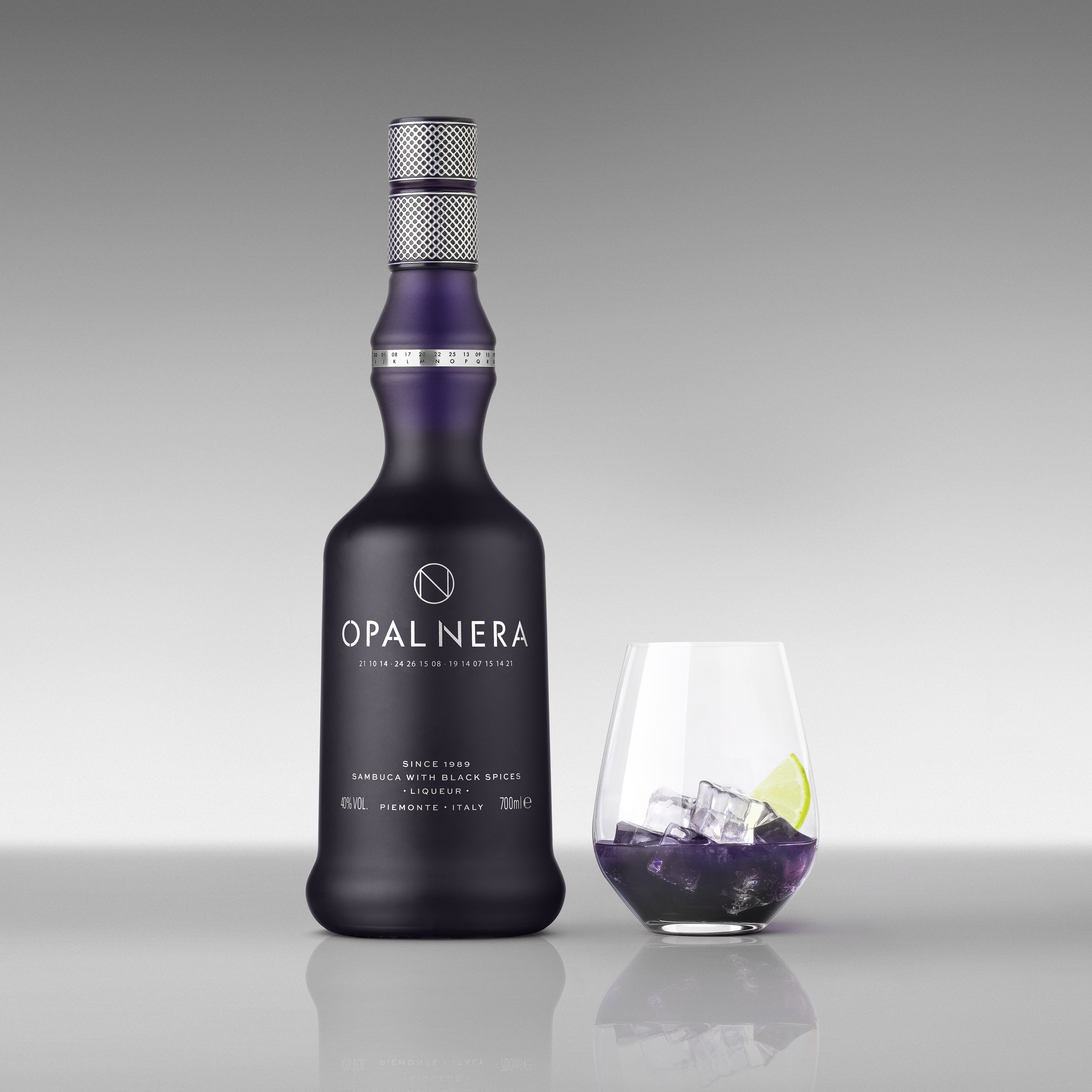
While keeping the much-loved bottle, the creatives succeeded to make the distillery more relevant to the modern consumer, by tapping into an explosion of popularity of ‘Insta-worthy’ liqueurs and aperitifs. Opal Nera is right there – a premium product made of ten ingredients. Sadly, in the last few years, it has lost its mojo as far as consumers are concerned. To attract new costumers to the old back, Denomination has brought a ‘brand-new’ identity that appears more friendly in inner-city bars.
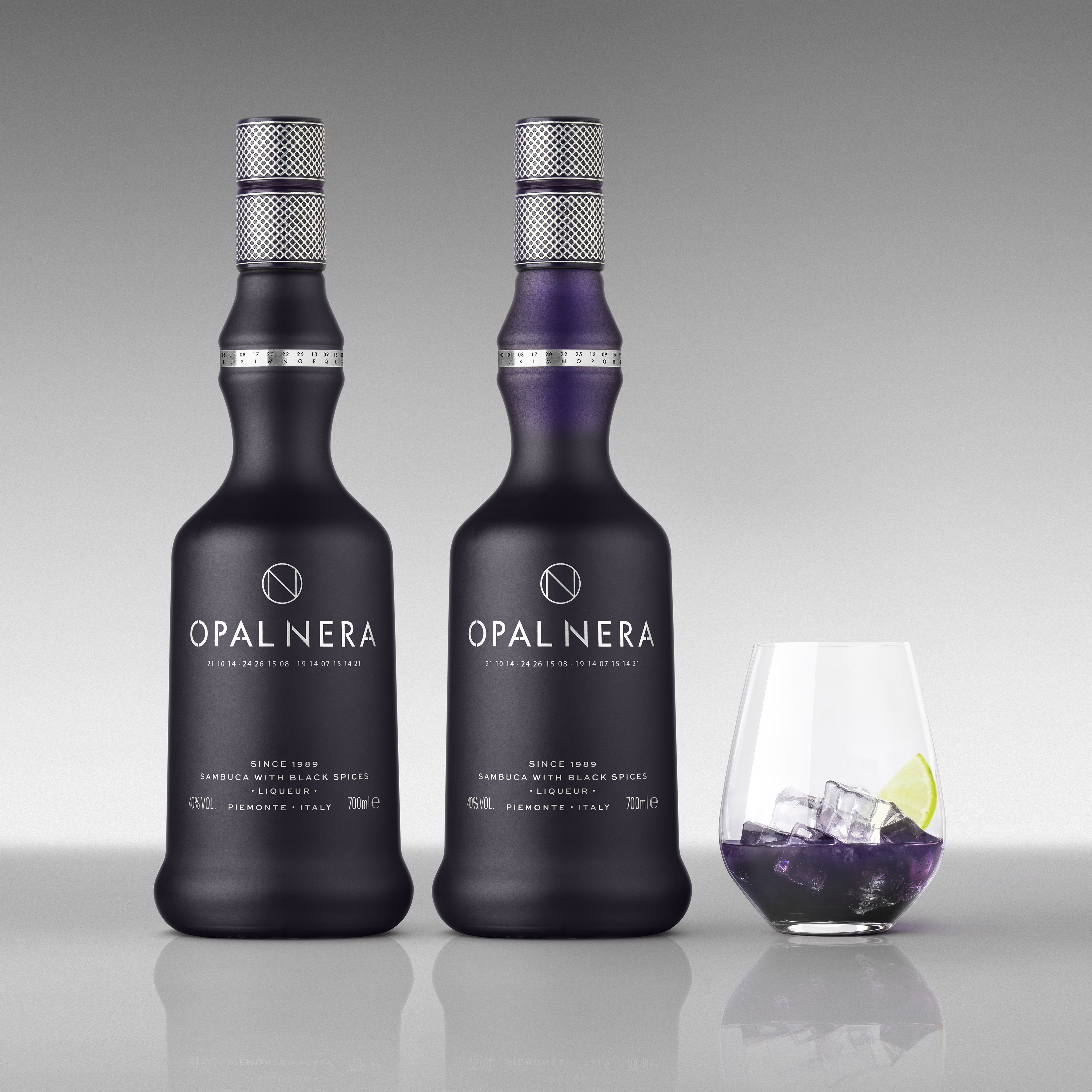
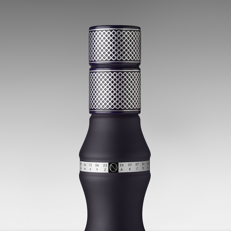
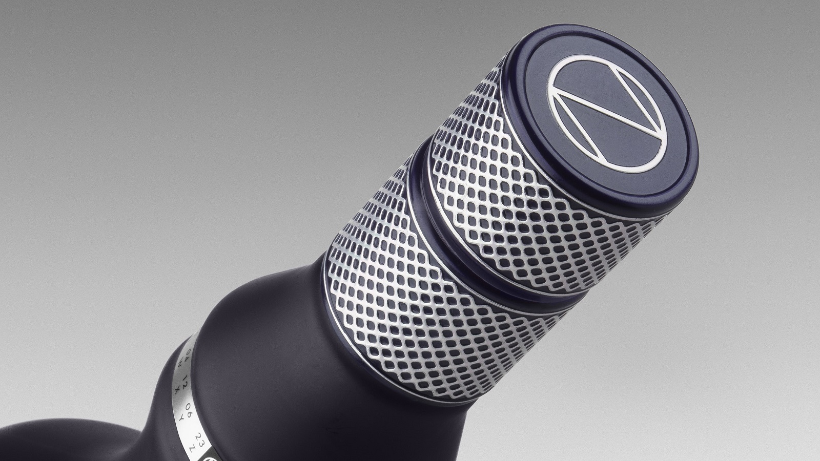
Rowena Curlewis, CEO, Denomination, explains the uniqueness of the new design: “Opal Nera’s USP – its ‘dark secret’ – is that it turns purple on contact with ice, so we modified the bottle to reflect that. At first glance it looks like black frosted glass but, on pouring, a purple color that matches the liquid is revealed.” To make the bottle even more appealing to the public, Denomination added a secret code beneath the logo, which can be deciphered using a sequence of letters and numbers that appear on the rim to reveal the words ‘dark s*****.’ Of course, we’re not going to give this away! However, Rowena has a hint for you: “We wanted to tell the story in a unique way, and our ‘secret code’ mechanism is distinctive and really engages the consumer.”
Besides celebrating the distillery’s colors, Denomination worked on the packaging design and placed the product at the center stage of Distillerie Francoli, therefore taking the full advantage of the current liqueur boom. That’s why the creative studio used contemporary typography and created a distinctive ON logo which has negative tension on the bottle. The team still wanted to keep the premium side of the product, so they also pointed out the virtues of the provenance in the messaging hierarchy and created a textural capsule with luxury design semiotics.
Nigel Brown, Commercial Director, Gruppo Francoli, describes the main feature of the new look: “Denomination has developed a beautiful design solution that captures people’s attention. It is still recognizably Opal Nera but has been brought up to date so that it will appeal to the modern consumer. It’s a sophisticated response that plays to Opal Nera’s distinctive qualities, making it stand out in a sea of conservative brands. We love the way consumers are now drawn in and taken on a journey of discovery, with layered packaging that engages bartenders and drinkers and makes Opal Nera a memorable experience.”
Are you ready to uncover Opal Nera’s ‘dark secret?’ Because we definitely are! But we’re going to wait ’till Christmas, maybe Santa himself has a creative way of finding out the liqueur’s best-kept treasures…