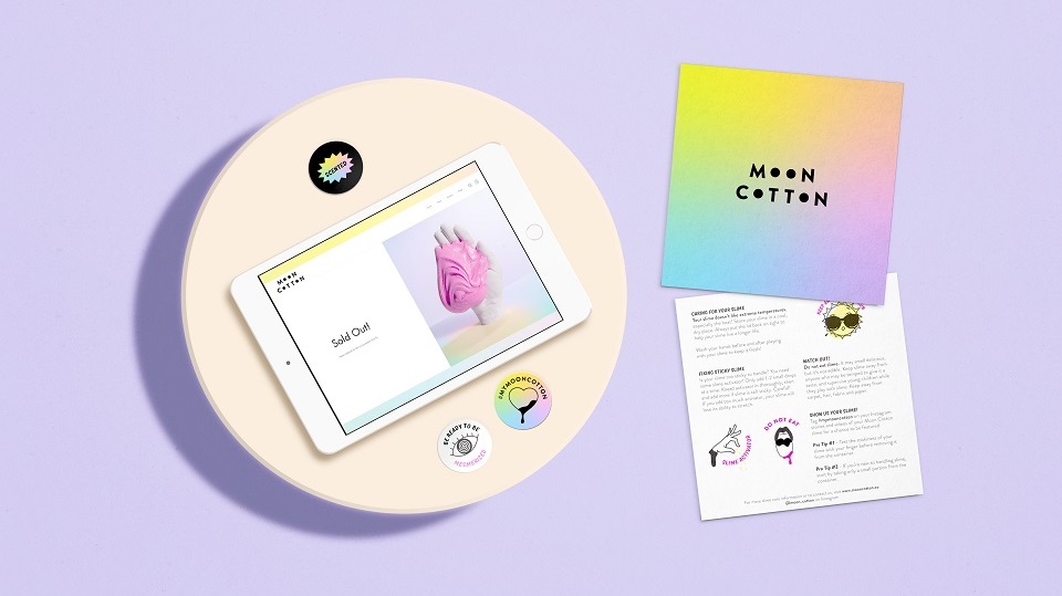
Brand design agency Vault49 made public the identity and visual language of slime brand Moon Cotton, which is now part of the IMGN Media portfolio. The newly-made branding comes with a full unboxing experience for the direct to consumer brand. Things proved to work so well to the brand that it ended up selling all the first batch of nine flavors on their first day.
Moon Cotton was launched in 2017 and is led by IMGN Media creative director Katie Woolly, who decided to refresh the visual personality of the brand. Woolly was not alone in this process. To get the best results and to stand out against its competitors, the company took the challenge to the New-York-based design agency, which, you can imagine, didn’t let down the brand.
Dor Mizrahi, Co-Founder, IMGN Media, says: “Vault49 has an expertise in connecting with consumers through design across all categories and we were happy to extend our partnership with the team. The way they paired the playfulness of the category with the premium quality of our slime was evident as the product sold out immediately.”
Leigh Chandler, Partner and Creative Director, Vault49, adds: “Slime as an industry has exploded. People love to play with slime or watch videos of other people playing with it. Slime is an effective form of relaxation, or escapism and is just one of many types of ASMR content, which we have seen taking off in recent years and adopted by brands as big as Ikea and Nickelodeon.”
“Yet this was an industry started by young people, fabricating slimes in their bathrooms, videoing themselves playing with it in their living room, and selling it online. This DIY, almost ‘brandless’ aesthetic and belief is welcomed by the slime community – when big brands such as Walmart have tried to enter the space they are greeted with skepticism. They don’t have permission to play in this space.”
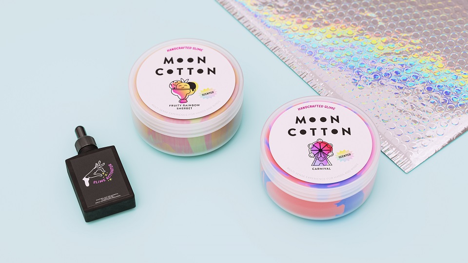
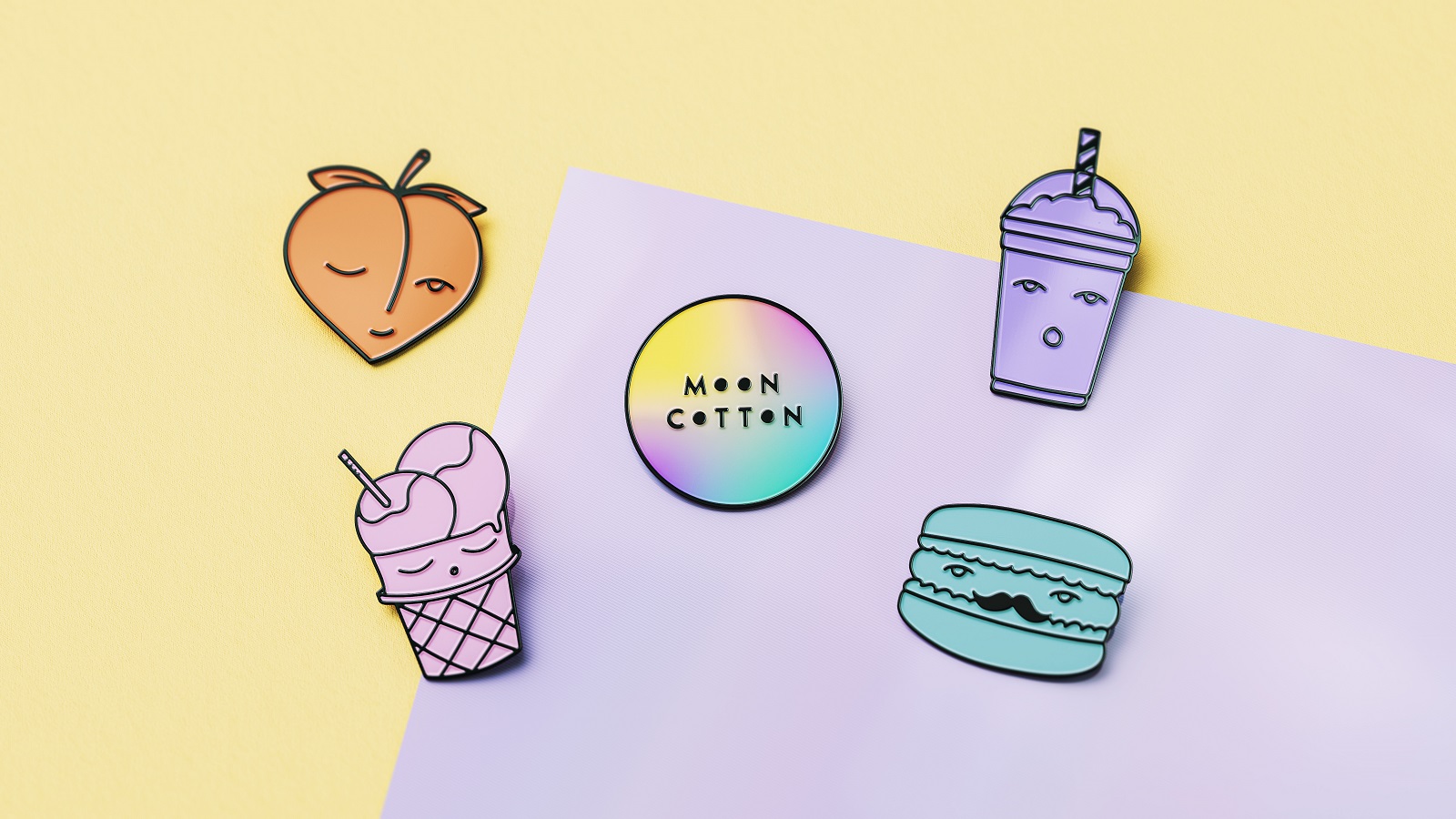
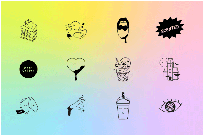
The solutions proposed by Vault49 take inspiration from the punk spirit of the DIY world through the lens of premium craft. All illustrations depicted on the packaging are hand-drawn with the intention to encapsulate the brand’s real personality and core values. The entire assembly is nicely complemented by a color palette that is bright, joyful, and irresistible, just like its products. To bring a joyful note to the brand, the artists added a flirty tone of voice.
Chandler continues: “Moon Cotton grew from the ground (or bedroom) up and the founder Katie quickly grew her tribe. It was important when designing her refresh that we didn’t lose the spirit of what she created, so instead, we embraced what was working and tweaked what could be improved.”
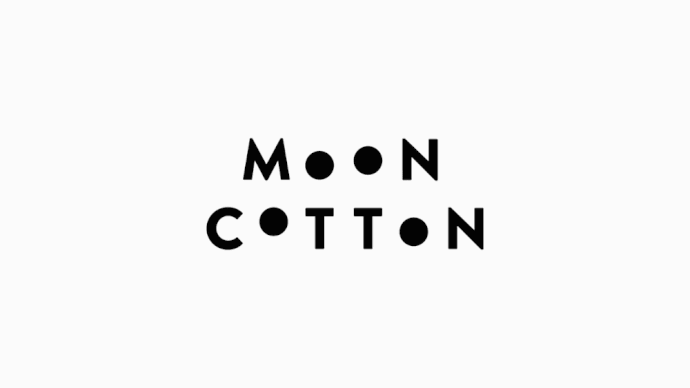
“The brand name was perfect – we felt it captured the surreal, nonsensical world that slime takes you to in your mind. It also provided inspiration for the logo treatment – by simply replacing the O’s with full circles and stacking the words, we could replicate the lunar cycle. These playfully come to life through animation.”
“A total of 70 ‘flavor’ illustrations were created in-house and communicate the breadth of weird and wonderful scents. Iridescent materials feel intriguing and hypnotic. An overall feel of rawness and imperfection combined with premium finishes captured what we were hoping to achieve for the evolved brand.”
Whilst the whole internet is obsessed with slime, we are simply stunned by Moon Cotton’s identity. Yet, if the brand randomly decides to surprise us with some of its products, we won’t mind. In fact, we’ll have something to keep the stress away while searching for other design projects that are worth mentioning…