The audience’s consumption of content is constantly changing but Groupe Média TFO is committed to offering the same educational content as they did until now. With a focus on the learning process, the Franco-Ontarian public media company launched a new visual identity, led by Toronto-based studio Le Parc Design with strategic support from Juniper Park\TBWA.
The refreshed branding comes in a time when people are getting their information from different platforms and devices. Because of this, the brand thinks that it is imperative for a media company — and its sub-brands — to have a brand identity that helps it streamline the information in an attractive manner, both for kids and adults.
The renewed brand architecture and positioning saw Le Parc Design developing a substantial, multi-brand, multi-platform identity inclusive of 2D and 3D animation for its on-screen design. The creatives also designed the static assets for TFO’s several sub-brands such as MiniTFO for kids; FlipTFO for pre-teens; PlusTFO, a new brand covering the adult programming including ONFR+; IDELLO by TFO, its educational digital platform for schools and families; and the LUV, the cutting edge 3D studio of Groupe Média TFO.

Both creative teams were commissioned with the task of creating a bold identity that reflects the brand’s efforts to keep Ontarians focused on educational themes using its content and platforms, which are slightly modernized now. “Vibrant, colorful, dynamic, and welcoming — that is what TFO’s new visual identity conveys, and we renewed it to reach our audiences more effectively. Through the precise work of Juniper Park\TBWA’s team and under the leadership of David Toto, the collaboration was an unparalleled creative experience,” said Carole Nkoa, Chief Marketing and Communications Officer at Groupe Média TFO.
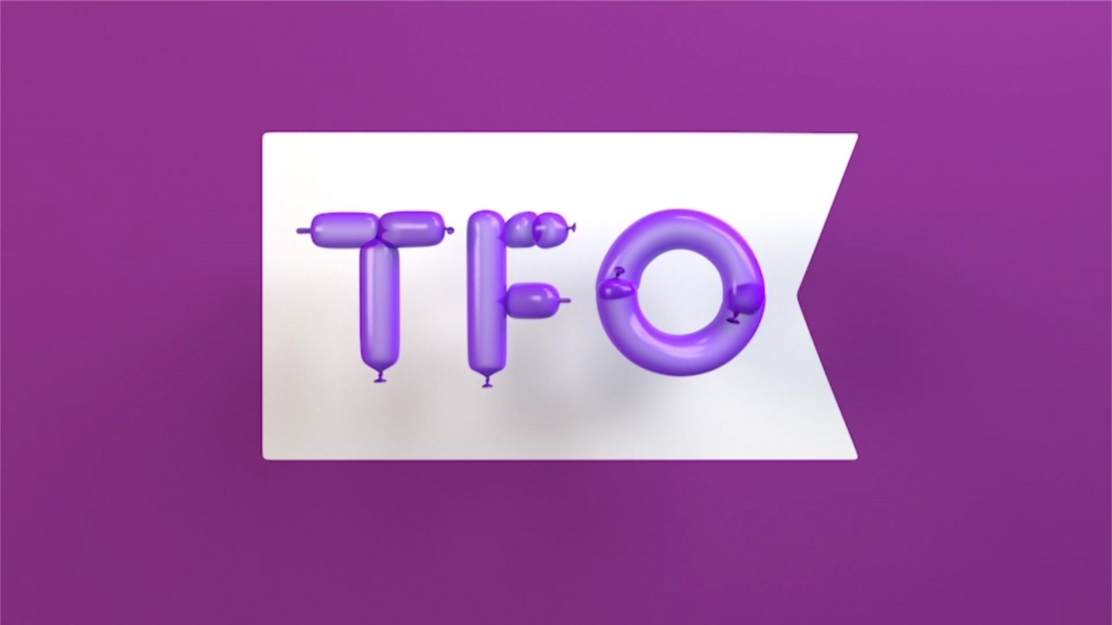
In the identity of each sub-brand, there is a visual element that follows the iconic contour of a flag — which, over time, has become a symbolic banner for the Francophonie culture. Its image is displayed in front and center, the team taking into account the size of the letters, depending on which they adjusted the proportions of the flag.
Also, the purple color has been refreshed with a brighter version of the same shade, creating smooth transitions between the company’s sub-brands. The looks of each member of the brand were “stamped” with the shape of the TFO flag, just to convey the idea that they are part of the TFO family. Subsequently, each brand was treated individually, each with its own graphic universe.
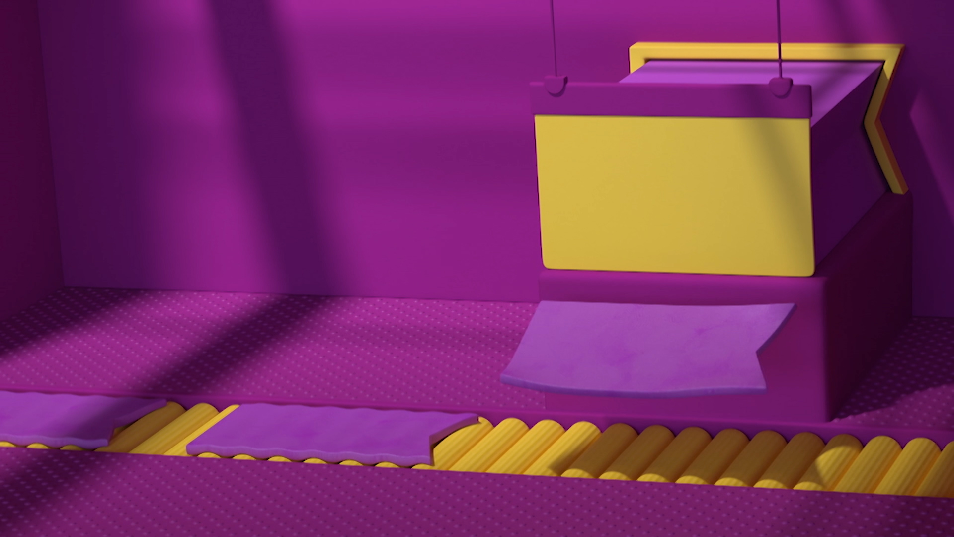
“The TFO brand has a rich history, and to honor this we created various brand expressions from simple animated 2D interstitials to textured, and 3D break fillers, that exudes its playful and inclusive characteristics,” says Nathalie Cusson, Creative Director at Le Parc. “The result is a family of brands built on the same framework but bearing their own unique personality.”
The group was simply delighted with this collaboration with the creative team and the way they managed to express its efforts. “This highly skilled team supported us throughout our digital transformation and managed to capture TFO’s vitality because they understood its nature as an innovative and forward-thinking symbol of the Ontarian and Canadian Francophonie. We are very pleased with the results: simplicity, unity, and power. It perfectly encapsulates our efforts to become a genuine omnichannel media,” concludes Nkoa.
This creative announcement is the first of many other initiatives to follow from TFO. Thus, as the brand continues to transform, it will come with more exciting news.
Credits:
Client: Groupe Média TFO
Agency: Juniper Park\TBWA
Design Studio: Le Parc Design