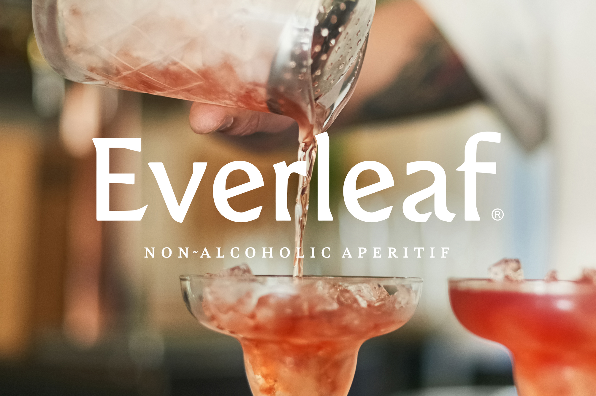
Rooted in nature, Everleaf Drinks was founded by Paul Mathew, a conservation biologist and bartender who is strongly connected with the environment. Finding inspiration in these two worlds, Mathew poured the foundation of the company. Born out of passion and from the desire to deliver a drink that encapsulates nature’s aromas, the biologist came up with his own recipe for a non-alcoholic aperitif. But given that alcohol’s unique viscosity is missing from non-alcoholic drinks, he had to think of something similar, yet different.
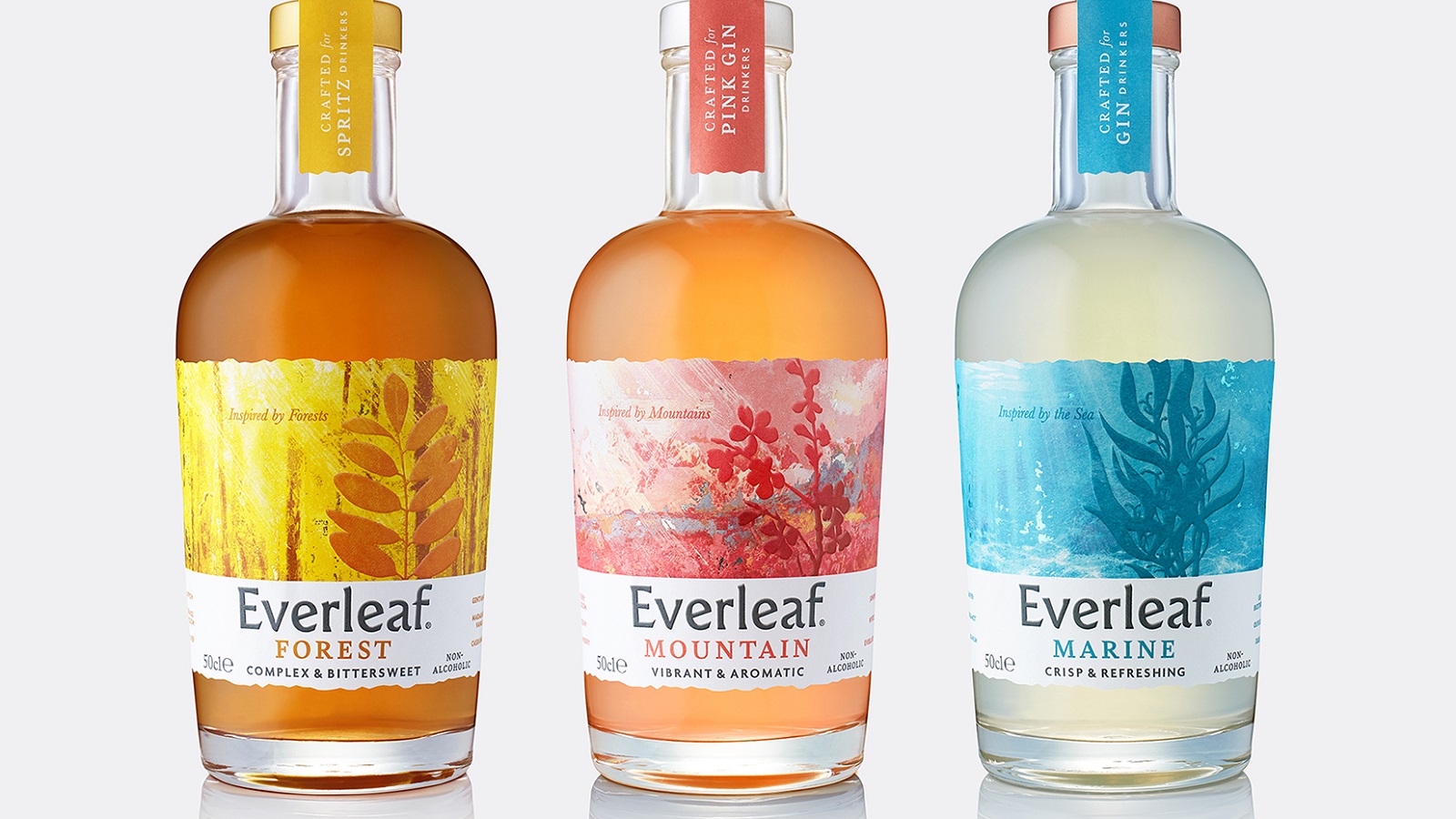
He knew that his solution lies in nature, in forests, mountains, and seas. And so, plants such as acacia trees and seaweeds became ingredients of Everleaf, a non-alcoholic drink which has undergone a strategic repositioning and redesign by B&B studio. The brand wanted to grow its presence in both on- and off-trade and launch a new line of products. Building on the success of its initial product, the family grew in size, with Forest getting two more brothers: Mountain and Marine.
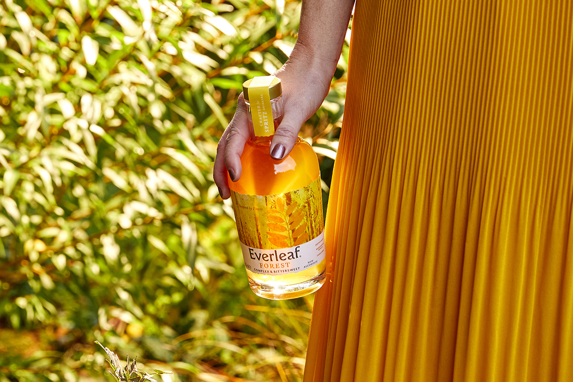
The London-based studio was very excited to work and reinvent Everleaf’s design. Thus, the artists considered the idea of making the brand stand out in this fast-evolving world of adult drinks. Initially, the drink was packaged in a tall bottle, with a patterned label, reminiscent of the world of cordials rather than craft spirits.
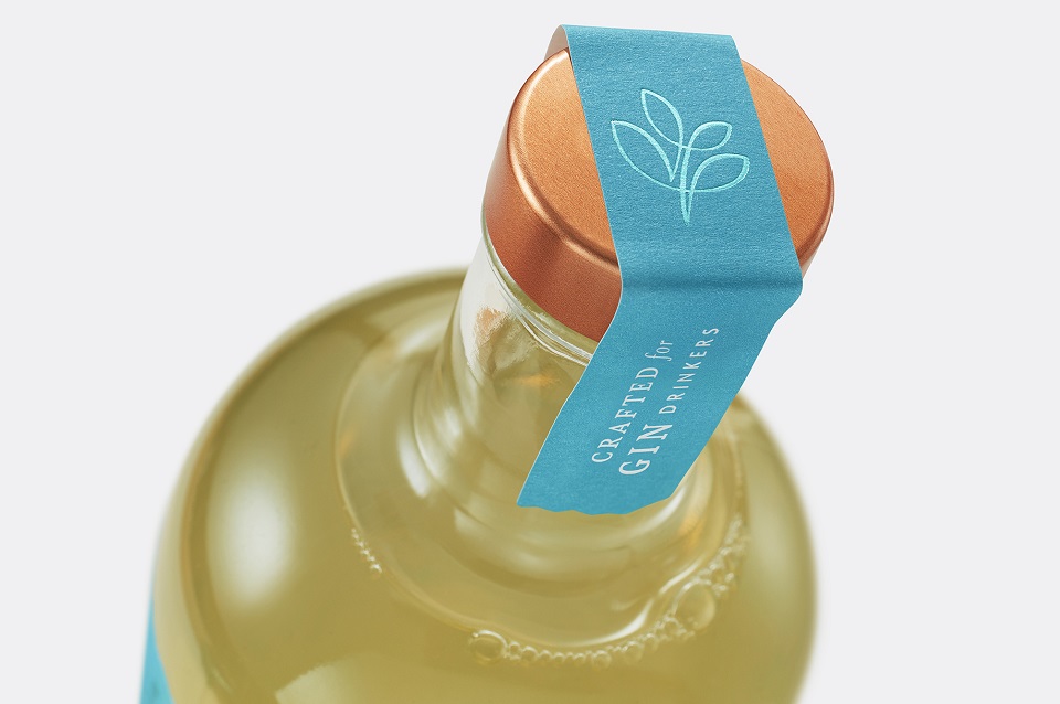
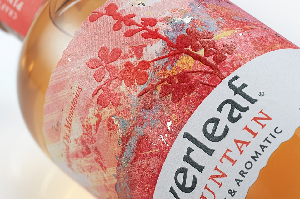
The creators replaced the tall silhouette of the former bottle with a shorter one, with broad shoulders and a more sophisticated neck. The new shape of the bottle makes it blend perfectly among its crafted peers. As for the label, it kept its color in the case of the Forest aperitif. If initially the label featured a series of white leaves printed on a yellow-orange background, the new label maintains similar colors but reveals a different design, this time, with a story. The same formula applies to the other two flavors as well.
The label design narrates a different story for each aroma, yet each tells Mathew’s adventure in search of the perfect ingredients. Moreover, the design embodies the essence of each biome represented while focusing on a single decorated botanical. The color schemes are inspired by these environments and evoke naturalness, echoing the colors of each drink.
Claudia Morris, Creative Director at B&B studio, says: “The new range is harmoniously designed for real collectability, but each label tells the unique story of each liquid and its inspiration. While rooted in the natural world, the design is incredibly effective at communicating the taste, occasion, and emotion associated with each drink.”
Adele Macky, Marketing Manager at Everleaf, adds: “The new Everleaf design perfectly captures Paul’s unique expertise in finding and understanding botanical ingredients and blending them into exquisitely crafted and complex drinks.”
Credits:
Client: Everleaf Drinks
Agency: B&B