There are six populous orders of insects: Orthoptera, Hemiptera, Diptera, Hymenoptera, Lepidoptera, and Coleoptera. The latter is formed of beetles. With around 400,000 identified species, this order is the largest of them all. They live in water, up trees, or in the soil. These diverse insects can be found almost everywhere, in every shape or size. Even in our imagination.
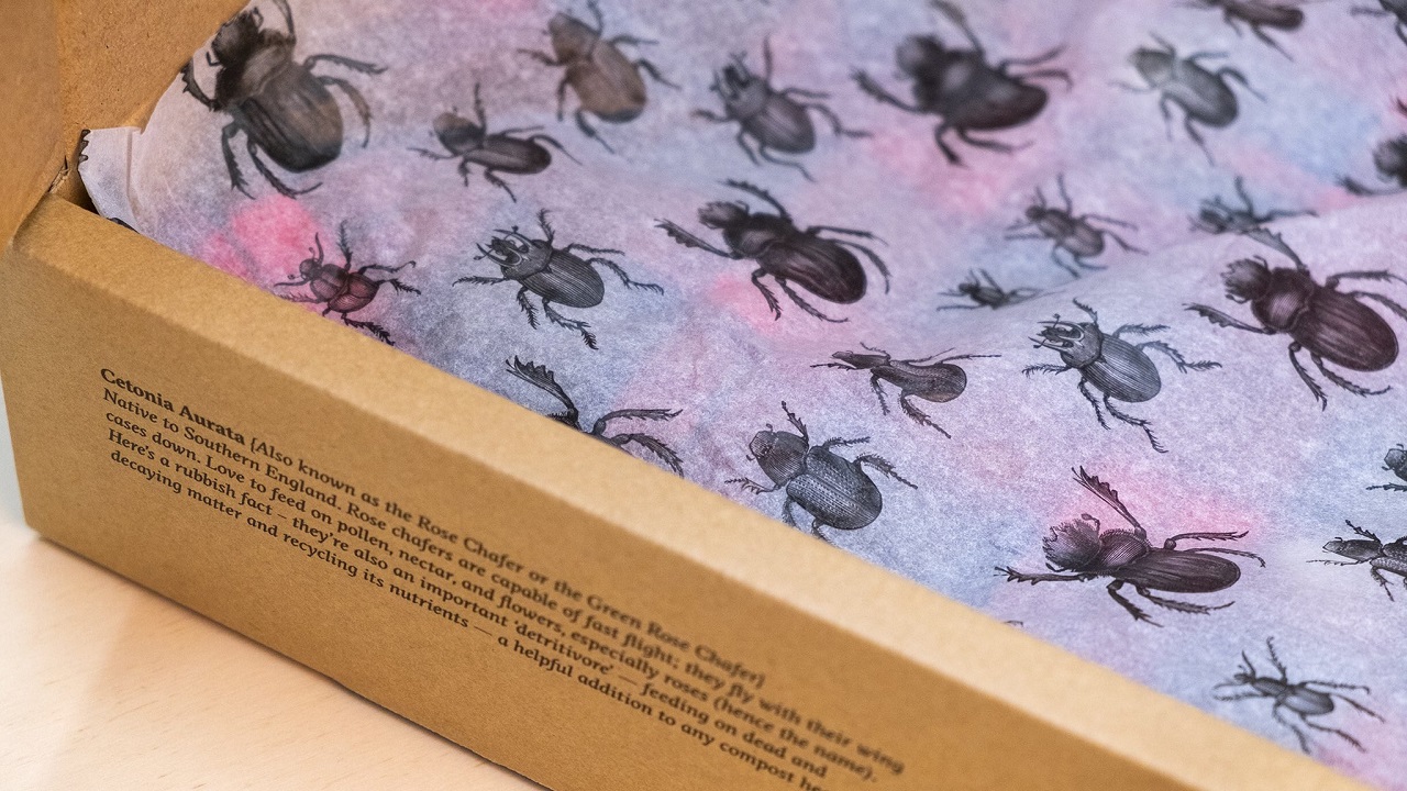
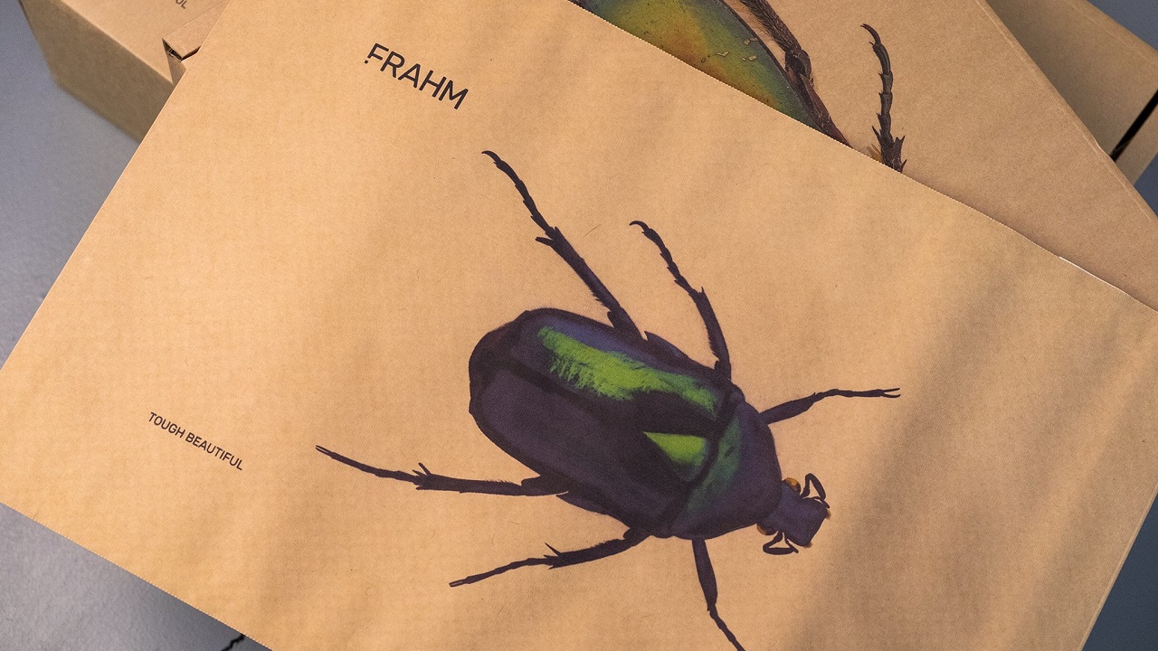
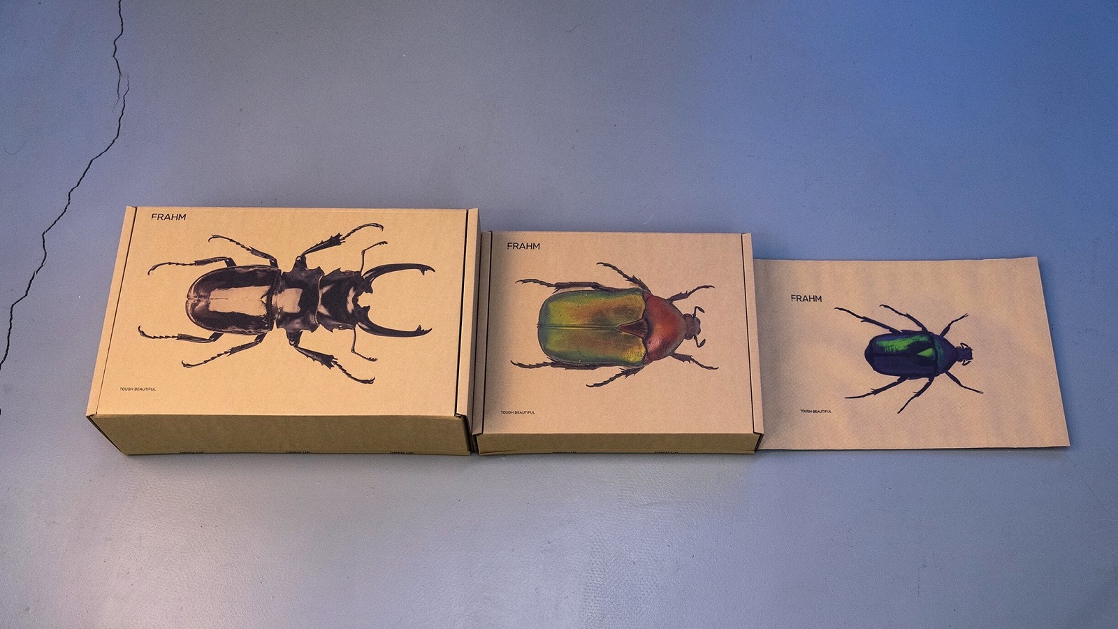
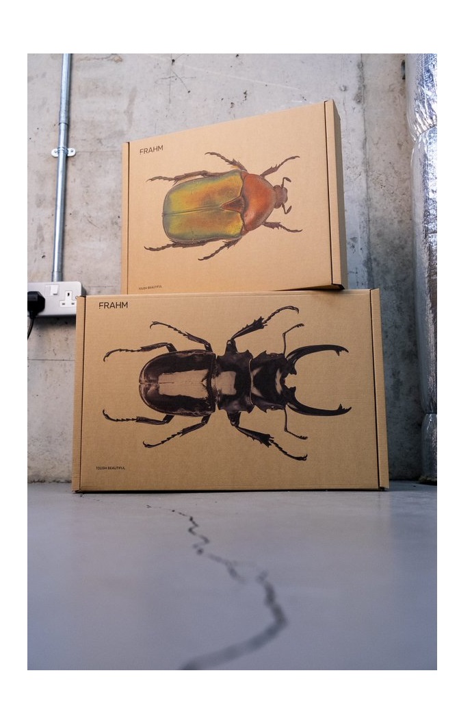
Their buzz was heard by the creatives at Supple Studio who, despite working separately, thought of using the silhouette of beetles for the FRAHM’s packaging design. “We went through all our other ideas, but really that was the one that really nailed it. And the fact we both thought of it independently really cemented the idea in our heads,” Jamie Ellul said about his collaboration with his colleague, Phil.
Yet, before starting generating ideas, the two artists agreed that whatever they came up with should resonate with the company’s mantra: Tough Beautiful. Founded in 2018 by Nick and Emmalou Hussey, with the help of Nicks’ best friend, Jason, FRAHM is simply “obsessed by jackets.” Yet, the brand felt like the packaging was letting it down. Nick asked Jamie, founder of the Bath-based studio and one of the company’s customers, to design the packaging and he was flattered that the studio said they will do it. “From loads of ideas, we picked the beetles immediately. Masculine but beautiful, tough yet fragile,” Nick says.
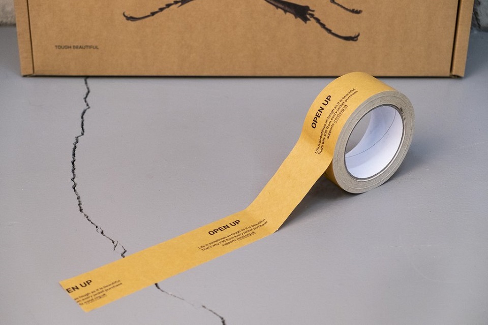
Speaking of fragile, FRAHM wanted to convey a message about mental health. In 2017, Nick had a nervous breakdown and hopes that, by speaking about it, will help others open up. He works on promoting better men’s mental health, so £10 from every jacket the company sells goes to Mind Charity. He wanted to convey this message on the packaging and so, the tape used to seal the boxes encourages people to open up.
“Part of Nick’s brief was also to give a nod to the mental health aspect of the brand — but without being too preachy. We came up with the ‘Open Up’ copy line as something to sit on the opening flap of the packaging. But Nick and Emmalou came up with the idea of using the line for the tape that seals the packs. We love it when the client gets stuck in and helps problem-solve. The project was in and out of the door in under two weeks — which to me is proof of a good brief, a brave client and us just ‘getting’ each other,” Jamie adds.

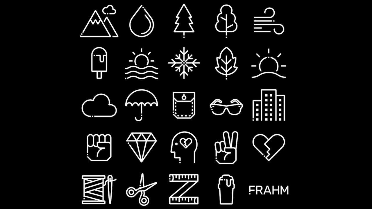
Besides designing the packaging, the studio was commissioned to create a set of icons that reflect the many benefits a FRAHM jacket has. Also, the F letter at the beginning of the name has a dot at the bottom. It was Nick’s hint of a question mark, an idea of addressing thought, doubt, exploration, and curiosity.
“For the icons, we wanted to create a set that felt harmonious with the FRAHM logo. The distinctive dot at the bottom of the F was something we incorporated into our initial designs. Nick liked the initial set but felt they were a ‘bit chunky and curvy’ and made the point that FRAHM designs are all about the angles. That got us thinking about the distinctive pocket corner angles which are very FRAHM. Bringing these angles into the icon set really made them feel bang on brand. Again, another lovely bit of input from Nick. Dream job, dream client. Can’t wait for the next one,” Jamie concludes.
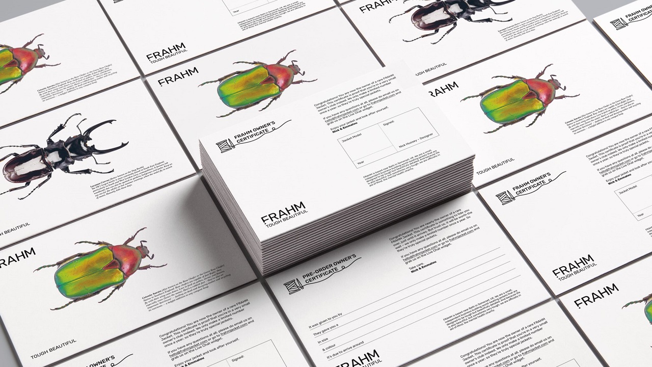
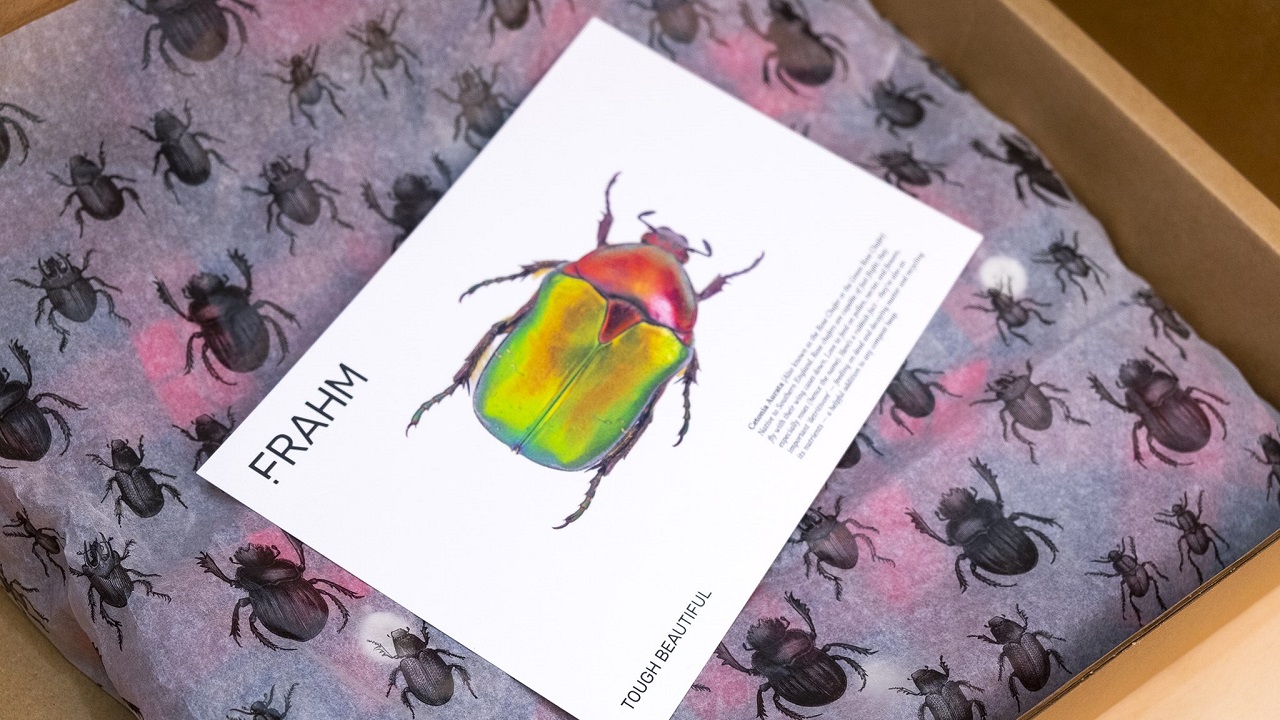
The colorful beetles appear on the tissue wrap and on the owner’s certificates too. Pre-order certificates can also be sent on request, in case the customers want to give someone a pre-order as a present. Plus, they are all signed by the founder.