A new year emerges and with it, the need for change installs in our minds. Oftentimes, we start by working on new plans or making new resolutions, giving up on some old habits, and start doing new things. Burger King took these things quite seriously and, together with creative agency Jones Knowles Ritchie, the fast-food chain has revealed a new brand identity. The fresh visual signature marks the brand’s first complete rebrand in over two decades and sees BK’s logo, packaging, uniforms, and typography embracing new appearances.
To design the new logo, the creatives were inspired “by the brand’s original logo and how it has grown to have an iconic place in culture.” It pays homage to BK’s heritage while highlighting the Whopper, being described by a “design that’s confident, simple, and fun,” adds the agency.
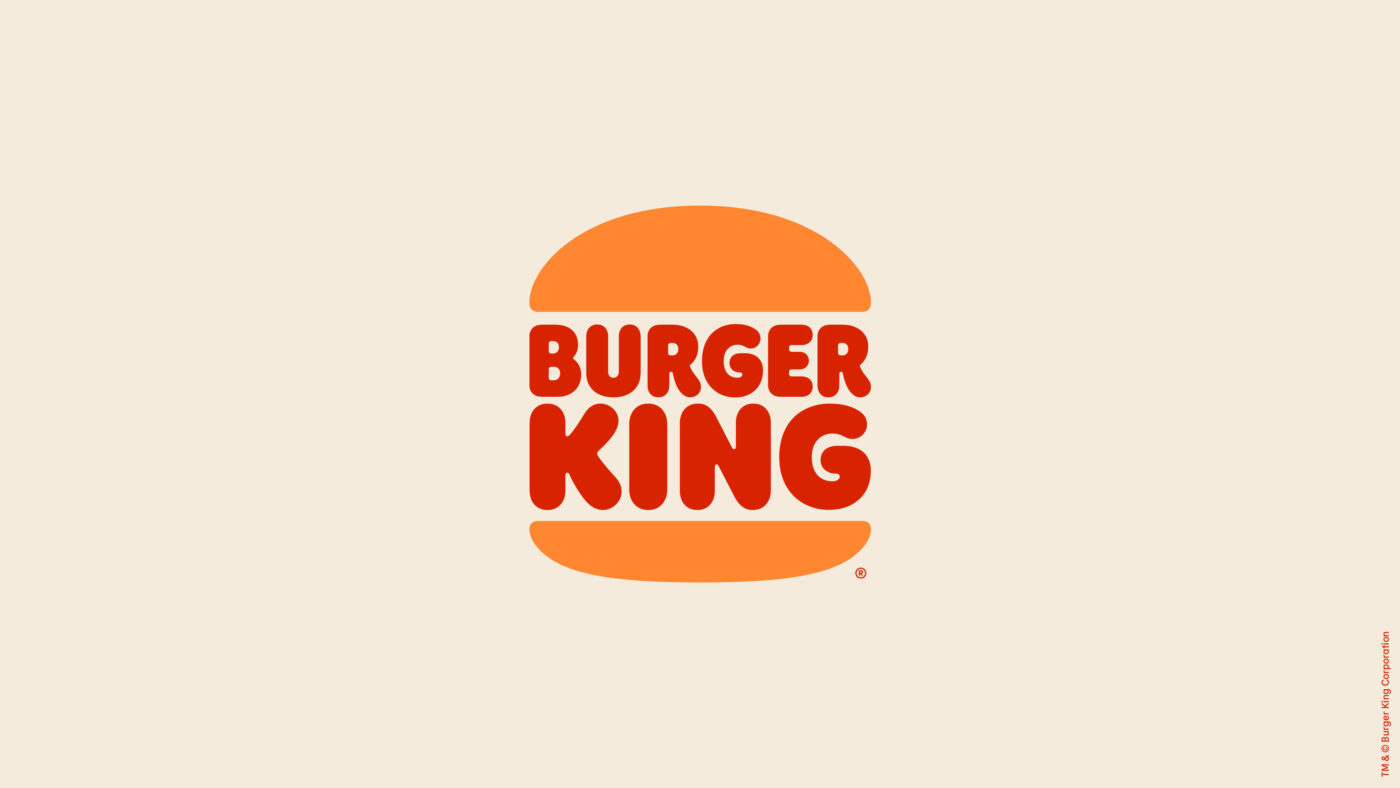
Compared to his father, the logo of 1999, the new one ditches the blue C-shaped motif around the logo off because “there’s no blue food,” said Global Chief Marketing Officer, Fernando Machado. The brand also got rid of the shiny elements too because “buns don’t shine,” adds the CMO. As with its predecessors, the new logo features two buns sandwiching the name of the brand.
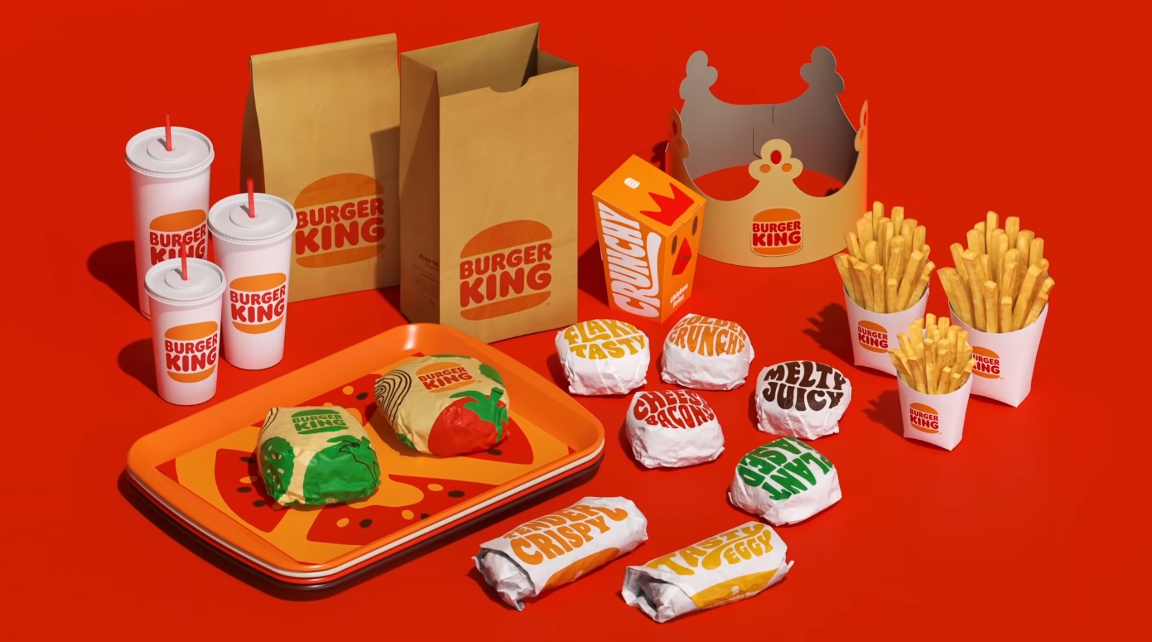
Besides the logo, the agency helped BK implement new packaging, which proudly wears joyful and warm colors all while the burgers and other tasty treats carry their names written in a custom typeface called Flame Sans. The font draws inspiration from the brand’s grilling process, the shapes of the brand’s food, and also from its personality.
“As our business evolves, we felt that our brand personality, attributes, and all the work we’ve done around food quality should be better reflected in our visual identity. The result by JKR perfectly signals our confidence in our future, while remaining true to what guests love about us,” said Rapha Abreu, Vice President, Global Head of Design at Restaurant Brands International.
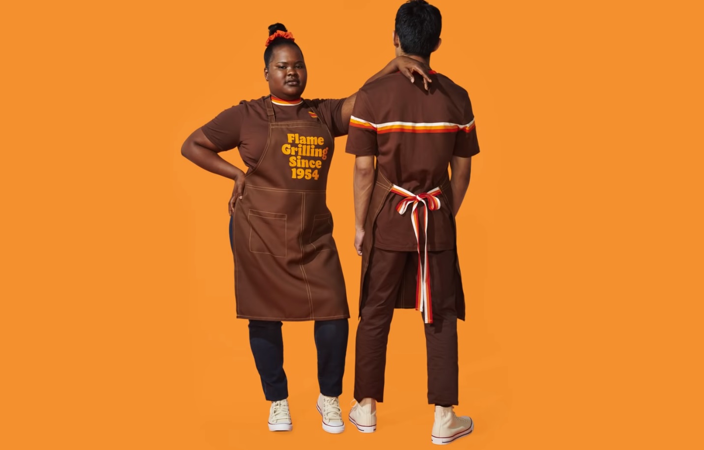
Other parts of the brand that have been updated are the uniforms, which are designed to reflect the masters of the flame grill, serving as a background for the merger of contemporary and comfortable style with unique colors and graphics. The BK campaign features real crew members.
The design will be visible on the mobile app first, BK deciding to invest in it over the past year with the goal to improve it, as more orders are placed online because of the pandemic. The brand also wants to boost the drive-thru experience.
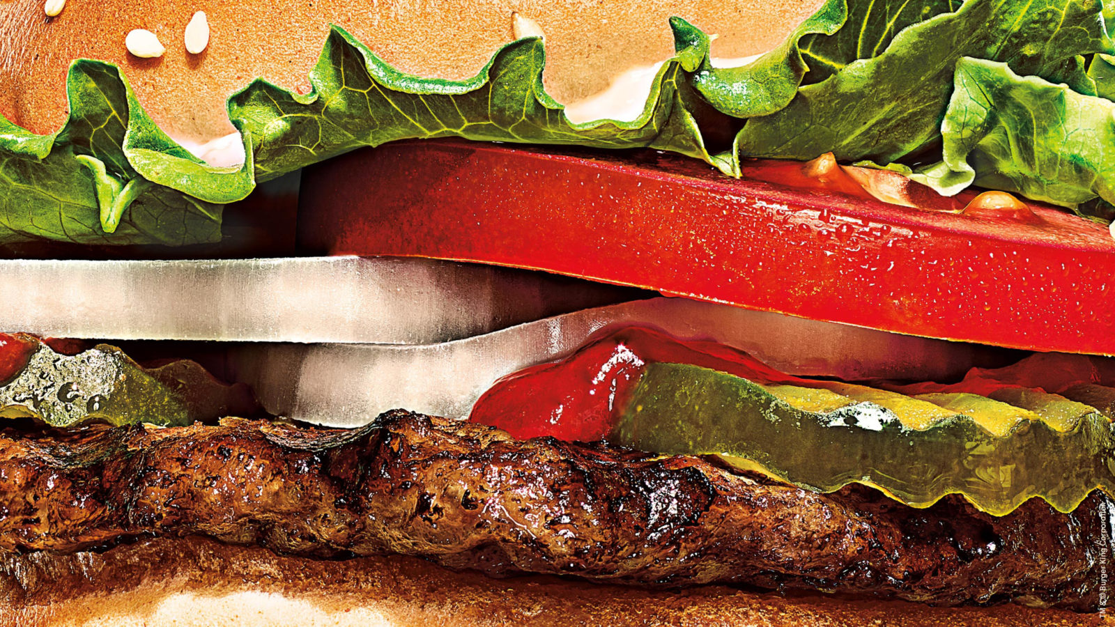
While remaining true to its roots, the new look marks the brand’s commitment to removing the colors, flavors, and preservatives from artificial sources from its menu items, as BK wants to ensure that its customers feel good when it comes to the food it cooks. The new identity captures this plan throughout its visual design, restaurant design, and across the digital experience. The announcement also signals the chain’s ambitious pledge to environmental sustainability.
Credits:
Client: Burger King
Agency: Jones Knowles Ritchie