For the award-winning bakery company Peter’s Yard, time is one of the most important ingredients that makes its crispbreads and crackers simply irresistible. This concept also spins around consumers, who are being advised to take time so that they can truly feel and enjoy each bite.
At the Swedish-inspired UK bakery brand, everything begins with its 45-year-old sourdough starter, fermented for 16 hours. “It takes time to make our award-winning crispbread,” the brand says on its page. “We believe it’s time well spent.”
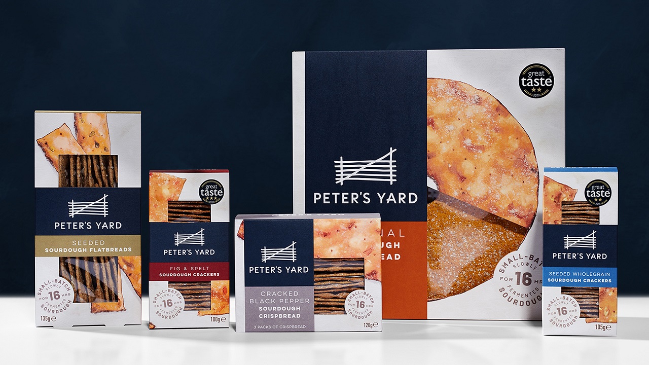
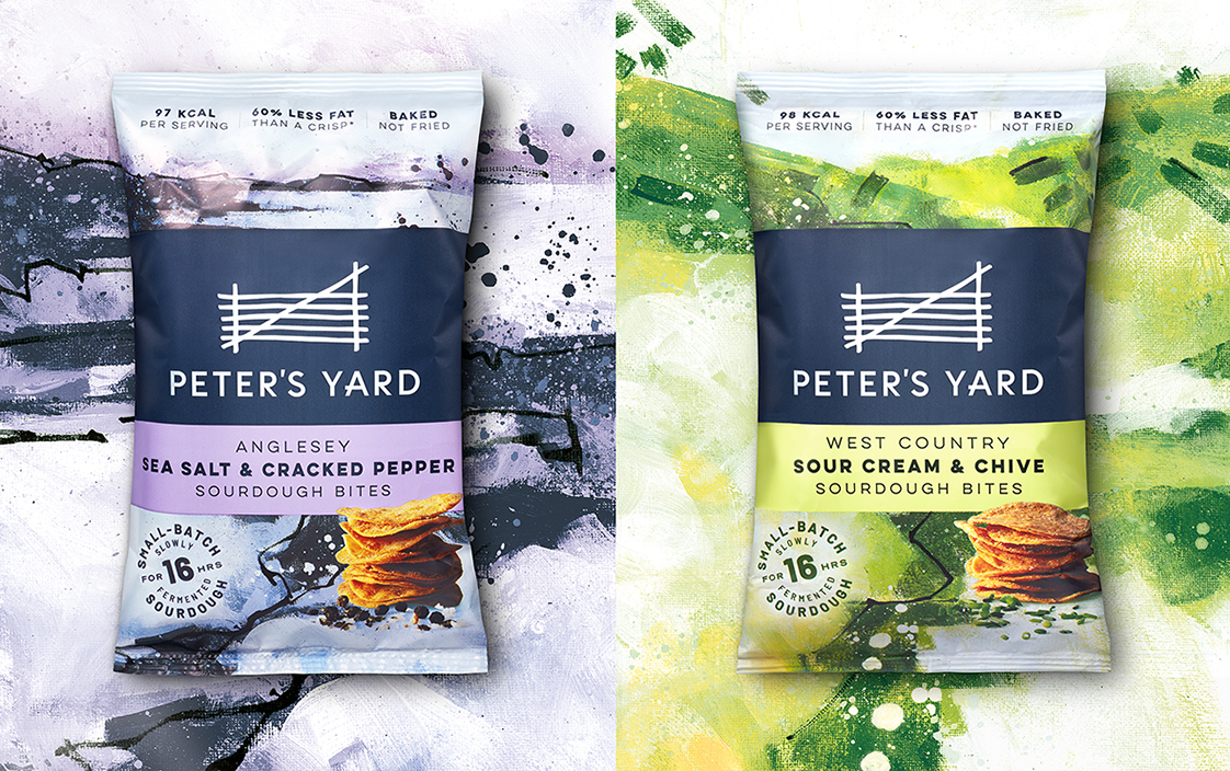
In fact, this is the mantra that B&B studio used as a guide in their plan to reposition and redesign the brand, which wants to drive growth and expand into new eating occasions. The new look includes all the brand’s existing SKUs but also sees the introduction of a new range of Sourdough Bites, a natural-baked and seasoned snack.
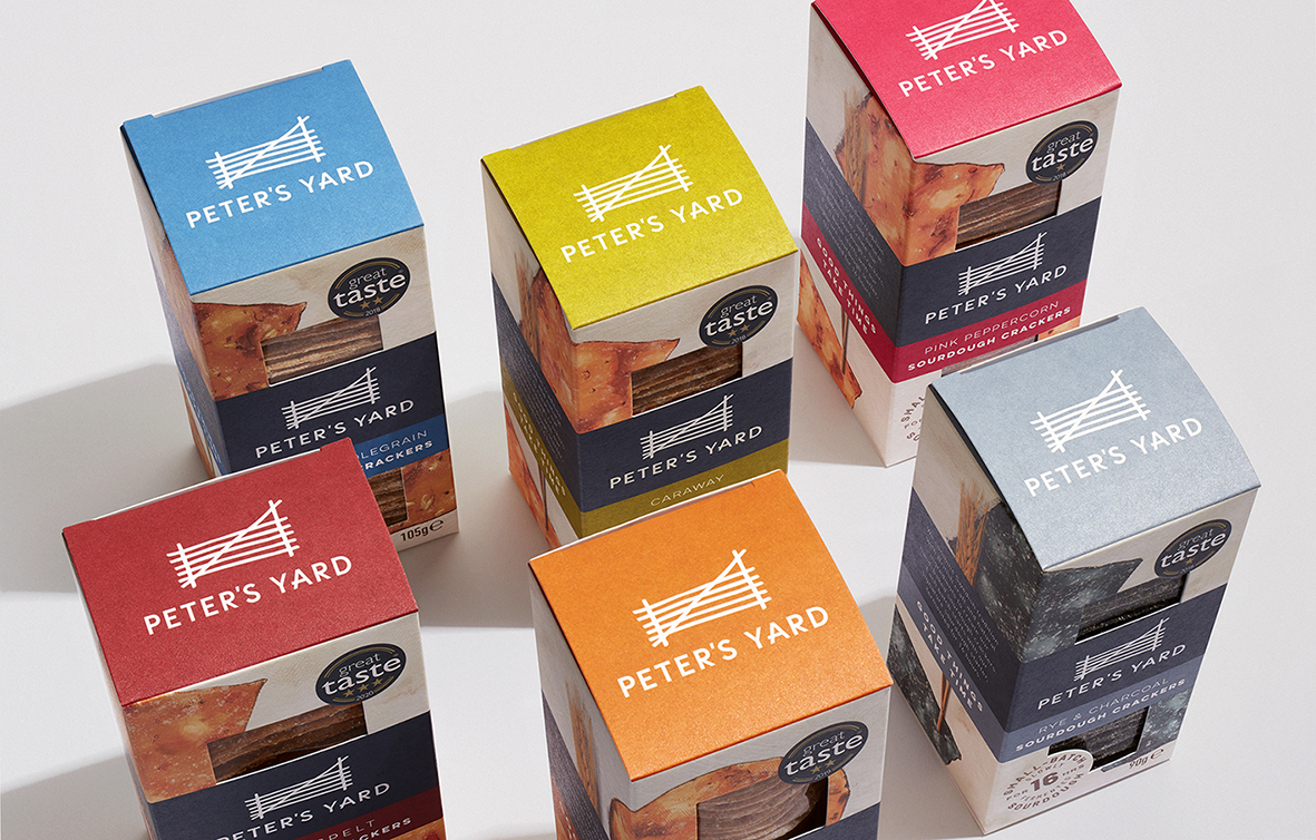
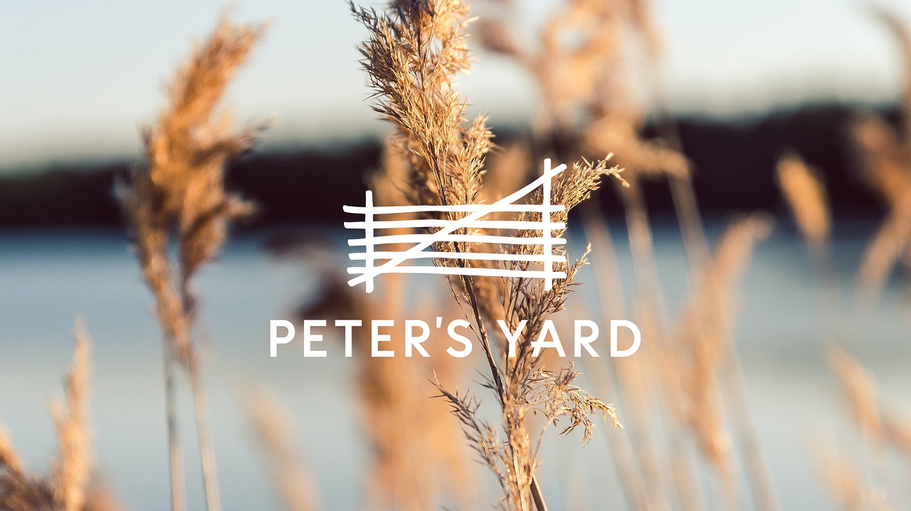
The new brand blooms out of the belief that time stands at the foundation of good things. The look captures a Swedish-inspired lifestyle that has its roots in mindful wellness, visually speaking about the rediscovery and appreciation of simple and pleasant things in life. Thus, the brand conveys a calm vibe through its new aesthetics which highlight a high-quality product. Under B&B studio’s guidance, Peter’s Yard expresses its spirit through a redesigned logo, packaging design, a belly band design, and evocative imagery.
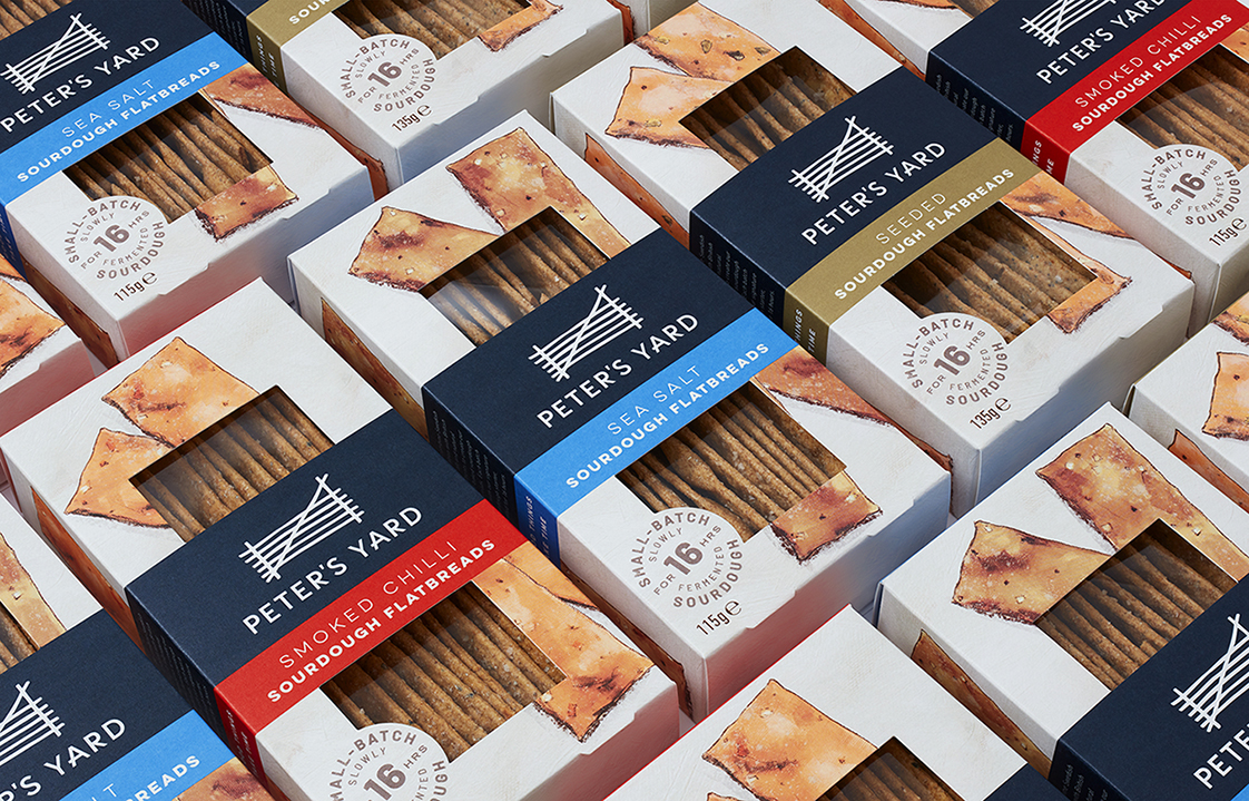
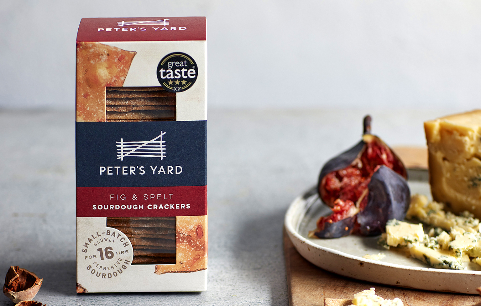
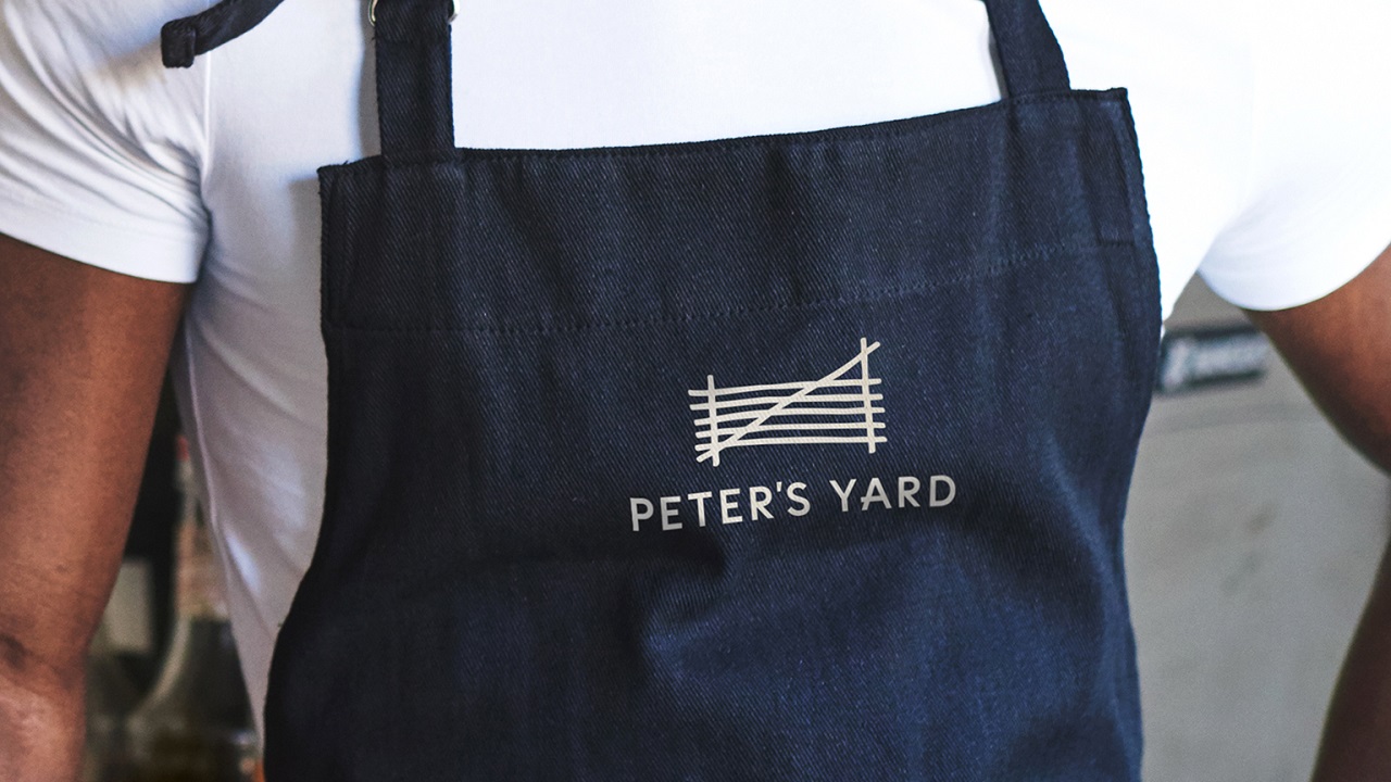
The company’s logotype has been reinterpreted with a contemporary sans serif font. Also, a small quirk was incorporated into the letter A to express the gate icon. As for the colors, including the company’s blue signature, these have been subtly changed in order to keep a similar yet slightly bolder color palette. The packaging design saw some changes too, the creatives from B&B studio introducing a band exclusively for the brand thus strengthening the connection between clients and Peter’s Yard, a bond that is also solidified through the consumer-friendly windows.
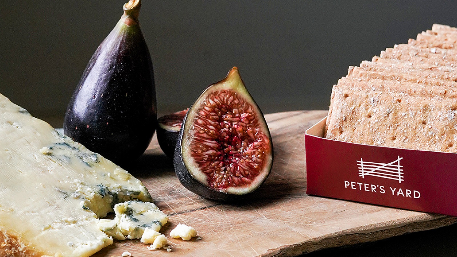
Another visual element that has seen some changes is the brand’s original illustrative pack imagery. Drawing inspiration from a photo of crispbread, the imagery was reexamined to better represent the product. The illustrations embrace the packs to interact with the brand and product story. Both ingredients and serving suggestions can be seen across photography.
Shaun Bowen, Creative Partner at B&B studio, says: “Updating the Peter’s Yard brand has required the sort of thoughtful and measured approach that the brand has become known for. We were keen to update imagery and introduce contemporary features, but to do so without losing the warmth and rustic feel that consumers loved.”
Head of Marketing at Peter’s Yard, Clare Stiles, adds: “B&B have created new branding and packaging that is completely in step with where we need to go. Our brand has great standout, while still feeling simple, understated, and completely authentic.”
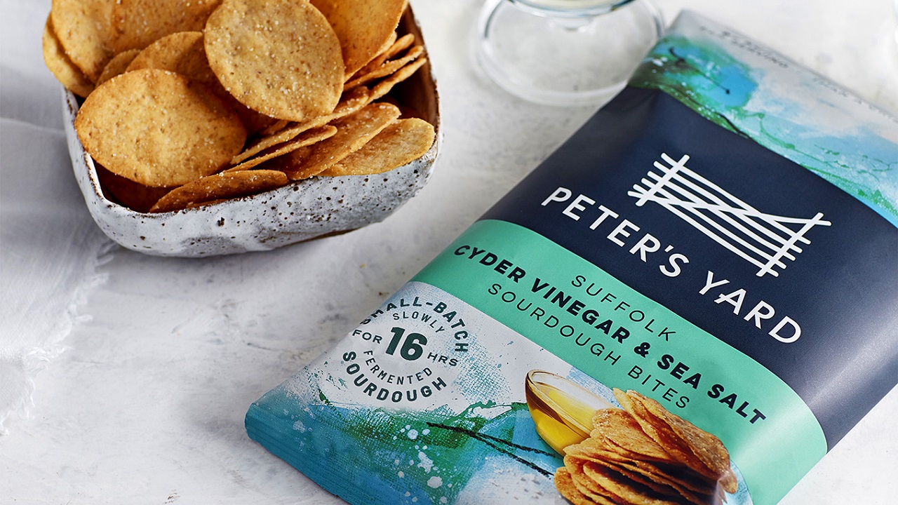
The creatives were eager to keep the brand’s story intact and paving Peter’s Yard path towards a world of snacking was a strategic challenge for them. In their attempt to contour the snacks as a moment of me-time rather than a hastily served snack determined the birth of a packaging design that feels more contemplative within its competitive set. Inspired by the acrylic work of landscape painter Paul Bailey, the background imagery makes consumers think about the flavors of the category, emphasizing the homeland of the ingredients.
Credits:
Client: Peter’s Yard
Studio: B&B