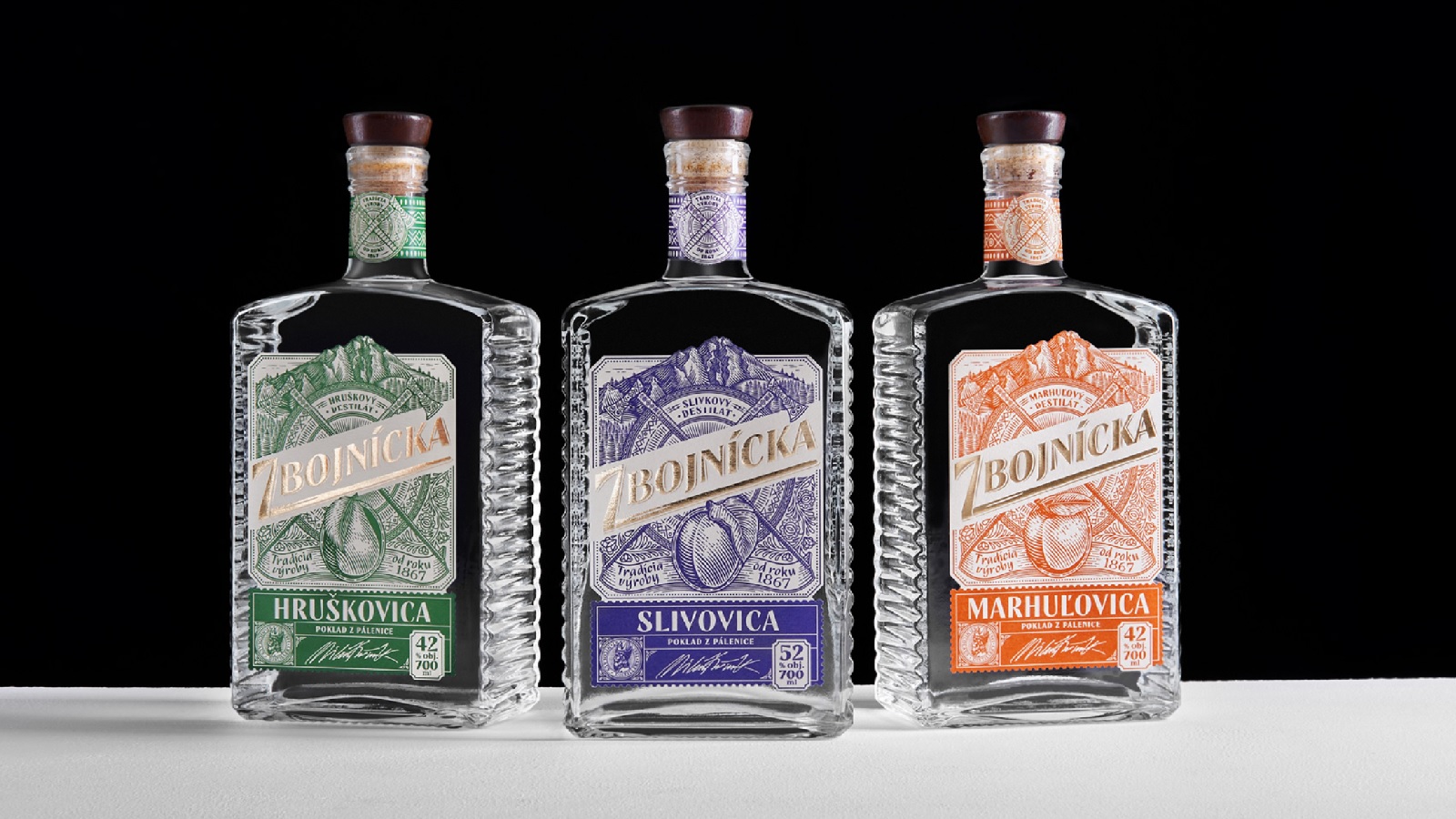
The largest producer of spirit drinks in Slovakia, St. Nicolaus, joined forces with AMOTH studio to create a label design for a line of fruit distillates named “Zbojnícka.” Among the design tasks that the creatives had to complete were: creating a pronounced character and mood for the brand, making the product stand out amongst its competitors, and working on a plan so that the dialogue between the brand and the consumers is better facilitated. They had to do all of this while preserving and conveying the Slovak culture and traditions.
Once they analyzed their competitors, the team concluded that they share a similar design pattern: A combination of typography and an illustration that portrays the distillate’s main ingredient. To make it stand out but also to ignite consumers’ interest, the Prague-based studio decided to express the drink’s personality by creating a story around the brand’s name — “Zbojnícka,” which translates as “belonging to Zbojník.”
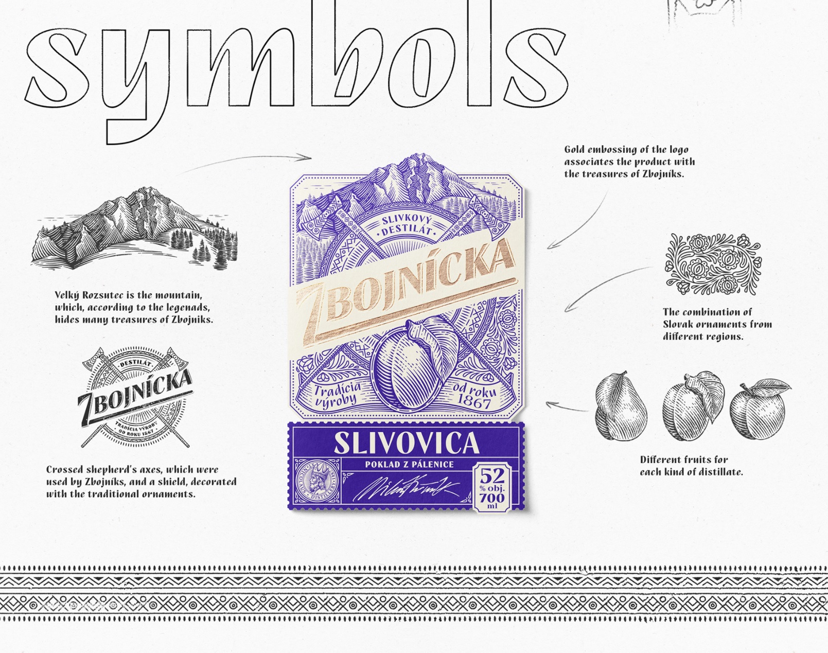
The illustrations are created based on the stories of “Zbojníks,” the Slovak Robin Hoods of the Middle Ages. These were robbers who revolted against wealthy landowners’ serfdom and tyranny. It is believed that these heroes activated in the region of the Slovak mountain range Mala Fatra and that the slopes are strewn with Zbojníks’ secret paths. Supposedly, they hid their treasures on the Velký Rozsutec mountain. Many set out in search of these treasures but no one was lucky.
It is supposed that among the things that were stolen from the feudal lords and hidden in the mountains was also gold. “But what else could be valuable for the mighty robbers? A good drink, of course, which is often valued more than any gold,” says the agency. In fact, this idea is carried throughout the labels. Each visual element illustrated on them has its own meaning and tells a unique story from the Slovak folklore.
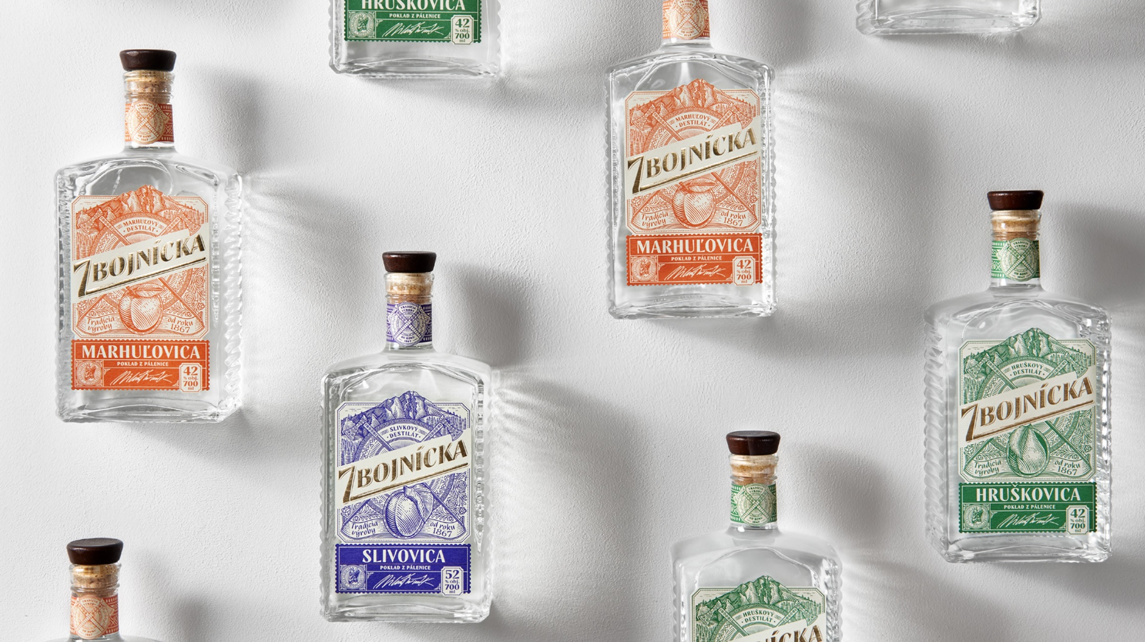
To enable the product to express a natural and home-made product feeling, the team settled on a matte crème paper with a soft texture. The elements perfectly complement each other: The combination of different traditional Slovak patterns used as ornaments evokes a feeling of a local product.
The crossed shepherd’s axes, which were used by the Zbojníks, and a shield, dressed in ornamental motifs from the Mala Fatra region, take the stage’s center. Together, these elements symbolize features that are characteristic of the robbers like their warrior spirit, readiness to fight, and protection of their treasures.
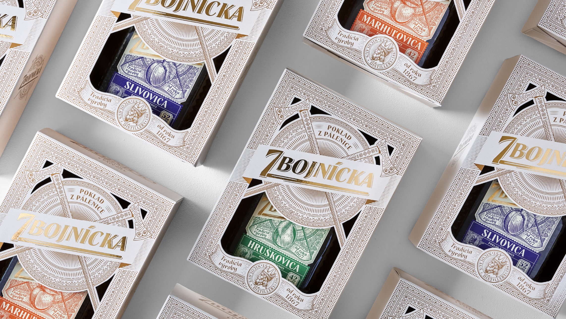
The labels are created in two colors. One of the colors makes the bottles different from the others because of the nuance used to outline the background. The other hue, used for the name and embedded following a different printing technique, borrows a golden look, thus expressing the premium quality of the product without jeopardizing the real message behind it — the treasures of Zbojníks.
“The working process with AMOTH Studio was imaginative, original, and precisely processed. High expertise, creativity, patience,” says Veronika Slováková, Brand Manager, St. Nicolaus.
Credits:
Client: St. Nicolaus
Agency: AMOTH studio
Art director: Sasha Sharavarau
Designer: Sasha Sharavarau
Illustrator: Tania Sharavarava
Artworker: Robert Špecián
Photography: Sabino Studio