In 2010, Diana Ghazaryan poured the foundation of R-Insights, a research agency that relies on traditional research methodologies but also harnesses innovative approaches to provide the best solutions for their clients. The Yerevan-based company’s members are passionate about exploring, discovering, and analyzing. Their very portrait, outlined by formascope design, reflects these values, and we get to have a look at it via our weekly #ThrowBrandThursday column.
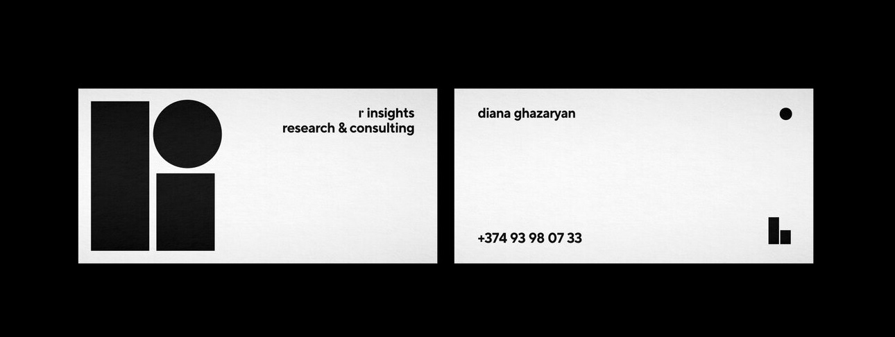
Inspired by the concept of research methodologies, the creatives designed the brand’s identity and logotype. Depending on the stationery, the logo “changes.” For example, when admiring a business card, you’ll see the logo split into two: A circle stands next to the name and two lines accompany a phone number. We’ll give you a moment, maybe you can decipher this on your own.
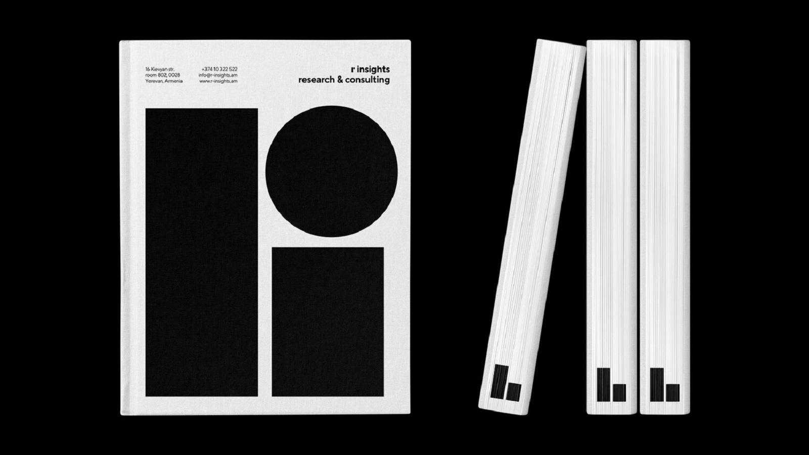
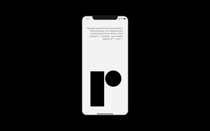
OK, did you unravel the mystery of the logo? Let us give you a hint: Quantitative and qualitative methodologies. The quantitative one represents a data collection method that gathers and analyzes information from a large number of respondents. On the other hand, the qualitative method seeks to convey people’s thoughts and feelings that might influence their behavior.
The logo consists of two lines and a circle, whereas the lines stand for quantity and the circle is a visual representation of quality. As a business card is divided into a name and a phone number, so is the logo: The lines being printed next to the number, which is quantity, and the circle next to the name, standing for quality.
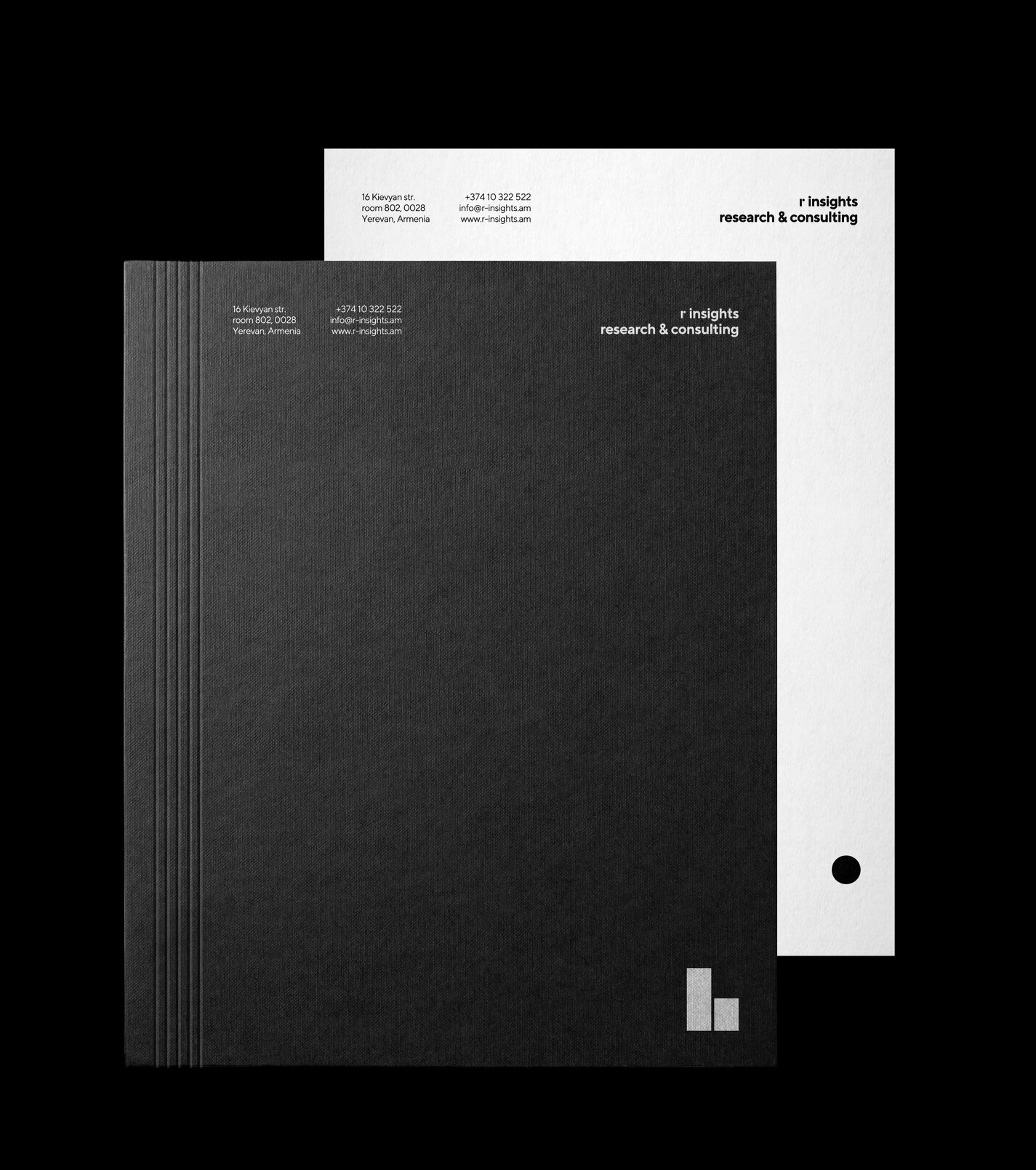
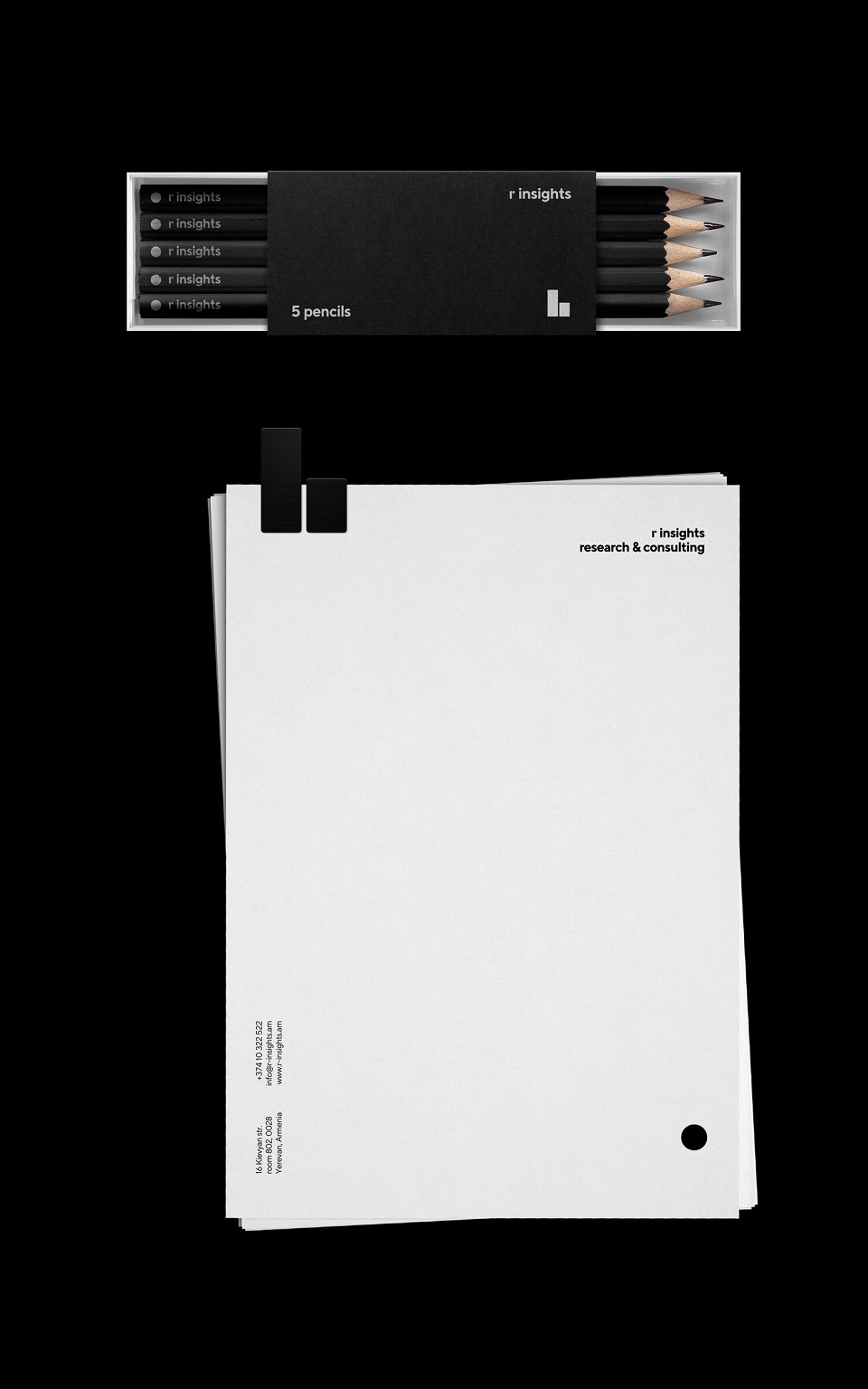
The concept is reflected in other stationery as well. For example, the notebook is made of pages, which people use as a canvas to express their thoughts. It’s no wonder to see that each page features a tiny circle on one of its corners. Yet, together, they are all quantitative, hence the lines on the cover.
Besides being visual proof of quantitative and qualitative, the logo also represents the first letters of the company — r insights — binding them together and creating an environment in which they can coexist perfectly, merging to finally reveal the symbol of the company.
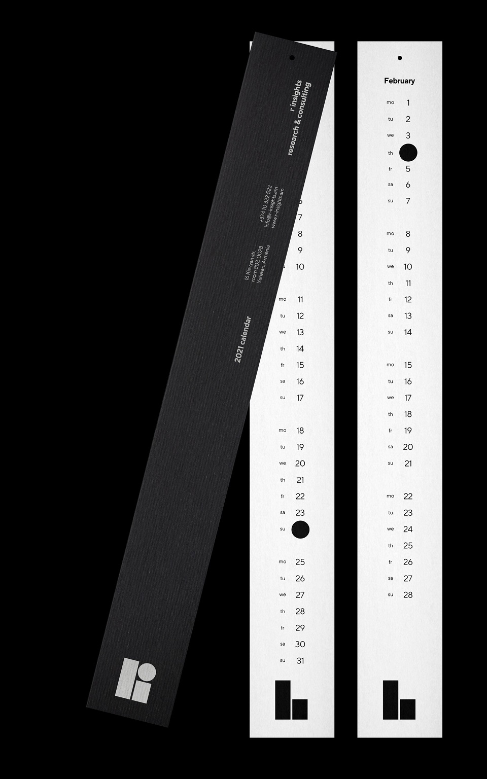
Here, you can try to untangle the stories below. One comprises a box of pencils near paper and the other captures a calendar.