
Dettol, Strepsils, Veet, Calgon, Durex, or Lysol are products that many people use every day. Yet, not many of them are aware of the brand that’s behind these: “From Dettol to Lysol, Nurofen to Durex, and Finish to Vanish, we sell more than 20 million of our trusted products to people every day, yet there is less recognition of the company behind those brands,” says Jo Osborn, VP Internal Communications and Corporate Brand.
But things are about to change, as RB, the brand behind these companies, rebrands as Reckitt. The new identity is created to narrate the story of the organization’s mission and its transformation, having as inspiration its rich 200-year-old heritage. “Our new Reckitt identity will better enable us to communicate our corporate purpose to the world, and to do so in a way that is powerful, consistent, and impactful,” continues Osborn.
The company embarked on a journey of transformation towards sustainable growth. Wanting to communicate this story more confidently and dynamically the organization decided to strengthen its brand by joining forces with Havas’ branding agency Conran Design Group, which worked on a bold, confident, and energetic visual identity.
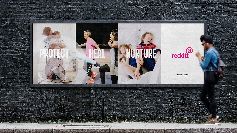
The rebrand is built on Reckitt’s purpose of protecting, healing, and nurturing in the relentless pursuit of a cleaner, healthier world. The new look sets the stage for the brand’s metamorphosis, marking a significant change and Reckitt’s pledge to make access to hygiene, health, and nutrition a right, not a privilege.

The company’s purpose is brought to life via a new logo, tone of voice, colors, typeface, photography, and icons, each being meticulously created to help the brand communicate its story more clearly and consistently. “The strengthened brand will help to reveal the value of Reckitt to the world, with more confidence, energy, and humanity than ever before. This is a brand that responds to the challenges of the modern world and recognizes its responsibility to protect, heal and nurture,” says the agency.
The logo takes the shape of the “R” letter, being a visible testimony of unity, strength, and relentless pursuit, having as inspiration Reckitt’s mission to protect, heal, and nurture. It denotes the brand’s role in the world as a partner and a catalyst for a positive transformation. The visual signature is “wrapped” in a symbol that resembles a shell, thus evoking a sense of protection and also making a reference to the natural world.
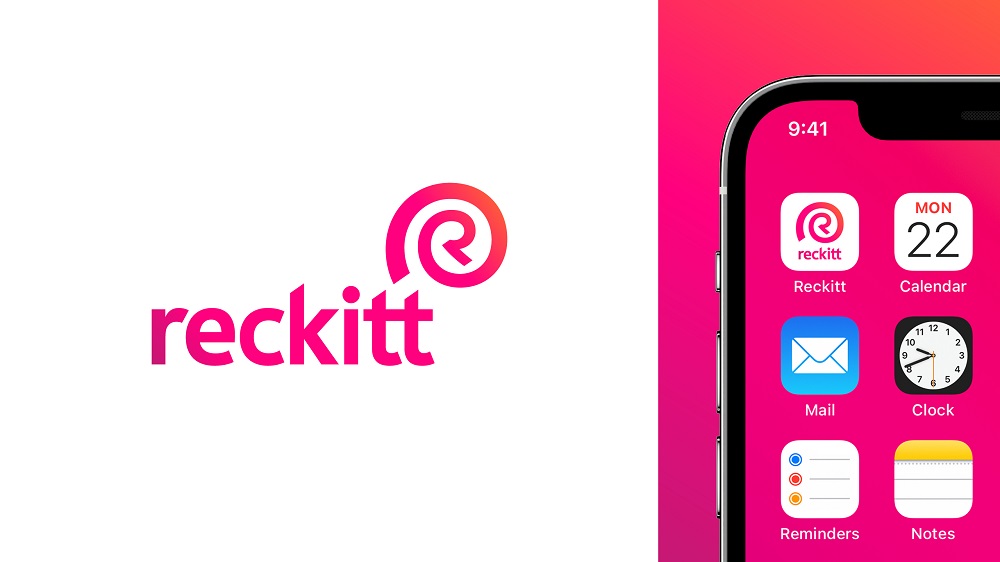
The color palette is highly distinctive and can be easily recognized. “Energy Pink” is the organization’s primary brand color and stands for perpetual energy. The secondary hues are inspired by its brands and follow the same purpose of a cleaner, healthier world.
The new, bespoke typeface “Energy” allows Reckitt to deliver its messages with more confidence, enhancing its commitment to making positive change. The iconography is distinctive, encouraging greater interaction with the brand’s messages. Lastly, the photography underlines the company’s impact on people’s lives, the strength of its partnerships, and its understanding of a changing world.
“The brand is a visible symbol of our corporate purpose and the change that has been taking place across the business on our journey of transformation. The name reflects the existing widespread usage of Reckitt and is clearer, simpler, and more memorable while retaining positive associations with the company’s heritage,” says Miguel Veiga-Pestana, Head of Corporate Affairs & Chief Sustainability Officer.
Commenting on the brand redesign, Thom Newton, CEO, Conran Design Group, said: “Reckitt has a compelling story to tell. The new Reckitt brand both reflects its 200-year history and provides an active expression of its purpose and ambition. The opportunity to work with the company to redevelop and launch the new brand was an opportunity we relished.”
The new brand will be implemented over a three-year timeline, during which Reckitt plans to use the natural replacement cycles of the business with the goal to manage an impactful transition in a cost-effective way.
Credits:
Client: Reckitt Benckiser
Agency: Conran Design Group