It was 1940 when Charles Alfred Neale started to sell his ice cream. Biking around San Fernando, Trinidad and Tobago, Neale’s one-of-a-kind coconut ice cream was a premium product and included no artificial flavors. Served in generous proportions and having an extra creamy consistency, consumers’ demands for the gelato simply exploded. He transformed his talent of making ice cream into a business, with profits helping him achieve his dream of buying a home, support his family, and put his 12 kids through school.
Before his death in the late ’80s, he passed his knowledge to his family, who succeeded in keeping Neale’s recipe alive. Eight decades later, Neale’s legacy continues, with Neale’s Sweet N’ Nice hitting the shelves of major supermarkets in Canada.

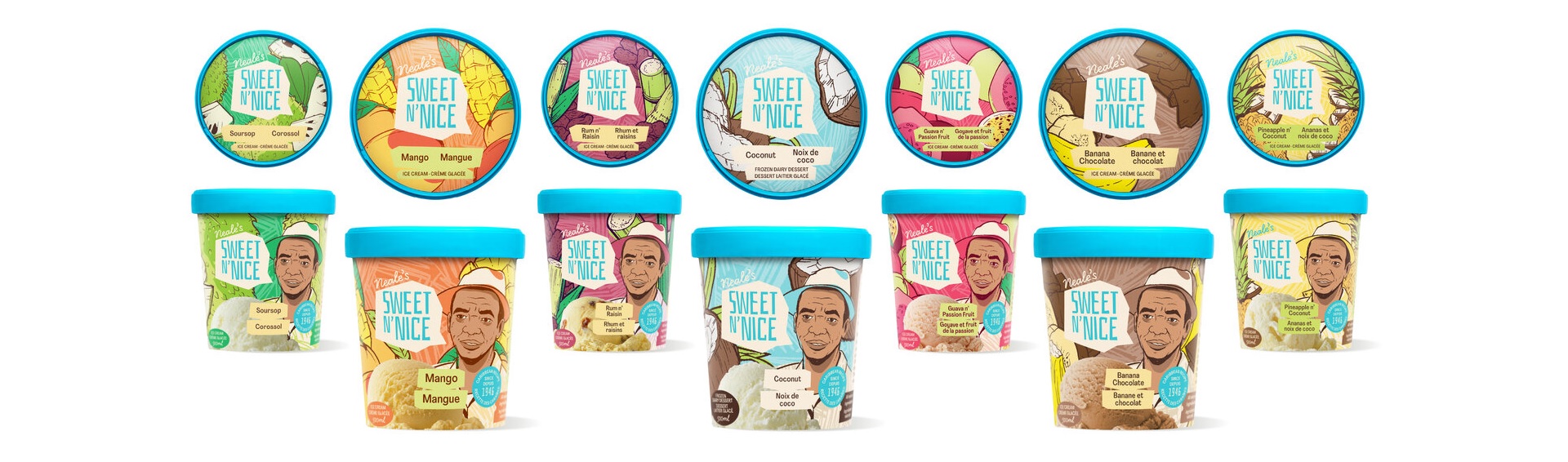
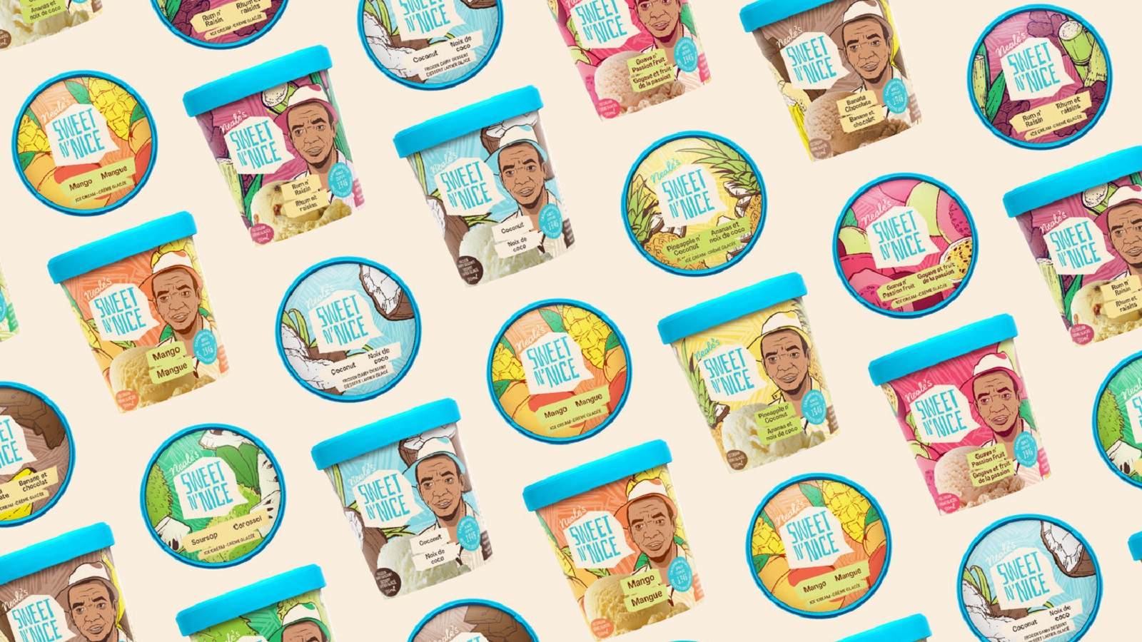
Following a steady year of growth and increased consumer demand across the country and as they prepare to launch new ice cream flavors, the family-owned business officially announced a new brand design and packaging, with tropical visual elements that remind Canadians of the brand’s Caribbean roots. Developed in partnership with Le Parc Design, the new packaging features vibrant colors and joyful illustrations, helping Canadians visually taste the Caribbean.
“Working with Le Parc Design, creative agency Juniper Park/TBWA’s design arm, we wanted our new identity to speak to the natural ingredients in our ice cream without overwhelming consumers with a busy package design,” said Andrew McBarnett, Co-founder and CEO, Neale’s Sweet N’ Nice. “We also want to continue to celebrate our heritage and our origins are now more clearly defined by the illustrations of my grandfather, Charles Neale, who used to call out ‘Sweet N’ Nice…’ when he rode his bike around South Trinidad.”
“With a history so rich, we felt it was vital not only to keep Charles’ portrait on the label but to actually make him the front and center of the new branding,” continues Nathalie Cusson, Creative Director of Design, Le Parc. “We’ve also expanded the color palette to be as varied as the flavors, with a constant turquoise woven throughout.”
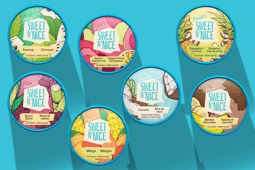
The creatives chose turquoise as the principal color for the brand, an element that was kept from the old packaging and that stands for the Caribbean Sea’s color. The hue is visible on the lid of each ice cream, behaving as a visual ingredient that allows the product to differentiate itself from competitors in the ice cream aisle. The new packaging bears “perfectly imperfect” shapes, adding an element of ‘home-made’ which reflects the way Neale first created his product. Plus, each ice cream container is accompanied by a speech bubble, onto which the phrase “Sweet N’ Nice” is printed, recalling the founder’s acclamation on the streets of Trinidad.
Launched by Neale’s daughter and grandkids, Neale’s Sweet N’ Nice Ice Cream is a Canadian company. Since the launch, the brand has grown its product offering from three to six flavors, with one more on the way. The ice cream can be found at major grocery stores across Ontario, British Columbia, Saskatchewan, and Manitoba with plans of expanding to Alberta, Quebec, and the Maritimes.