With natural products and low-ABV beverages drinks returning to the public’s attention, Becherovka, a proud product of the Czech Republic, saw a good opportunity to relaunch one of its products. Becherovka LEMOND, the “younger daughter” in the brand’s portfolio, had a design that didn’t reflect its personality. As its look became outdated, it was no longer appealing to consumers. During this week’s #ThrowBrandThursday, we are about to deep dive into the award-winning branding and design agency Cocoon Prague‘s work for the brand, which rejuvenated the bottle and the identity.
The change came in stages, so the bottle itself was treated as a priority. It received an update, the crew introducing a fully transparent look. Yet, this step came with some challenges, as the team encountered some technical obstacles along their way to fulfill their plan. They had to run some tests and find the right producer in order not to threaten the quality stability of the natural product and to secure the desired shelf life.
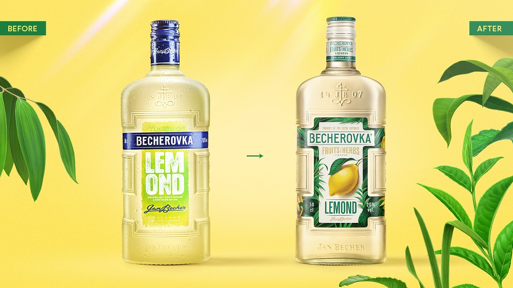
“By replacing the original LEMOND sand-coated glass with a clear glass bottle, the true color and appearance of the liquid were exposed. It now proudly presents quality, enhances taste-appeal, and most of all, underlines the message of honesty which this reborn brand decided to send,” says the agency.
In the second step, the packaging design was in the spotlight. This change had to help the brand better communicate with the audience, so the emphasis was on naturalness while maintaining a modern visual language. Although the look was completely changed, both the iconic glass and the shape of the label were preserved. Also, any references that send the consumers to “artificiality” have been removed.
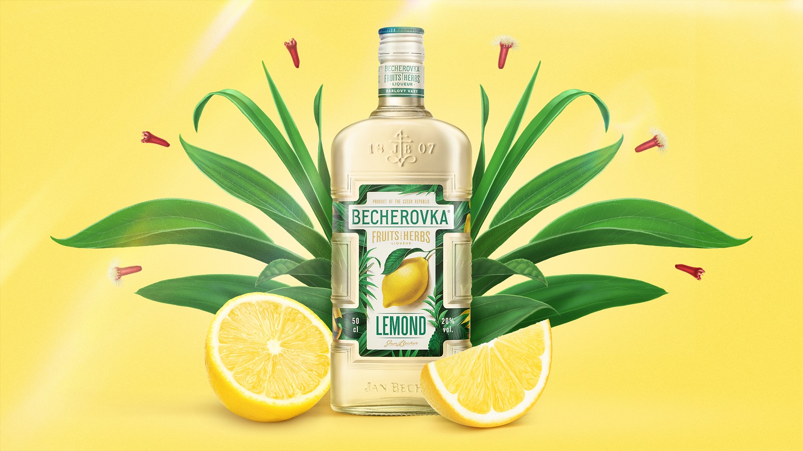
The predominant color on the label is a beige, this being the foundation on which the rest of the visual elements were “poured.” In its center, a lemon is illustrated, evoking tones of freshness and also helping navigation on the shelf. Combined with green hues representing the herbal aspect, a label contrast emerges.
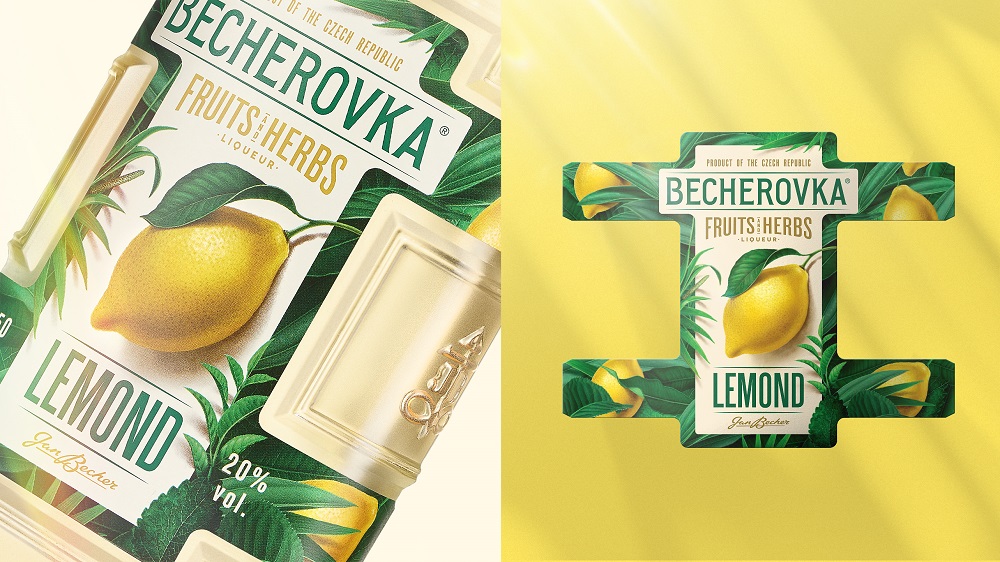
The illustrations were carefully selected, their role being to express the natural personality of the brand but in a way that feels modern. A large part of both the fruit and the herbs outlined on the label were digitally treated to help create a frame-like composition on the label.
Most of all, the creatives worked on a new architecture, which brought them back to step zero: “In line with the brand strategy, the Becherovka Pernod Ricard team made the decision to introduce a new portfolio-architecture for LEMOND. By establishing a whole family of naturally flavored Becherovka low ABVs, called Becherovka Fruits&Herbs — with the vision of other flavor SKUs to follow soon.” As such, a new architecture and sub-brand wordmark were born.
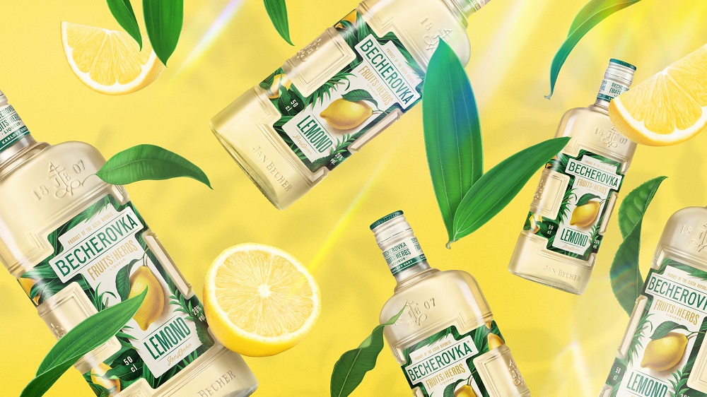
Even though the LEMOND name was kept — for consistency and reassurance — it was attributed less prominence on the label of the “newly crowned” Becherovka Fruits&Herbs rage logo. While there are golden elements speaking about the premium quality of the product, the “lemon” on top is the citrus fruit itself which, thanks to the fully transparent bottle, see-through liquid, and double-sided label printing, tricks the human mind into thinking there is another lemon inside the bottle.
Credits:
Client: Becherovka
Agency: Cocoon Prague
Creative Director: Karolína Bělohlávková
Account Manager: Çiğdem Çevrim
Senior Designer: Sasha Sharavarau, Andreea Bora
Illustrator: Petr Menčík, Sasha Sharavarau
3D Visualisor: Petr Ludvík
Artworker: Petr Ludvík
Photographer: José Sabino Jr.