The Faculty of Mechanical Engineering and Naval Architecture at the Zagreb University has officially opened the Regional Center of Excellence for Robotic Technology — the CRTA robotic laboratory. One of the center’s goals is to bring robotics into everyday life, targeting students, scientific research projects, and finally, business people. Established as a center for research, development, and education in the field of robotics and AI, one of CRTA’s ambitious projects was creatively completed.
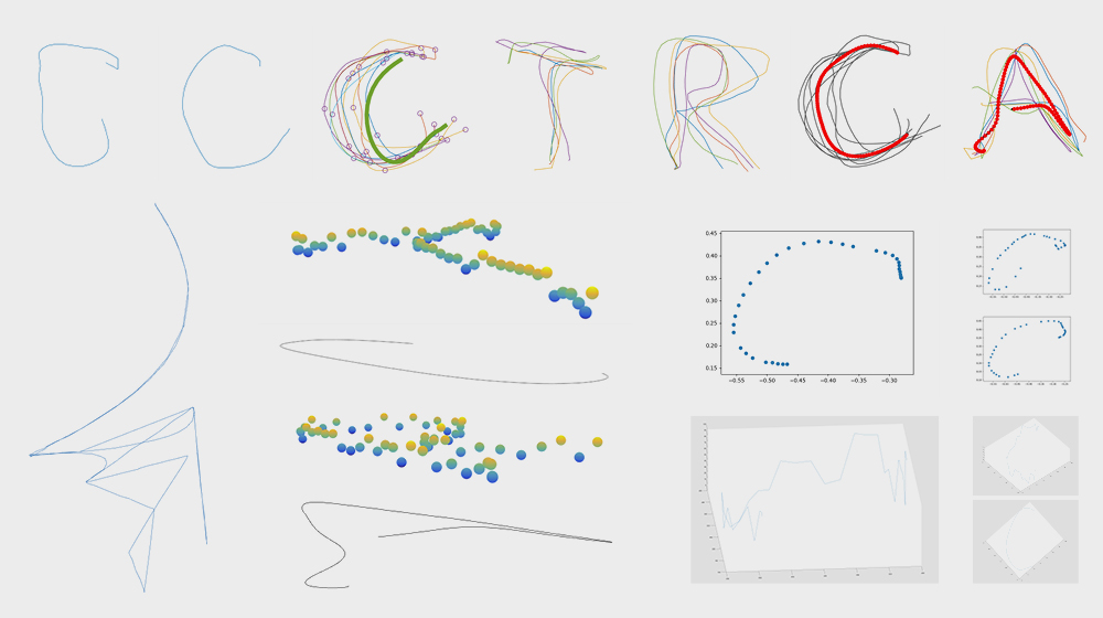
During this week’s #ThrowBrandThursday, we are witnessing a team of students who, tasked with a pretty amazing homework, helped the center develop its visual identity. Design agency Bruketa&Zinic&Grey supervised the creative process, giving students the simple assignment of writing the institution’s name down on board. Eventually, the handwritten words were used as input for artificial intelligence, which helped shape CRTA’s visual signature.

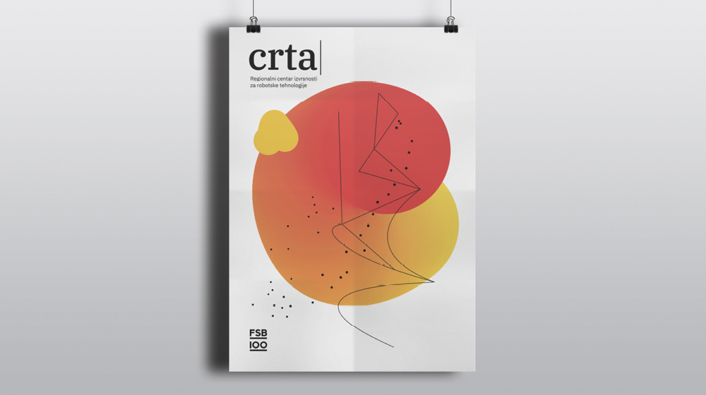
According to the agency, the visual identity emerged as a result of an experimental attempt to navigate AI through the learning process. Once the machine memorized the information, a series of different visual data were delivered, serving as a foundation onto which the visual identity was built.
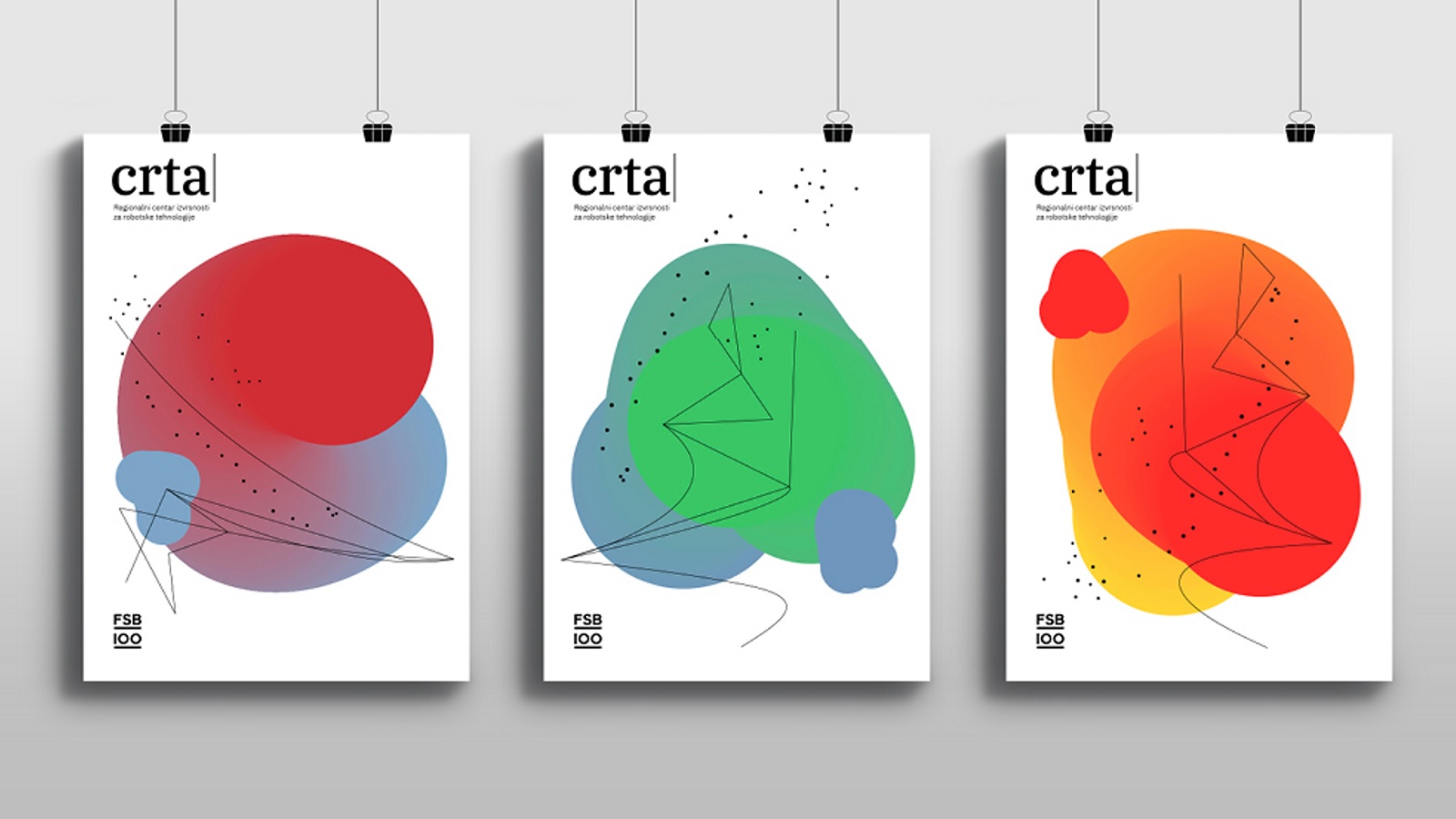
The basic elements that contributed to contouring the visuals are the point, line, and plane. Aside from their mathematical meaning, these components can also be deciphered as a process of education for all those who are part of the world of CRTA: The agency used points to describe individuals; lines to explain the way they communicate and share knowledge, and planes to define the systems the center is intended for — education, healthcare, and business.
“The visual representation of the concepts contained in the definition of the word line is a symbolic representation of the process of growth i.e. the trainings provided to the Centre’s beneficiaries. It is a bridge between the individual — a student or a scholar — and their professional surroundings — be it a corporate, education, or academic system, for that matter,” Borjan Pavlek, designer at Bruketa&Zinic&Grey agency, explained.
The Zagreb-based agency’s project is yet another creative way to show how fun math is. Previously, in a campaign for Corpus IT school, agency RA Voskhod relied on mathematics’ most beautiful manifestation, the cellular automaton, to speak visually about the school. Relying on the cells’ ability to constantly evolve based on their environment, the agency let them do their magic and work on generating the institution’s visual identity.
Now that you have seen both projects, don’t you agree that math is simply wonderful?
Credits:
Client: CRTA — Regional Center of Excellence for Robotic Technology, Faculty of Mechanical Engineering and Naval Architecture
Bojan Jerbic, Marko Svaco, Filip Suligoj, Bojan Sekoranja, and Josip Vidakovic
Agency: Bruketa&Zinic&Grey
Art Director: Borjan Pavlek
Designer: Bruno Bolfan
Creative Director: Davor Bruketa
Account Director: Dina Borosic
Account Executive: Barbara Busic