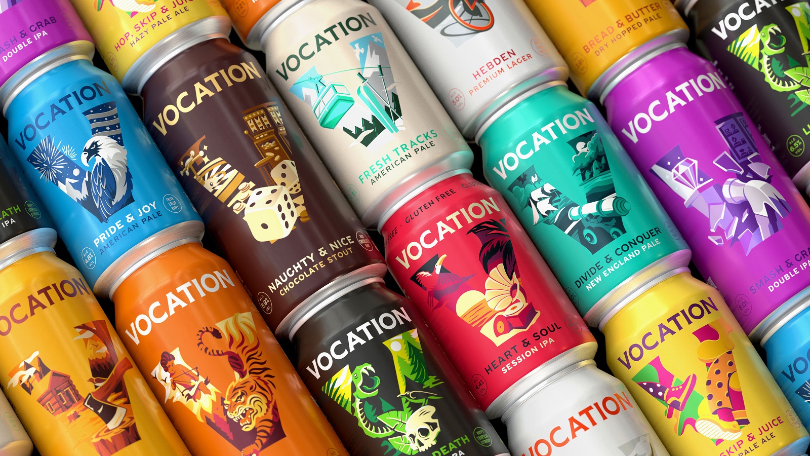
Since launching in 2015, independent craft brewer Vocation has seen remarkable growth, becoming one of the largest volume craft breweries in the UK. Committed to bringing “better beer to more people,” according to John Hickling, the brewery’s founder, the company felt it could do better in terms of design.
Having its initial branding developed by Robot Food — the agency which also coined the brand name — Vocation continues to pursue its calling under the creative guidance of the Leeds-based team. “I’ve always seen Robot Food as our 5th Beatle,” says the founder. “It’s our vocation to bring better beer to more people and from the start, I’ve relied on them to tell our story and manage how we present ourselves. We’re genuine partners so we’re proud to have them along for the ride as Vocation continues to champion its calling.”
Tasked with creating a new brand positioning and new visual identity, Robot Food’s work for Vocation respects the brewery’s key role in the driving of the craft category since launching six years ago. It highlights its team and drinkers’ committed and passionate spirit while its distinguishable brand presence created by the agency enables it to feel at home at craft shops, bars, and supermarkets.
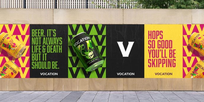
The creative strategy saw the team updating the design to obtain greater brand stand-out and also securing more consistency between Vocation’s beers — the core range and its ongoing specials. Moreover, the process also meant paying close attention to creating brand recognition in bar settings. “The craft category is ever-growing and it’s still quite noisy,” adds Rich Robinson, Robot Food Senior Designer. “Vocation wanted to become better established in the on-trade bar scene, so it was about striking a balance between being brand focused and keeping its craft sensibility at the same time.”
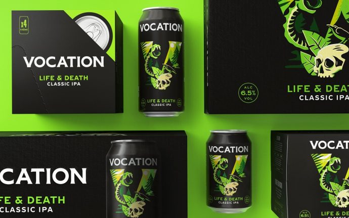
Set to sell more on-trade, Vocation needed a boost, which translated with developing a branding system that enables brand recognition regardless of where it is sold. “Part of the challenge was building a bigger brand in the craft beer category, where people are a bit suspicious of big brands: It had to be more prominent, but keep all that excitement, fun and difference of craft beer,” explains Ben Brears, Robot Food Strategic Design Director.
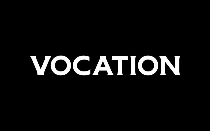
While the old can designs focused more on the beers’ names rather than putting the brewery’s one at the heart of the packaging, the new cans offer plenty of room for the new wordmark to unfold. Acting as the primary logo across all brand communications, the wordmark pays tribute to the brewery’s Yorkshire roots.

Besides offering support to the wordmark, a new “Vocation V” brand icon was outlined, assigning it the task of providing a frame for the packaging illustrations. Moving away from the previous black core range cans, the new packs are developed using bold colors which merge to form playful images that simply complement each can’s distinct personality.
“Illustration has always played an important role in the brand’s identity. Now the new brand mark, our Vocation ‘V,’ houses a newly evolved illustration style that showcases each beer’s unique identity. Punchy and distinctive — just like the beers,” adds Robinson.
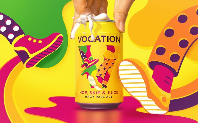
With a confident, ambitious, and authoritative brand of voice, Vocation manages to express the uncompromising quality of its bold aromas without shouting out loud. The new branding taps into the brand’s nature, raising a toast to the brewery’s team, who, driven by passion and talent, help Vocation continues its vocation.
Credits:
Client: Vocation
Agency: Robot Food
