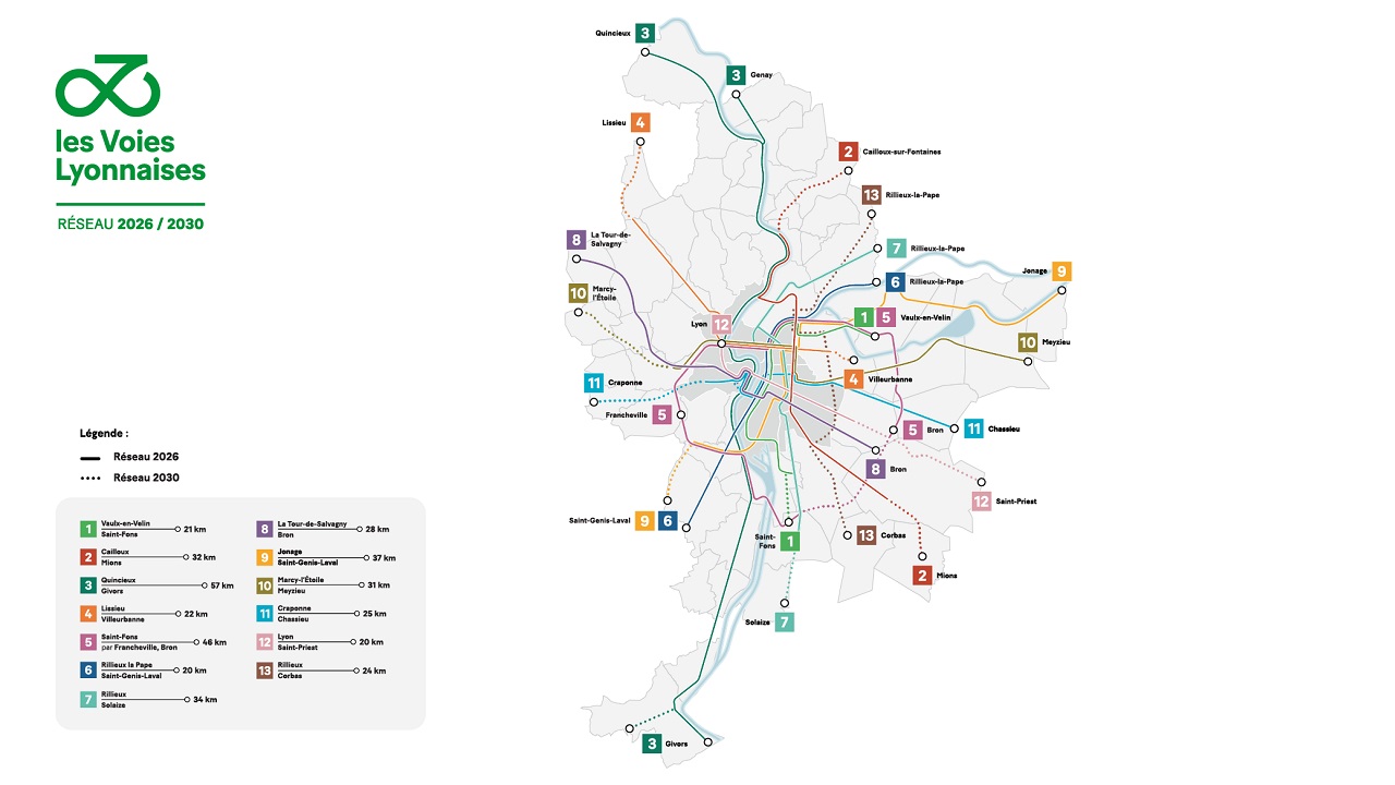
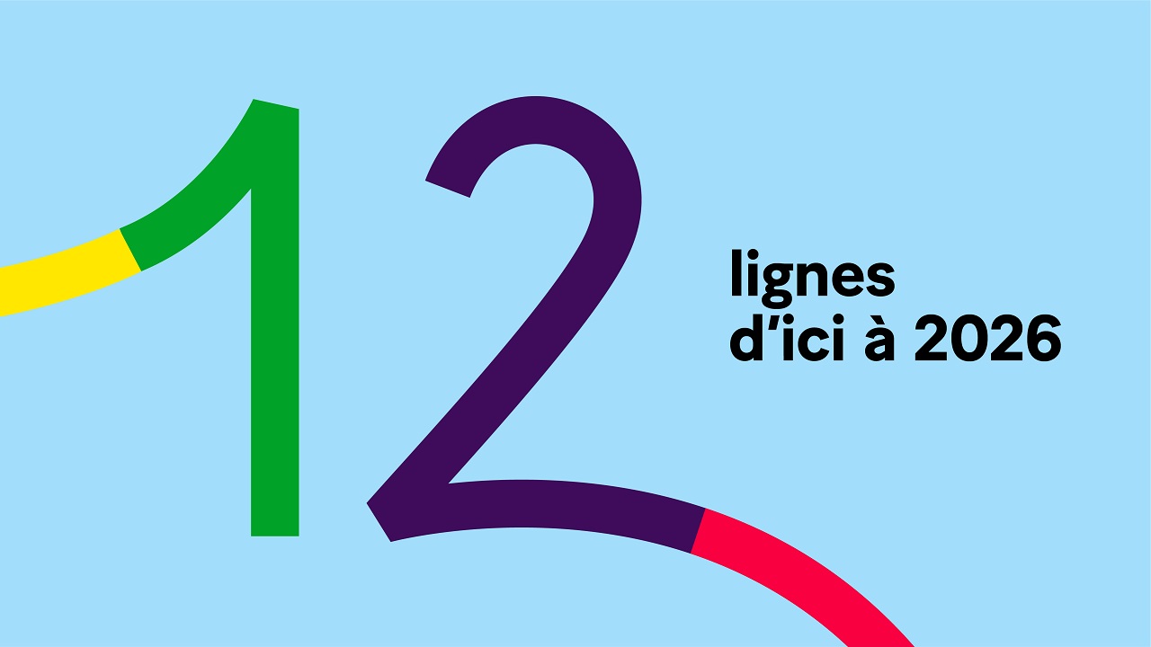
At the end of September, the Grand Lyon region has unveiled its infrastructure plans for its upcoming express cycling routes. Known as les Voies Lyonnaises, the network will connect the peripheral municipalities with the center of the region. Scheduled to cover most of the territory by 2026, the 250-km network comes with wide and safe cycle lanes and aims to encourage people to go around the metropolis using bikes.
The unveiling of the big news is accompanied by a visual identity and communication campaign, courtesy of Spintank in partnership with Yellow Windows, which defines the new brand’s message in a fluid and understandable way. For starters, the team wanted to find a name for this project that describes the network of safe and protected lanes in an attractive manner without alluding to references that are so specific to transportation.
“We wanted to find a name that avoided references to public transit (express network, lines, etc.) or a lesser, marginal place on the road. La voie Lyonnaise, or Lyonnaise Road, conveys a sense of status and importance within the public space,” explains Nicolas Vanbremeersch, President of Spintank.
Les Voies Lyonnaises goes beyond just a network of bike lanes. While sending us thinking of the ancient Roman roads, the Greater Lyon region hopes to reflect the project’s civic mission: That of outlining cycling as a new way of moving from one place to another, placing it next to other ways of traveling in public spaces, such as walking, public transportation, and cars.
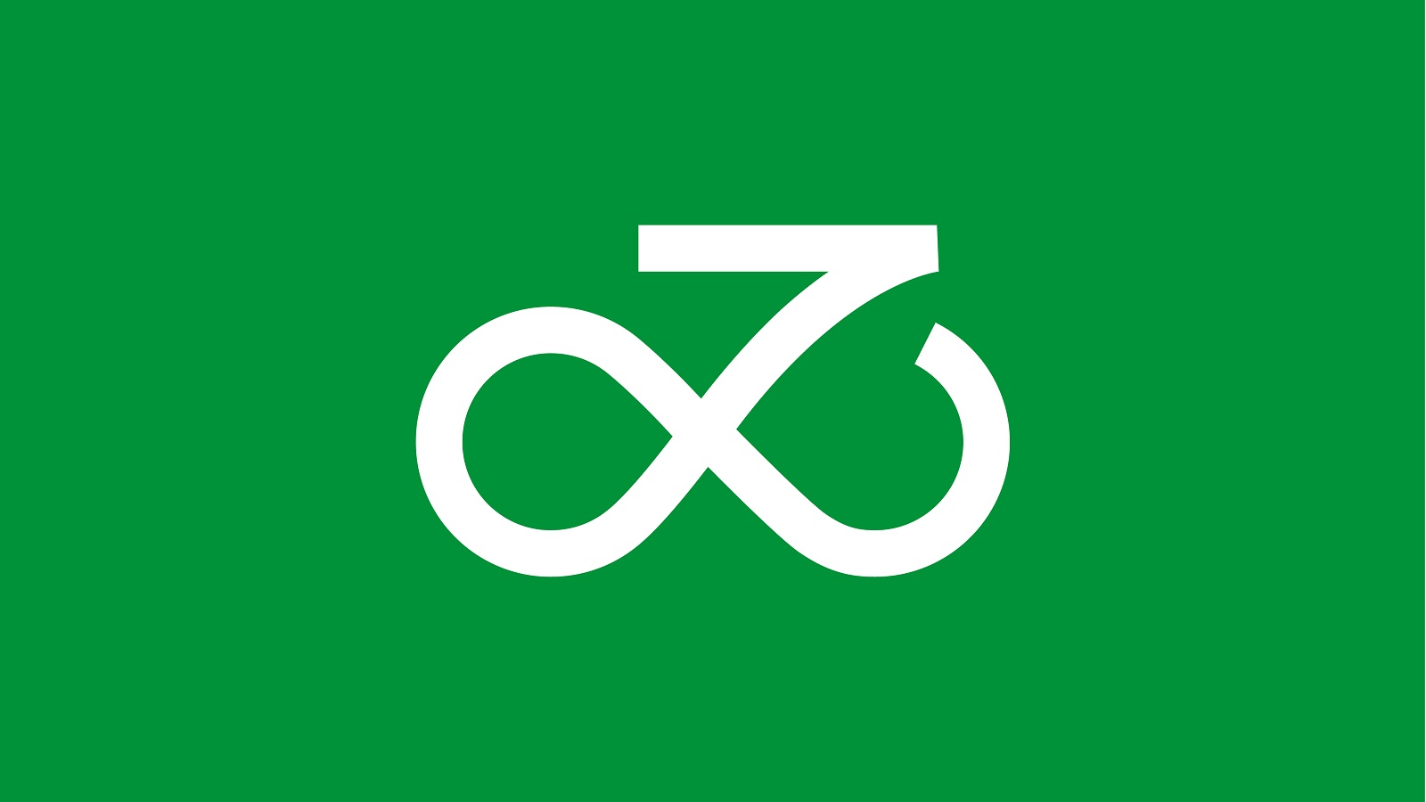
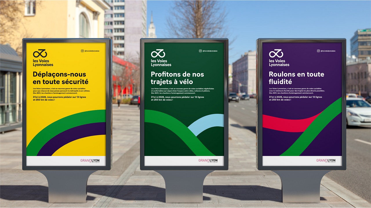
The Paris-based agency’s identity for the project is built around the concept of fluidity, the artists aiming to describe a visual signature that can be understood by all the city’s residents. On the one hand, it makes us think about cycling and cycling routes thanks to the shape it follows — that silhouette of a bicycle.
But it also resemblances the symbol of infinity, which probably highlights the limitless possibilities one can enjoy in experiencing freedom. Adapted into a full range of distinctively visual elements, the les Voies Lyonnaises addresses everyone, pointing out the change we need to make as a collective when it comes to mobility.

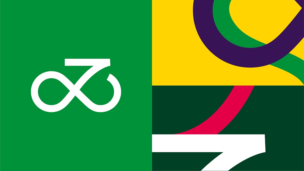
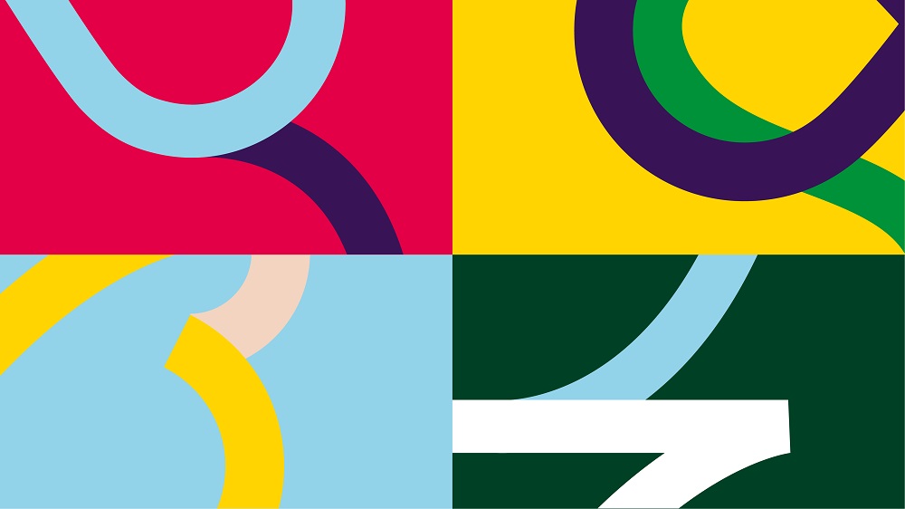
“Ultimately, we based the new identity on a strong, memorable, and friendly sign that everyone can understand. It employs a vivid color palette that represents all the diversity of our relationships to travel,” adds Jonathan Mignot, Creative Director of Spintank.
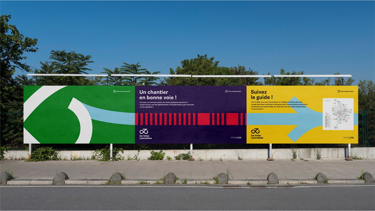
A broad teaser campaign was launched in early September with the goal to generate interest. As of September 22, an omnichannel communications campaign has been launched throughout the city as a way to invite city dwellers to engage in the project and be part of the les Voies Lyonnaises’ future. The vivid identity has been adapted by Yellow Window into a map and signage system, which will gradually be rolled out, depending on the project’s development stages.
Credits:
Client: Grand Lyon
Brand: les Voies Lyonnaises
Agency: Spintank
Project Team:
Consulting Director: Coline Naudi
Creative Director: Jonathan Mignot
Strategic Team: Julia Ternon, Victoire Quemin
Creative Team: Jules Romier, Sophie Koch, Marie Dupont
Industrial Design Partner: Yellow Window