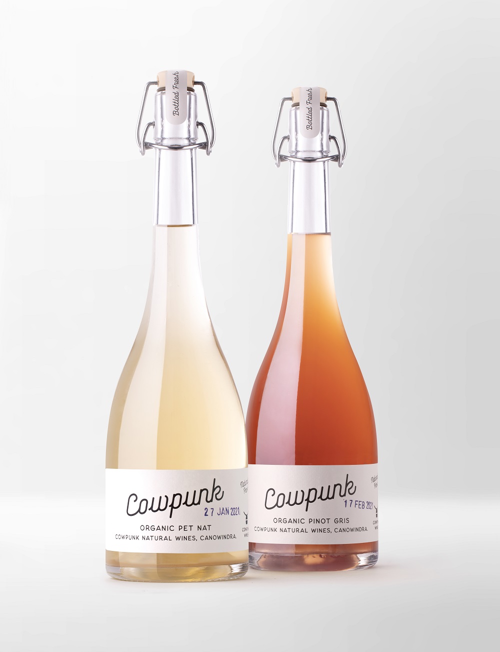
Although it is highly popular among hipster drinkers and sommeliers, consumers who are just discovering the category of natural wines may feel a little intimidated because of this segment’s colorful and edgy labels. As clients’ demands for natural products are on the rise, Australian winery Cowpunk Wines launches its inaugural brand, aiming to make this sector available to everyone. The news of the launch is accompanied by a brand strategy and packaging developed by Sydney-based agency Denomination, which worked to make the wines stand out on the shelves and to convey a sustainable message from the brand.
“We wanted to respond to the growing consumer desire for additive-free, sustainably produced original-state wines, but it was important that the range appealed to a broad market. Cool, yes, but not intimidating. Denomination’s strategy has helped us to take a niche, boutique, and uncommercial sector and make it available to everyone,” says Nicholas Crampton, Co-owner.
The brand gets its name after cowpunk music, according to Rowena Curlewis, CEO at Denomination. The music genre blends country and punk, “is unvarnished and edgy, and was inspired by the real, raw sound of country music before it became hugely commercialized. We thought this was a great analogy for what natural wines are all about,” Curlewis says.
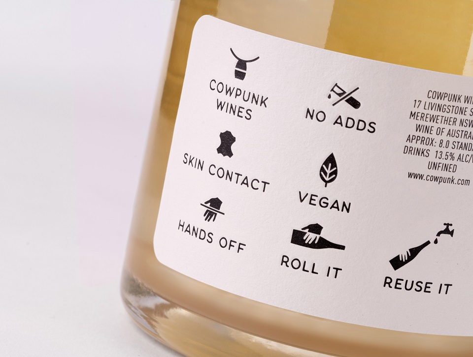
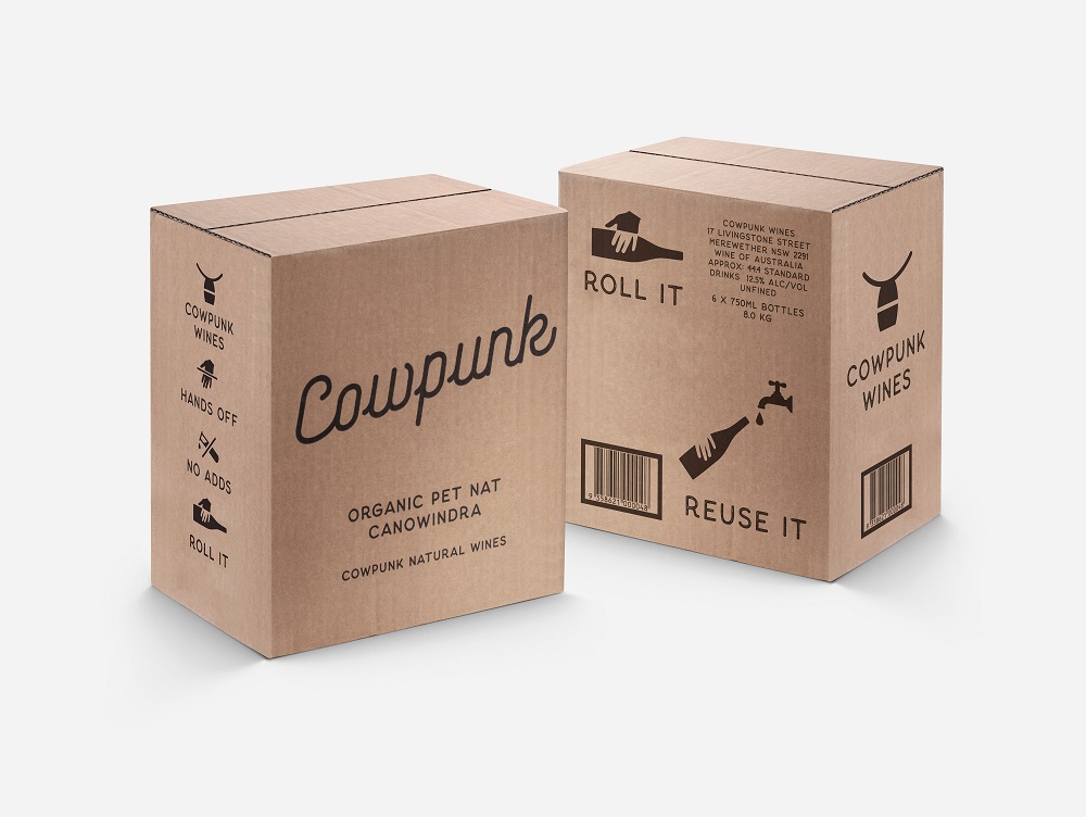
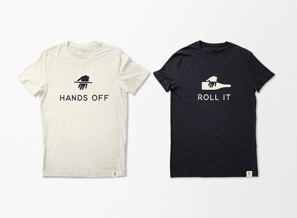
The packaging identity features a series of icons, inspired by cattle branding. When put side by side, they form an infographic, visible on both the bottles and the shippers. Its purpose is to send messages to consumers but in a simple and short way. For example, the “ROLL IT” symbol offers tips to newcomers about an essential step that needs to be followed before opening the bottle.
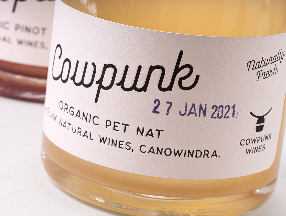
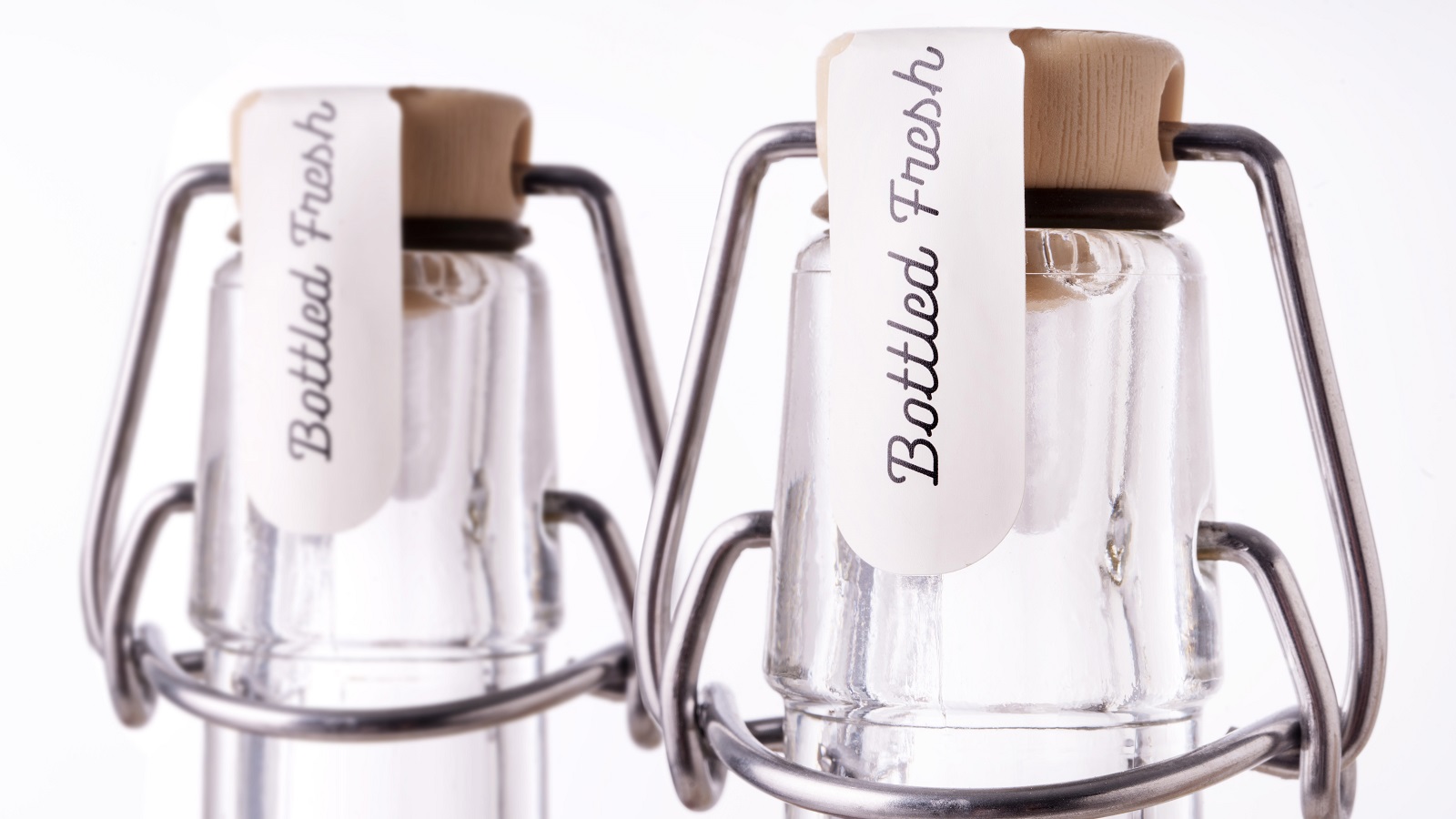
Freshness is another element that creatives have taken into account when it comes to label design. As freshness is the key benefit of natural wines, the labels are hand-stamped with not only the year in which the grapes were picked but also the month and even the day this process took place.
The swing-top enclosure — a practical element borrowed from the fresh category of pickles and preserves — turns the bottle into a reusable and resealable container, with the brand planning to have refill stations at selected retailers. Also, the “REUSE IT” icon, which adorns the back label and shipper, pushes consumers to continue the bottle’s life cycle by reusing it rather than simply recycling it.
“Cowpunk’s natural wines are sustainably made, so Denomination, which is also working to futureproof the industry, was the perfect partner for this project. Denomination is committed to helping winemakers and other drinks producers on their sustainability journeys and has put together an unparalleled network of experts to help make that happen. The team’s work on Cowpunk is as brave and progressive as it gets, and it’s this kind of thinking that will protect as well as grow our industry,” concludes Crampton.
Besides being used across merch, the Cowpunk-owned icons are aimed at encouraging consumers to discover this sector of natural wines and embrace sustainable packaging.
Credits:
Client: Cowpunk Wines
Agency: Denomination