Previously known as Pizza do Pepe, the Salvador-based pizzeria has changed its name to Gran Pepe. The change comes with the departure of one of the partners and is accompanied by a new look that’s meticulously built to reflect the pizzeria’s joyful — and quite delicious — personality.
The new identity is also developed against the background of some problems faced by Pizza do Pepe, which has been plagiarized for a few months now, affecting not only the company but also the customers. Thus, in order to avoid any kind of confusion, Gran Pepe is born, a brand that does not lose its essence and that aims to expand its range of products and make customers’ experience even better!
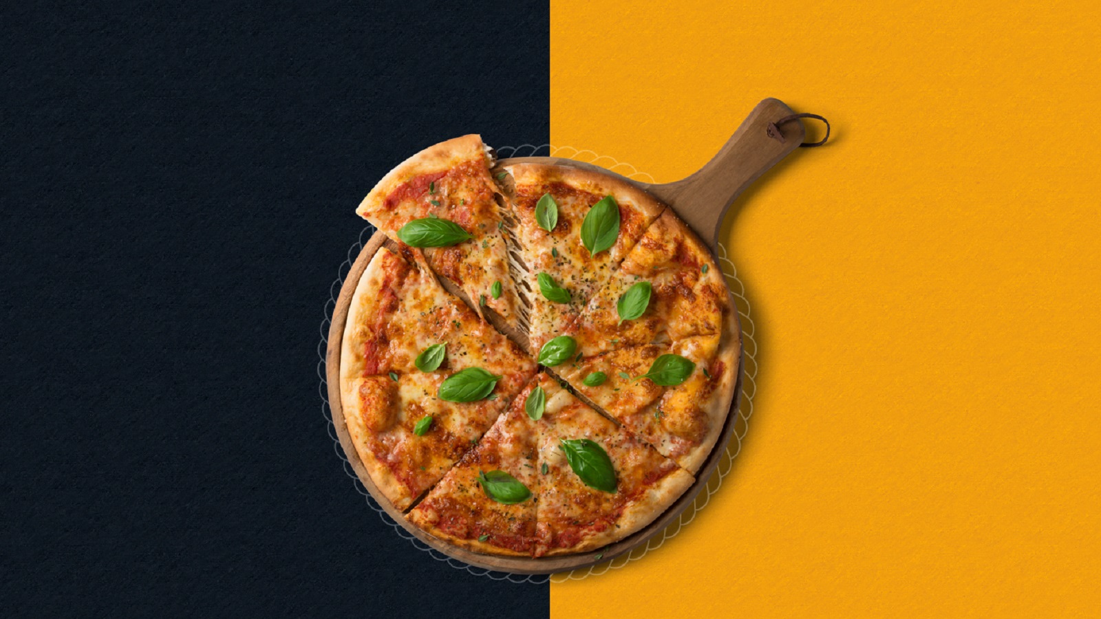
Many of you are probably planning a way to mark the end of the week. So, here’s an idea: With Christmas around the corner, an evening spent in front of the TV, watching themed movies, might sound just about right. But no movie night can be a true movie night if there are no snacks.
So while we can only assume that your weapon of choice is a delicious pizza, we at branding.news are going to feast our eyes — and yours, of course — on the identity and packaging of Gran Pepe Pizzaria, signed by Tons Design.
Behind the eye-pleasing branding stands Gabriela Cardoso, CEO of Tons Design, who listened to Pedro Cardoso’s thoughts on how the pizzeria should look, carefully turning his imagination into reality. Throughout the new branding, clients can see some visual elements that are reminiscent of the previous brand.
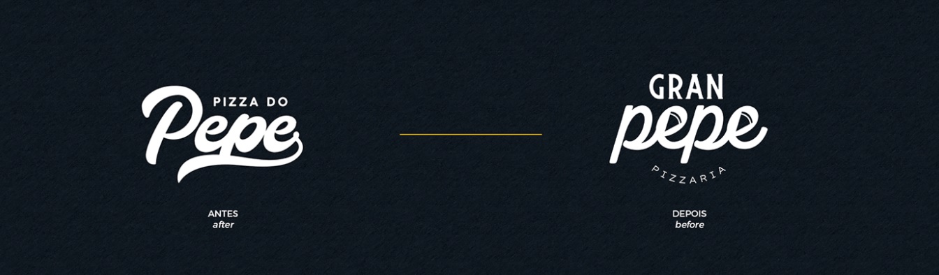
In fact, this is what the team wanted: To keep the old version’s essence to allow customers to easily associate Gran Pepe with Pizza do Pepe. By slightly changing the existing version’s visual DNA, inserting a combination of two typographies, and a bold color palette, a new, mouthwatering chapter is being written.
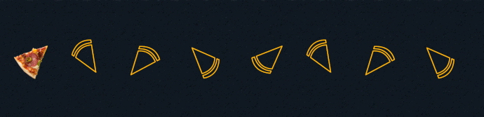
By mixing two typefaces, the agency wanted to evoke a feeling of familiarity and express the Italian roots of the pizza. The Camper Script font is a handwritten typography that draws inspiration from the old version, using round lines to write the word “Pepe.” Also, by cleverly inserting the silhouette of a slice of pizza inside each “E” letter, Tons Design brings the new brand to life in a fun way.
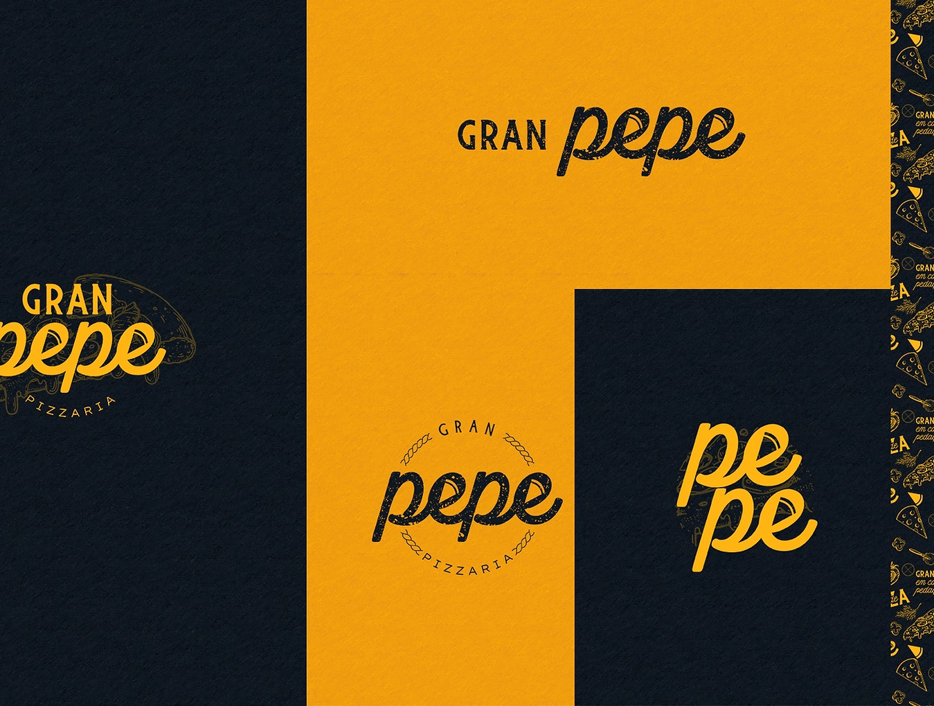
For the “Gran” word, the Burtons typography was used to remind consumers about the pizza’s origin. At the same time, writing the new name (which comes from greatness) reinforces the grandeur feeling the brand wants to convey to its audience.
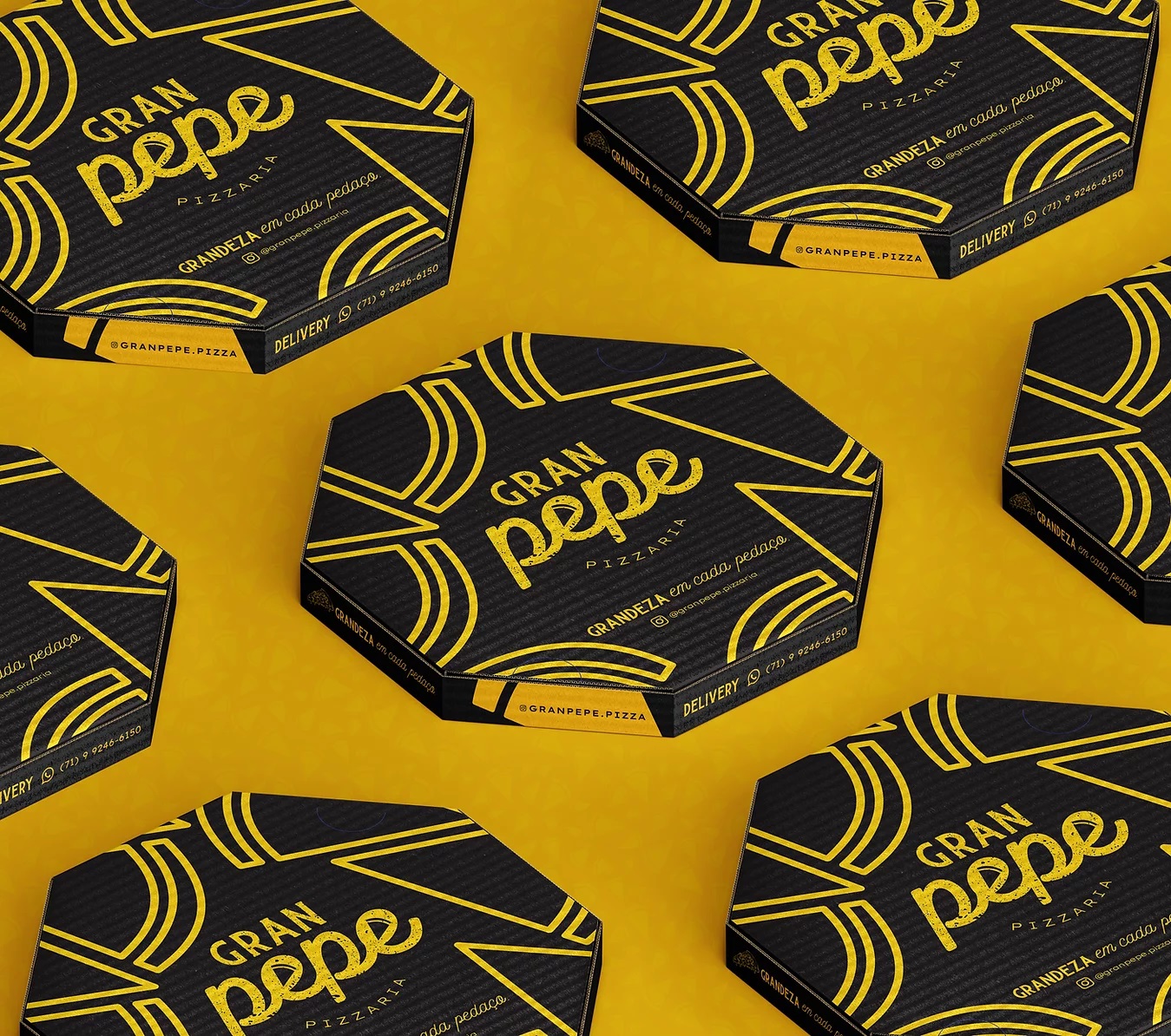
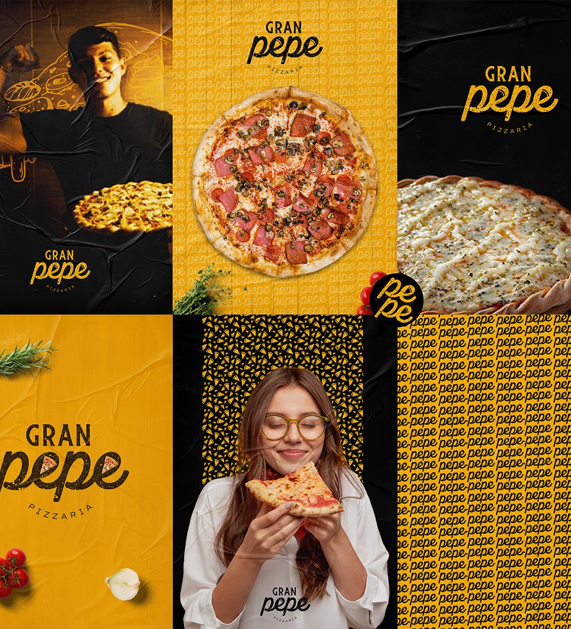
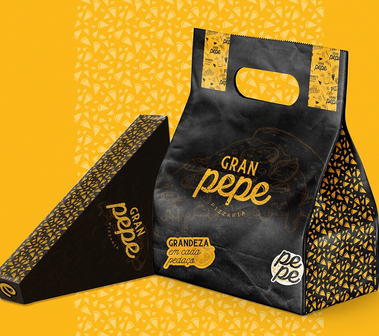
Following the client’s request, the agency settled on a color palette that harmoniously combines yellow with black. Symbolizing the sun, summer, prosperity, and happiness, yellow unlocks a feeling of joy, providing people the background they probably need to let their imagination roam free. On the other hand, the simplicity of the black color balances the whole assembly, highlighting that although the brand has a playful side, when it comes to customers’ demands and pampering their taste buds, there’s no time for games; only high-quality food.
“From the first contact with Tons, which was through Instagram and the website, I soon realized their professionalism, already differentiating themselves from many competitors. And then, getting in touch with Gabriela, who managed to take what is a simple thought and imagination of what the brand was in my head, and put it all on paper and make it real, and exceed expectations is priceless. And the sharpness and care and attention she has for the brand. As I said, my new brand has become addictive and every time I see it, I like it even more. Thank you, Gabriela, and thank you for making this change process real in the history of my pizzeria,” comments Pedro Cardoso, Gran Pepe Pizzaria.
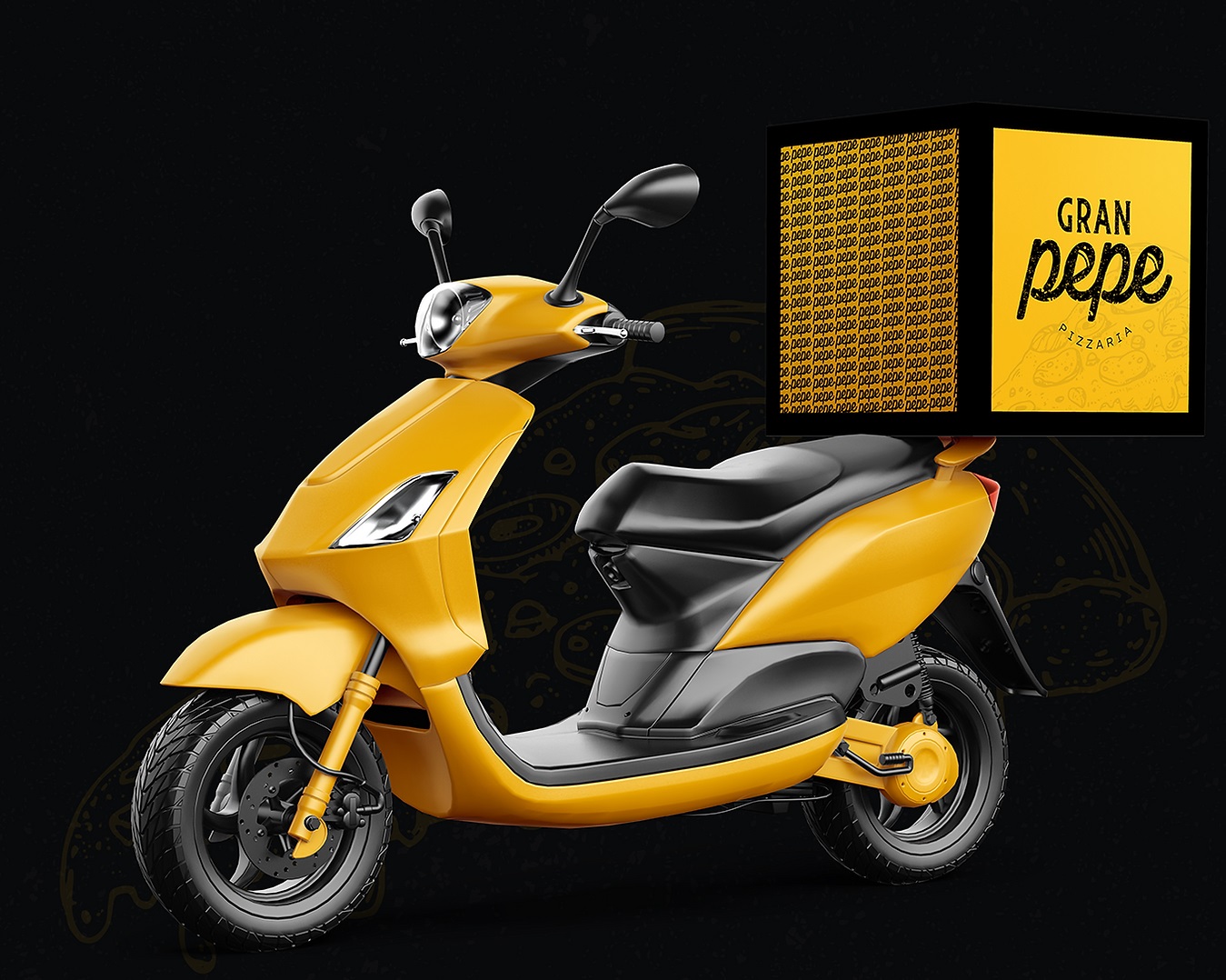
So, have you decided on the movie yet? Because Gran Pepe is ready to deliver its pizza (branding) to your door!
Credits:
Client: Gran Pepe
Agency: Tons Design