Stink Studios started to write its story back in late 2008 as Stink Digital, its fate being planned by five people in a London basement. Despite its humble beginnings, the creative advertising and digital experience company has grown into a global network, currently stretching across four continents. The studio has more than 150 family members and holds hundreds of awards, including 100+ Cannes Lions, 50+ D&AD Pencils, and 20+ Webbys, among others.
To mark its decade-long anniversary, Stink Studios started to work on a new version of its brand. Call it a new chapter, one that includes a refreshed visual identity and website, as well as templates and tools, a brand-new icon, a typeface, and a complete brand book. Simultaneously, wanting to continue “everything that has made [them] great in the past,” the studio revealed its first-ever company values, specially developed to accompany the team while they venture into the next decade of creativity.

“In a moment where office culture has receded into the background, it’s important for creative companies to explain what they stand for and why they’re different,” says CEO Mark Pytlik. “This isn’t just a visual refresh — all of the changes we’ve made reflect something deeper about the direction of the company itself.”
The rebrand, which marks the company’s first in six years, is in line with the studio’s philosophy, reminding us of Stink Studio’s roots in digital culture. It goes way back to “the bare-bones aesthetics of the early Internet,” evoking the memories we have about the “primitive” emojis in our minds and comprises Stink Studio’s award-winning work within a minimalistic frame — one that doesn’t minimize its triumphs but rather complements them.
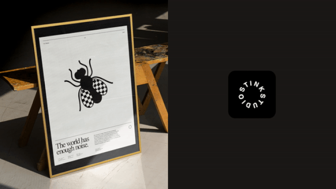
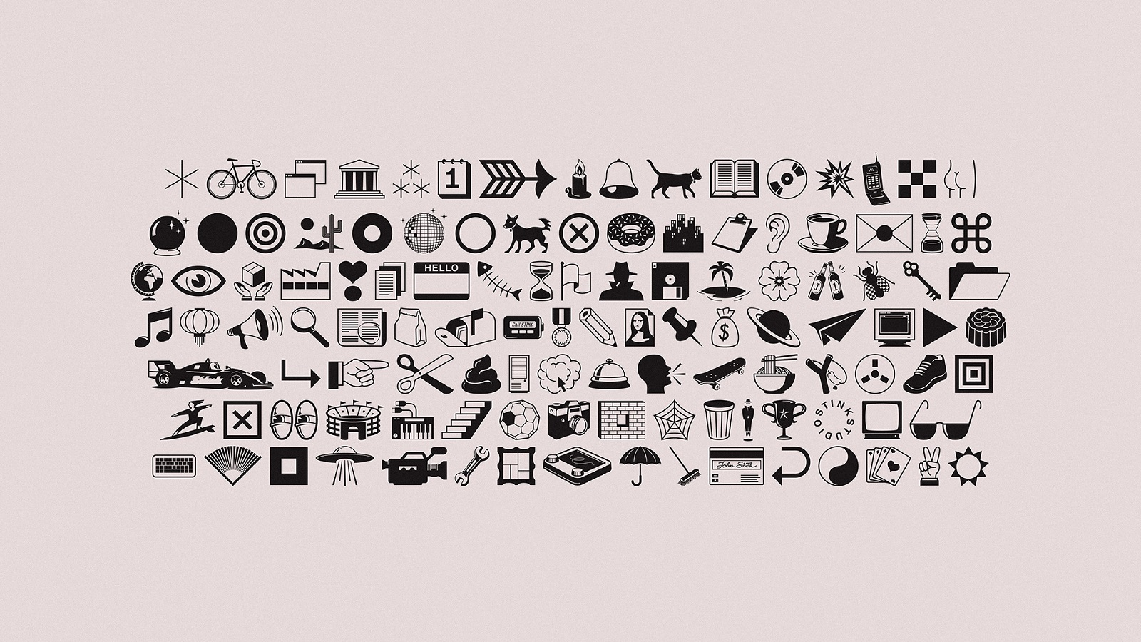
Stink Studios’ new look is coherent, the company keeping it simple with a black-and-white background and system fonts like Times New Roman, Helvetica, and Courier. This unsophisticated but harmonious combination is accessorized by a series of visual elements that take the audience back to the early days of internet emojis. Introducing Stink Dings, the studio’s custom internal font that resulted out of the collaboration with type foundry Dinamo.
Available to be used by anyone, anywhere, the font pays a tribute to Webdings, Wingdings, and Dingbats typefaces, from which the modern emojis descend. “Our iteration of Dings incorporates bespoke illustrations which reference our industry, work, and studio cultures,” says the studio. With more than 100 illustrations designed, the studio’s monochromatic rebrand doesn’t feel colorless at all — able to be used in different contexts, the icons speak about the company’s fun personality and playful spirit.
“Sometimes I feel like we’re terrible at telling the world about all the exceptional work we do,” adds Pytlik. “This new rebrand is the perfect frame for our incredible output, and a perfect representation of the company we’re building.”
The rebrand also includes a refreshed website that hosts some of the studio’s work, a photo presentation of the team “made up of observers and scientists with good ears and big brains,” and the new showreel for 2022, capturing everything the studio has made since 2008. And while you browse the studio’s page, don’t forget to check out the dark/light toggle, list mode, and the 404 page.
Credits: