After having its looks polished — going through a rebranding process — Gluemasters, a high-quality glue brand in the US, asked for formascope agency‘s support in helping it build a new brand. This time, for the European market. While keeping the target audience in mind (those who use adhesives for household, for arts and crafts, or simply to express their imagination), the Yerevan-based agency had to come up with a brand concept, name, and packaging that not only speak about the product’s strong adhesiveness but also about its right positioning in the market.
According to the Oxford Advanced Learner’s Dictionary, glue is a “sticky substance that is used for joining things together.” Yet, the agency’s creatives had other thing in mind when thinking about it: How about explaining the “law of adhesiveness” through gravity? But what could possibly glue and gravity have in common? As per the agency, there is a place — call it a common ground, if you want — where both of these can manifest: Gravix.
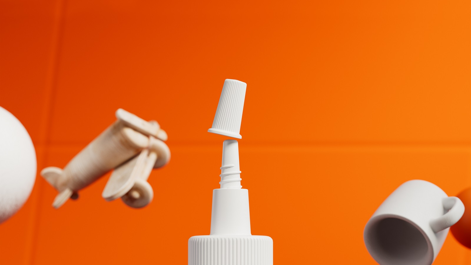
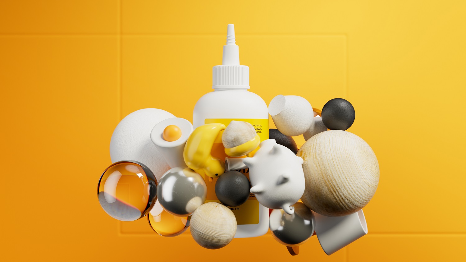
The Gravix brand, which gets its name after the agency “glued” the words “gravity” and “fix” together, is the visual manifestation of an unusual duo: science and creativity. Drawing inspiration from physics and using one of its laws, the artists gave the sticky substance a playful representation.
“We emphasized the strong formula of the glue and drew a parallel between two things: gravity and glue. The concept is based on the law of physics, mostly the force of attraction,” we find out from the agency.
The playful approach used by the agency in outlining the concept can be noticed on the packaging as well. There are four products, three adhesives and a debonder (a product used to remove the glue). Kept in white bottles and following a similar aesthetic style, the agency customized each product’s label design.
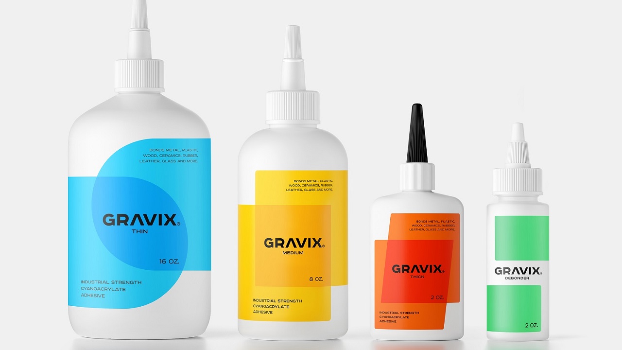
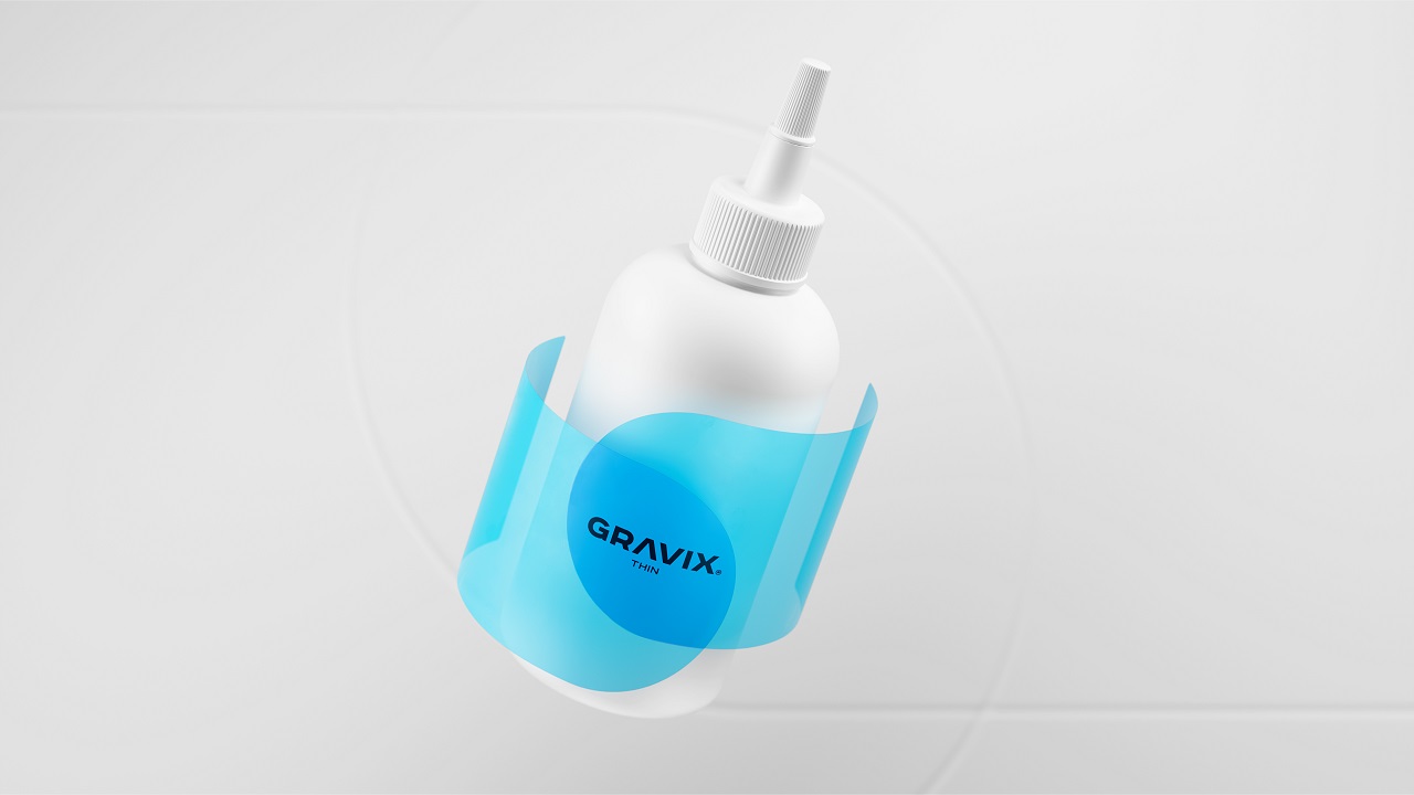
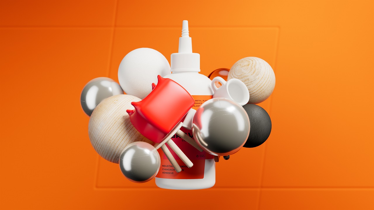
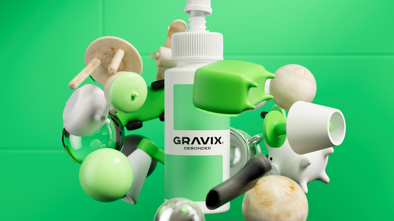
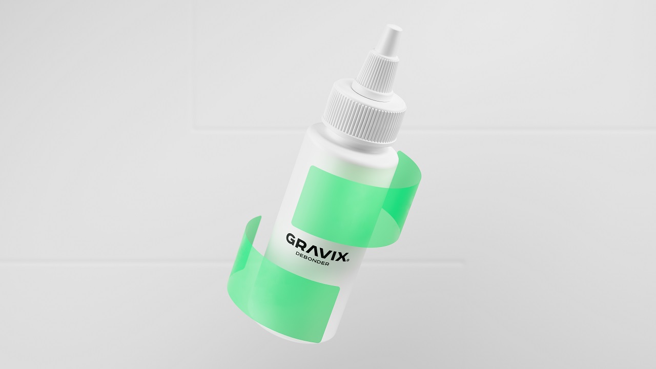
The key element that allows consumers to differentiate the products from one another is embedded right on the packaging, allowing glue users to find which product suits their needs best in a fun way. As such, the overlapping forms are used to give clues about the product’s percentage of fluidity — the rounder the wetter, the pointer the denser. However, the debonder bottle’s design “defies” gravity, with the two separated shapes suggesting a powerless force of attraction.
“Gravix is very strong and with an enhanced professional formula. formascope agency found a great and simple way to show the functionality of our glue. Gravix=gravity,” concludes the client.
Credits:
Client: Glue Masters LLC
Agency: formascope