Despite having a two-century-old heritage, the Royal Horticultural Society (RHS), the UK’s largest gardening charity, wasn’t that coherent in terms of branding. Yet, the previously plain and somehow inconsistent look has been given a recent boost, one that truly reflects the green spirit of the charity and the gardens that are teeming with colorful life, without minimizing the organization’s rich history.
Painting a new identity for the RHS wasn’t an easy task, we find out from Design Bridge — the agency behind the charity’s full rebrand and visual identity — as contouring it required a period of 12 months. But the creative team’s work paid off: The rebrand suggests an electrifying tableau, with visuals infused in a rich color palette.
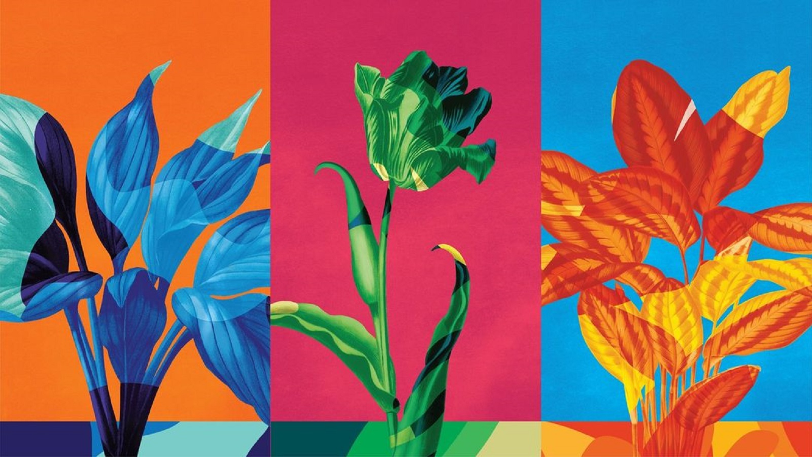
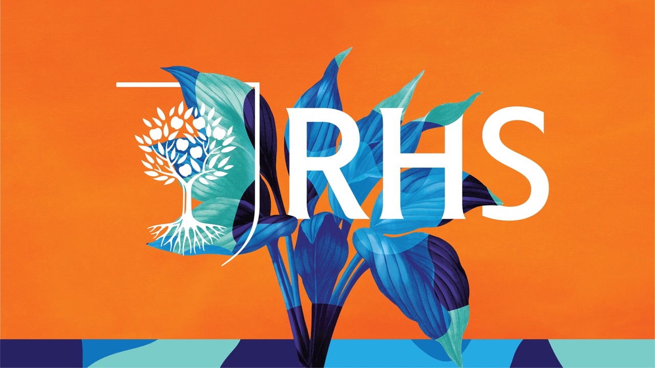
In bringing the final picture to life, the London-based agency worked similarly to a gardener: The team “planted” a seed and nurtured it with creativity and inspiration for quite some time, eventually achieving a bouquet of floral-inspired visuals they are really proud of. In this brand refresh project, the seed is actually a design concept: “The limitless wonder of growth,” an idea that was fed with motion design, vibrant patterns and distinctive illustrations, a season-themed color palette, and a modern typographic style. Taken care of it with such rich nutrients, the seed eventually sprouted into an eye-catching identity that exudes the RHS’ positive vibes and green personality.
Commenting on the project and the way they worked with the Design Bridge team, Martine Parnell, Director of Members, Marketing and Digital, The RHS, says: “The project between the RHS and Design Bridge has been a delight — taking a brand with multiple sub-identities and inconsistent visual identity and forging with us something transformational but anchored in our heritage and purpose. This is giving us the tools and opportunity to grow the power of the RHS brand with gardeners across all touchpoints, leading to greater engagement with, and funding for, the charitable work we do across science, communities, schools, and young people.”
Tim Vary, Creative Director, Design Bridge, continues: “We were thrilled to work with the RHS to create their new design system and visual identity. We created a cohesive design system which reflects the vast history of the organization whilst simultaneously making the brand more appealing to contemporary audiences.”
The creative director then added: “Using the design idea of the transformative power of growth, we designed visuals that are consistently evolving and transforming. By layering textures, vibrant seasonal color palettes and a mix of historical botanical illustrations and typefaces alongside new moving imagery, we formed a design system which is reflective of both the past, present, and future of the organization.”
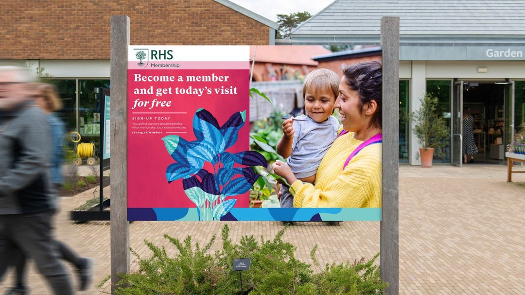
Coming alive in digital and print, the new visual identity tells the charity’s story in a distinctive way, making the RHS truly stand out amongst the crowd. Plus, using “plantesque” visual terms, the new look fluently speaks about the work unfolding at the organization. Involved in many activities, the RHS is committed to inspiring everyone to grow — be they plants or people interested in horticulture and gardening in the UK. Equipped with the right information, the gardeners can help plants have a long and happy life. However, WPP agency and partner, Wunderman-Thompson, captured some flowers and plants complaining about their carers, because, apparently, their humans don’t seem to completely understand what the herbs need.
Collaborating on the project with a focus on the brand strategy and the integrated brand campaign, the agency developed the “We Speak Plant” video, a nice animation that uses humor to speak about the plants’ needs and how their days go wrong because their carer doesn’t know how to take care of them properly. Captured whining about either being watered too much or not enjoying enough sunlight, the video targets plant enthusiasts, suggesting a slight improvement in their gardening skills with help from the RHS. This way, humans can be sure that their plants won’t have any reason to talk about them behind their backs.
Credits:
Client: Royal Horticultural Society
Design Agency: Design Bridge
Business lead: John Morris, Chief Executive Officer
Strategy: Holly Aurelius, Associate Creative Strategy Director
Creative Director: Tim Vary
Senior Designer: Chris Algar
Design Director: Stuart Bolt-Palmer
Motion Director: Alessandro Foschini
Designer: James Green
Client lead: Helen Hughes, Sustainability Director
Production Project Director: Julia Thompson
Production Artworkers and Retouchers: Adam Stanley and Mark Douglas
Operations: Maya Antonov and Libbie Trusselle
Collaborators:
Brand strategy & accompanying campaign: Wunderman Thompson
Illustration: Paul “Dessy” Desmond
Lettering artist: Rob Clarke