The TABASCO® Brand sauce is appreciated by many — around the world and even in outer space. Launched in 1868 by McIlhenny Company, the condiment has maintained its instantly recognizable flavor across all of these years, pampering the taste buds of some of the most demanding consumers.
The hot condiment made it to many restaurant tables around the world and is served by space shuttle astronauts as well, who use the sauce to make their meals taste better. It is a global phenomenon indeed, with many other famous people having a particular affinity for this condiment: Not only is the sauce served on Air Force One but TABASCO is proud to say that Queen Elizabeth is one of its most famous fans.
“Giving things kick and heating things up is a category table stake — TABASCO® Brand does so much more. Its unique strength is that it makes everything it touches more original. Some of the most distinctive people in the world are passionate about TABASCO® Brand from chefs to celebrities to astronauts to royalty,” comments Kate Wadia, Founder & CCO at Mrs&Mr, the creative agency tasked with helping the most famous pepper sauce in the world condiment the brand with a new, “spicy” visual identity system.
Despite being craved by so many people around the world, TABASCO lacked a branding that speaks coherently about its heritage, its legendary status, and the ability to amplify flavors across all cultures and cuisines. Set to be rolled out across all communications globally, the new identity portrays the company in a modern way while still keeping some of TABASCO’s classic elements in the spotlight.
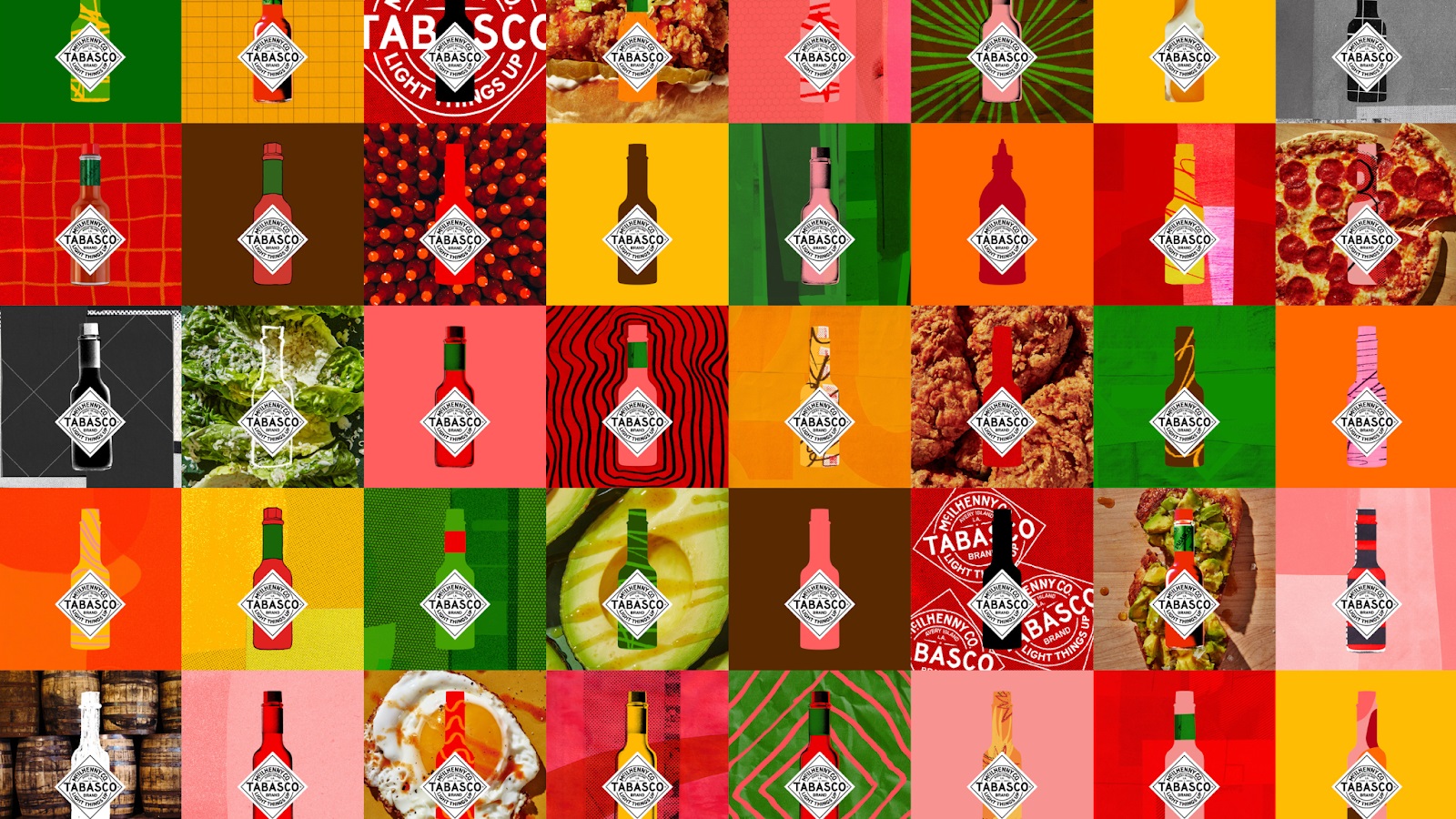
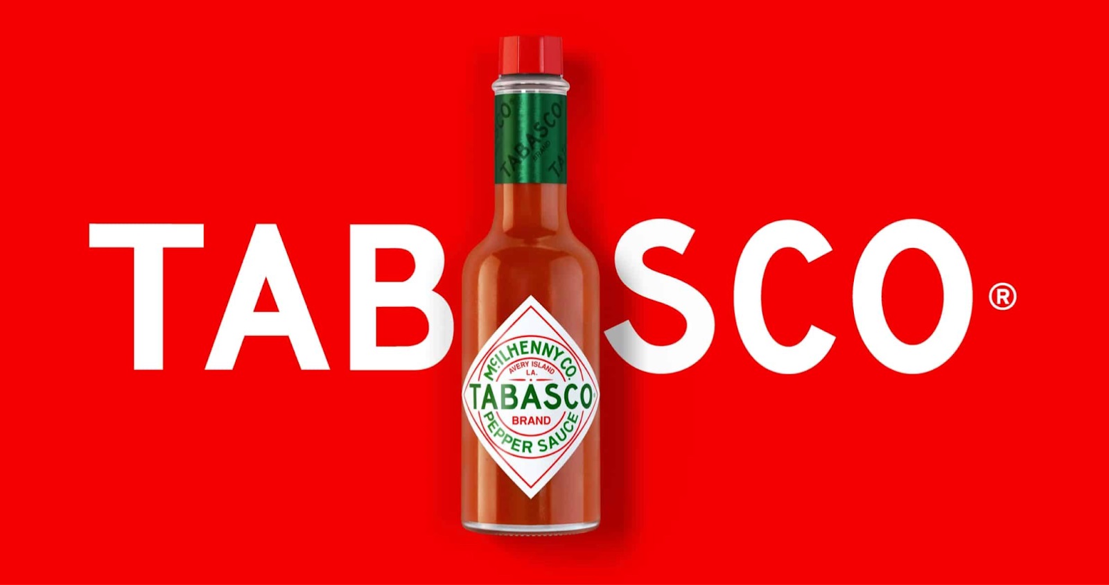
The refreshed identity resulted from the New-York-based agency’s idea of blending the brand’s iconic bottle shape and label with new graphic elements. By doing so, the team designed a visual language that is faithful to the brand’s new tagline, “Light Things Up.” The TABASCO brand “has been a beacon for original people and tastemakers for more than 150 years and we celebrated this essence with a dynamic, contemporary visual system that keeps the iconic bottle and diamond logo central to every communication,” continues Wadia.
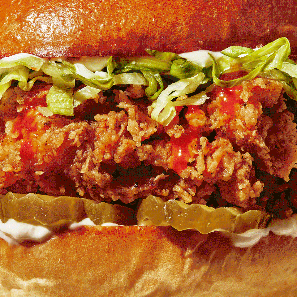
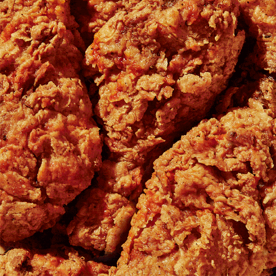
Instead of using cliched illustrations of flames and explosions, the new branding is created following vibrant, dynamic imagery, bold graphics, and food photography. By choosing such visual ingredients instead of the predictable ones, the agency communicates the brand’s “transformative power,” developing a structure that playfully brings out each of TABASCO’s individual aromas.
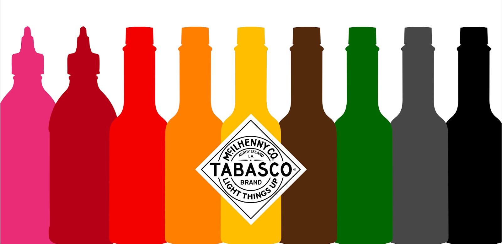
Amongst the elements that have been stylized by the agency include a refreshed TABASCO Brand diamond logo, a new bottle — which now features a more pronounced diamond logo, facilitating an easier branding communication and flavor distinctness — as well as a halftone bottle that enables a more tangible feeling. Additionally, the agency worked on verbal icons, a new color palette, new typography, and a mouth-watering approach to food photography.
Credits:
Client: TABASCO® Brand
Agency: Mrs&Mr
Chief Creative Officer: Kate Wadia
Chief Strategy Officer: Daniel Wadia
Art Director: David Zoppi
Designers: Arian Franz, Austin Welch
Strategy Director: Maya Kincaid
Photographer: Alex Lau
Print Producer: Katie Olsen