
From running its own record label, London Symphony Orchestra LIVE, to offering music education to programmers, performing for more than one billion people at the 2012 Summer Olympics in London to hiring a new conductor, the last few years have been a big hit for the London Symphony Orchestra (or LSO).
Their last exploit was indeed a huge deal: by appointing Sir Simon Rattle as the main conductor, the LSO got a chance to sing about its rich heritage and speak about its long-standing reputation. But most importantly, the highly-talented conductor helped the LSO contour its new visual identity and watch as it literally blooms under the magical notes of classical music.

But as each orchestra has its own conductor, the designer crew responsible for crafting the LSO’s new signature look has its own chief: Superunion agency—formerly known as The Partners—the leader behind the creative ideas that introduce a mixture of musicians and events with a unique visual representation of the institution’s audio traditions.
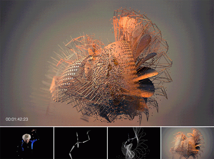
Taking advantage of the fact that a new conductor has stepped on the big stage and inspired by the old LSO logo, the agency, which worked closely with the digital artist Tobias Gremmler, nicely reinterpreted the orchestra’s signature using nothing else other than the scenic movements of the one and only Sir Simon Rattle.
The entire eye-catching scene was then processed using motion data and delivered to the audience as a visual language that speaks and reflects the emotions, passion, and spirit of the orchestra, and its conductor.
This week’s #ThrowBrandThursday brings a design project that includes visuals, logo, and typography, all inspired by Rattle’s fluid and angular movements. Under the direction of Tobias and using the charming and melodious gestures of the conductor, the creative team has managed to transform static images into a fluid visual opera.
While using motion data technology (12 cameras running at 120fps), the team captured Sir Simon’s gracious movements as he conducted Elgar’s Enigma. Then, the digital artist translated the data into a series of short animated films, which describe a striking picture of the musician’s sweeps, stabs, and twists of the baton. The result reflects the music’s emotional qualities through color, texture, and motion even in the smallest visual details.
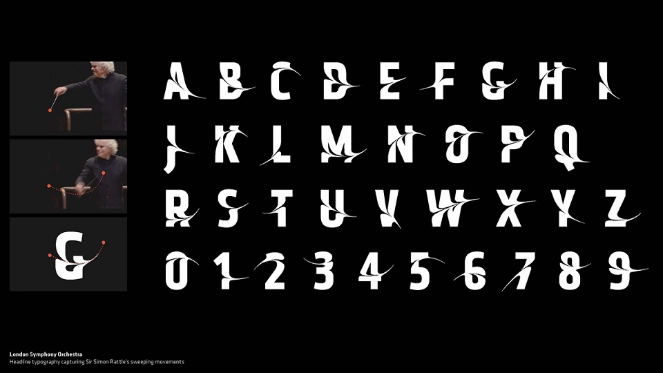
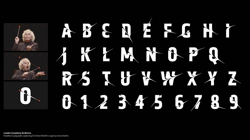
Besides the short films, which approach different design lines, the team managed to capture the musical drama with a series of stills, such as typography and logo. Moreover, the conductor’s beautiful fluid and angular movements—that almost resemble some sort of delightful ‘dance’ moves—were used by the creatives to develop two typographic styles.
The team carefully studied Sir Simon’s gestures and, after a long analysis, these were applied to the headline font; one captured his vigorous movements and the other addressed his sweeping ones. The newly-born font expresses deep emotions of music. To further give a sense of rhythm, the digital artist split the letters with multiple lines.
“The process we have been taken through has been enlightening and made us question many aspects of how a 21st century orchestra should appear to its audience, with the end result being both bold, confident and forward-thinking, and a stunning reflection of how music can inspire, and now exist, in design,” said Edward Appleyard, LSO’s Senior Marketing Manager, Brand & Communications.
Are you ready to explore the award-winning brand identity? If you want to know more and experience the visual side of the campaign, then we invite you to watch the video below to get a sense of what it feels like to literally see sounds and how they move according to Sir Simon’s directions!
Credits:
Client: London Symphony Orchestra
Agency: The Partners (now Superunion)