Commissioned to design the new label of the Single Estate Wood Brothers Vodka, Pencil Studio‘s artists did not disappoint their English client nor us, big admirers of tasty visuals, and the distilled beverage too. But first things first: let’s find more about the Single Estate Vodka’s heritage and production process so we can better understand its exquisite aesthetic lines.
Processed using Wood Brothers‘ own technique, the premium spirit will tickle your taste buds with various flavors, such as caramel, vanilla, and honey. On top of that, there’s a hint of pepper to spice things up a bit. The recipe also includes English winter wheat grown in the sweeping Oxfordshire countryside. Ed and Charlie Wood, the team behind the grainy drink, added their passion, which they carefully poured into the vodka.
But the process has only gotten completed thanks to Pencil Studio’s designers, who added a teaspoon of imagination and originality to the original recipe, dressing the product into a nice, artistic coat. A robe that is the subject of this week’s #ThrowBrandThursday column.
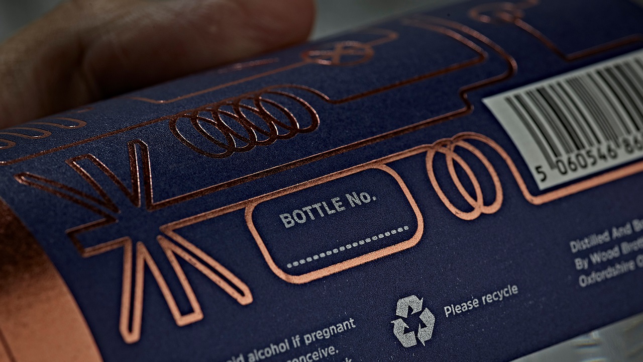
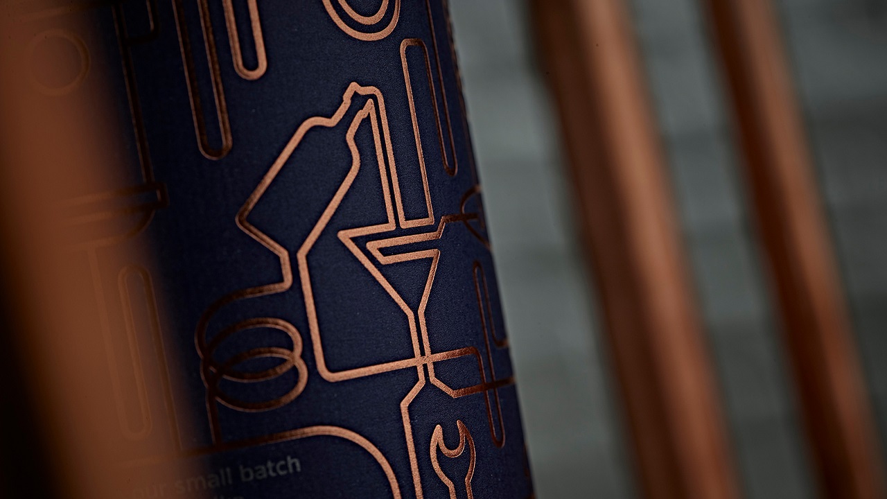
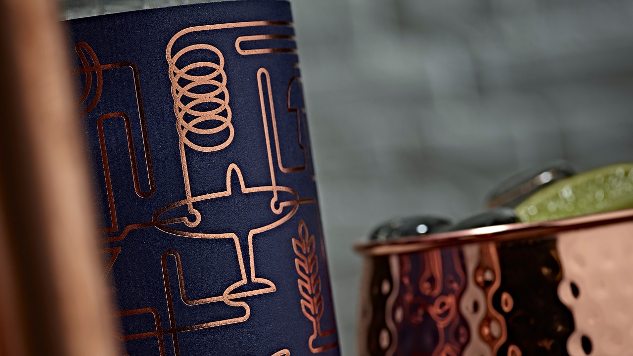
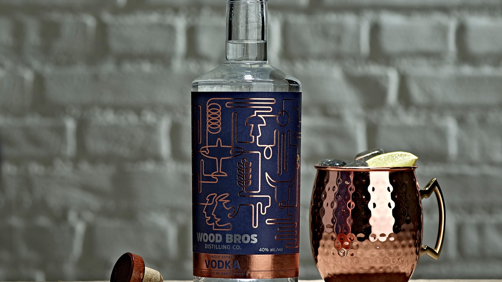
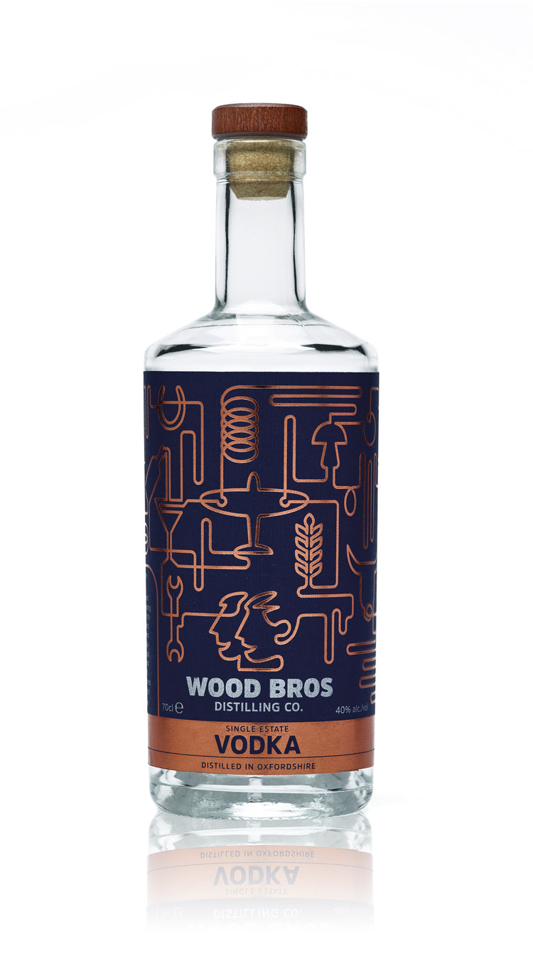
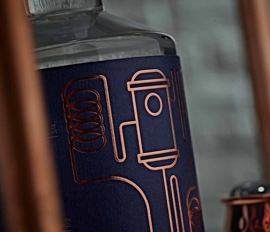
Taking inspiration from the distillery’s long history, the artists crafted a sleek visual essence of the product. A massive transparent bottle proudly carries a blue-colored label on its surface and visually reflects the brand’s strong DNA. The design is wonderfully executed and describes a series of line illustrations dressed in shiny gold.
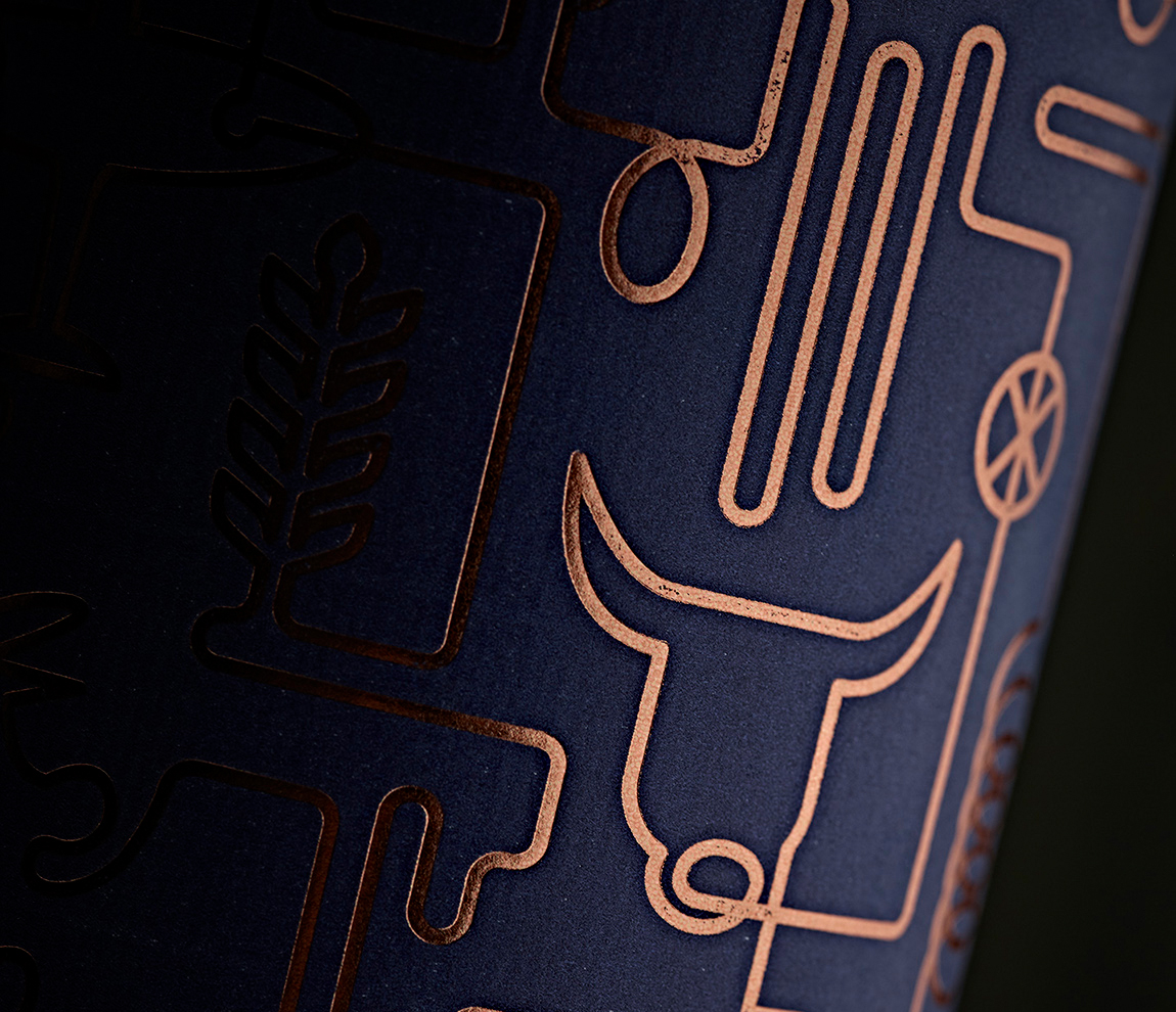
The lines represent nothing else but a clever reflection of the distillery’s copper pipes, which supplements the brand with an industrial note. The color chosen to fill in these important lines points out the premium quality of the tasty drink. The matte foundation—which carries these elaborate illustrations—mirrors the same feeling, luring the drinkers to try this delicious and sophisticated vodka.
Zobrazit příspěvek na Instagramu
According to the studio, the illustrations were crafted to honor the brand’s real spirit and core values: “It’s a visual celebration of everything that [the Wood Brothers] have been through and the very essence of them being distilled into their drinks.”
“This vodka is creamy and sweet on the nose, with hints of warm vanilla and toffee, cut through with notes of soft piney wood. The palate is remarkably smooth; its subtle peppery notes contrast a soft mouthfeel with wafts of creamy, almost butterscotch developing on the long finish,” says the Craft Drink Company.
And after looking in detail at the visual assemble, we’d definitely add that the packaging design is as smooth as the drink is. Its subtle rose golden lines contrast with the background, revealing a complex image that can speak by itself. Cheers!